Wilson Hartnell Rebrand
Designed by Halley Anne Kennedy and Lisa Clarke at Rowdy Studio
Categories: Website / Identity
Industry: Corporate
Tags: Icons
Website: wilsonhartnell.ie/
Ceaseless Wonder. Thoughtful Impact.
Wilson Hartnell has been at the forefront of the communications industry for 50 years. With a mindset fixed on the next 50, its heritage brand needed kicking into the future.
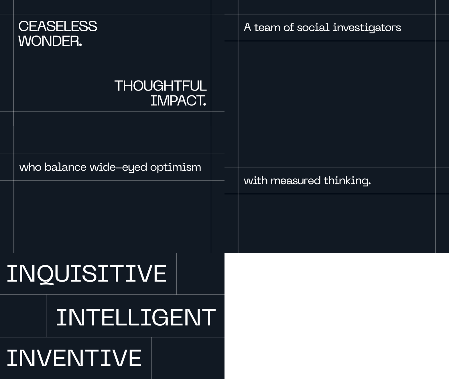
IT ALL STARTS WITH WHAt its heart, Wilson Hartnell is a team of social investigators. Wide-eyed optimists who are constantly curious, with the maturity to care deeply about their impact – on their clients, their people and the world. We articulated this in a new positioning – Ceaseless Wonder. Thoughtful Impact. Three guiding principles – Inquisitive, Inventive, and Intelligent – back this up and nod to a history full of firsts.
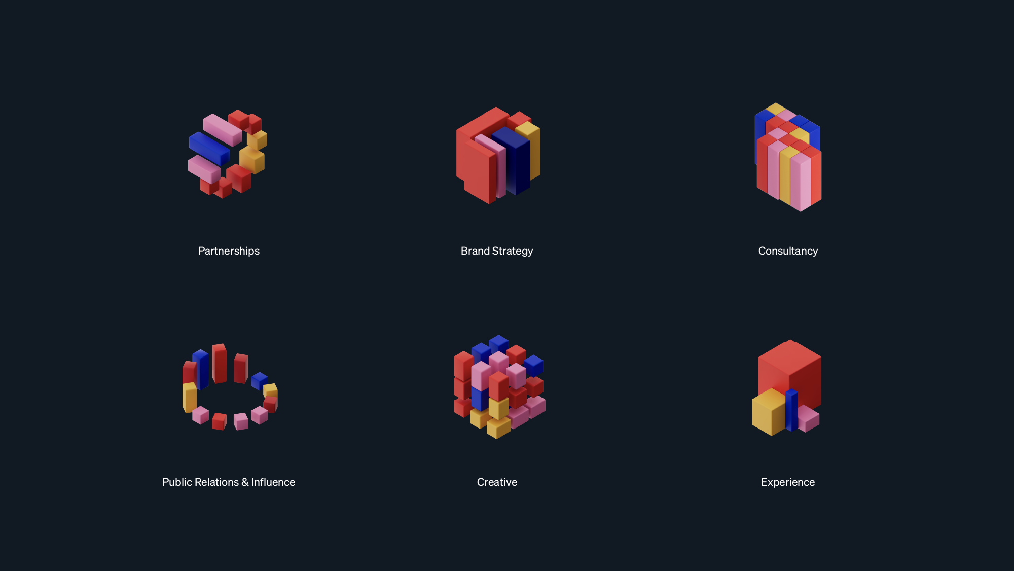
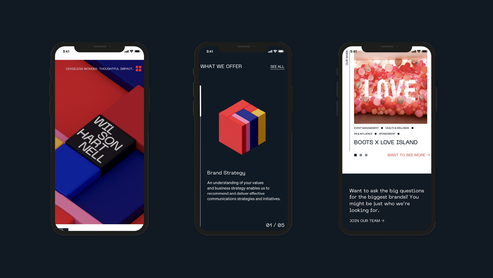
RECLAIM BEING SQUAREThe brand needs to capture both Wilson Hartnell’s ‘original’ status and the spirit of reinvention that keeps it in the lead. The new visual identity retains and reclaims the square mark. It now expands and challenges spaces, boundaries and form. The system built around it is flexible and adaptable, just like Wilson Hartnell’s agile approach.
REFRAME THE REDRed is integral to Wilson Hartnell’s heritage and legacy. To make it more reflective of the future and introduce flexibility, we reframed its use throughout the brand. Always important and included, on its own red creates moments of delight. And when Wilson Hartnell is at full volume, it works alongside a new, expanded colour palette.


