Wexford Festival Opera – Rebrand
2024
Designed by John Gavin, Eddie Rochford Whelan and Julia Smolnicka at TrueOutput:
Categories: Print / Identity / Moving Image
Industry: Cultural
We were engaged to rebrand the 73-year-old Wexford Opera Festival. There was a drive to move forward and develop a more progressive solution that could broaden appeal and handle the demands of it required today.
We centred around the idea that when we truly engage with something like a festival, it becomes an immersive experience. Connecting people, the environment and live performance. To immerse, you connect with all aspects with a heightened awareness and it becomes a portal to another space.
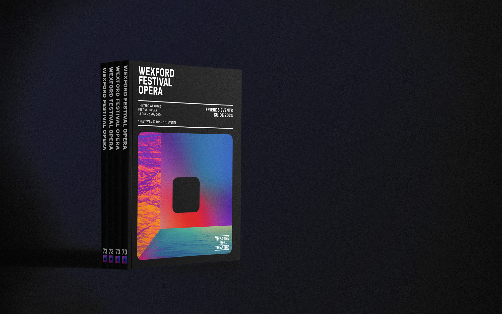
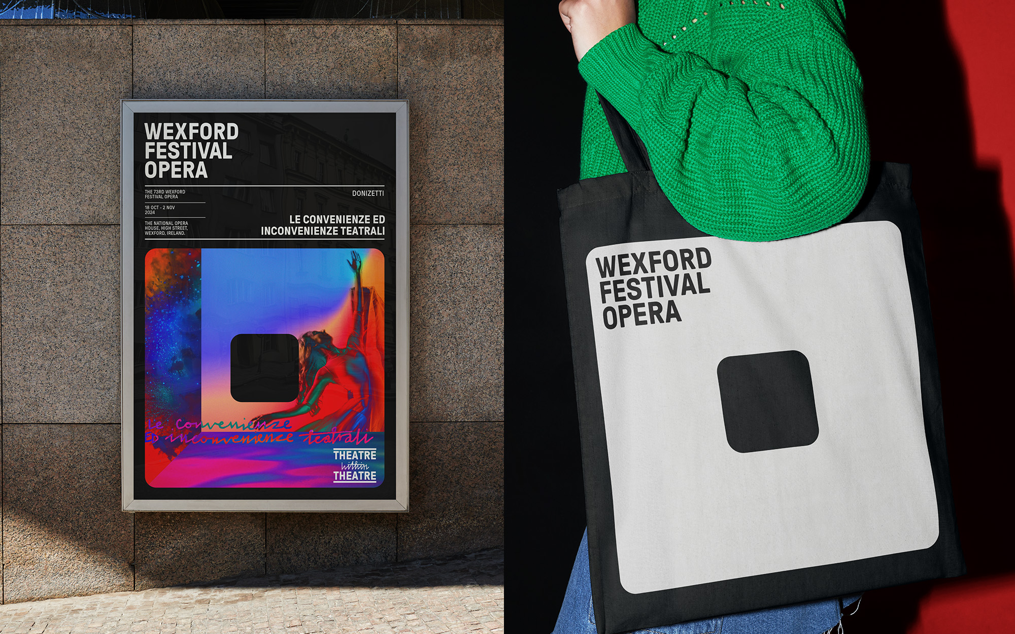
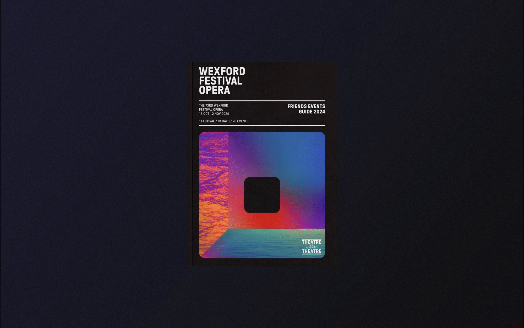
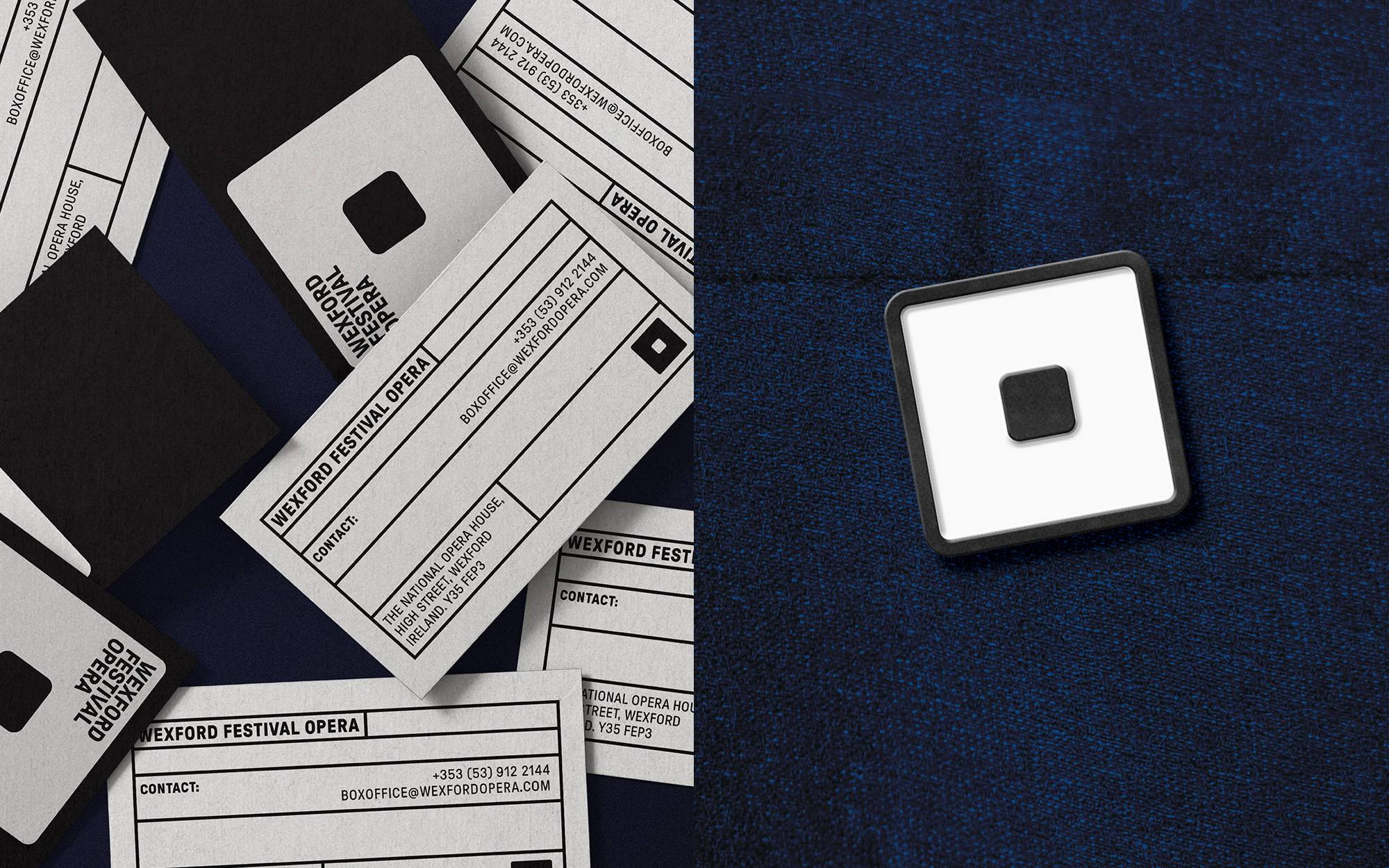
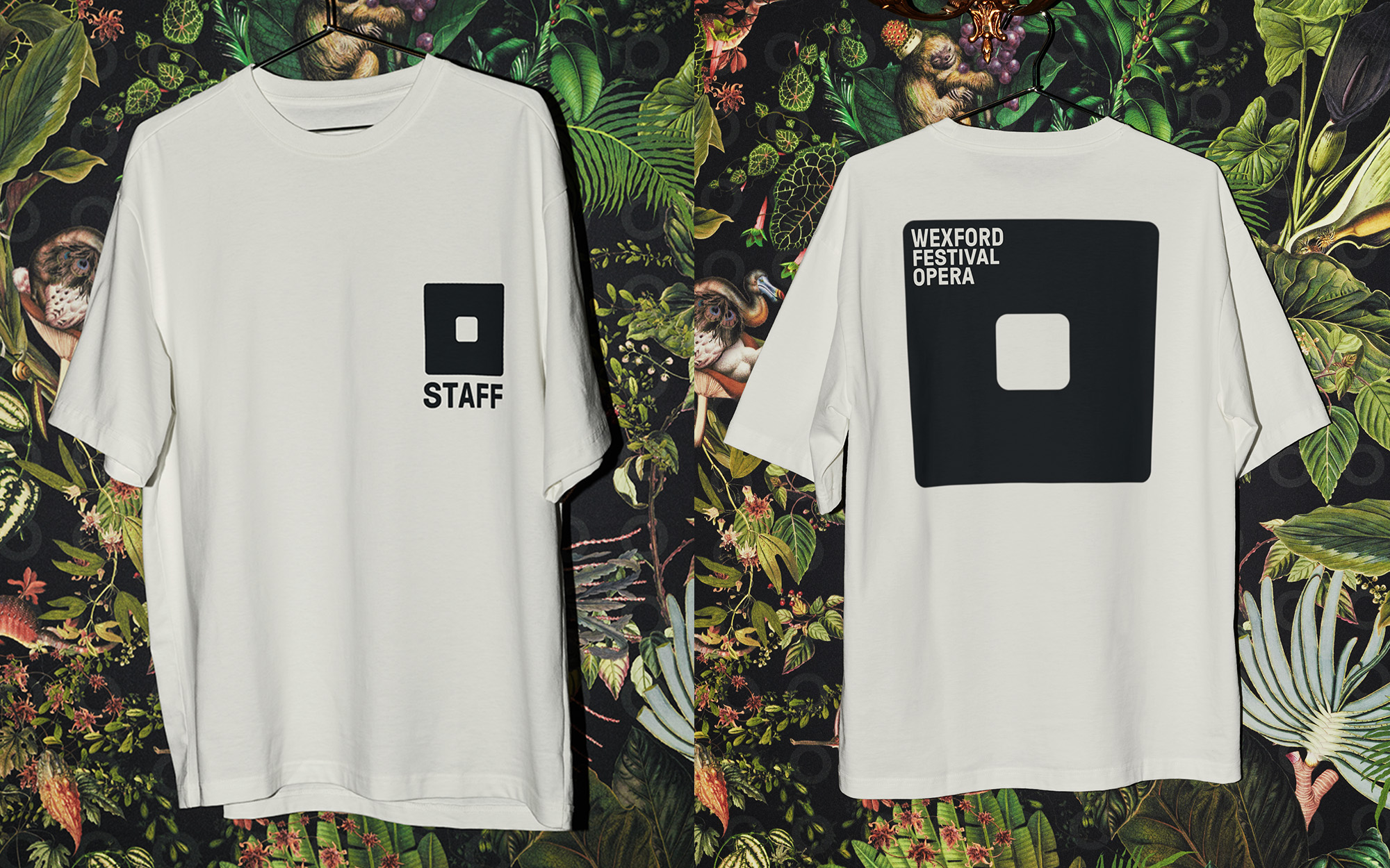
To represent the festival, we sought to create a strong symbol. We noted that the letter "O" for opera resembles a singing mouth. Additionally, architectural drawings revealed that the opera house stage is a square shape in all directions - a perfect 3-dimensional cube. This led us to create a square "O" as a distinctive symbol that connects both the singer and the stage. This "O" then becomes a portal for immersion and a device to hold imagery and film.
This theme was central to the 2024 festival imagery, where we created a 3D space inside the portal "O" drawing the audience into a theatre within the theatre. The use of ultra-vivid colours references the wide range of emotions in opera, from cold-blooded murder to unbridled passion. The imagery unifies a broad range of concepts, building recognition for the festival across all touch points.
The design system incorporates a visible grid structure, creating a consistent and distinctive look for printed materials. This framework allows the in-house team to easily create marketing materials, integrating each season's imagery theme while maintaining visual consistency year after year.