Walsh Whiskey Website
Designed by Emma Wilson at Slater Design
Web Development: Thought Collective
Photography: Trevor Hart
Stylist: Eleanor Harpur
Food Stylist: Johan Van Der Merwe
Models: Ipanema & Morgan
Glassware: Criostal na Rinne
Categories: Website
Industry: Commercial
Tags: Digital / Food and drink / Art direction
Website: walshwhiskey.com/
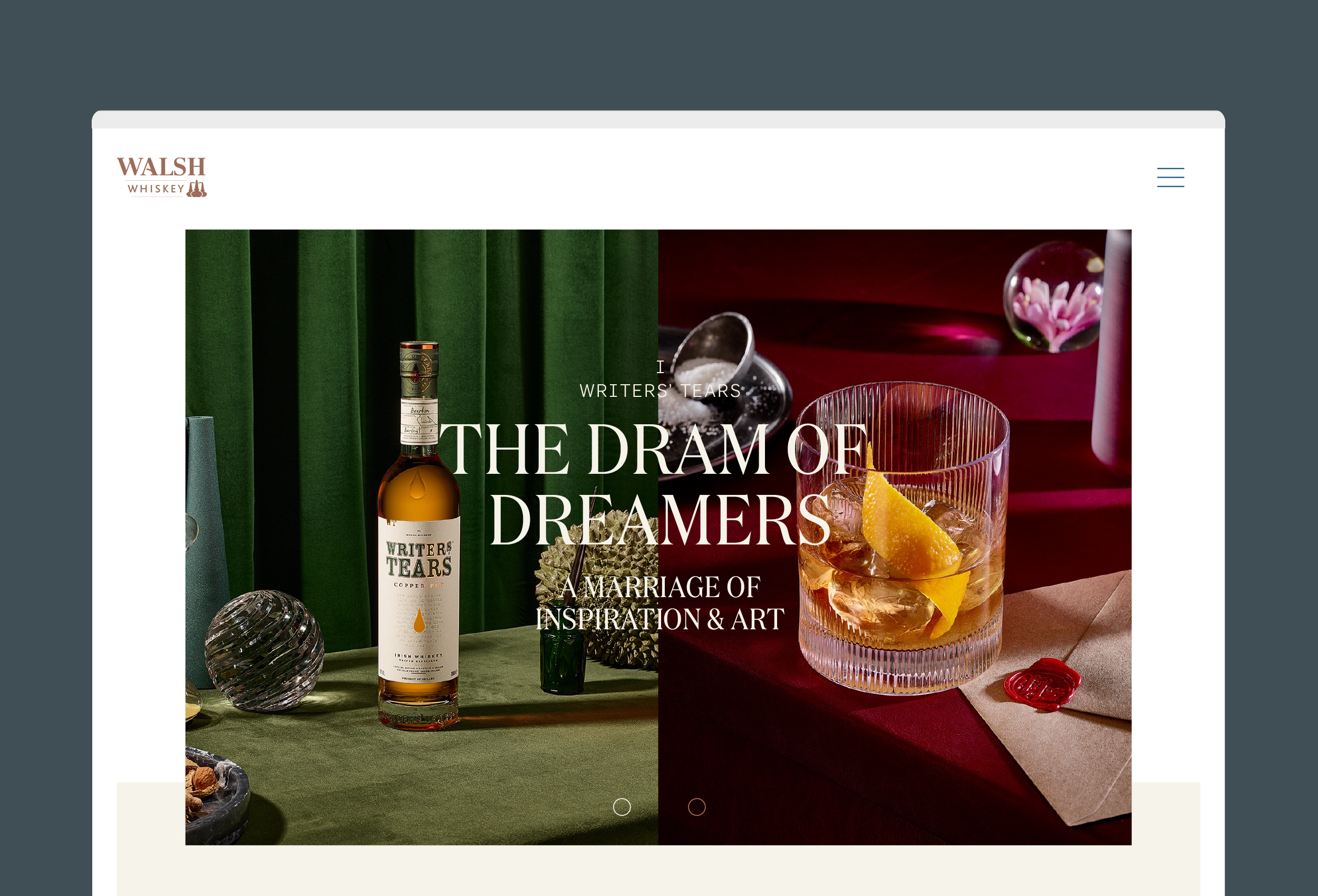
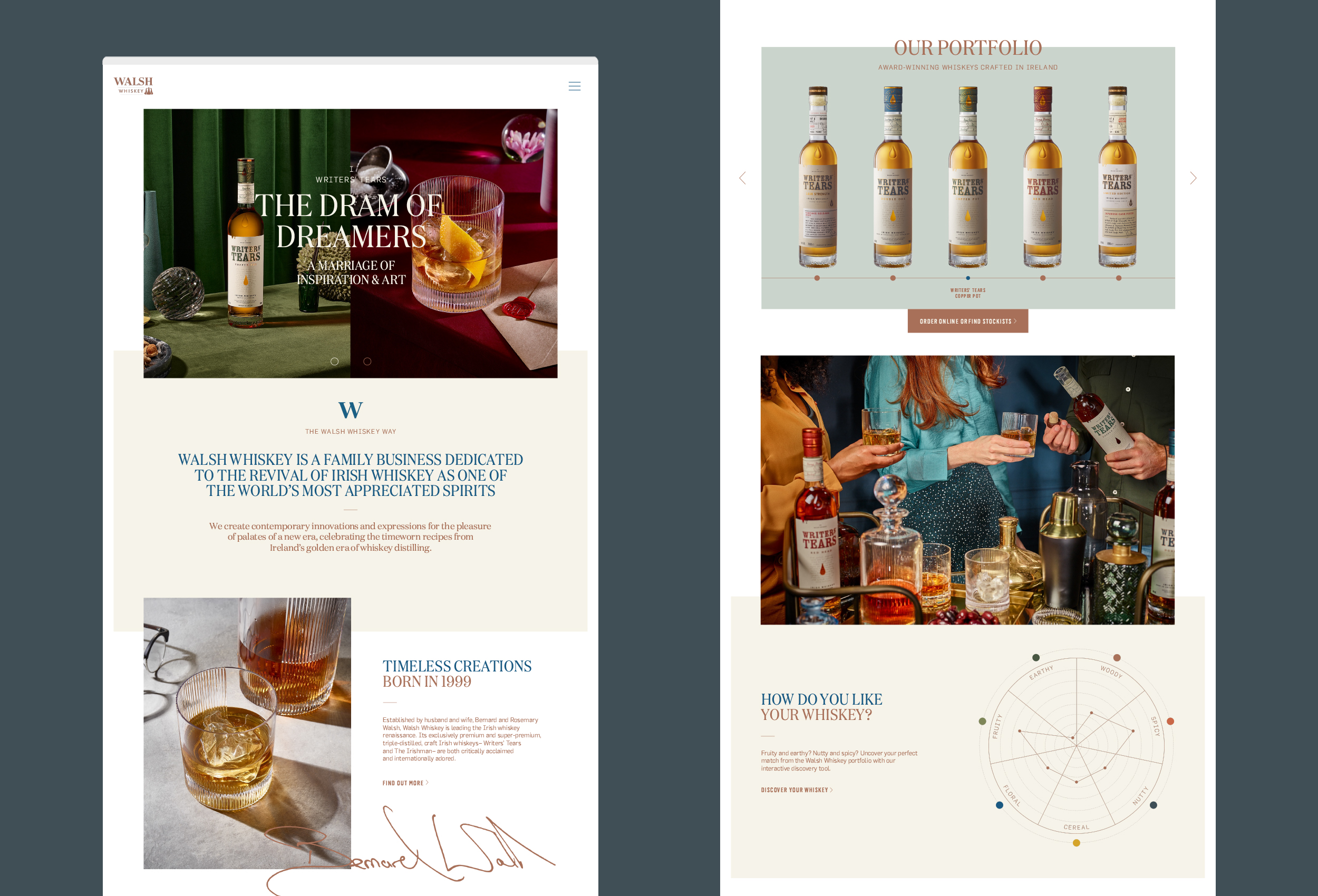
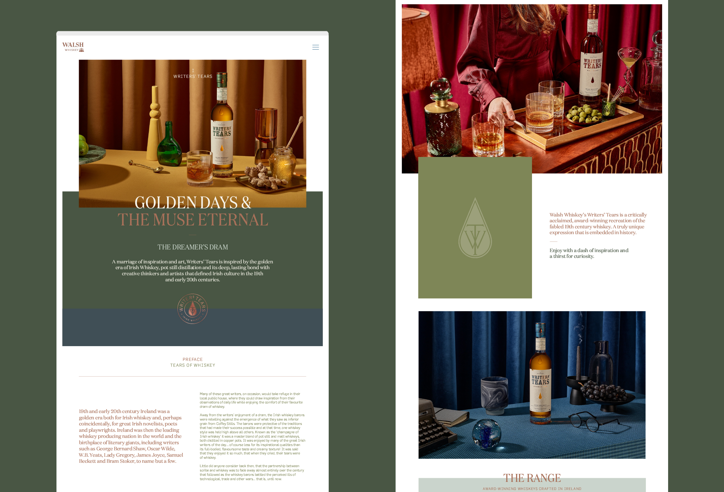
Walsh Whiskey approached us earlier this year to redesign their website which represents their two brands Writers’ Tears and The Irishman. Established by Bernard and Rosemary Walsh in 1999, Walsh Whiskey is a family business dedicated to playing a part in the revival of Irish whiskey as one of the world’s most appreciated spirits. Their products are inspired and shaped by Ireland’s golden era of whiskey, and the timeworn recipes from this period, transformed through innovation for a contemporary audience of whiskey enthusiasts.
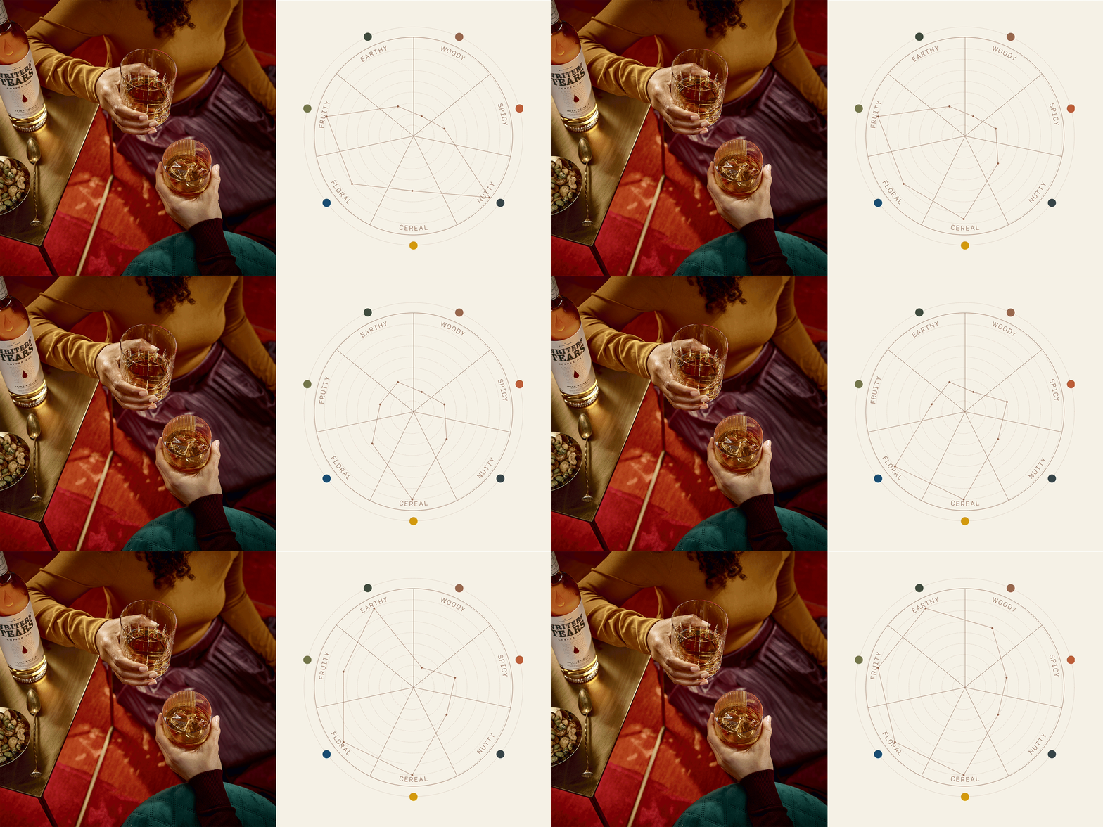
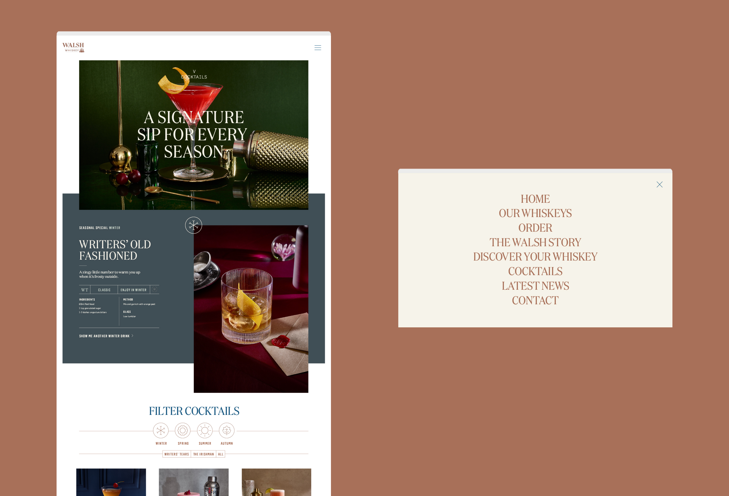
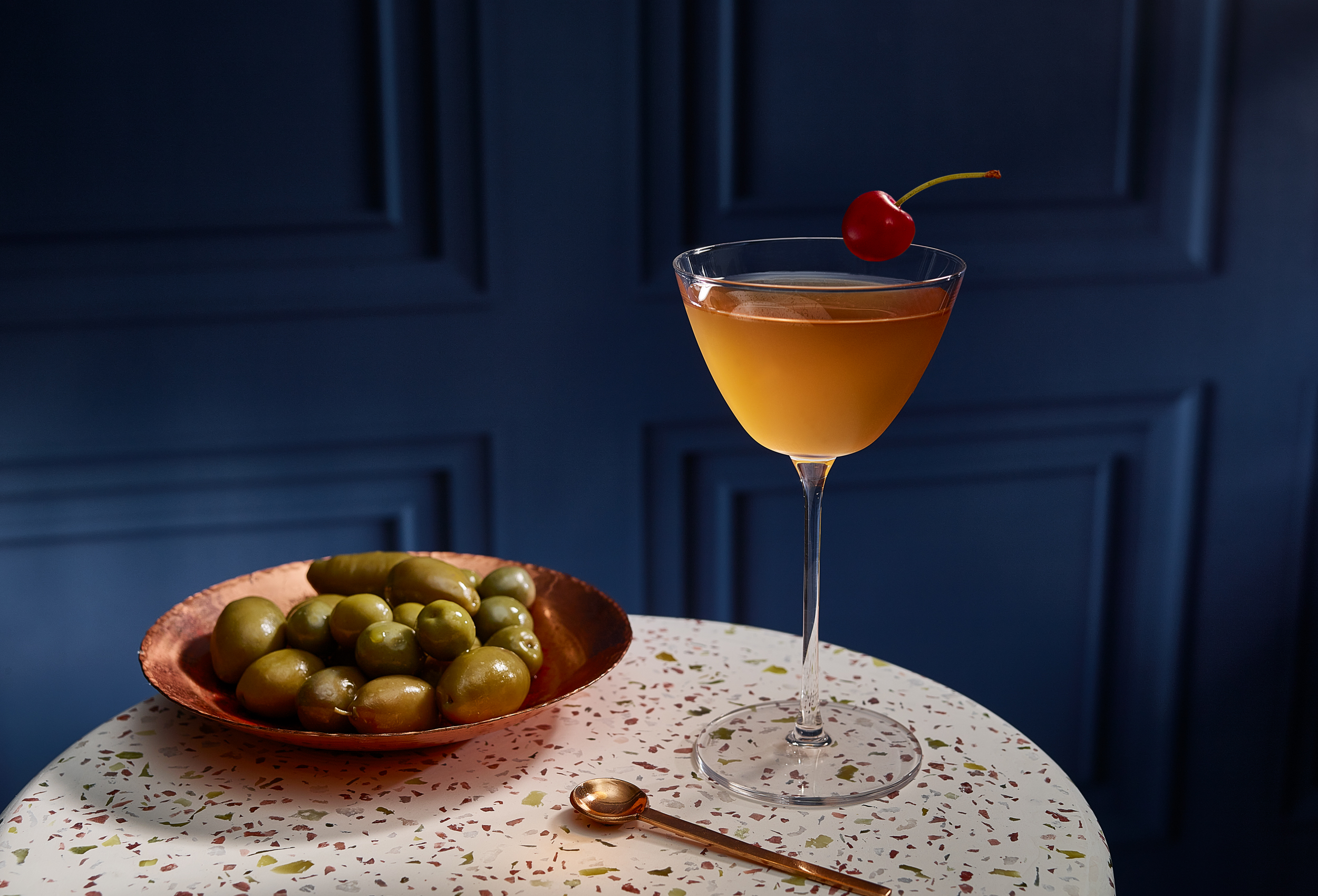
We developed the new website with the enthusiast in mind, creating a space online for the two brands to sing, with lots to discover and a high level of detail and personalisation for the user, with an interactive flavour profile tool at the centre of this. Creating an elegant but contemporary style sympathetic to the unique personalities of the two brands, we developed a system that could flex and grow as new products are launched within the ranges. Coinciding with the launch of a packaging refresh of Writers’ Tears, we engaged Trevor Hart and Eleanor Harpur to realise our photographic vision for the new brand as a work of high art, and a status symbol of eclectic tastes. The images spanned bottle and pack, cocktail, creative serve shots, and a suite of luxurious lifestyle vignettes, taking inspiration from the still lives of art history.
