TynanDillon (2012)
Designed by Ronan Dillon and Peter O' Gara at me&him&you
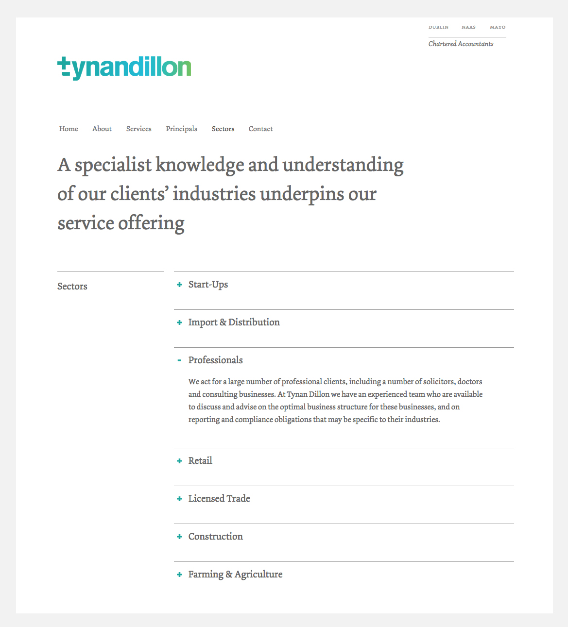
Website: tynandillon.ie
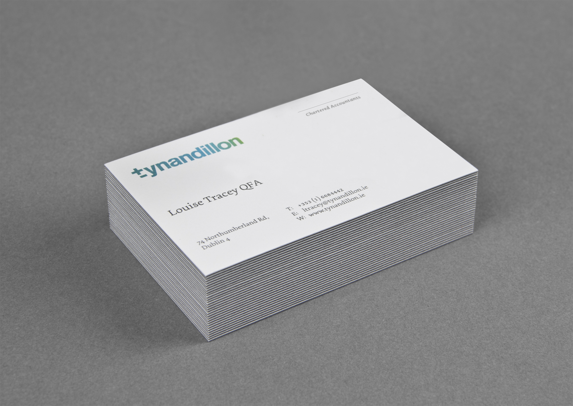
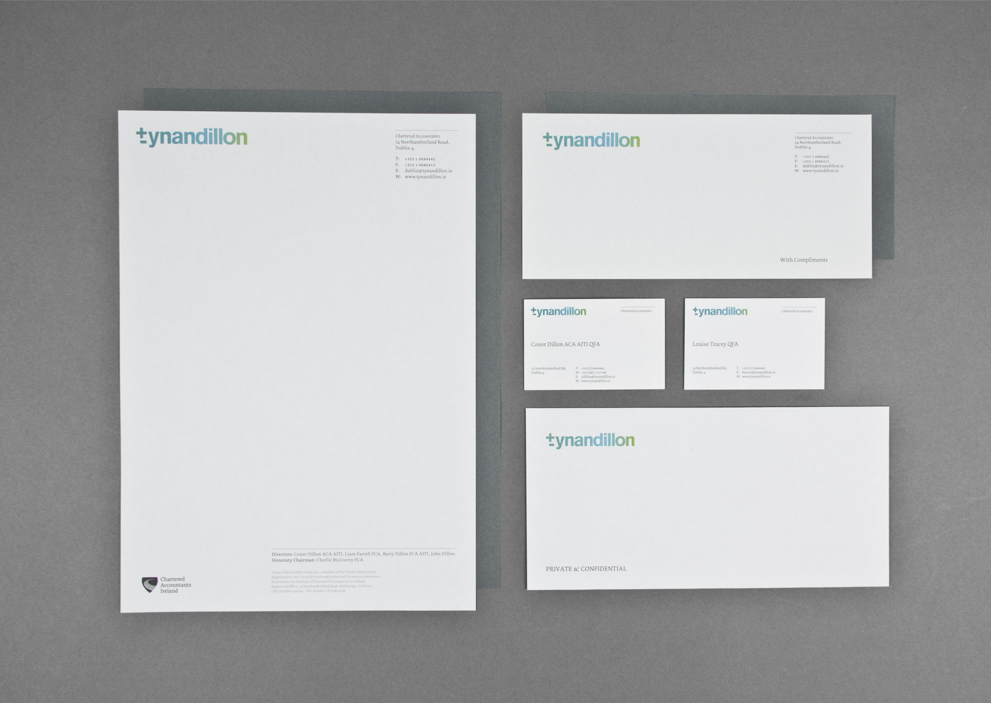
Re-branding exercise for TynanDillon Chartered Accountants. Derived from crossing the lowercase t to illustrate the companies attention to detail, the logotype shown, incorporates the traditional +/- signs that are symbolic of the book keeping system which has served the accounting profession so well for centuries.
The logotype is a strong, fresh and contemporary mark, symbolic of the forward thinking and progressive approach taken by this professional services group.


