Tóchar - Midlands Wetland Restoration
2024
Designed by Gillian Reidy at Penhouse
Design Team: Leonie Rafter
Design Team: LesleyAnne Furness
Design Team: Gemma Corcoran
Design Team: Ger Sloyan
Categories: Identity
Industry: Civic
Tóchar is a wetlands restoration project, co-funded by the Government of Ireland and the European Union through the EU Just Transition Fund Programme. The focus is on the restoration and rehabilitation of degraded peatlands and engaging with people who live and work near or on wetlands to help the area make the transition to climate neutrality and away from the extraction of peat – a fossil fuel.
Tóchar was chosen as the project name to represent the path along the Just Transition journey, and as a reminder that generations gone before us have used and experienced bogs and wetlands in a myriad of ways. A tóchar or togher is a path made from planks or stones, through the bog or wetland, hundreds of which have been found deep in the peat across the midlands. This term not only honours the historical routes carved by previous generations who traversed these wild landscapes, but also speaks to the journey ahead, as we work together with communities affected to restore and revitalize these vital ecosystems, while offering new opportunities too.
Decision making for the practice of restoration is part of a social transition, where restoration of landscape must go hand in hand with community restoration and relationships with nature. Our communications must share this message, and one of nature positivity to our audiences, while being cognisant and attuned to a range of attitudes prevailing in the region.
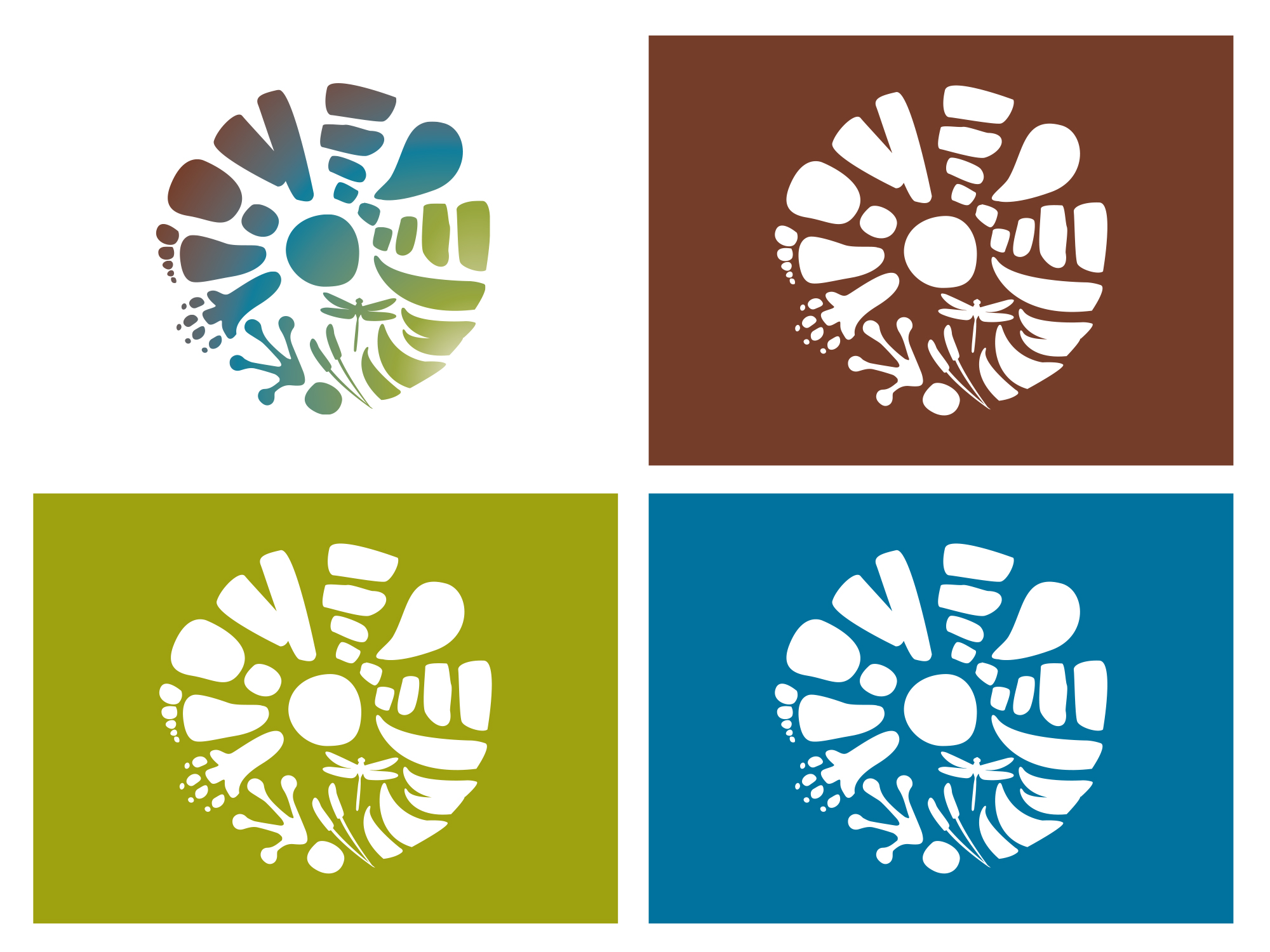
The aim of creating a brand identity for Tóchar was to visually represent the cultural, ecological and social aspects of our wetlands, and in particular to represent how people are coming together to build new relationships with them. Our logo connects all aspects in a circular motif, all in mutual support of each other. The logo represents the journey and transition that we are part of towards climate neutrality and nature positivity, identifying people and cultural heritage as an important anchor for place-based wetland restoration with multiple benefits.
At the heart of the project’s visual identity lies an icon that encapsulates the essence of Wetland Restoration. A circular design weaves together footprints, human and animal, alongside representations of wildlife, plant life, turf, and the winding path of a tócher, symbolizing the cyclical nature of life in Ireland’s wetlands. These elements come together to form a harmonious mark, depicting the ongoing, interconnected journey of the land, its wildlife, and its people.
The flowing gradient from earthy browns to tranquil blues and vibrant greens evokes the transformation of the bog, the movement of water, and the lush vegetation that will thrive once again.
The font choice enhances this balance, with an artistic script reflecting the gentle resilience of the bog, complemented by a more grounded tagline that anchors the message in purpose and resolve.
This combination captures the spirit of Tóchar—a project rooted in the past, yet looking boldly toward a more sustainable future for the people and lands of the region.