The New Republic
Designed by Jack Collins at Pentagram
Partner in Charge: Eddie Opara
Designer: Xinle Huang
Designer: Steven Merenda
Designer: Leo Field
Project Manager: Dana Reginiano
Illustrator: Daniel Stolle
Categories: Website / Print / Identity / Editorial
Industry: Cultural
Tags: Typography / Digital / Cover / Rebrand / Website / Print / Identity / Culture / Current affairs / Brand Identity / Magazine / Editorial / Publication / Politics
Website: newrepublic.com/
The New Republic is the premier US journal of liberal opinion, dedicated to addressing today’s most critical issues with commentary on politics, culture and the arts.
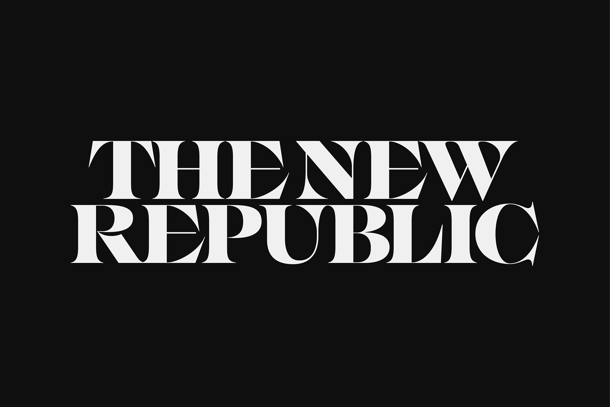
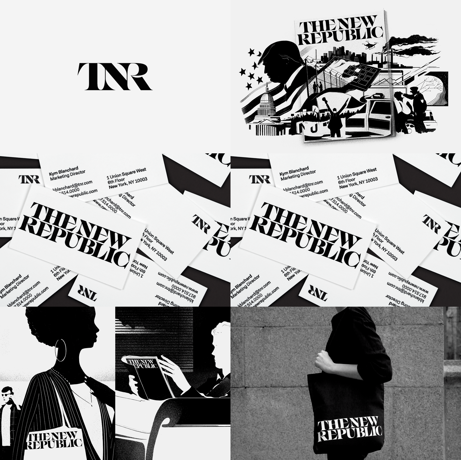
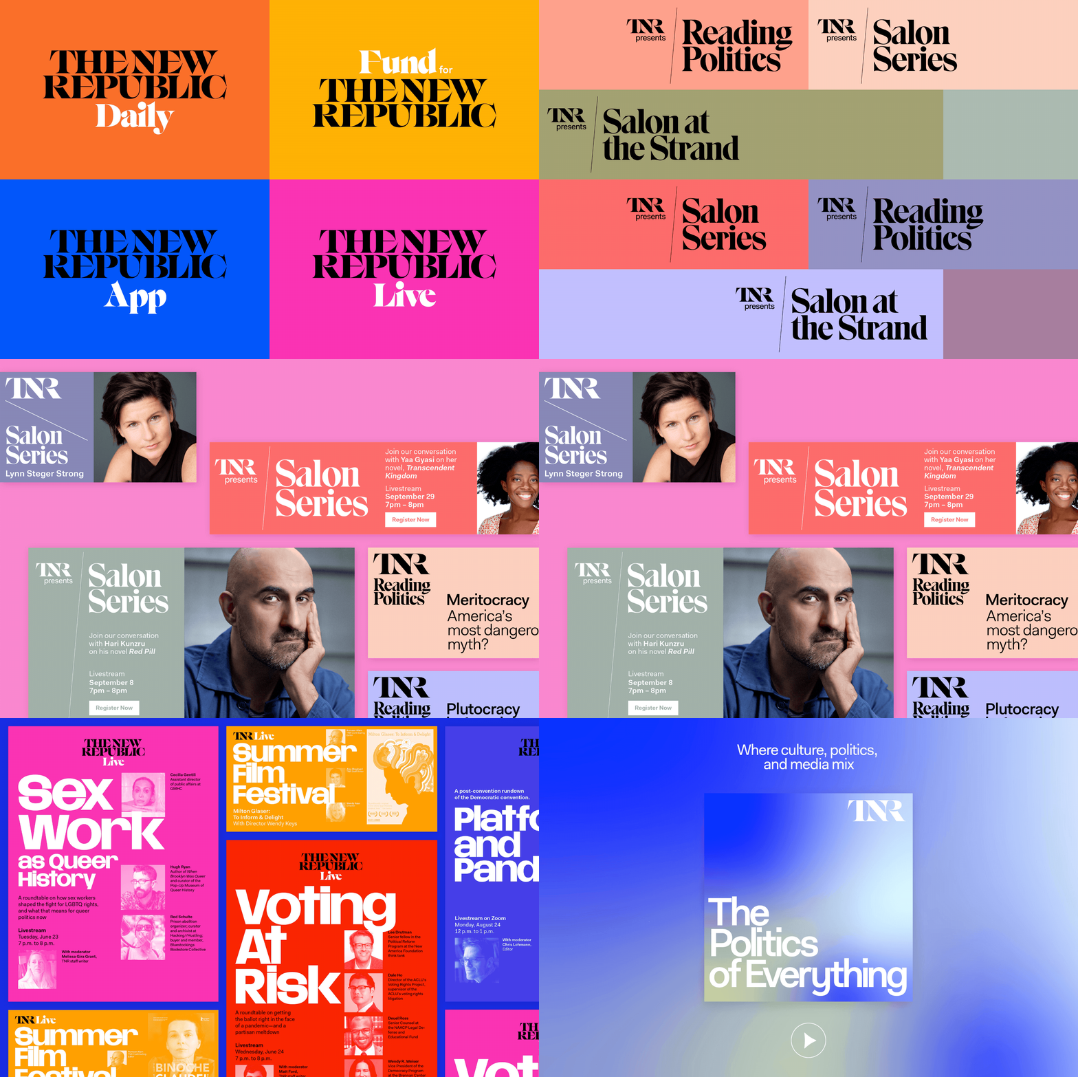
Founded in 1914 as an intellectual call to arms for reform, the magazine has evolved over the past century into a modern media organization with the mission to respond to the current political moment. The designers were tasked with creating a new brand identity framework for TNR that reinvigorates the magazine with a bold look that matches its forward-thinking content. The resulting redesign pays homage to the magazine's roots in the Progressive Era but adds a greater sense of the contemporary. TNR is incisive, progressive and authoritative, and the new identity restores these qualities to the visual brand. This process originated with the new wordmark and monogram designs which are set in an experimental font featuring sharp terminals, flared serifs and strong contrast – all typeset and crafted with custom connection points to create a uniform and striking lockup.
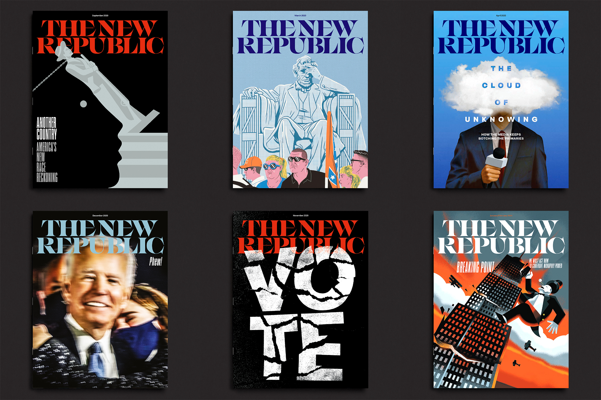
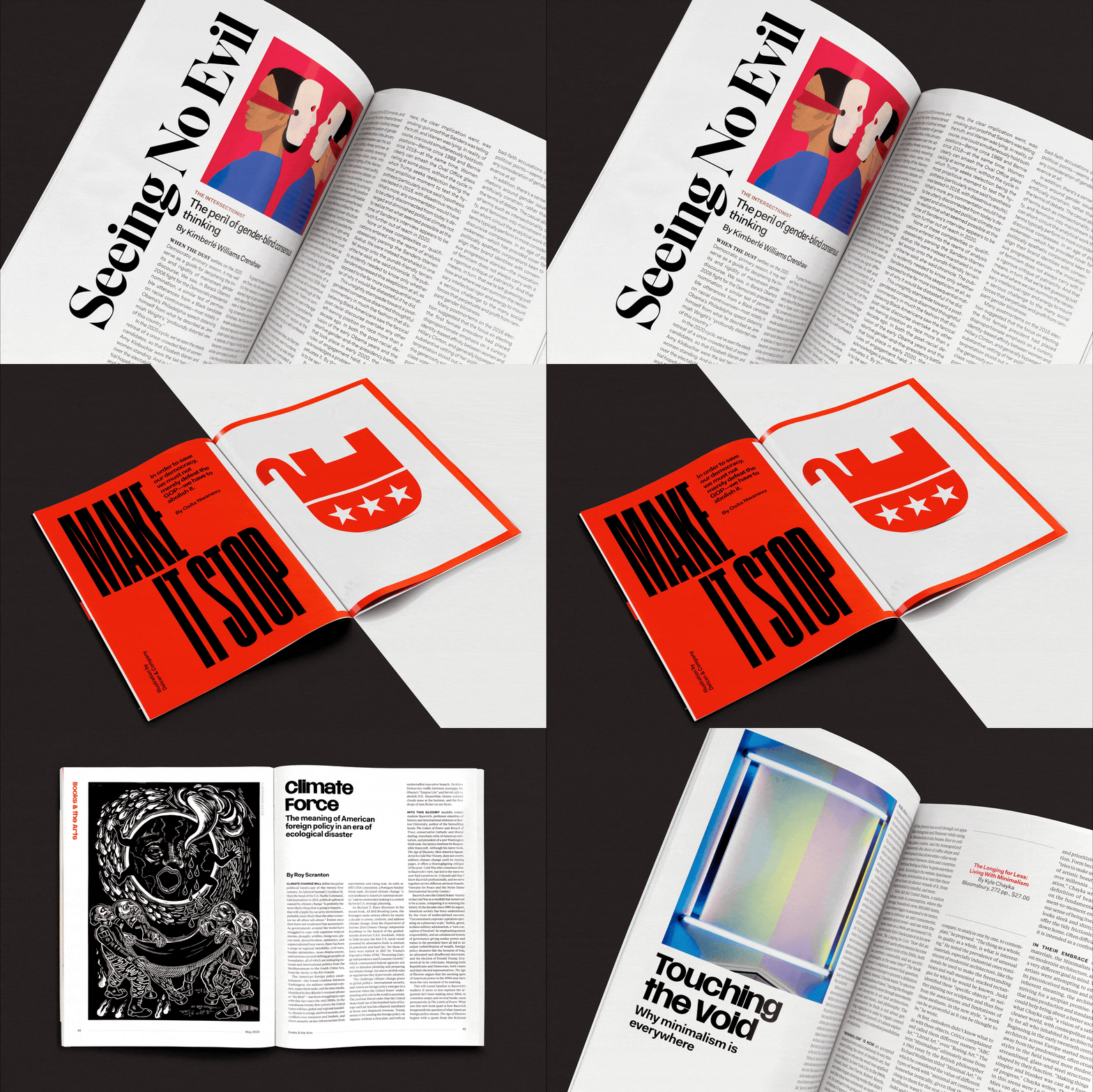
The project carries through a new editorial design for the print publication and digital design for the website. The magazine rework is lead by a powerful new masthead, matched by cover art direction that uses type and image for maximum graphic impact. The overall look of the magazine is more visual, with a redesigned 12-column grid that improves readability and offers greater flexibility to utilize illustration and photography. As part of the rework the designers specified a family of 10 contemporary display typefaces for use throughout the publication, chosen for the myriad of voices and viewpoints they can lend to individual stories, as well as the fresh typographic direction they give to the magazine.
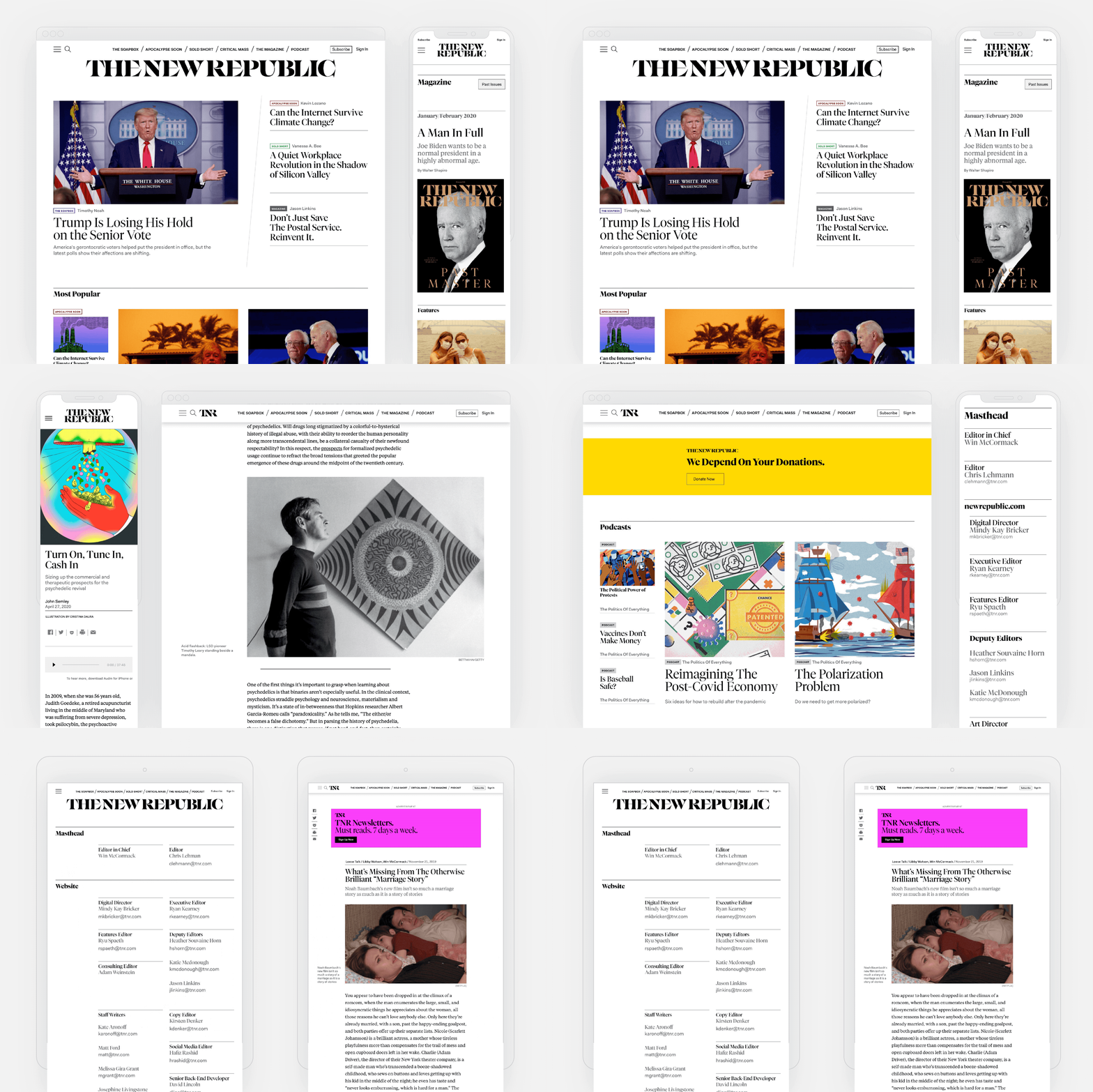
The relaunch of the TNR website followed the rollout of the magazine’s redesign, translating the look and feel of the print edition online while also establishing the site as a dynamic platform in its own right. As with the print magazine, the goal was to make the site feel distinctive in its category and signal that TNR has a different point of view. It wanted to compete with other publications that have a robust online presence, such as The Atlantic and New York Magazine’s Intelligencer, with an increased publishing schedule that brings readers back daily for new content. The site design reflects this with dynamic modular layouts that prioritize imagery and bold typography.
