The Book Centre — Rebrand
2024
Designed by John Gavin, Eddie Rochford Whelan and Julia Smolnicka at TrueOutput:
Industry: Commercial
Tags: Illustration / Retail / Stationery
A family business for over 50 years, their three book stores have been a cornerstone of their communities—a welcoming space where customers linger, discover, and connect. They came to us to discuss their brand identity. Rather than reinventing, our strategy was to distil and elevate what already made them special. The project was about honouring this legacy while ensuring they continue to thrive in an ever-changing retail landscape.
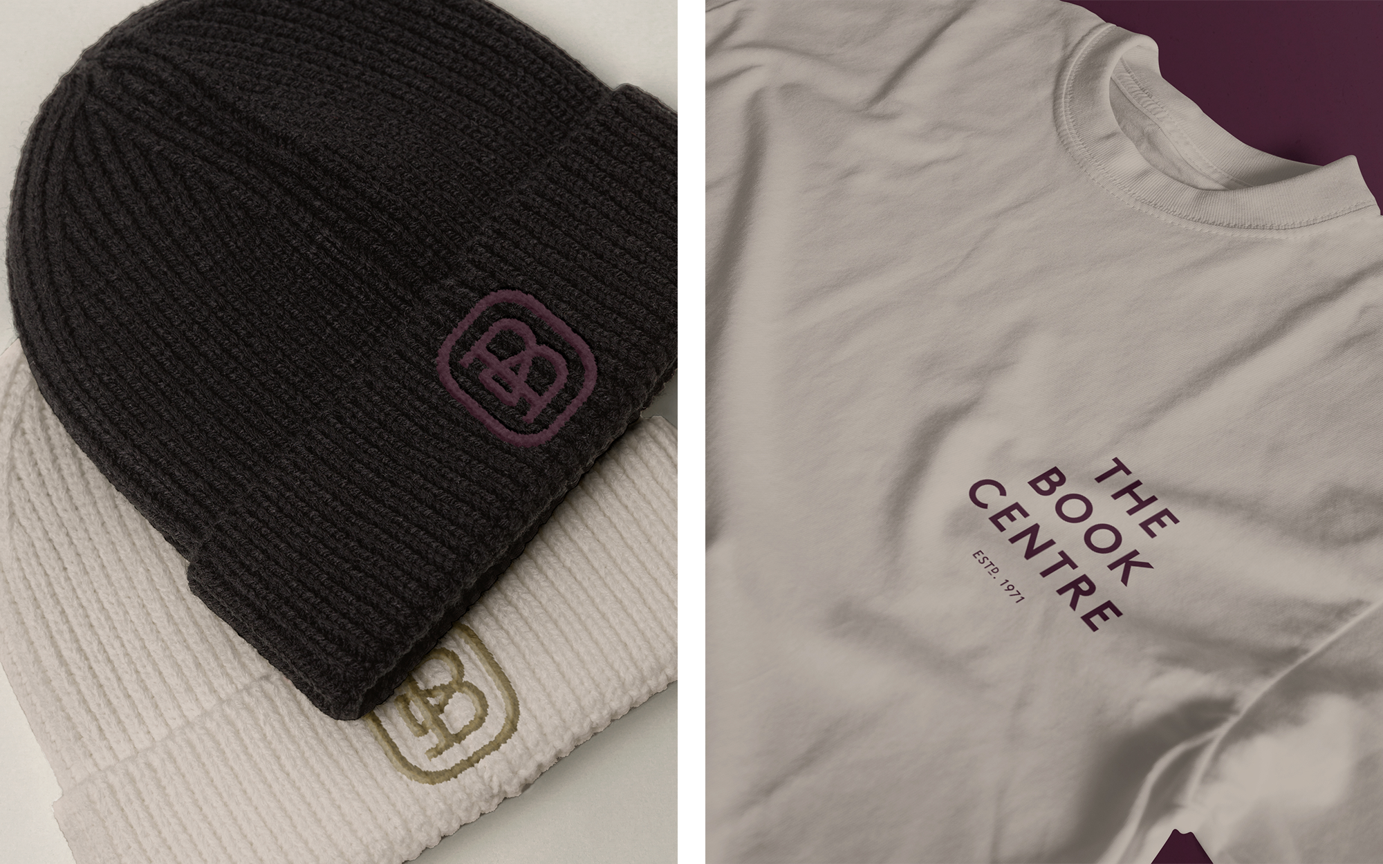
We introduced a new monogram, inspired by classic book publishing symbols, combining the letters (T)he (B)ook (C)entre into a singular ‘B’. The heritage wine colour was retained but deepened for a richer, more distinguished tone. A new logotype, along with an expanded colour palette, gave the identity more flexibility to appeal to a broader audience. The stacked pages of a book motif on the kraft paper carrier bags and the playful punctuation motif added more texture and detail across applications.
The new identity has been rolled out across all aspects of the stores, from signage and staff apparel to printed materials. Throughout the process, we focused on creating efficiencies and incorporating sustainable solutions wherever possible, ensuring The Book Centre’s brand is as enduring as the stories it celebrates.