Sula – breathable cannabis
Designed by Ken Deegan and Jack Collins at Pentagram
Partner In Charge: Eddie Opara
Designer: Paul Yoon
Project Manager: Dana Reginiano
Brand Strategist: Saundra Marcel
Illustration: Manshen Lo
Photography: Claudia Mandlik
Categories: Identity / Packaging
Industry: Commercial
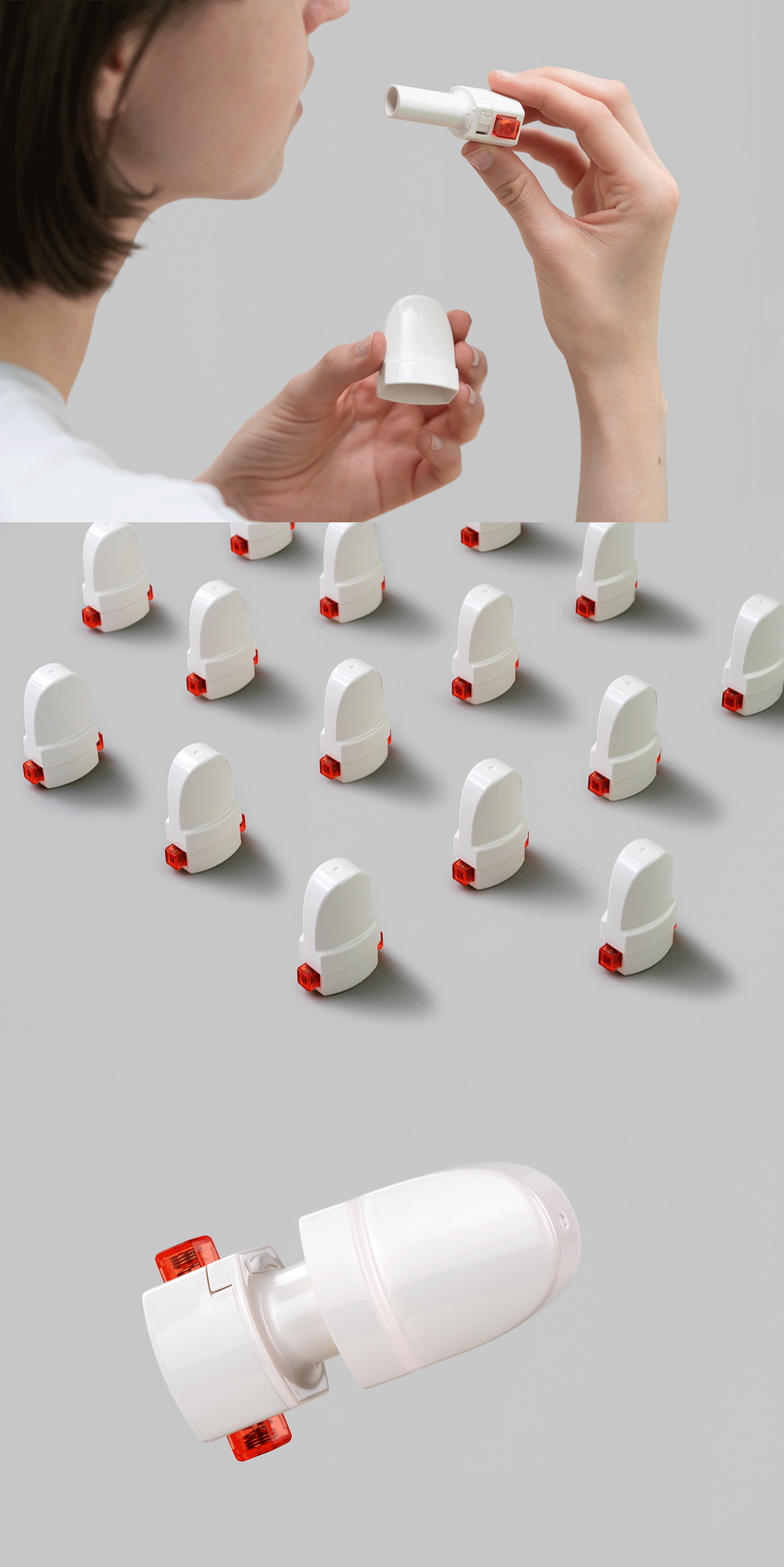
Sula is a radically new form of breathable cannabis that offers a better and safer way to experience cannabis. Developed by Dispersa Labs, Sula delivers a precise dosage with each breath, dispensed from a capsule-based device that is smoke-free, fast-acting, discreet and comfortable to use.
The brand identity framework for Sula was developed systematically, encompassing everything from naming, brand positioning and messaging to packaging design, brand collateral, digital design and art direction of product photography and illustration.
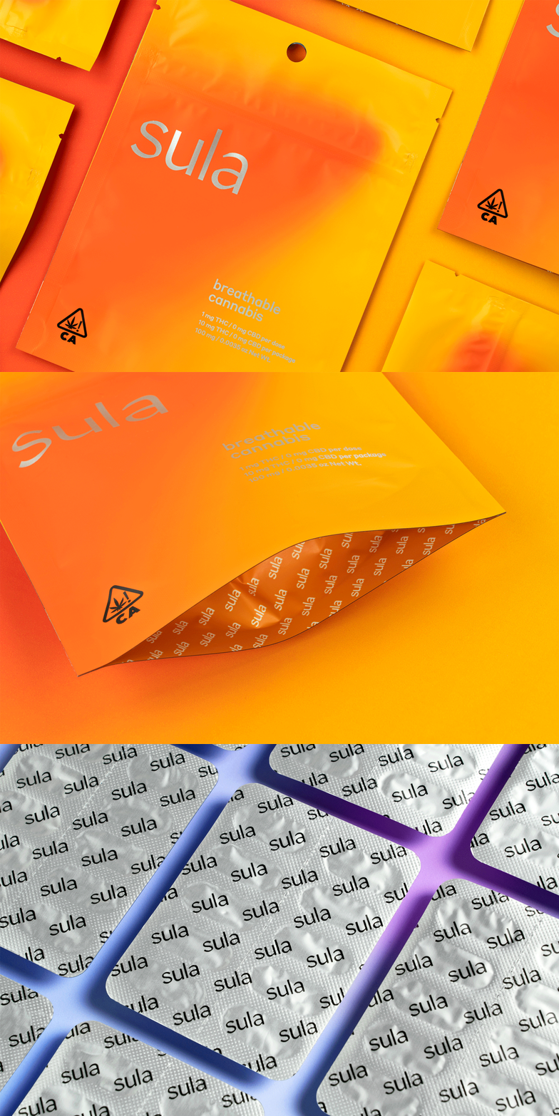
The Sula mark is drawn in Robinson, a contemporary calligraphic-inspired sans serif. The primary brand typeface is Styrene B. Both were selected for their considered and crafted nature, their subtle quirks and specific character reflecting the precise and approachable (if unusual) experience Sula represents.
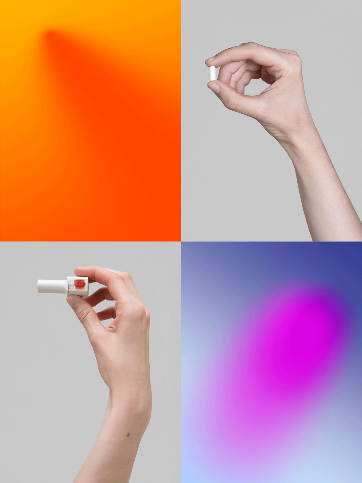
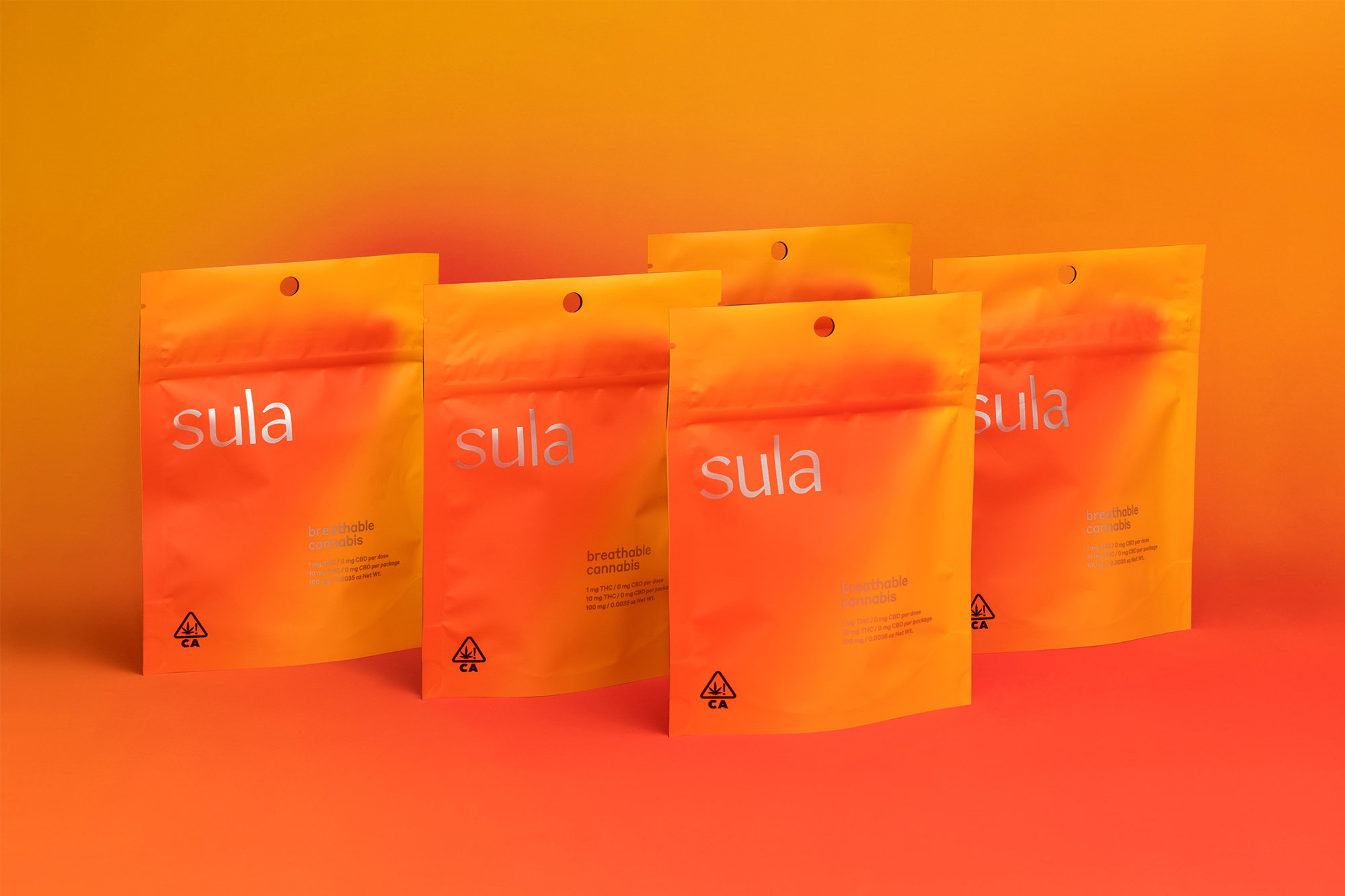
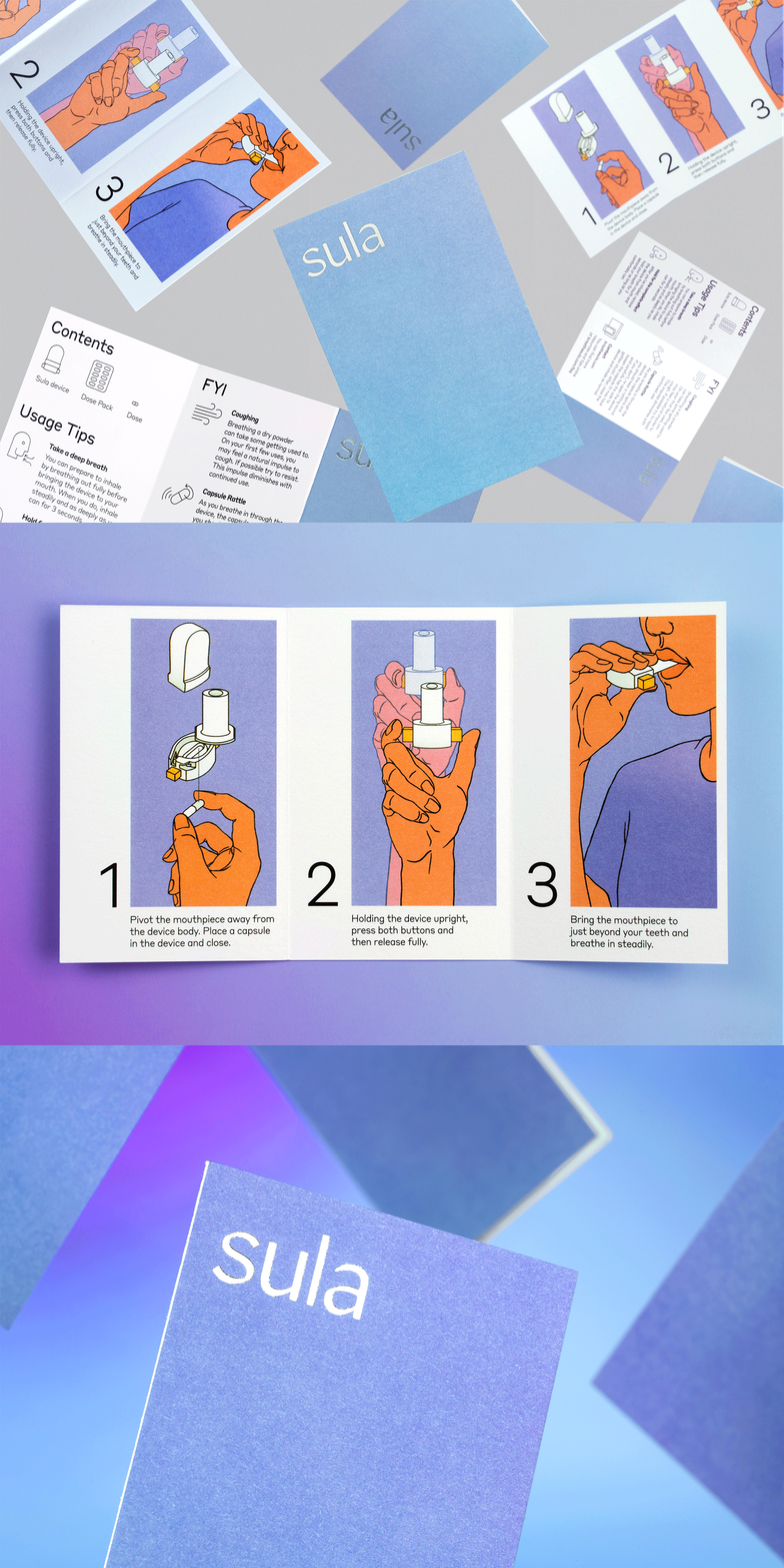
Sula comes packaged in a child-proof pouch that includes the inhalation device, a packet of 10 doses and an illustrated instructional guide. The radiant color palette, inspired by the “aura” seen while using cannabis, features blends of warm orange and yellow, or cool blues and purples and features prominently across brand applications. The guide plays off the simplicity of a how-to manual, with a custom iconset and illustrations by artist Manshen Lo.

