Stemple Exchange
2012
Designed by Anne Moloney, Thawana Broska, Gary Kealy and Luke Dolan at Cream
Managing Director: Cian Pas
Creative Director : Eoin Tierney
Categories: Identity
Industry: Commercial
Website: stempleexchange.com/
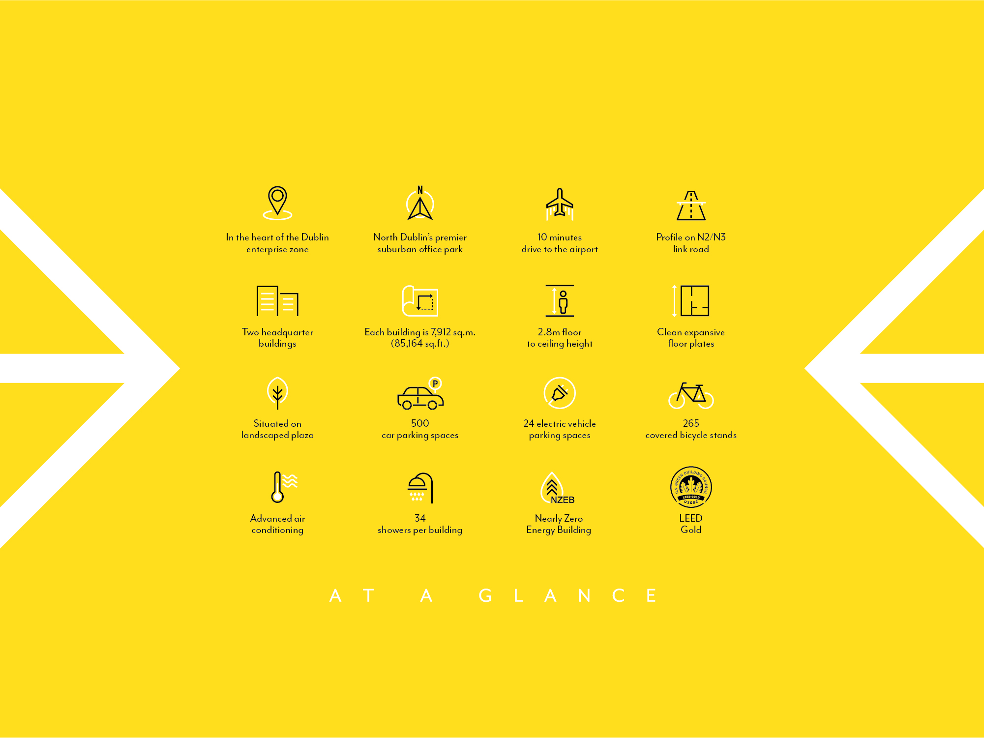
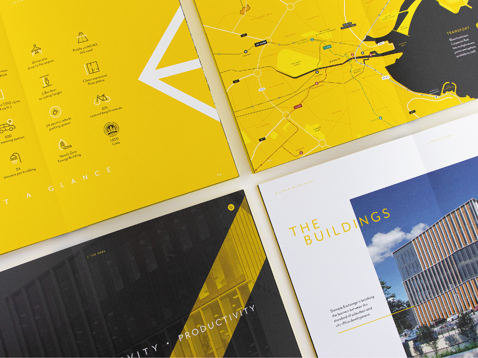
Blanchardstown Corporate Park is a 100 acre campus in the heart of the Dublin Enterprise Zone. Stemple Exchange forms the focal point of the next phase of development at the park, with two headquarter buildings extending to 85,000 sq. ft. and a specification comparable to anything the City Centre has to offer.
After creating the branding for Blanchardstown Corporate Park last year, we were excited to develop a new identity for Stemple Exchange. The logo is influenced by the scheme's core values of innovation, creativity and collaboration. Two arrows come together to create an “X”, representing these values and the central plaza where the two buildings meet. The typography and bright colour palette is inspired by the stand-out quality of Stemple Exchange’s cutting-edge architecture and its position as a future-facing hub of commercial activity.
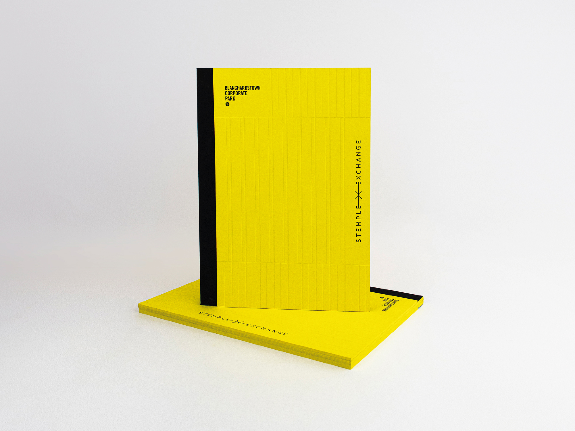
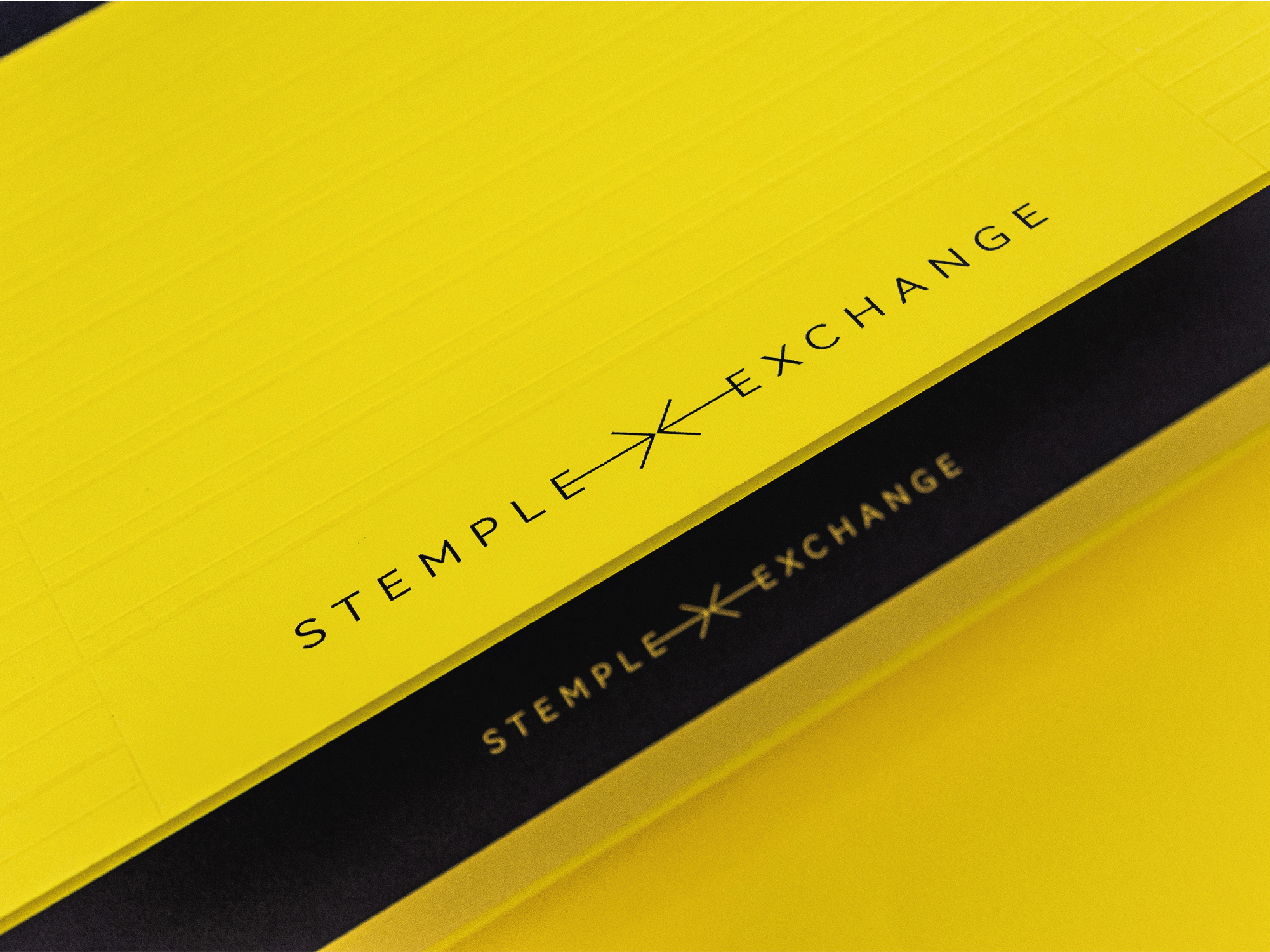
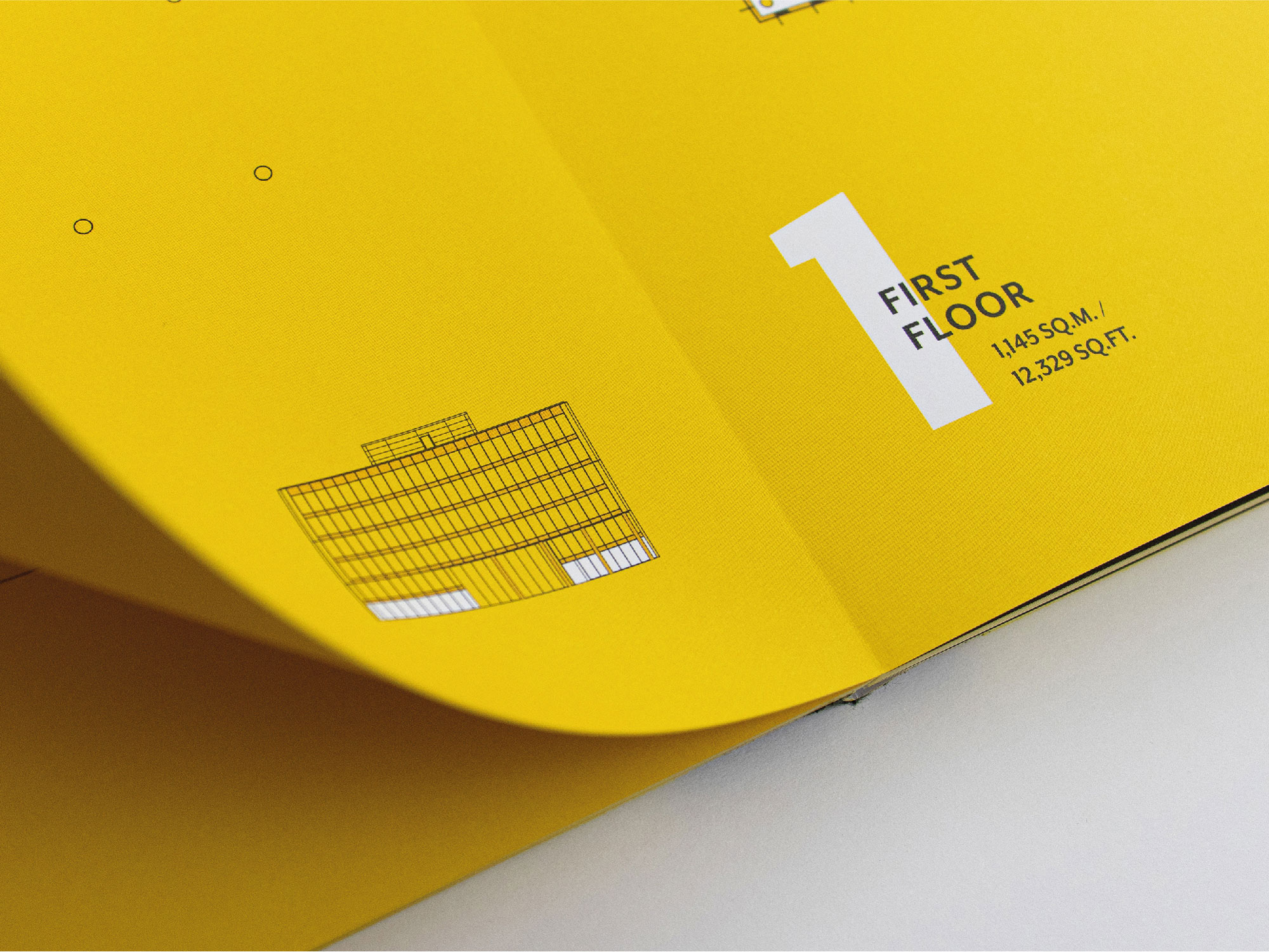
The brochure’s print finish was designed to mirror the impact of the buildings themselves. The cover features a blind deboss impression of the unique facade and black foiled text, brought together with lay flat binding, a linen spine and yellow Koloredge pages.
The website introduces interactive aspects for maps and floor plans and adapts the brochure layouts for varying device sizes.
