St. Kilian's Rebrand
2011
Designed by Paula McEntee and David Stanley at Red Dog
Industry: Commercial
St. Kilian’s, a German/Irish school with a strong European focus, is unique in the Irish educational landscape. Named after Killian, an Irish saint who was known for his love of study and who travelled to Würzburg, Germany as a missionary, St. Kilian’s is co-educational, inter-denominational and spans the full educational cycle from Kindergarten to Leaving Certificate. The school offers a diverse, inclusive yet challenging environment, enriched with a strong sense of Irish, German and European culture. It fosters independence of thought, a love of learning, personal responsibility, confidence and integrity, while educating students to be confident, independent and competent citizens in Europe. St. Kilian’s logo and brand identity had become outdated and we were chosen to develop a new brand identity to reflect this contemporary school and its ethos.
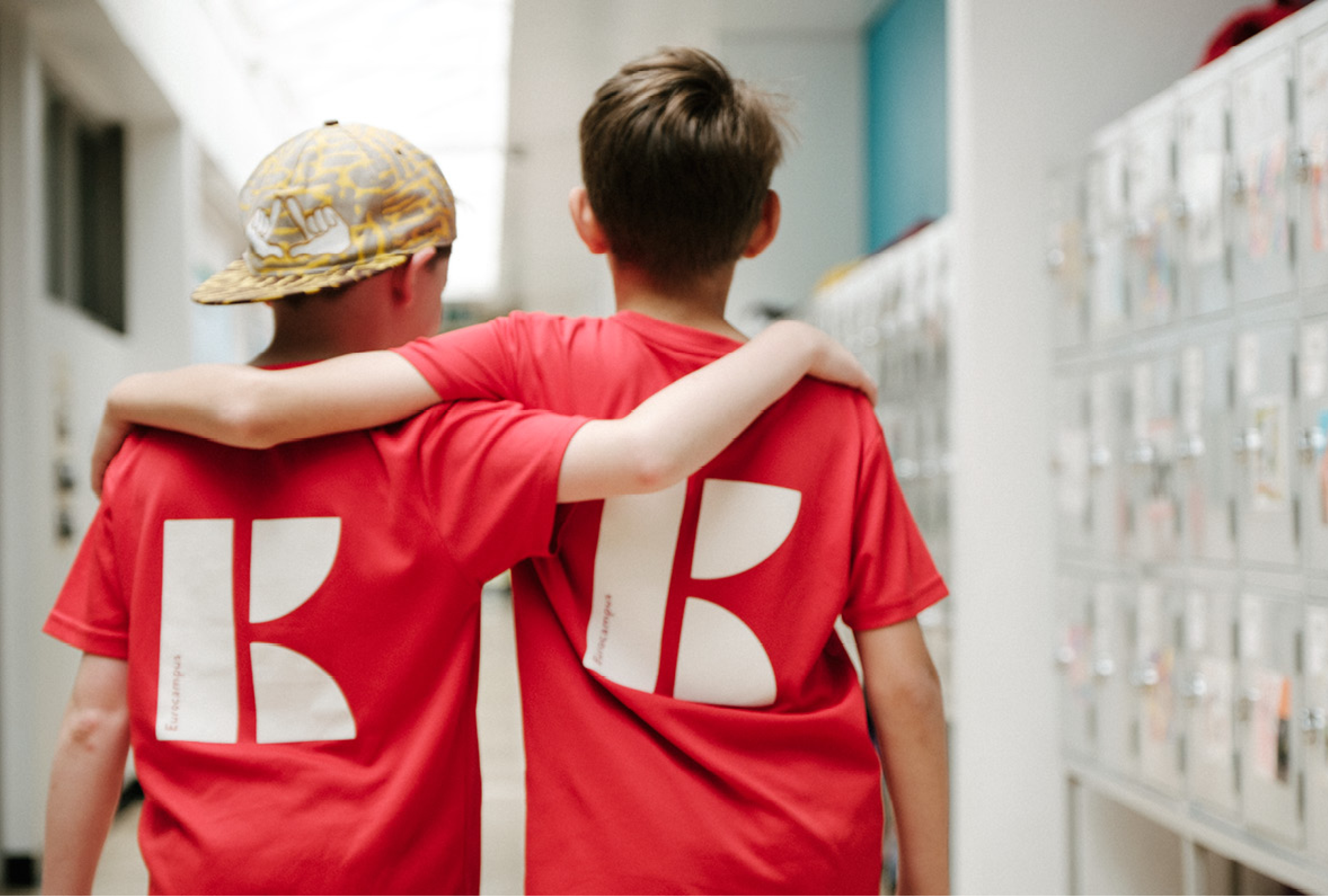
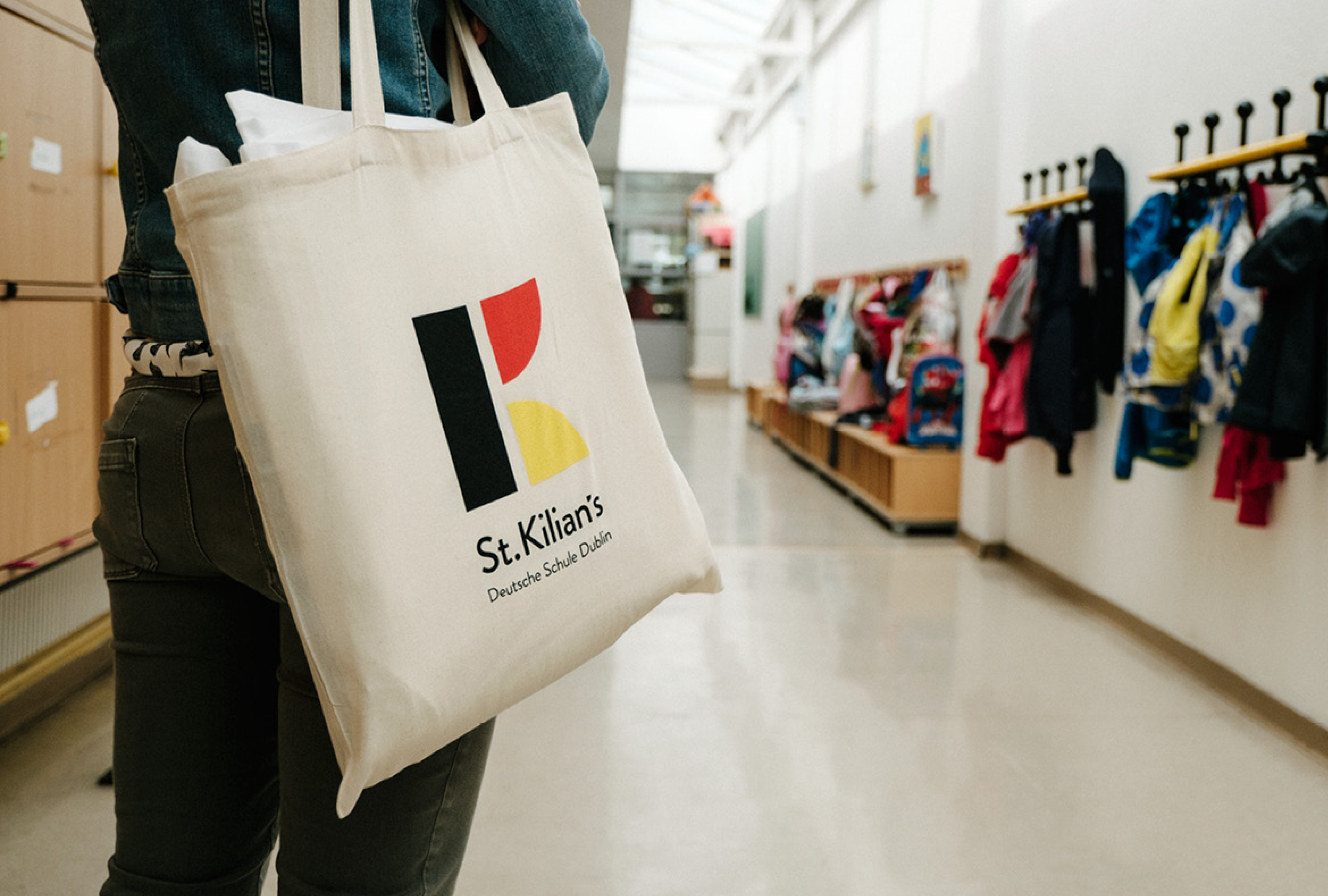
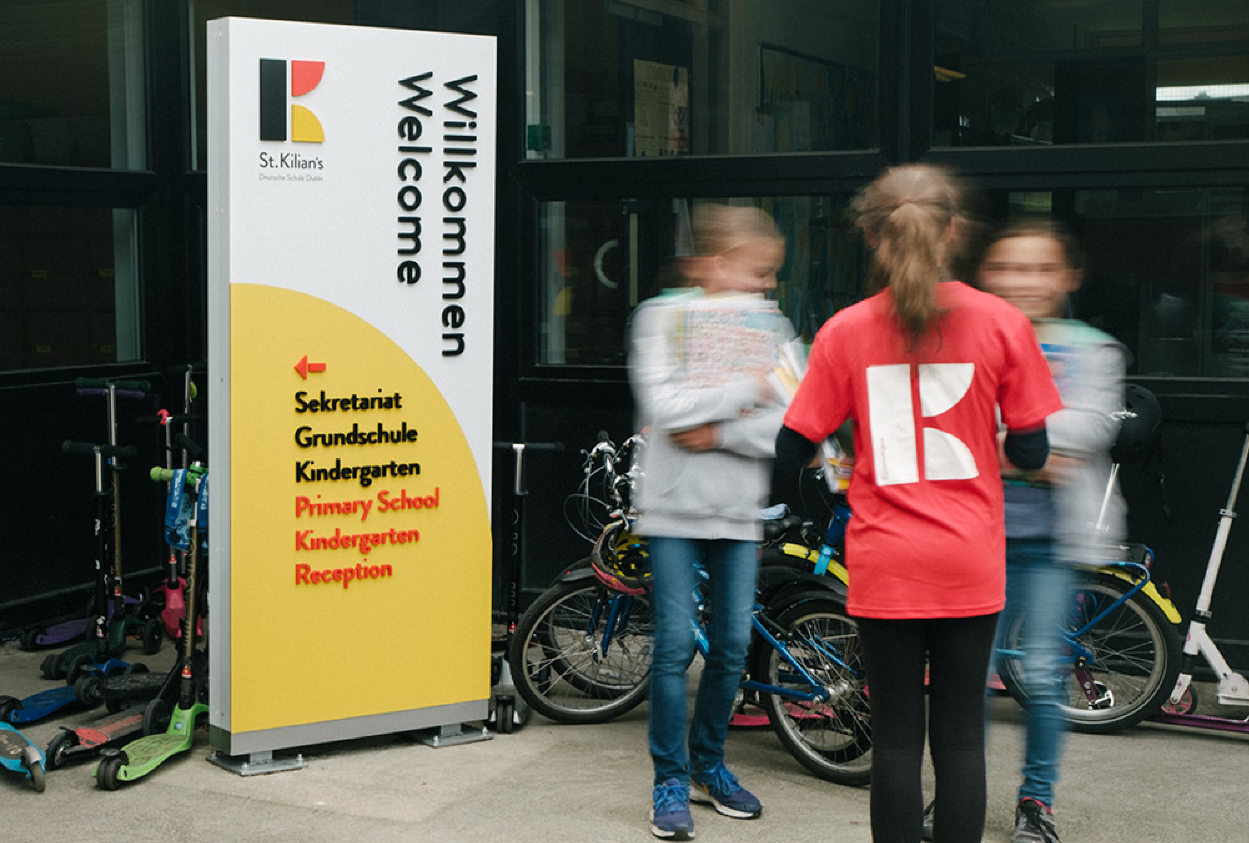
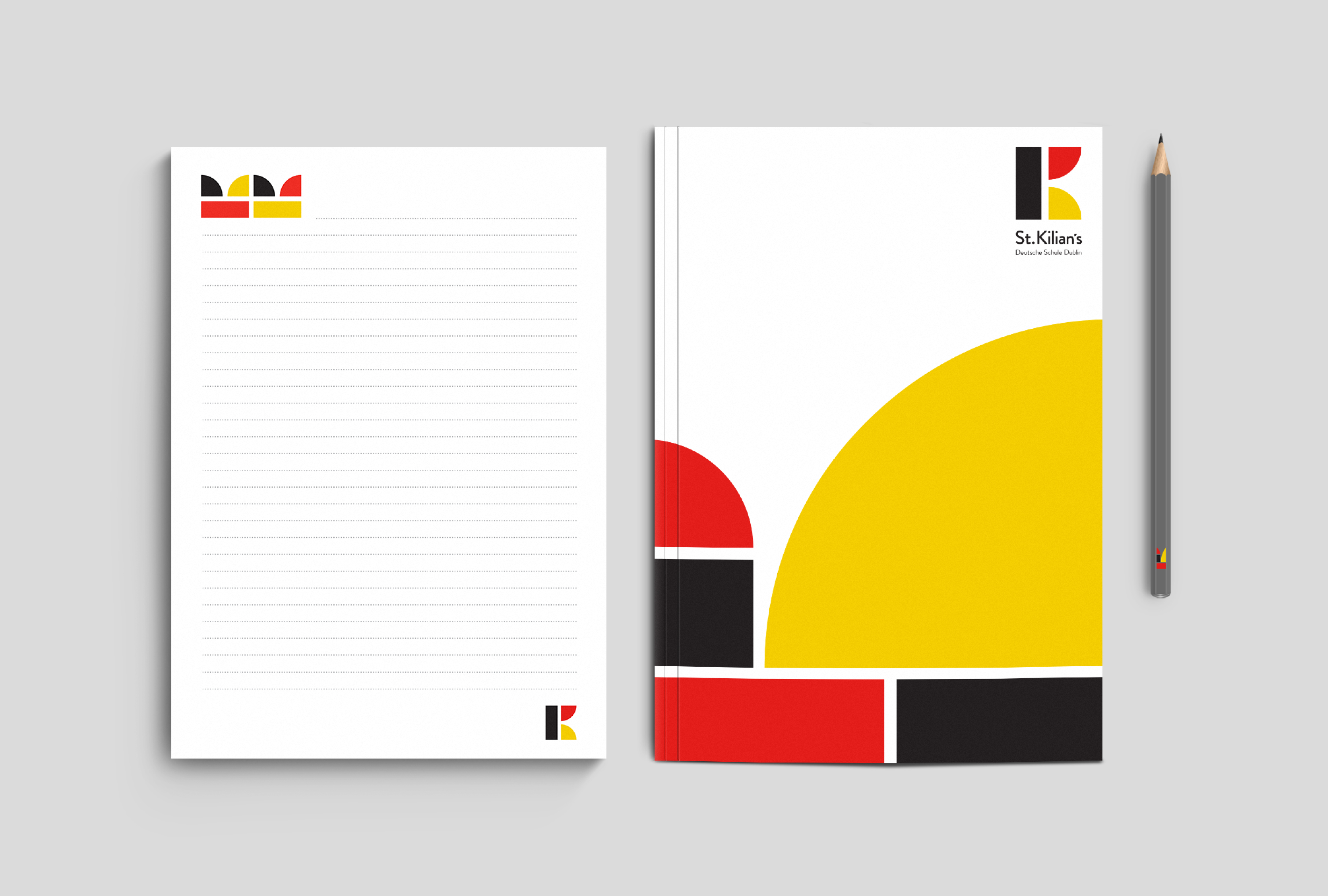
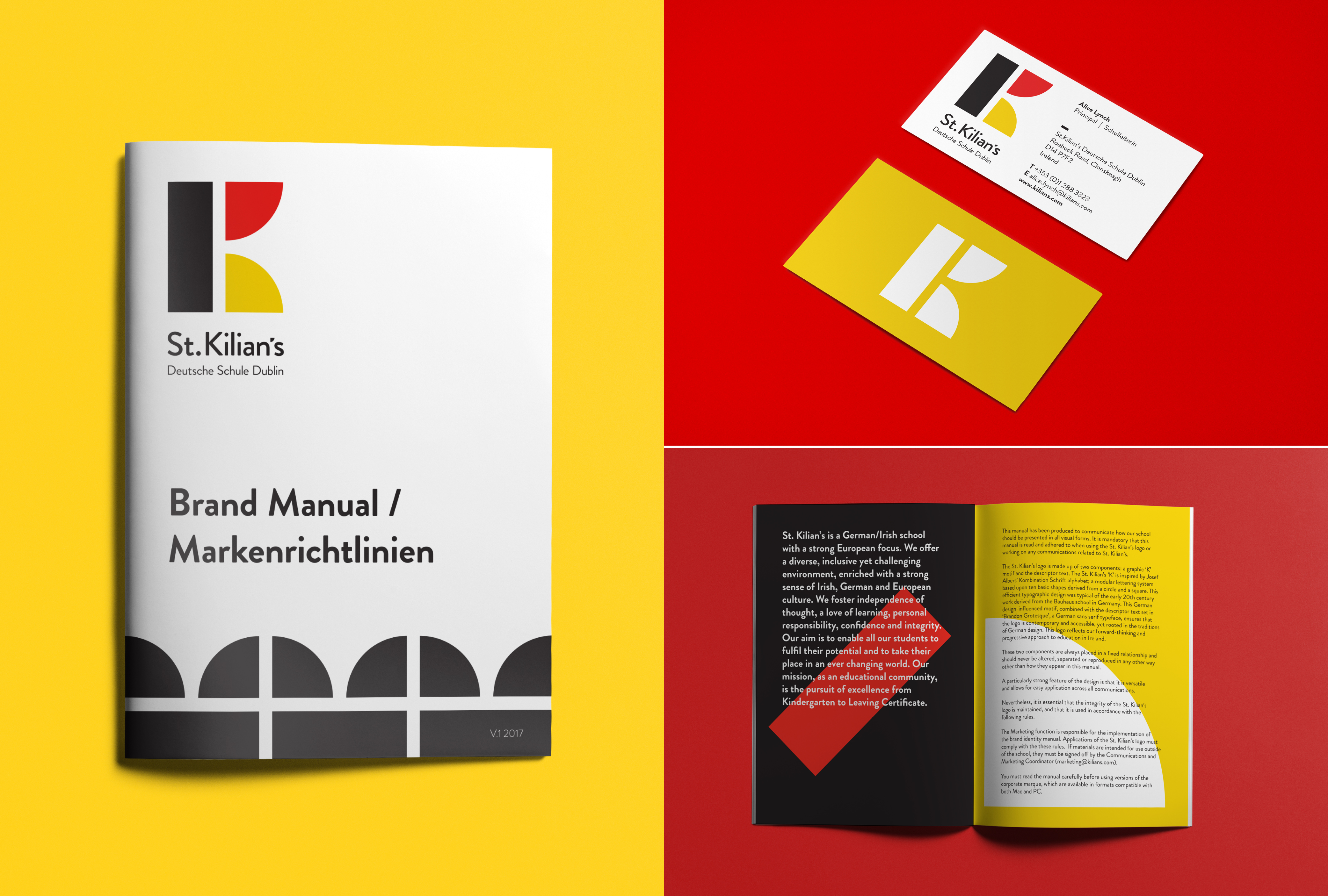
St. Kilian’s new logo is made up of two components: a graphic ‘K’ motif and the descriptor text. The ‘K’ motif is inspired by Josef Albers’ Kombination Schrift alphabet – a modular lettering system based upon ten basic shapes derived from a circle and a square. This German design-influenced motif, combined with the descriptor text, set in Brandon Grotesque, a German sans-serif typeface, ensures that the logo is contemporary, yet rooted in the traditions of German design. The ‘K’s three core elements may be reconfigured, creating dynamic compositions as part of the graphic language in St. Kilian’s communications, including stationery, wayfinding signage and uniforms. The identity has already been embraced and integrated into school life by staff and students alike, with students proudly wearing their branded clothing. Elsewhere, a recent art project gave kindergarten students the opportunity to express themselves creatively using the logo’s three shapes – an indication of the identity’s engaging nature and accessibility.
