Springtide Brand Identity
2023
Designed by David Torpey and James Tuomey at Image Now
Project Manager: Sinéad Watters
Categories: Website / Identity
Industry: Corporate
We had a multifaceted role in branding Springtide; a new project services company operating in the Renewable Energy, Electric Vehicle and Semiconductor sectors. After an initial period of competitor and sector research, the project kicked off in earnest with a strategic workshop with the core team to define their purpose, mission, vision and values. We emerged from this session with a clear personality in mind – a challenger brand determined to deliver agile and bespoke project management solutions to clients in a sector that was dominated by large, immobile competitors. A leadership group with a desire to build a diverse, vested team in a culture of collaboration.
We developed the name ‘Springtide’ to reflect the ambition and positivity of the company. A metaphor for renewal, growth and rejuvenation, a spring tide occurs during new and full moon phases. Gravitational forces of the sun and moon align to create the most significant tidal range where ecosystems flourish, bringing an abundance of new resources, sustainable energy and positive momentum.
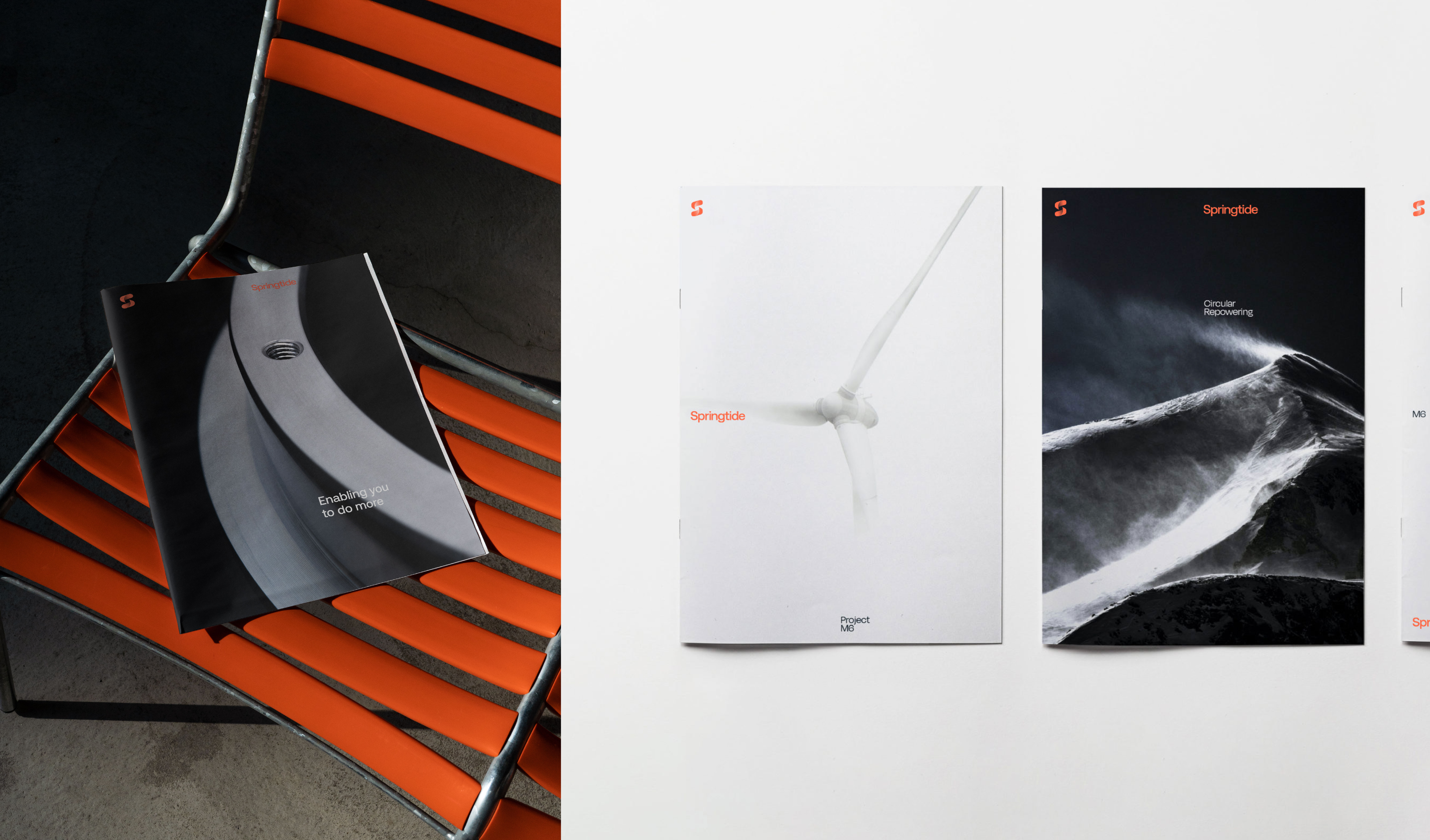
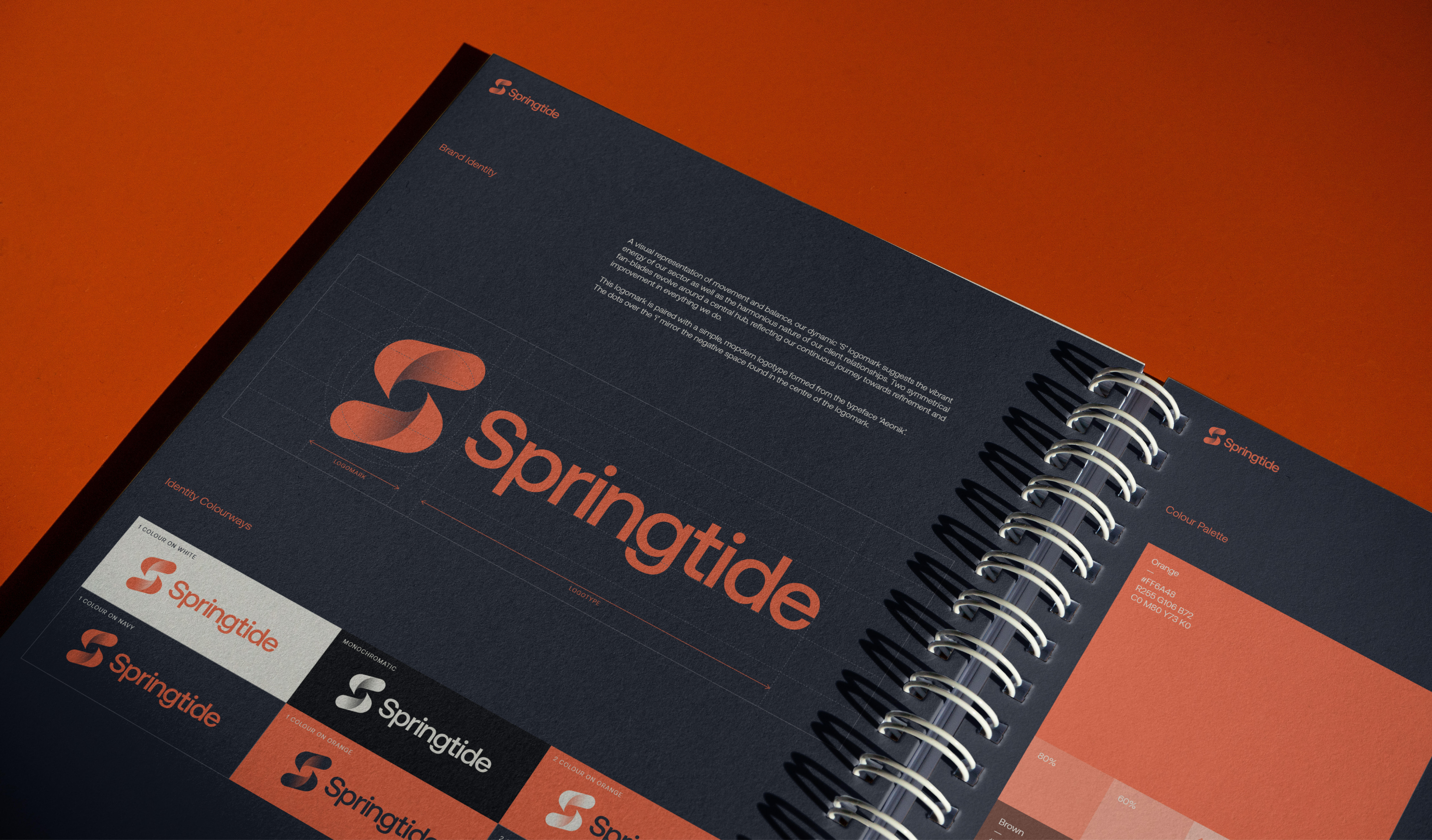
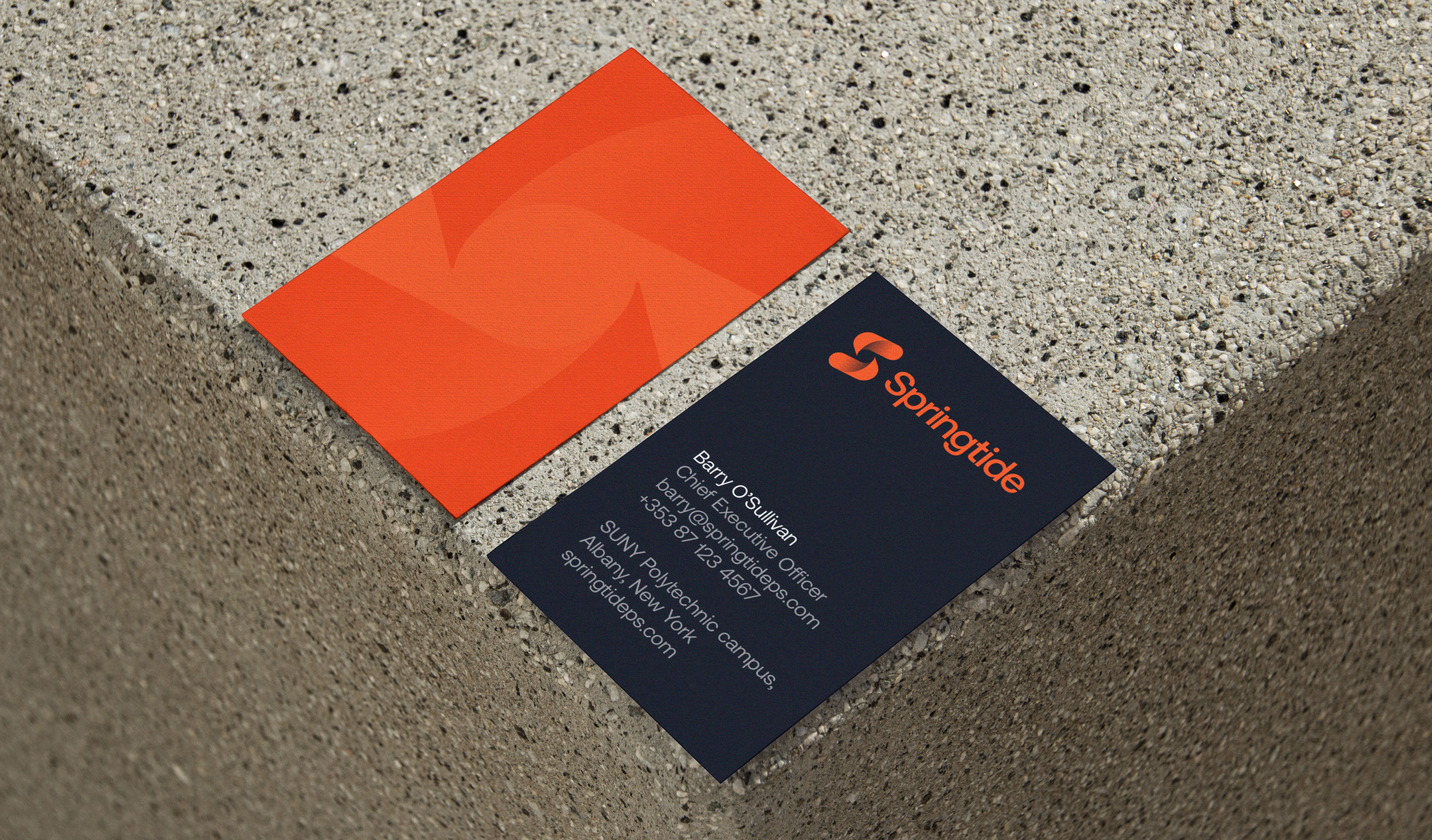
We designed a dynamic, symmetrical monogram logo mark to represent this duality and balance – the balance between sun and moon, between client and service provider, between the project goals and the needs of the end user. Our intention throughout was to distinguish Springtide as a fresh and alternative voice in their sector. The brand name, vibrant colour palette and humanistic photography stands apart from the traditional aesthetic of their competitors.
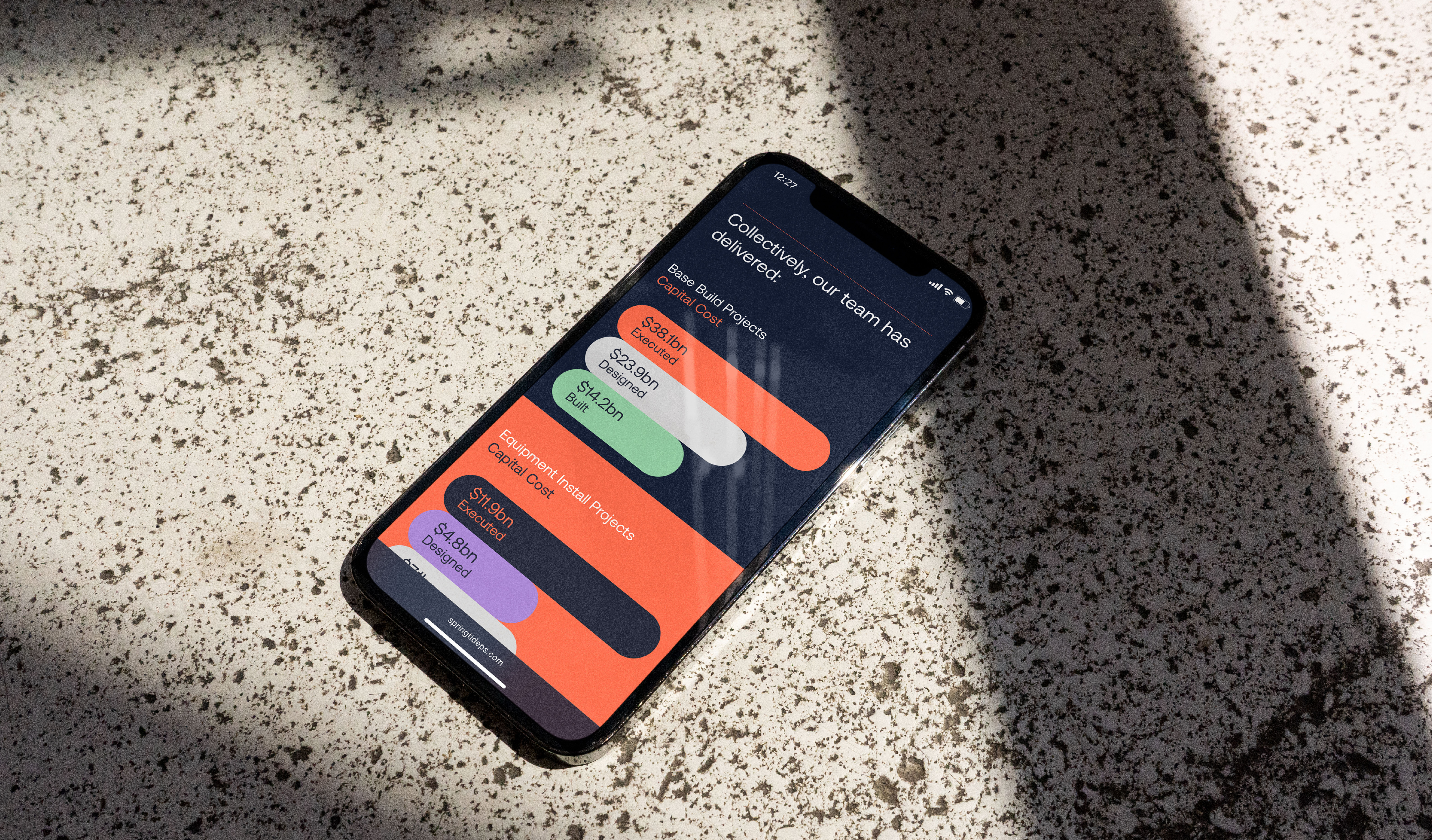
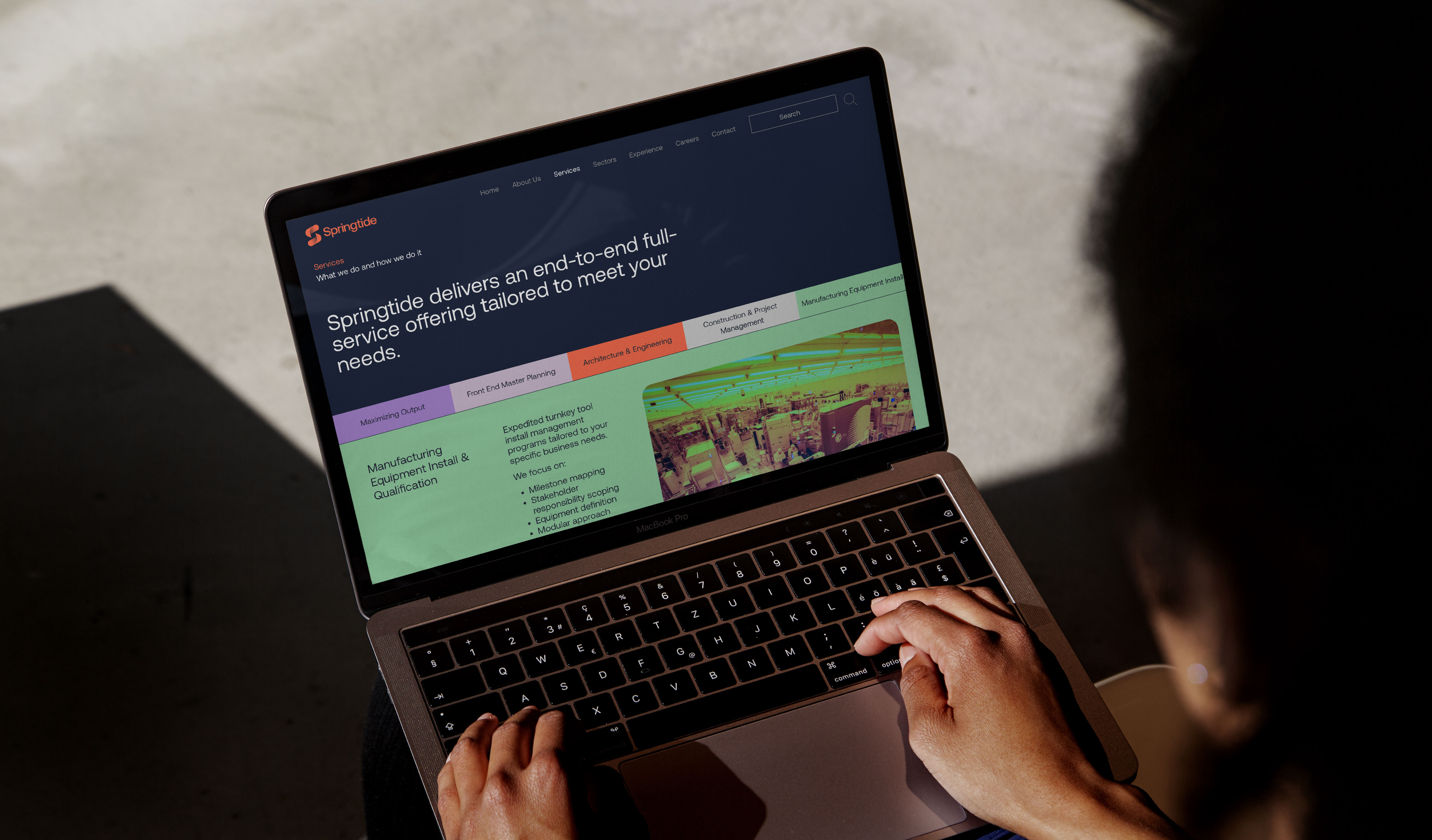
As part of the brand rollout, we created a brand narrative to allow the leadership team to properly introduce their new company to prospective clients and employees. This narrative then informed the structure of a new website that showcases service and sector expertise as well as telling the story of Springtide.
