Sonas Sans – Custom Typeface Design: IDA Ireland
Designed by Bobby Tannam and Éanna O_Shea at Image Now
Type Designer: Bobby Tannam
Creative Support: David Wilson
Categories: Typeface
Industry: Corporate
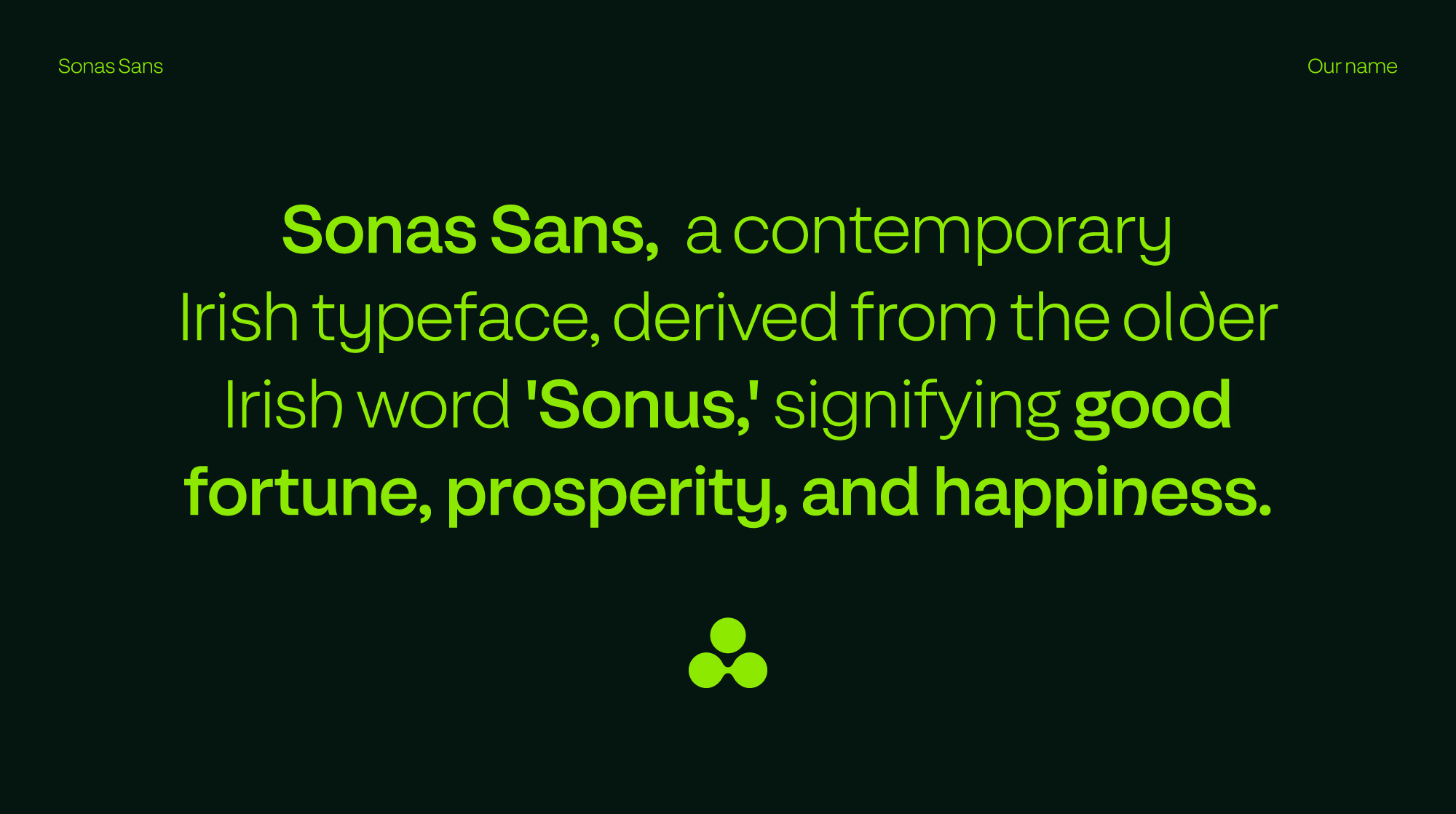
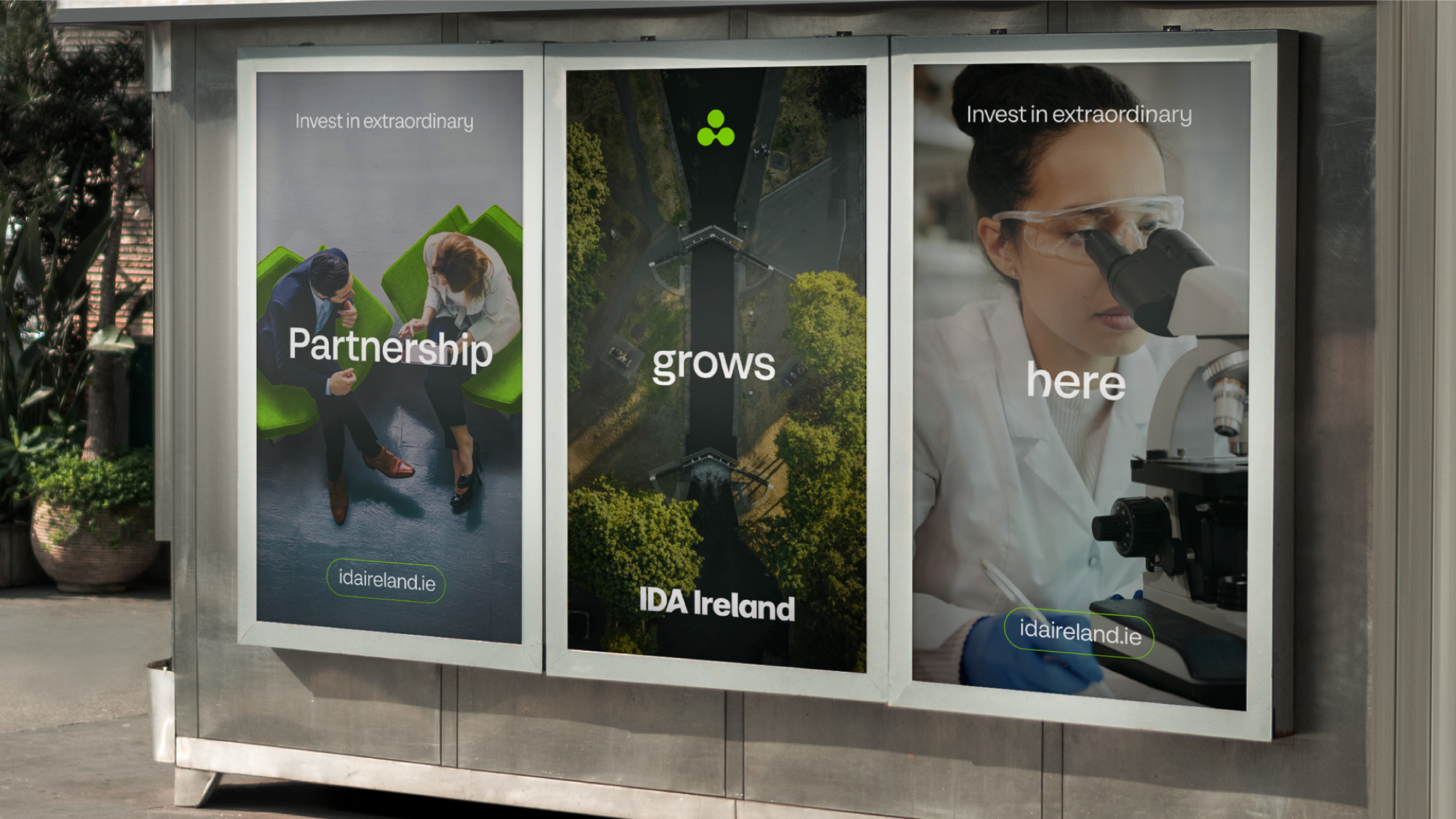
In the process of rebranding IDA Ireland, a key objective was the development of a contemporary typeface that harmoniously blended business professionalism with a modern Irish aesthetic. Emphasising legibility, readability and accessibility, our inspiration drew from the clean and sophisticated design principles observed in minimalist modern business brands.
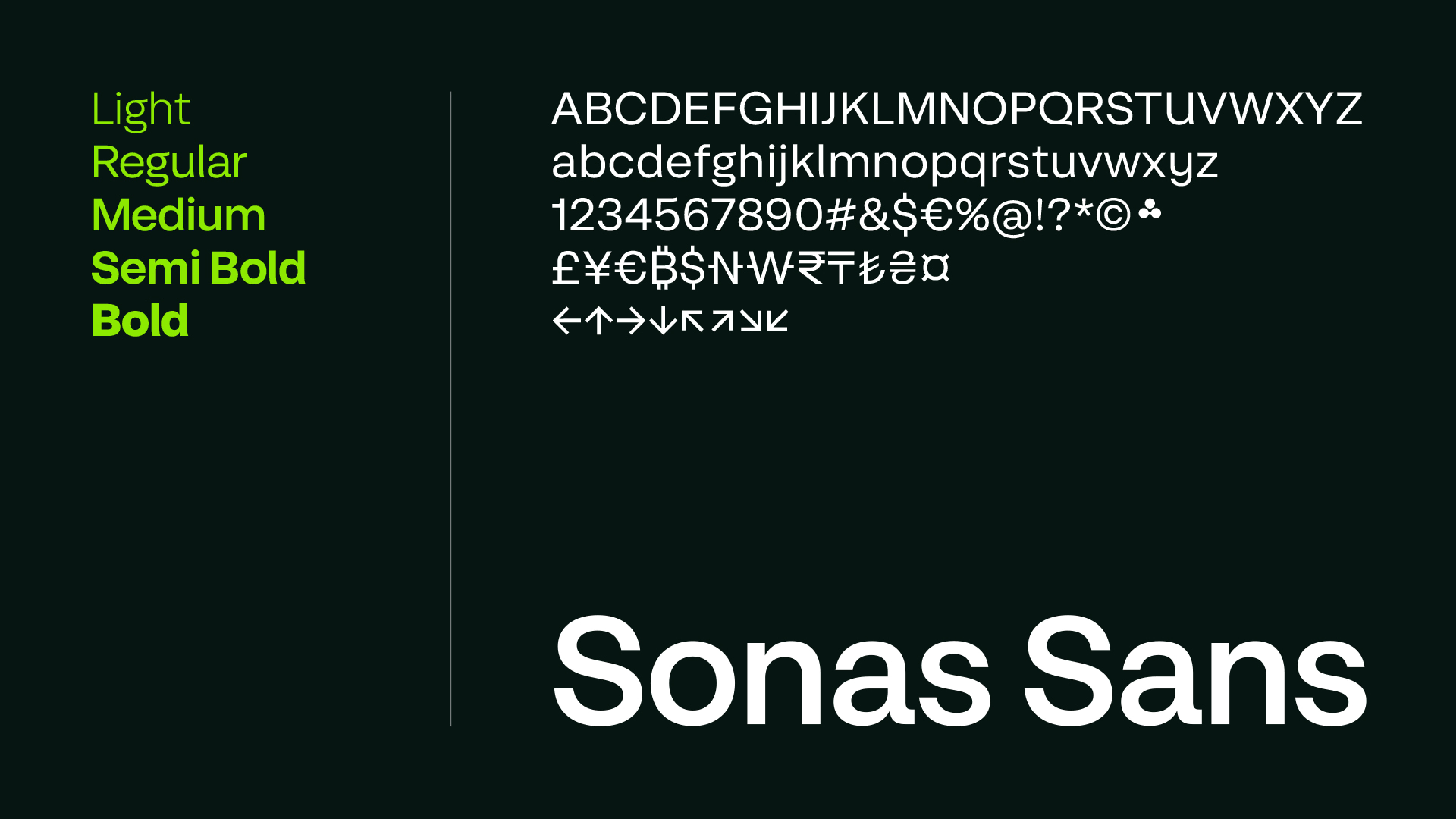
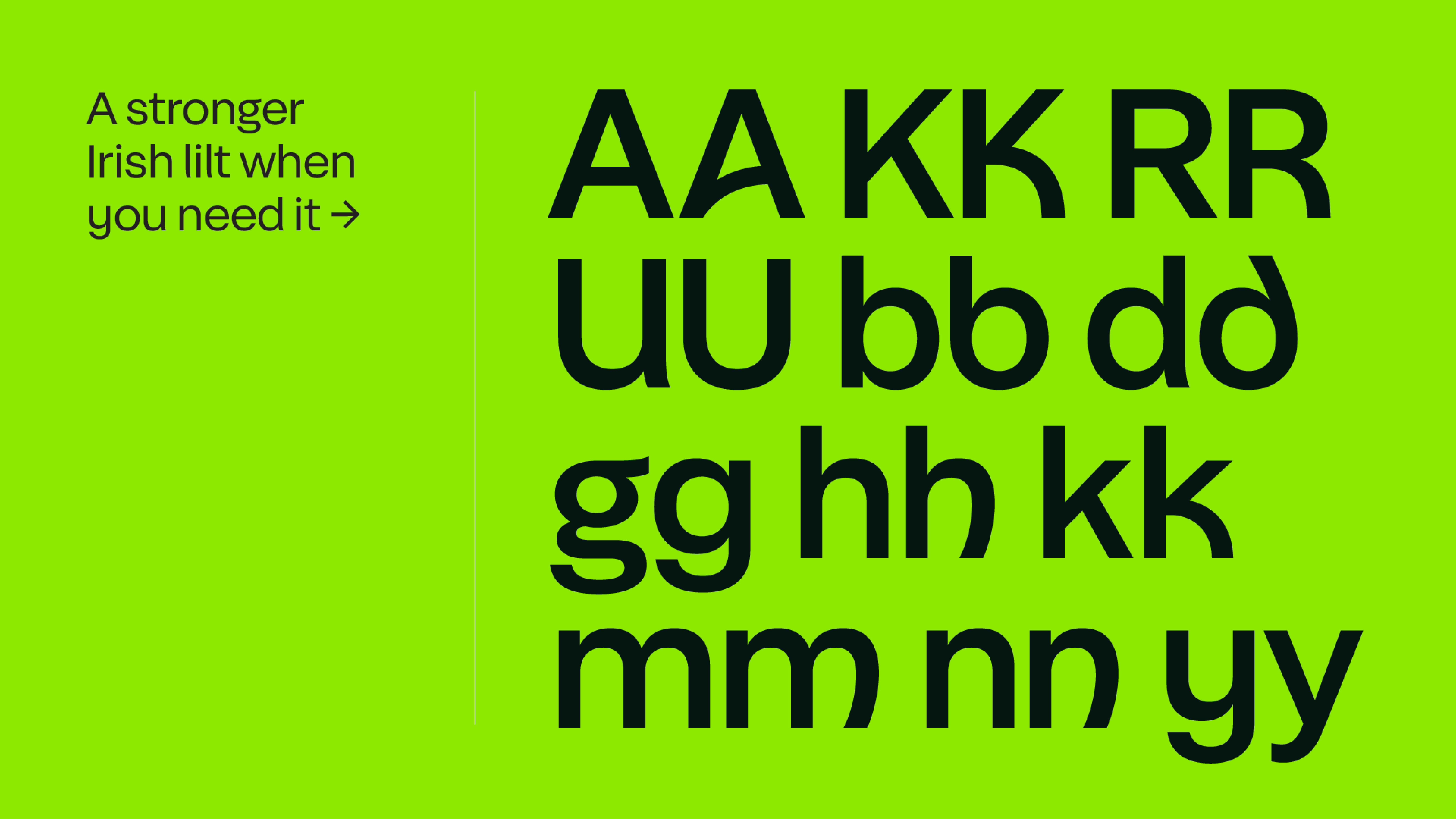
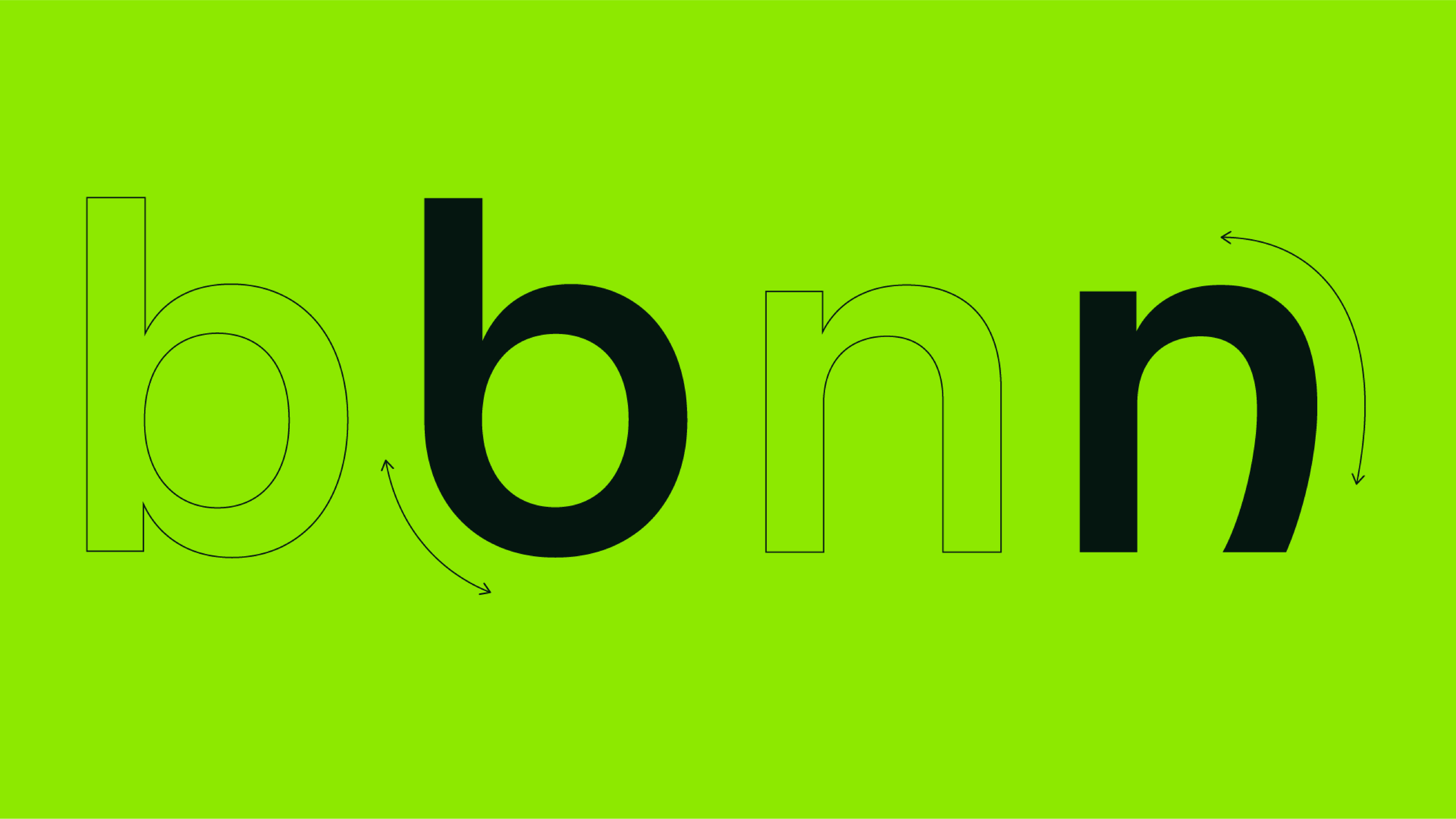
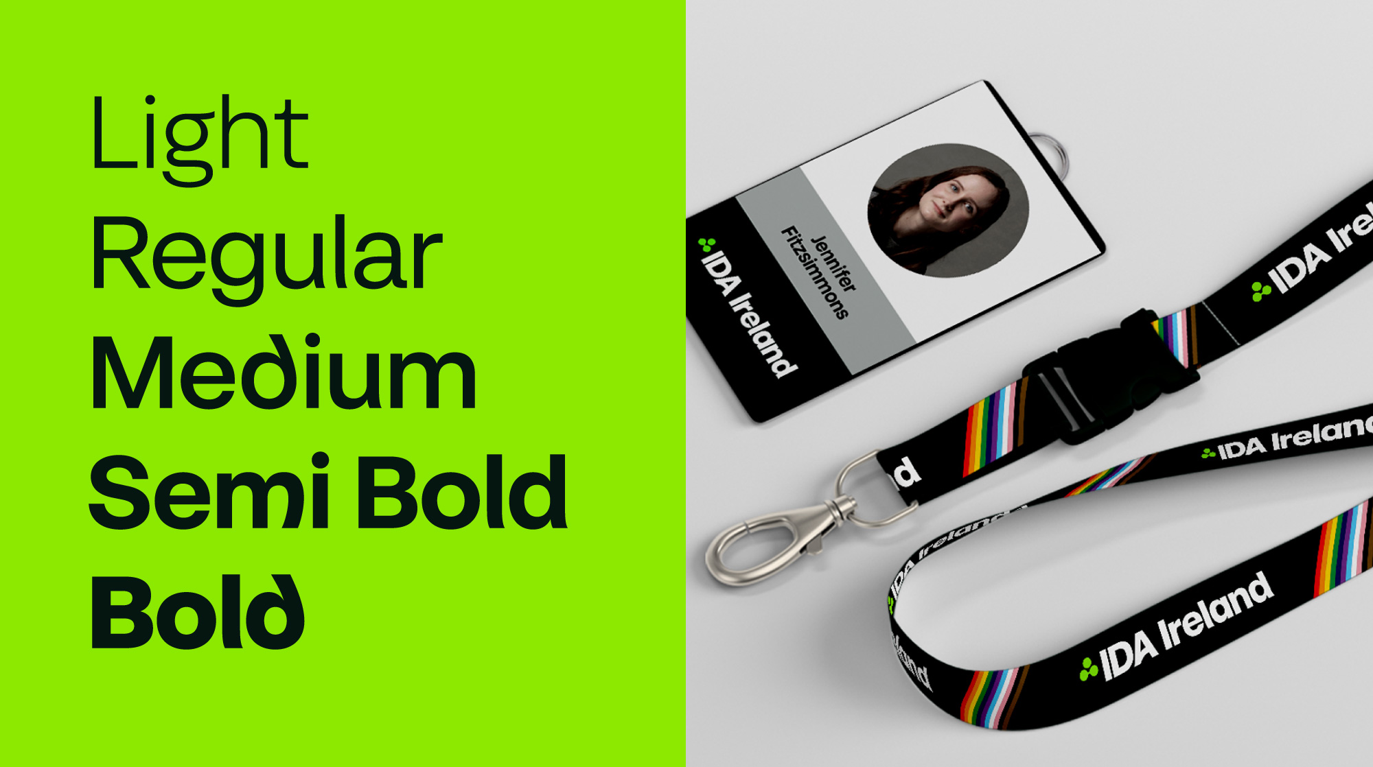
In close collaboration with typographer Bobby Tannam, we meticulously fine-tuned letterforms, numerals, and glyphs to strike the right balance, avoiding the creation of something overly generic or overly 'twee’. A distinct feature of our approach was the introduction of alternate characters, enabling users to inject a more pronounced Irish influence into headlines and communications when needed. This playful customisation extended to a family of type-weights – light, regular, medium, semi-bold, and bold – offering versatility and conveying different tonalities and typographic distinctions.
We also developed the type weight 'Sonas Sans Text,' a specialised and accessible font crafted for body copy to enhance legibility and to encourage brand consistency. This shift from the generic fonts previously employed by the brand has built a cohesive and flexible typographic system, effectively capturing the essence of IDA Ireland as a business-first organisation with a modern Irish heritage.
The entire design journey was rooted in practicality, collaboration and a strategic reimagination of the brand's visual language. Specifically, Sonas Sans embodies the successful integration of functionality and aesthetics, culminating in a type-family that is proudly Irish, progressive, versatile and unique.
