Sisk
2024
Designed by Mel ORourke, Philip Mitton, Conor Flood, Aidan Moore and Archie Heaslip at CI Studio
Photography: Fionn McCann
Videography: Dave O'Carroll
Signage: Ken Finn (Vision Branding)
Categories: Website / Print / Identity / Moving Image / Wayfinding / Signage / Livery
Industry: Corporate
Tags: Photography / Typography / Digital
Website: sisk.com
Sisk, an Irish-owned, fifth-generation family business is an internationally recognised market leader in the construction space. Established in 1859 by John Sisk, today they remain a family business, innovating and pioneering best practice in construction excellence.
Working in collaboration with their board, we better defined the brand strategy and structure while redesigning an overarching visual system which aligned with plans for future international growth. The strategy was simple: the company identity and the culture of Sisk lie in a determined can-do mentality, accomplishing large-scale international projects using the most modern methods of construction. It was important to make this strength of personality palpable while retaining its heritage.
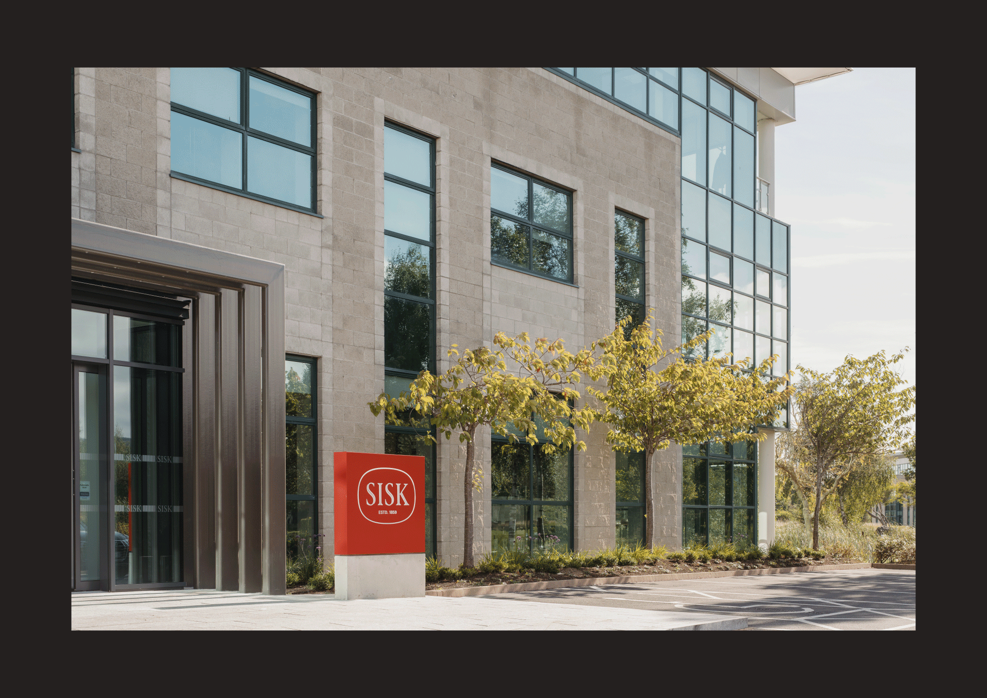
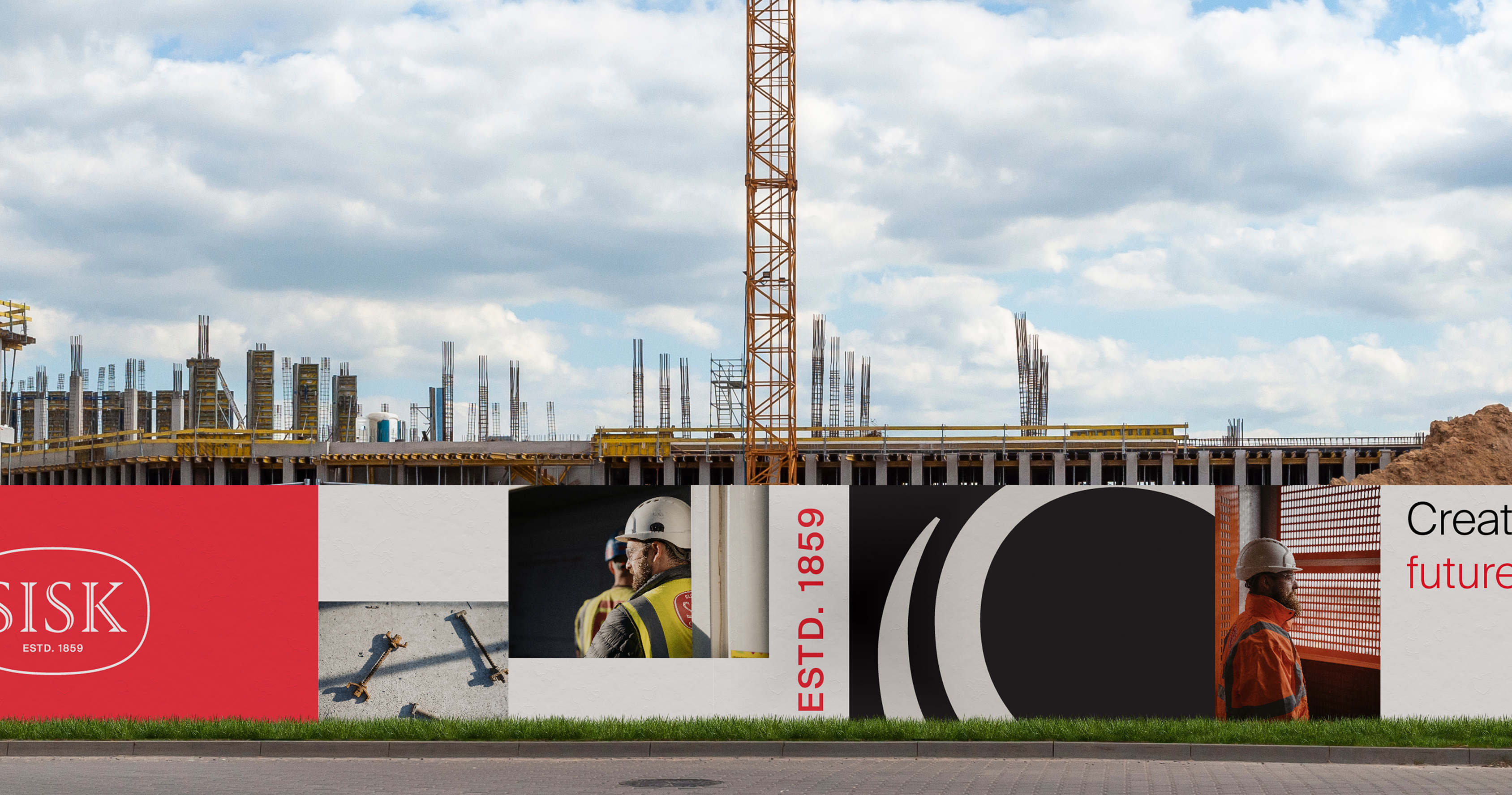
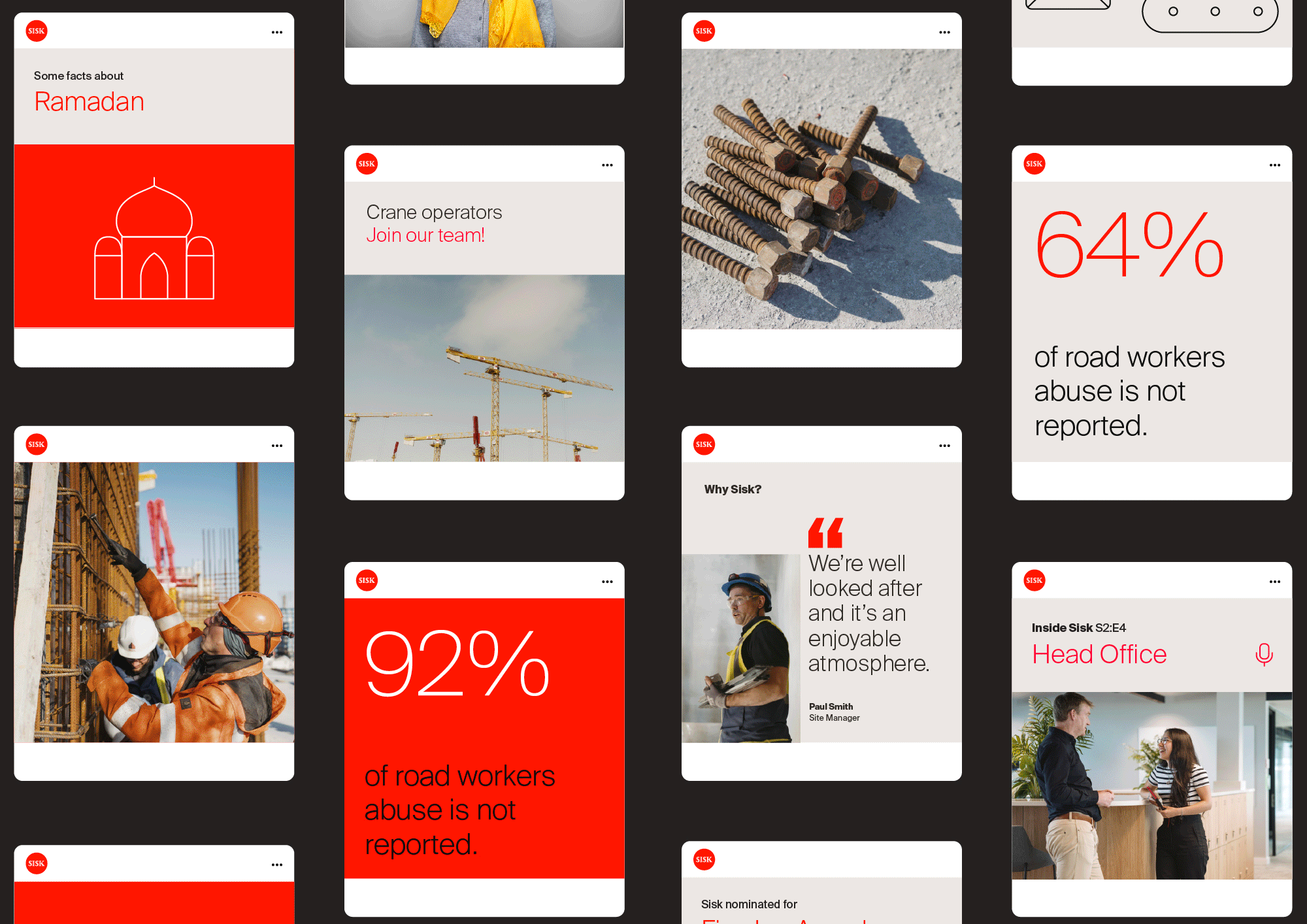
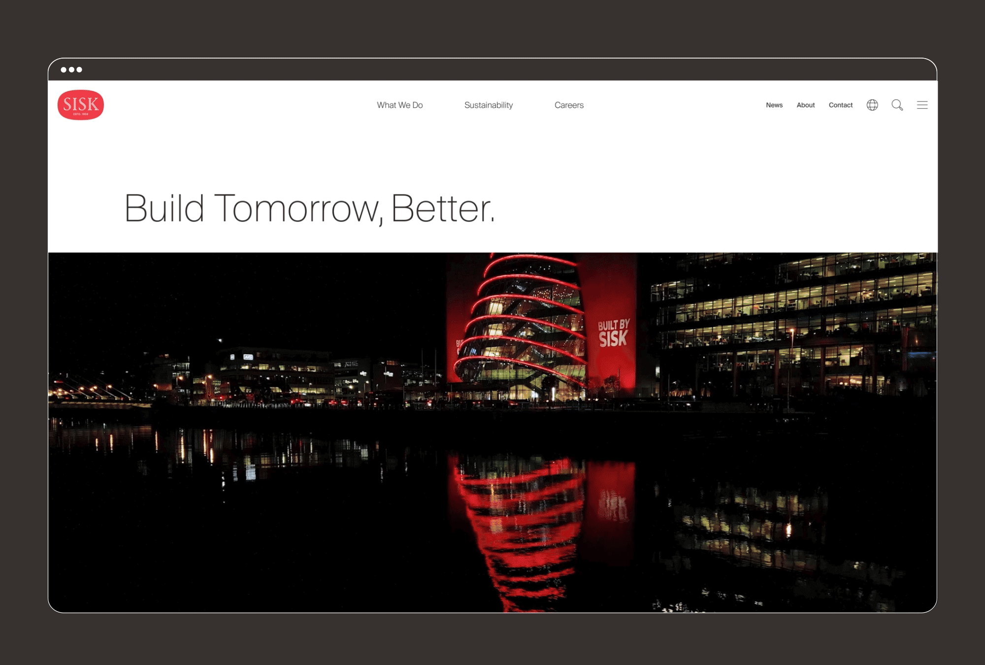
The existing Sisk burgundy word-mark is redrawn to be clear, solid and contemporary, retaining its distinctive oval shape and introducing a brighter pop of red. Supported by a strong, sophisticated colour palette of black and grey and an improved approach to photography, the identity has been applied to all touchpoints from print and digital, to safety clothing, hoarding and wayfinding.
The new visual identity and system has firmly placed Sisk in a position of leadership in the industry, while continuing to innovate and challenge. The new identity highlights both sides of Sisk, indicating its strength and unique, innovative character combined with its commitment to sustainability and Net Zero. It has helped to transform market perception of the brand and, in doing so, has boosted the morale and pride of its employees.