Silks Irish Dry Gin
Designed by David Walsh at Greenhouse
Categories: Identity / Packaging
Industry: Commercial
Tags: Packaging / Branding / Brand Identity / Design / Brand application
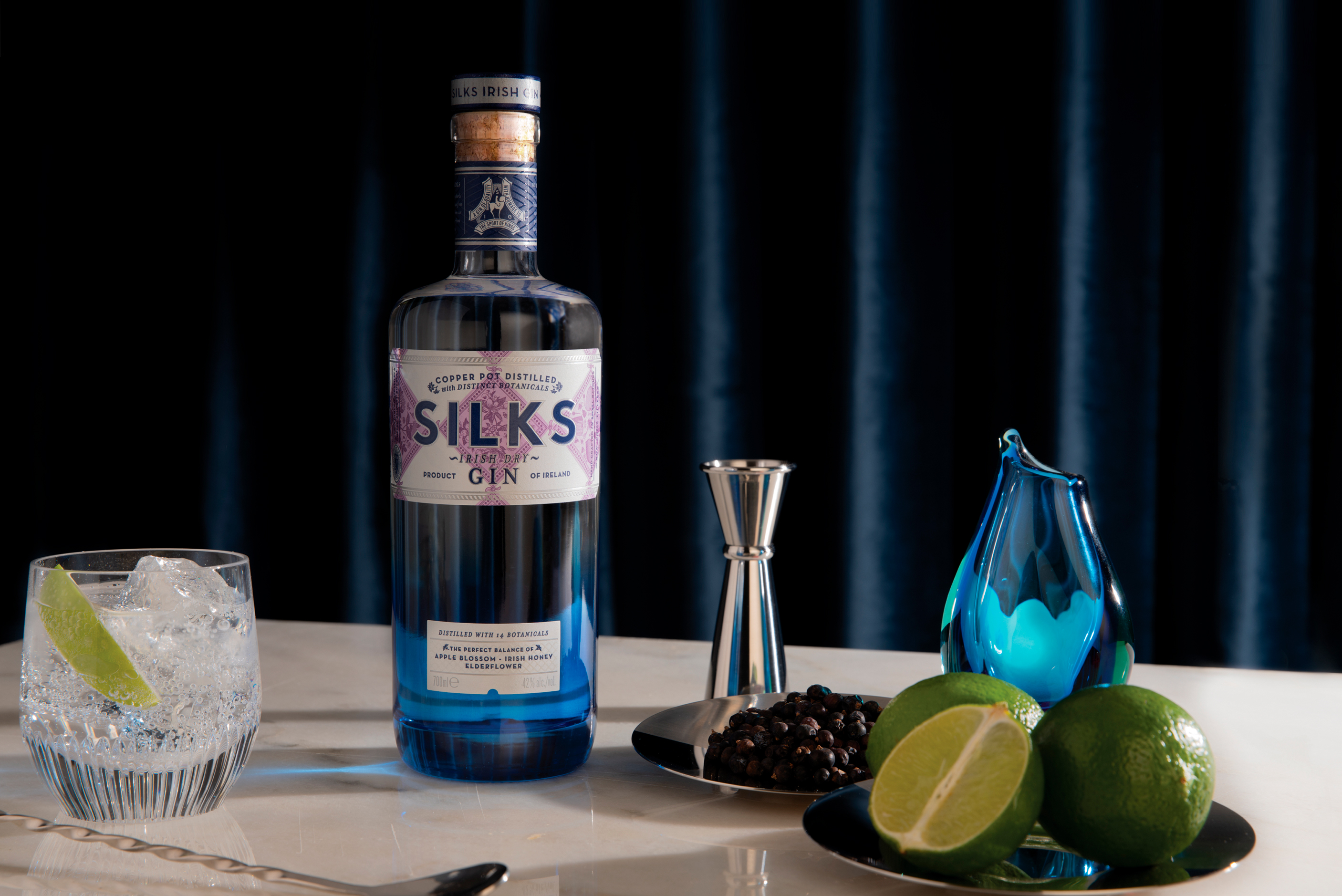
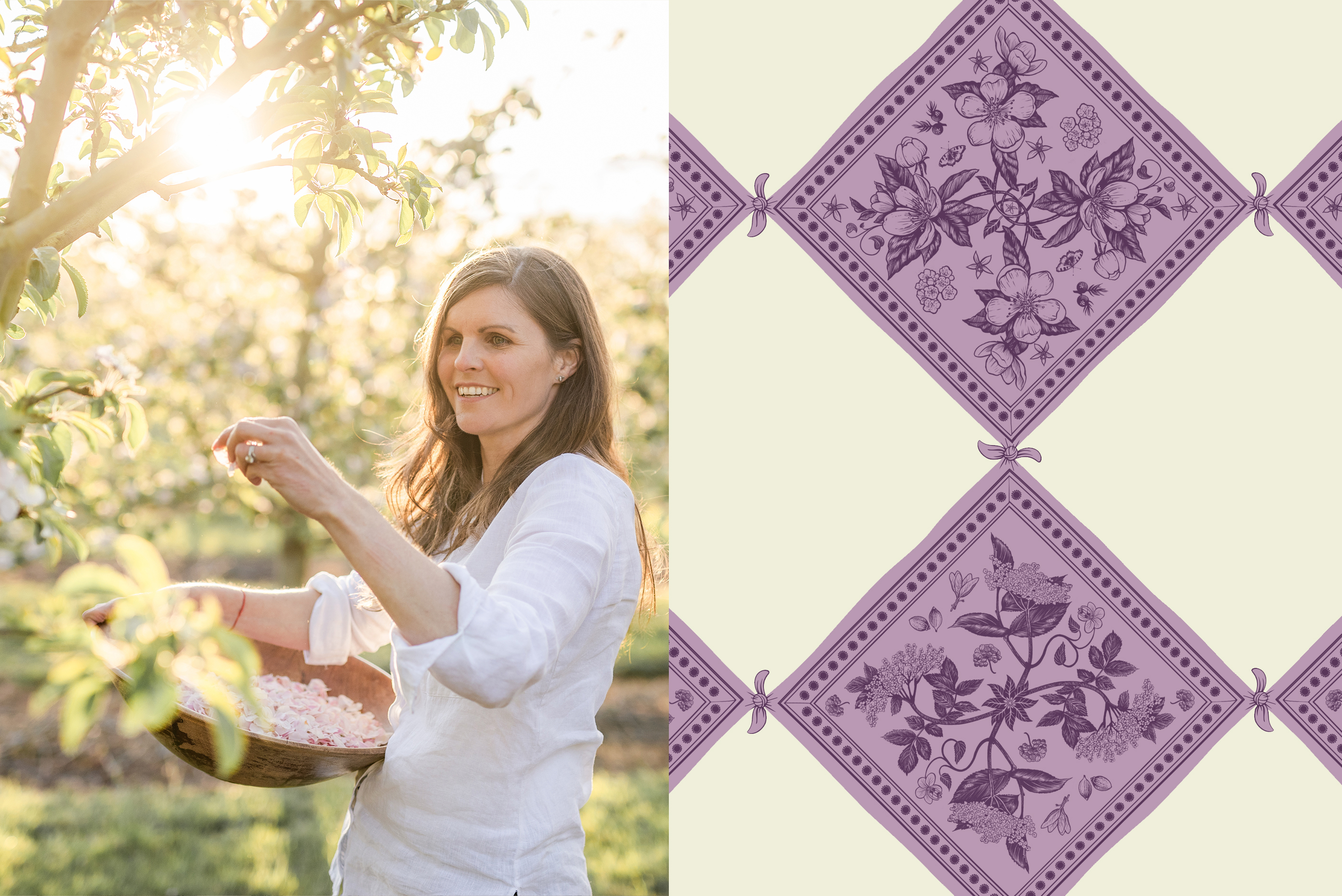
Inspired by the Bellewstown Racecourse seen from the distillery partnering with their love of the equestrian, Silks Irish Dry Gin is the creation of a mother and daughter team who set out to distill a new twist on Irish Dry Gin using distinct lead botanicals foraged from their own orchards.
Developing the Silks brand, a softness of touch was given to the influencing world of confidence. A layered brand was developed where every different aspect would unfold something exciting while being intrinsically linked to their love of horse racing and the art of gin-smithing.
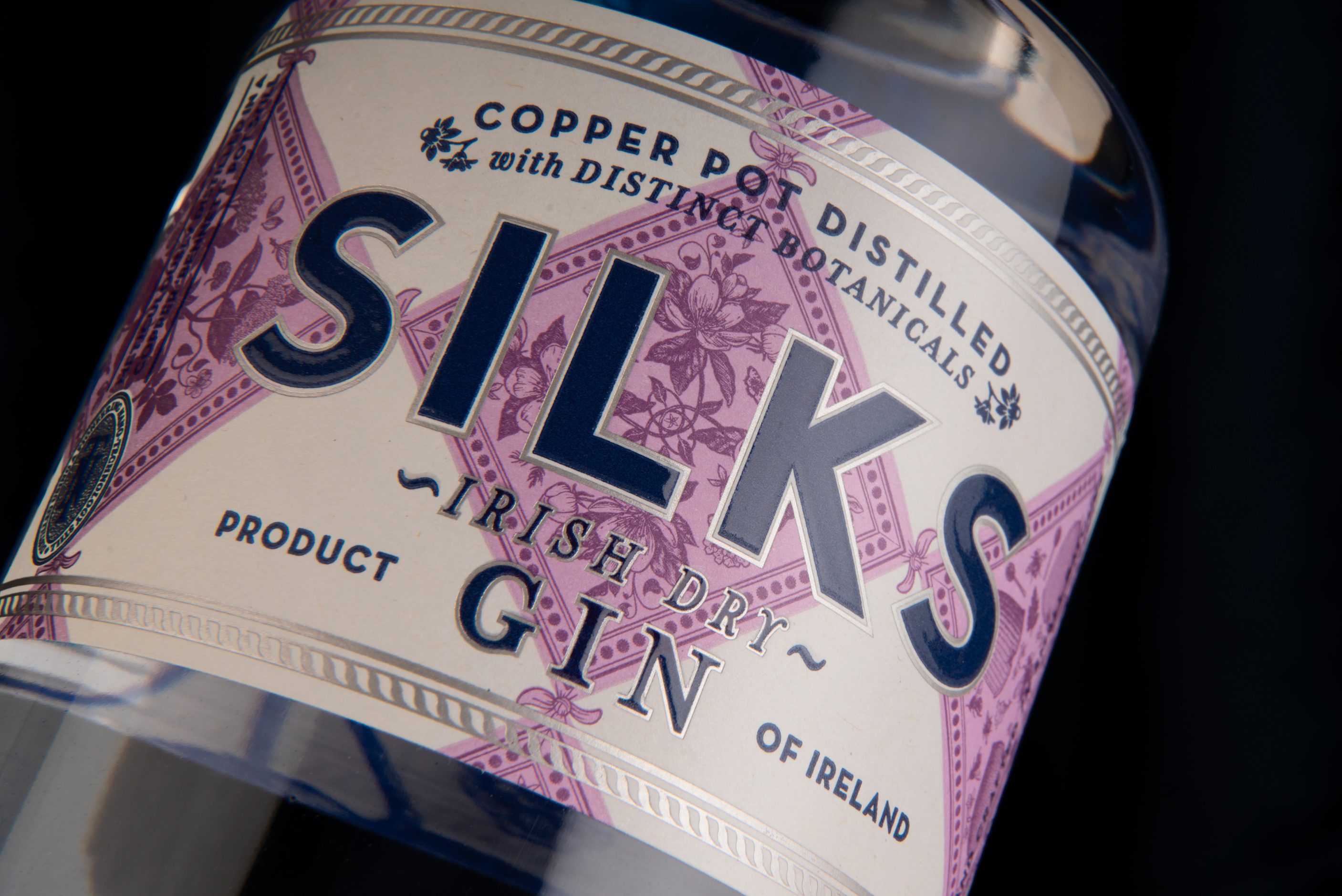
In order to embody this approach onto their tall and elegant bottle, a label was designed where the main graphic motif comprises of scarves tied at each corner. Each of these scarves depict the gins infused botanicals and work collectively to build a pattern similar to that of a jockey’s silks worn on race day. Typographically, the main Silks title is treated classically while secondary copy is set to have an established feel. This approach is complimented by the colour choices which comprise of a confident navy and a softer mauve giving the design a lightness of touch.
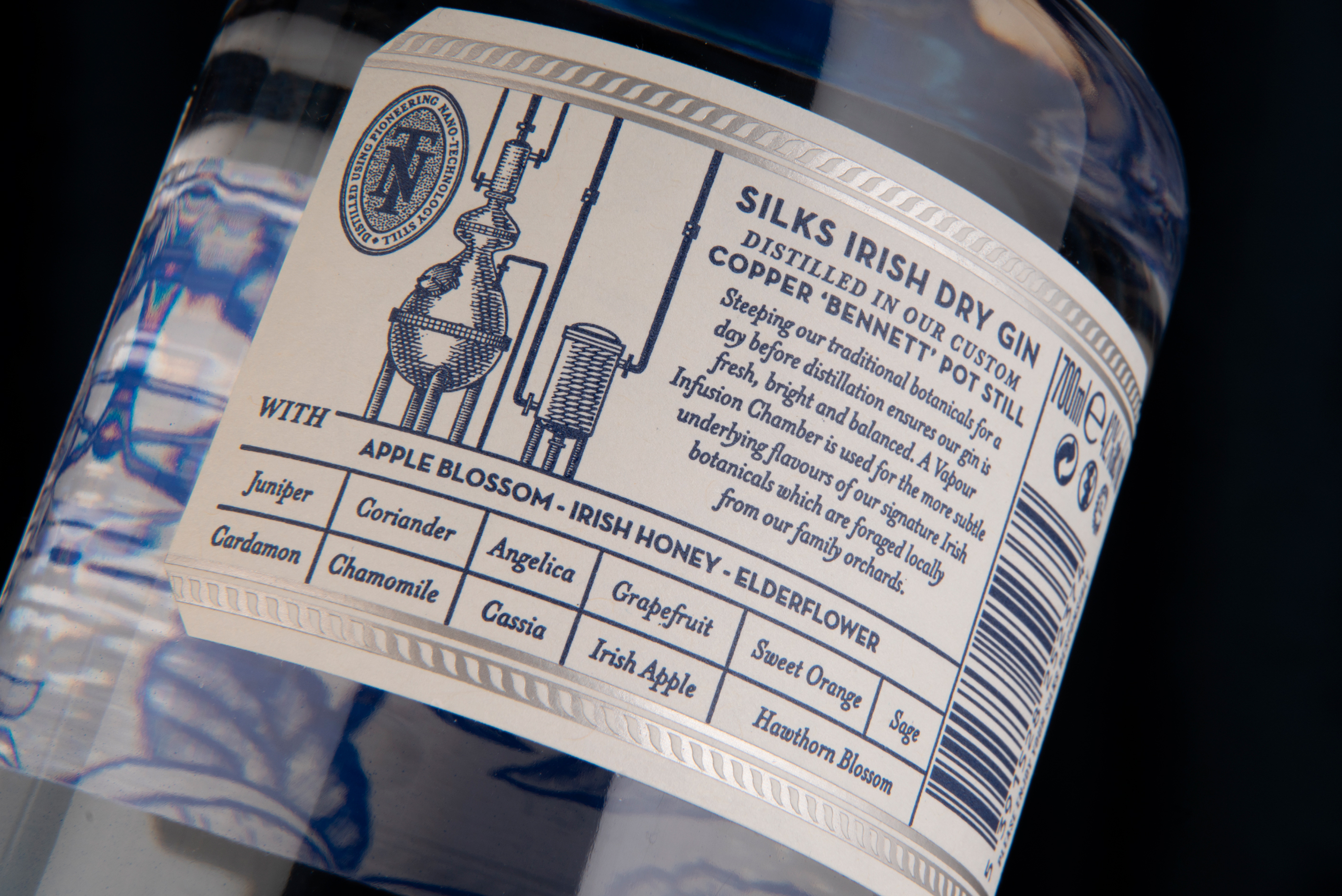
On the back, the opportunity was taken to convey the craft and art that has gone into the gin. An etched illustration of their unique gin still is partnered with information that sets them apart from other gins.
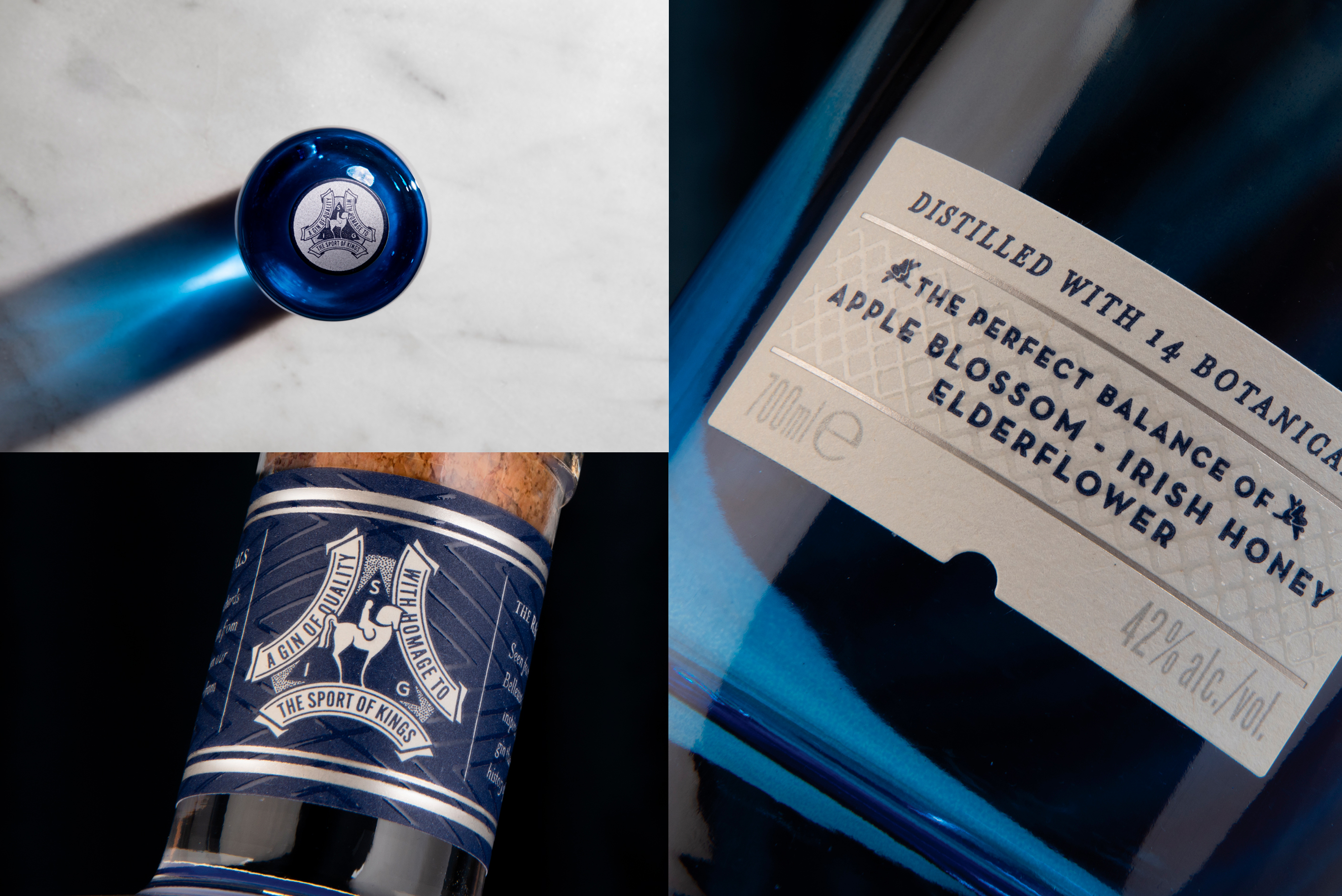
Label stock is recycled, finished with a matte silver foil and raised tactile varnish giving dynamic and ever changing reaction with the light as well as a tactile feel to hand.
A blue vignette at the base of the bottle grounds the design and gives presence to a clear liquid. Printing the botanicals on the reverse of the label generates a direct connection between the gin and its botanicals while also offering a visual reveal when the bottle is closer studied.
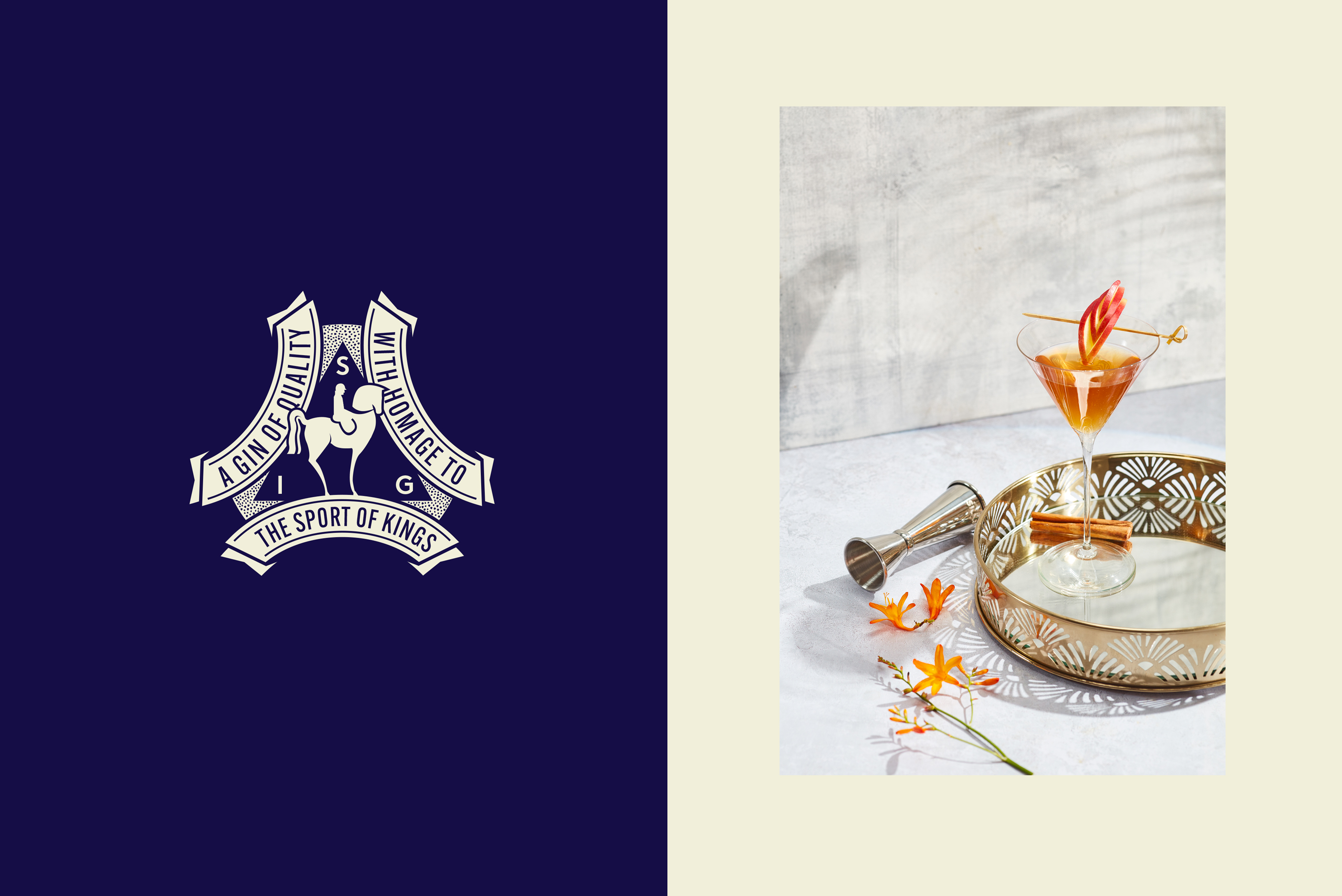
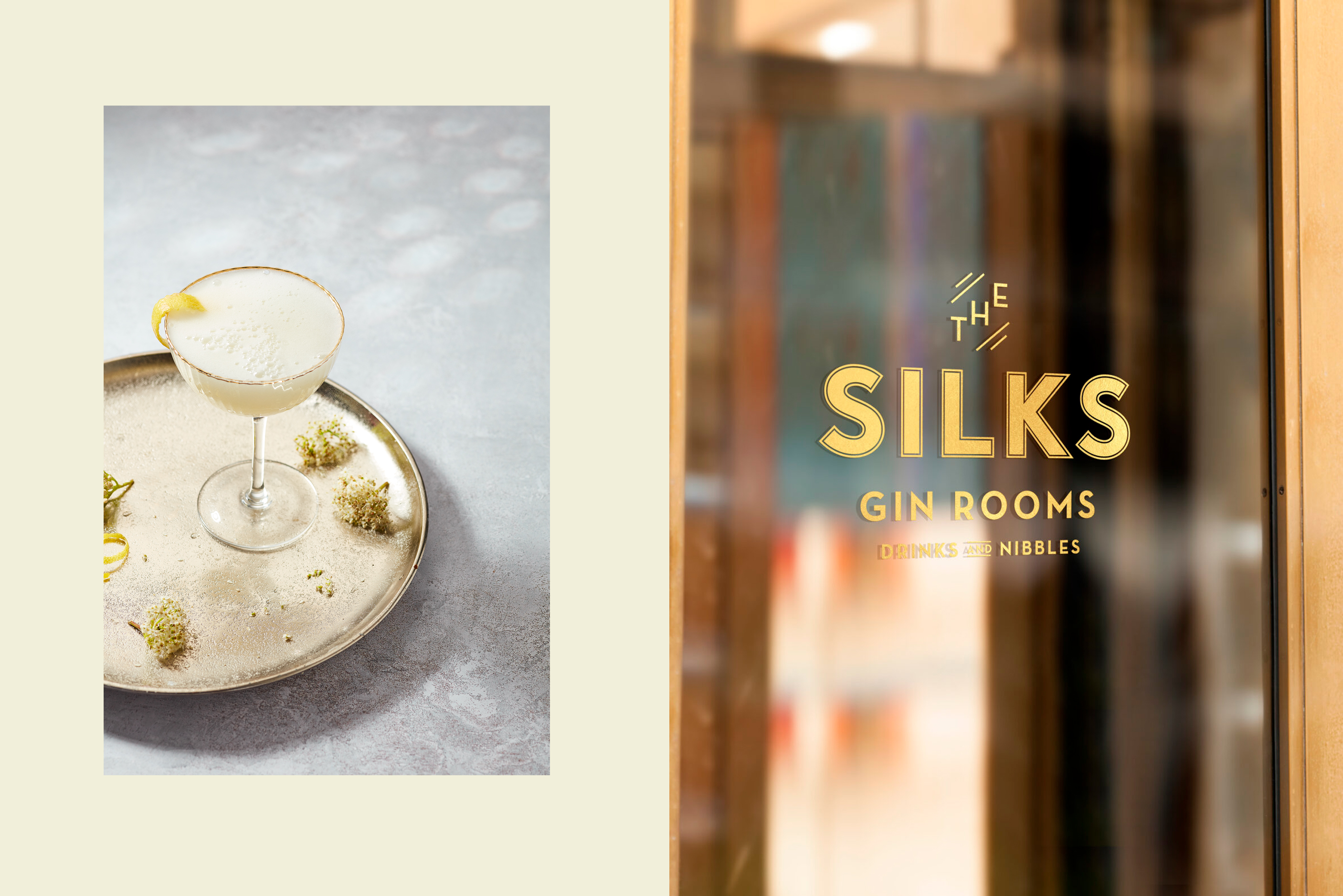
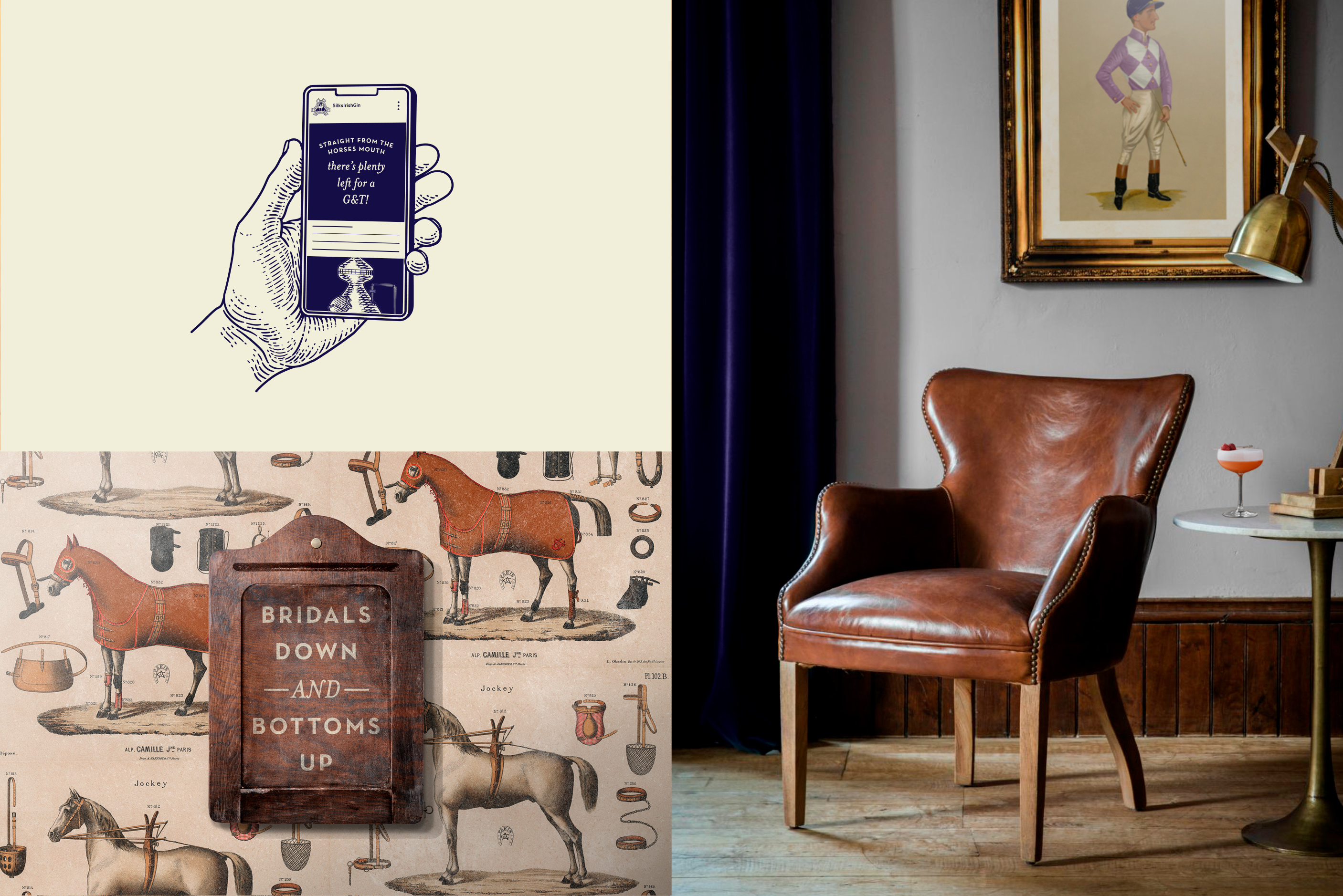
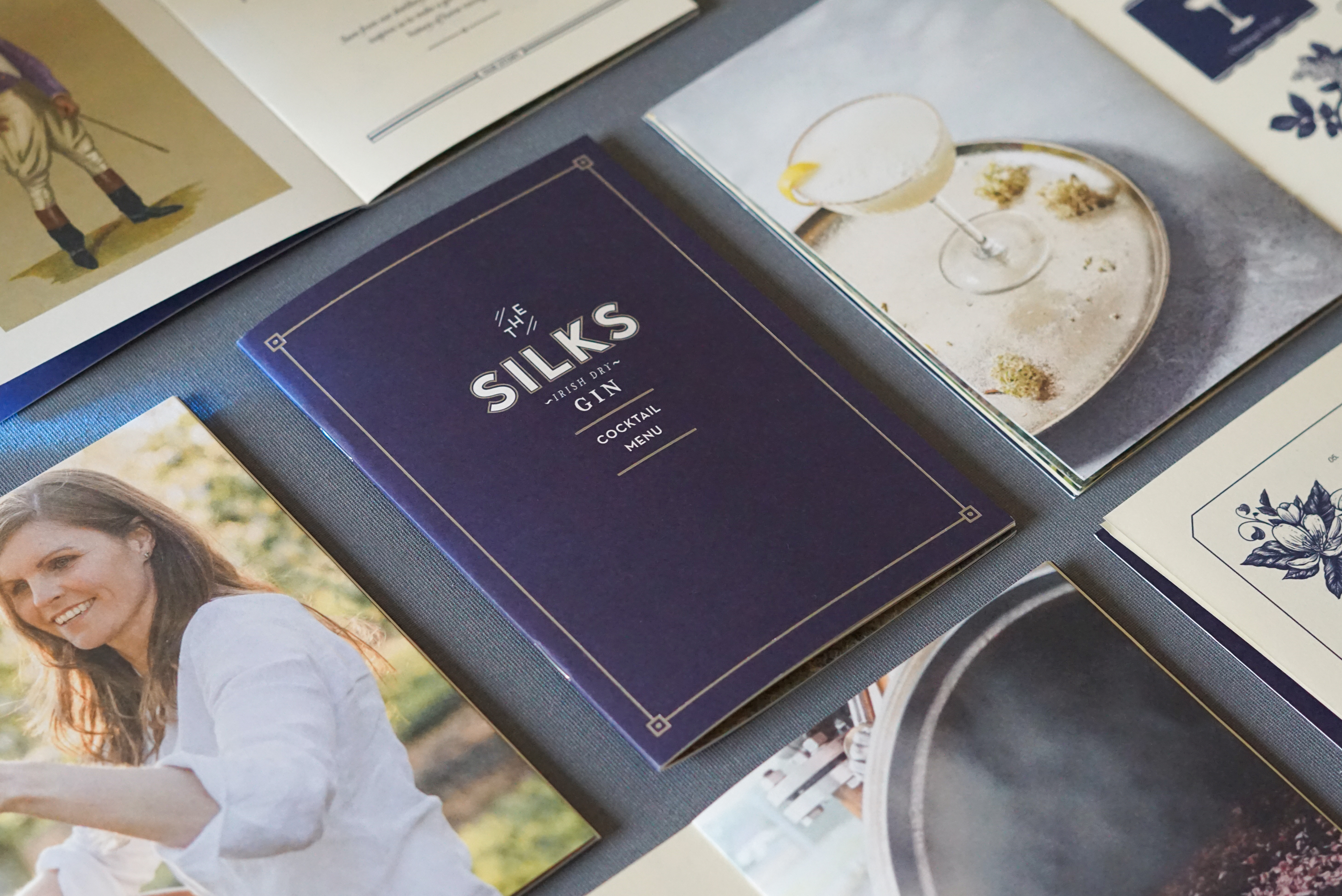
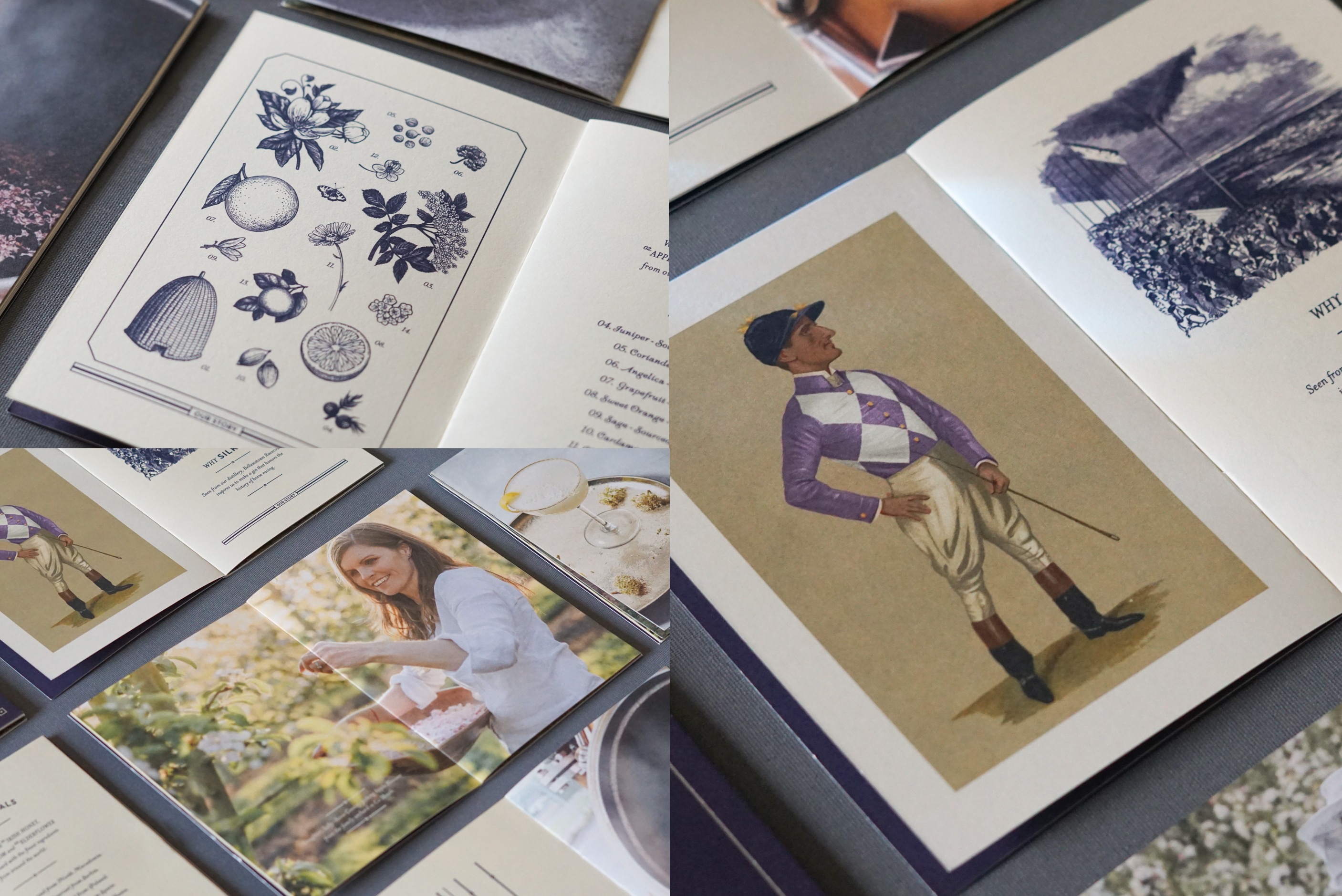
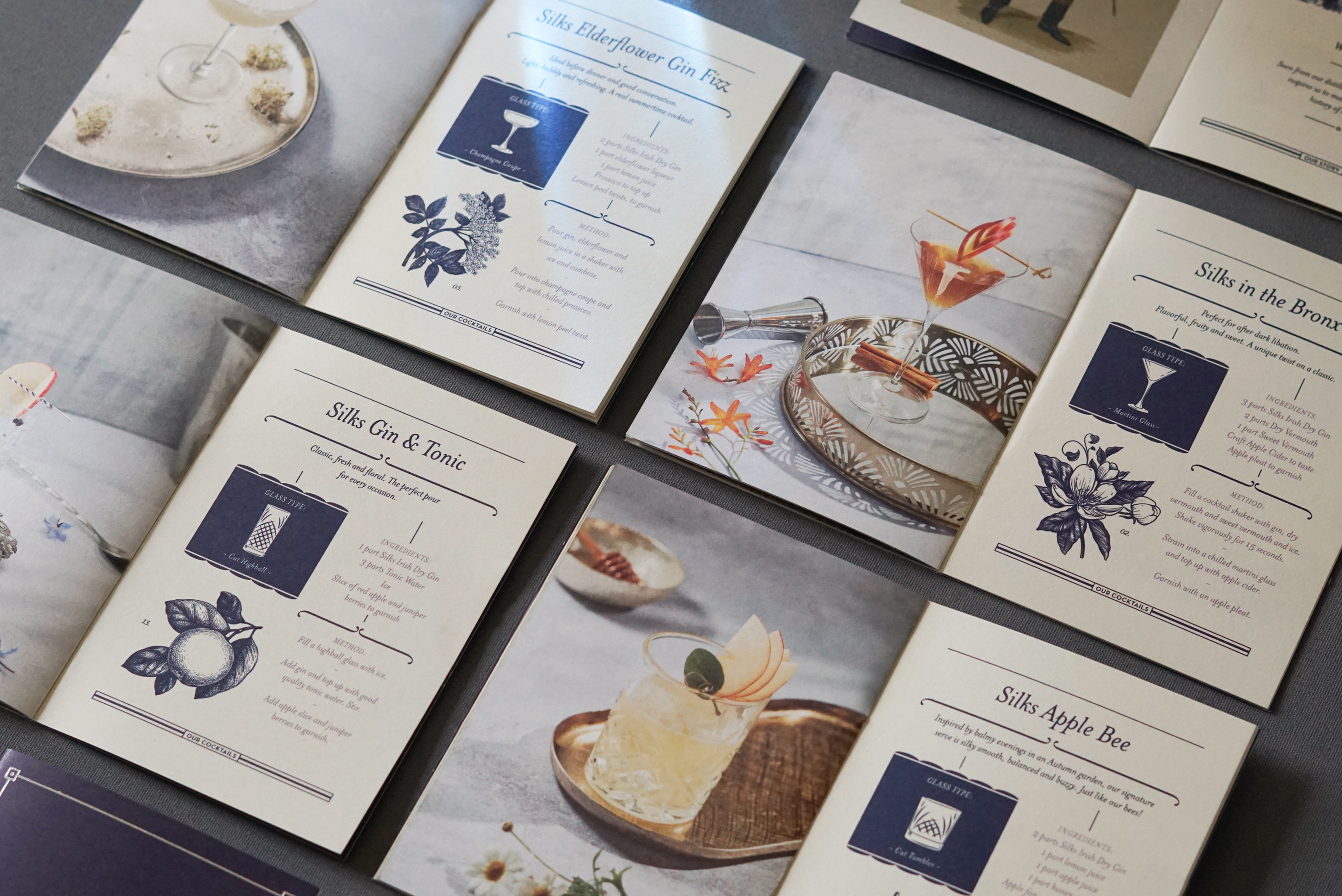
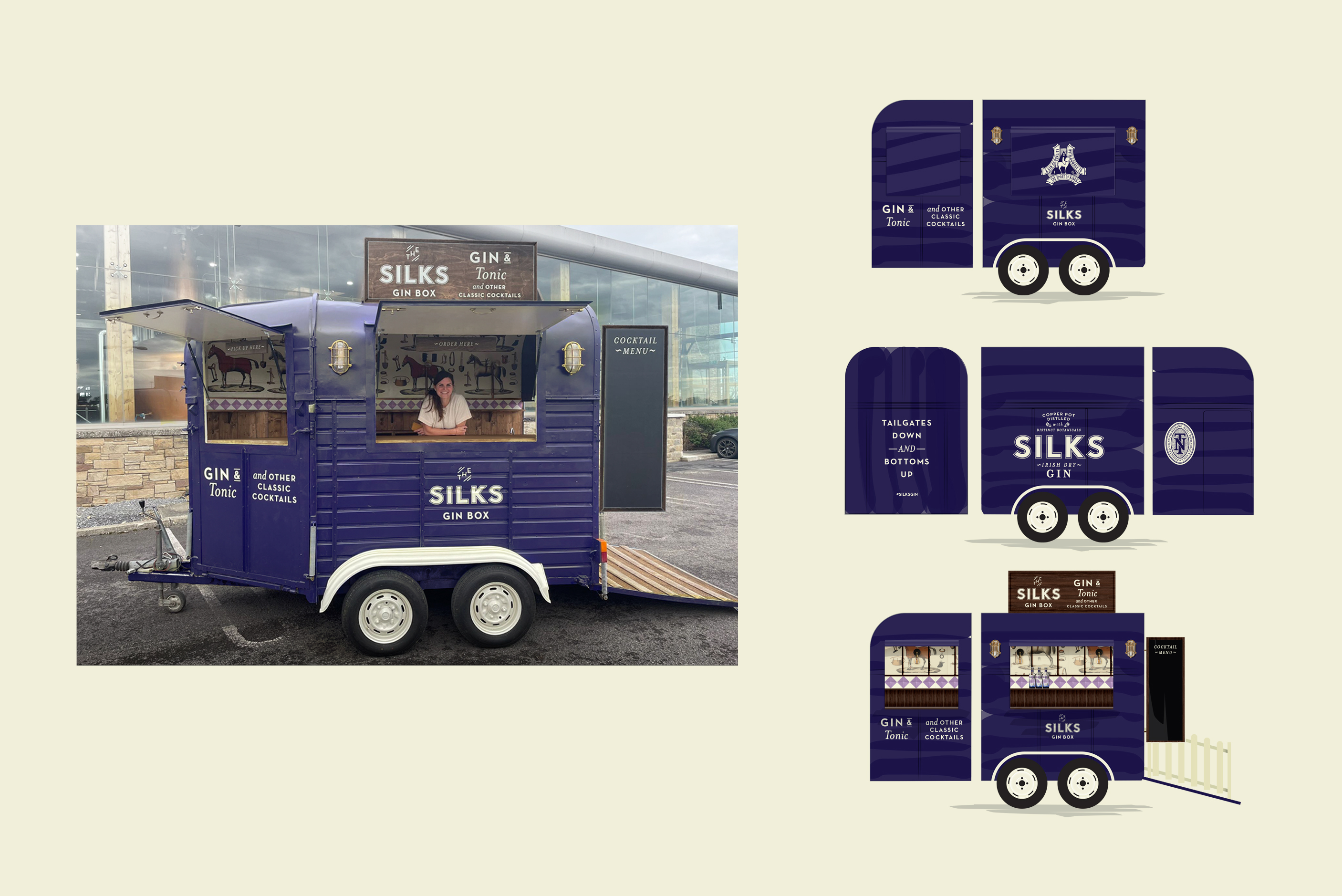
Bringing the brand alive off pack allowed us to build on the aesthetic and distil a tone of voice that was accessible and approachable. Various activations from converted horse boxes to tasting rooms to brand-led cocktail booklets gave the opportunity to follow the brand through in memorable ways while always staying true to the core inspiration of the brand.
