Searing Point
Designed by Scott Burnett and Kevin Horan at Aad
Categories: Identity
Industry: Commercial
Mentioned in:
Website: searingpoint.ie/
A new professional services company who are setting out to do things differently. They’re interested in a holistic and sustainable approach to doing and building business that focuses on strong relationships, honesty, solidity and foresight. They will seek out relationships with like-minded leaders from every industry type. The model is a constructive one built on always being financially, operationally and philosophically solid. This is how they will build their business and what they will help their clients do. To grow in a way that is responsible, sustainable and ultimately enjoyable.
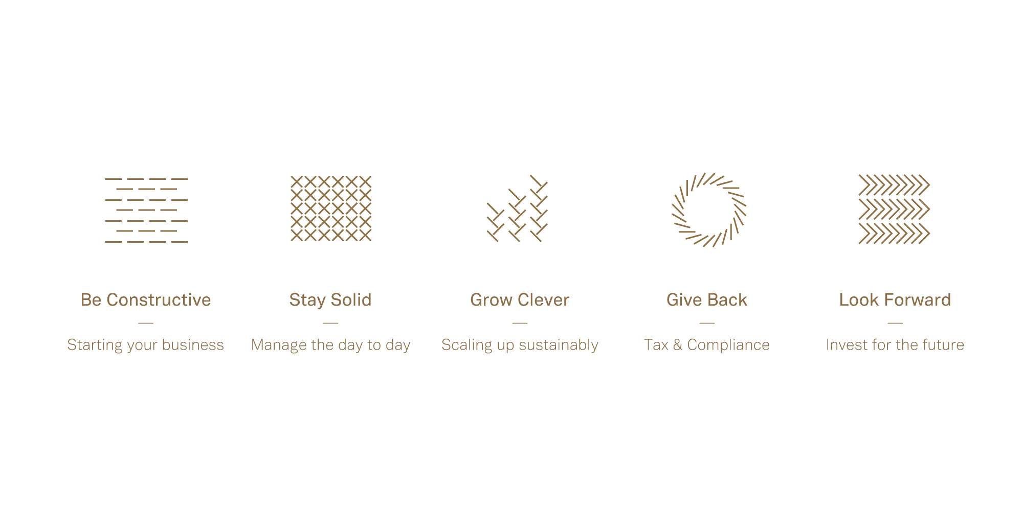
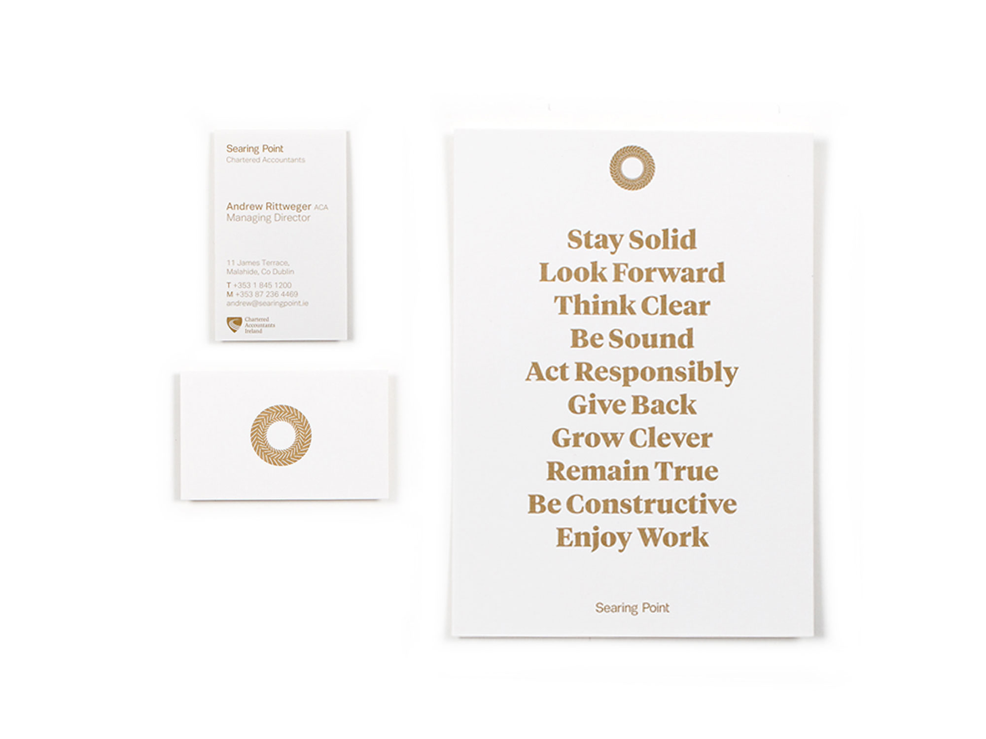
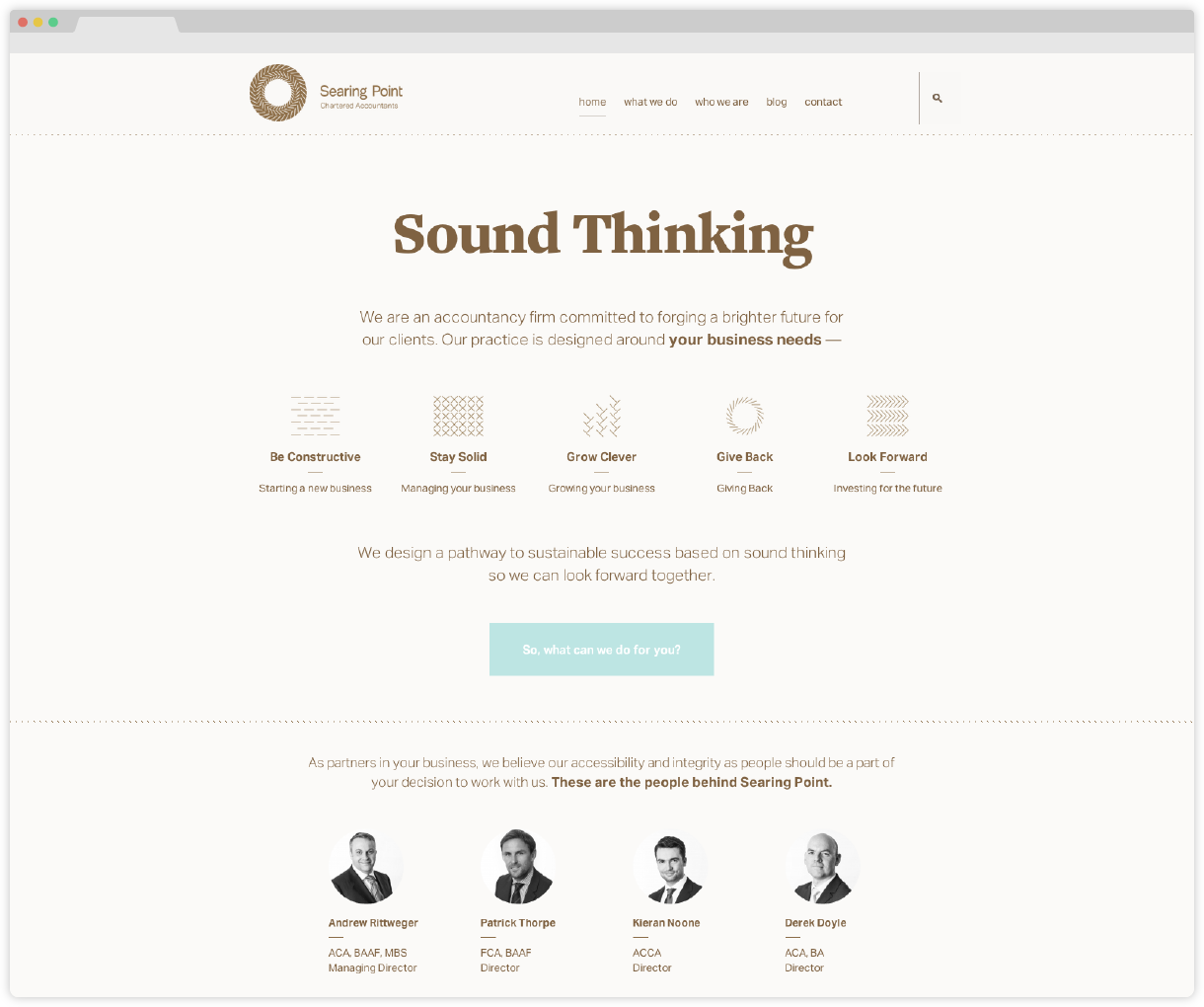
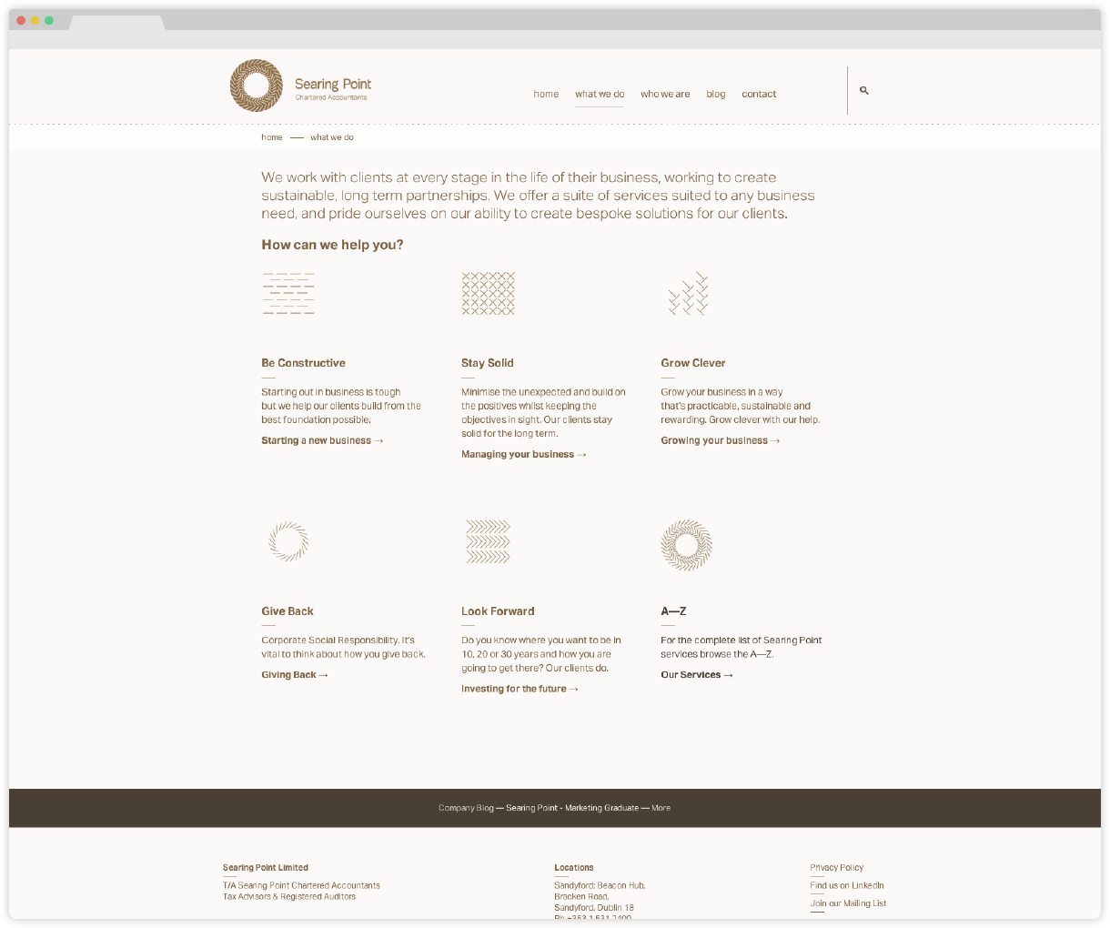
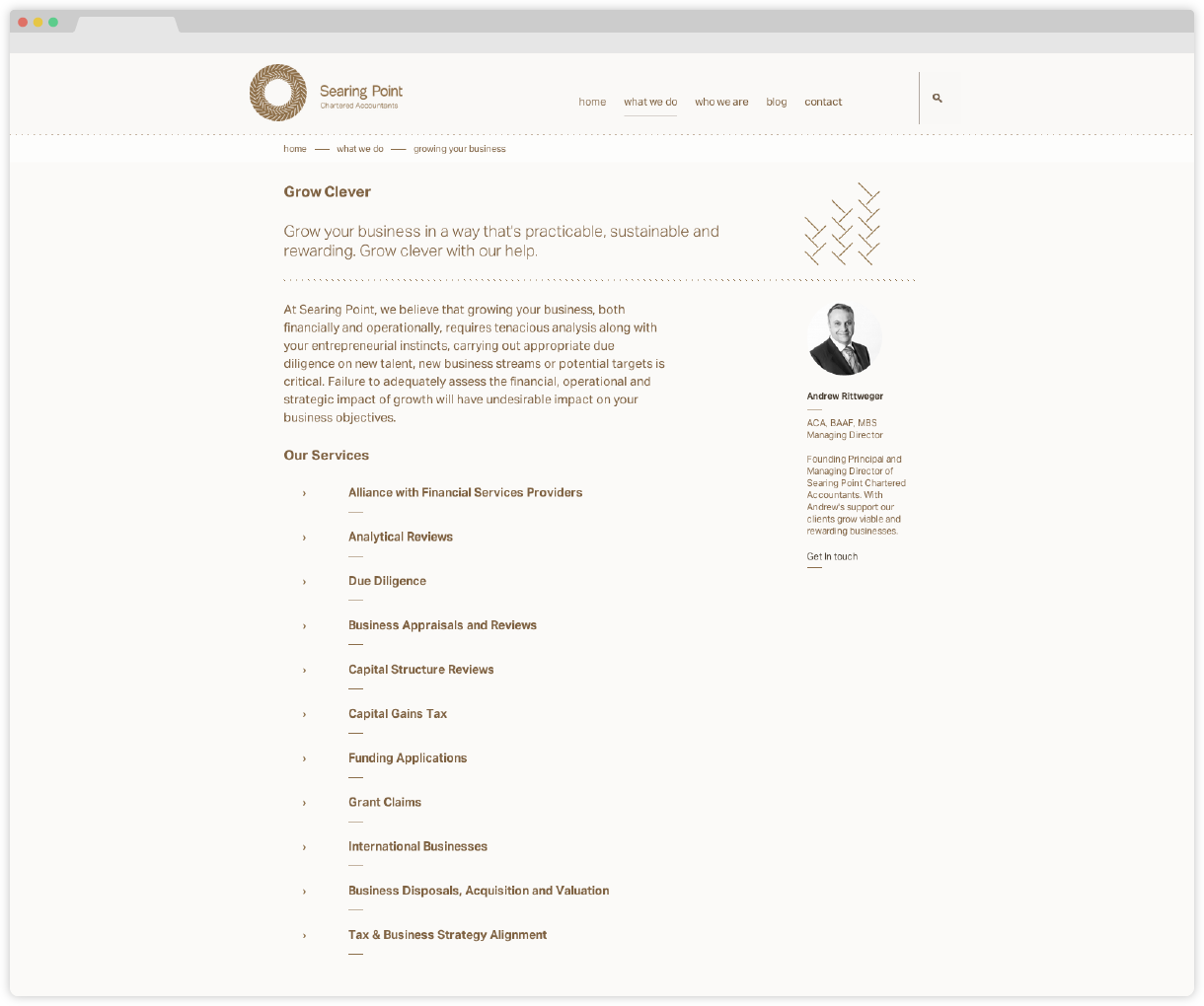
We developed an identity and series of communication tools to help them state their intention and set themselves apart in what is a traditionally conservative industry. We helped them turn their ideas into a series of core principals which are then used across communications. We conceived the name Searing Point, a bright point in the future that they wish to help businesses get to. This was reflected in the logo, copy and use of a dull gold as their dominant colour. A series of icons were developed from the logos visual language to help them communicate their core concepts.

