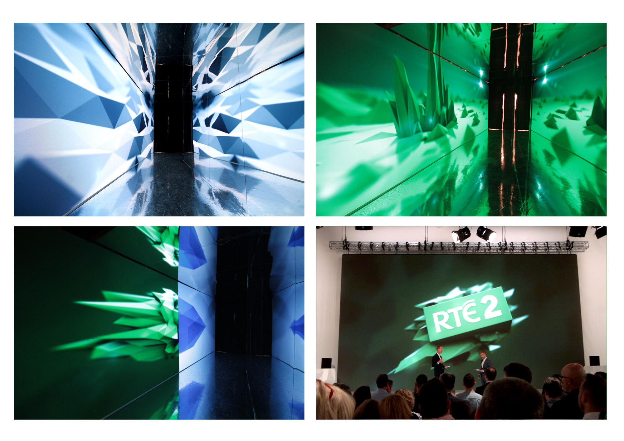
RTÉ2 New Season 2017
2011
Designed by Stephen Mac Devitt at RTÉ Graphic Design
Categories: Moving Image / Identity
Industry: Corporate
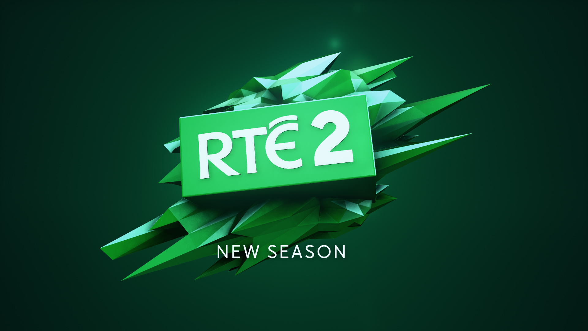
In August 2017 RTÉ unveiled its new season of programming for its younger channel RTÉ2. It was an interesting time for the channel as its target audience had shifted. The programming had evolved and was now aiming for an slightly older market. The channel need to reflect the fact that it had grown up & the more sophisticated needs of it’s viewers. However it it still remained the younger brother of the channels and still had it’s punky edge.
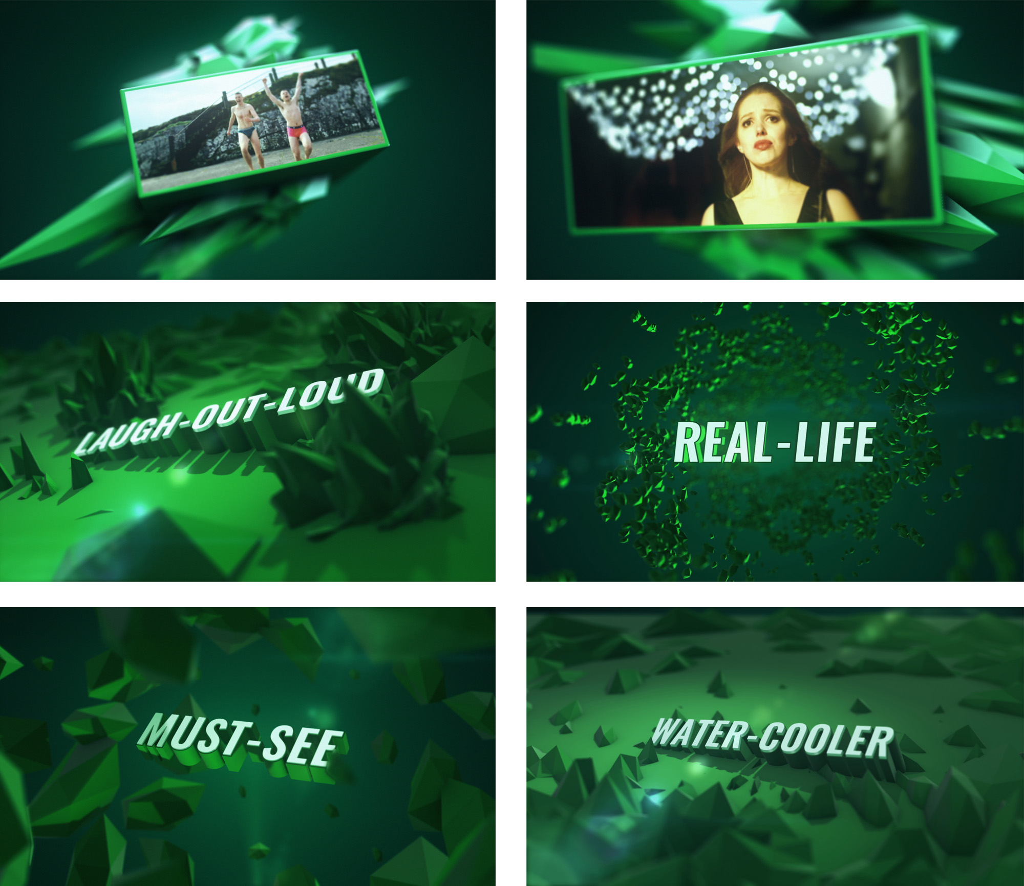
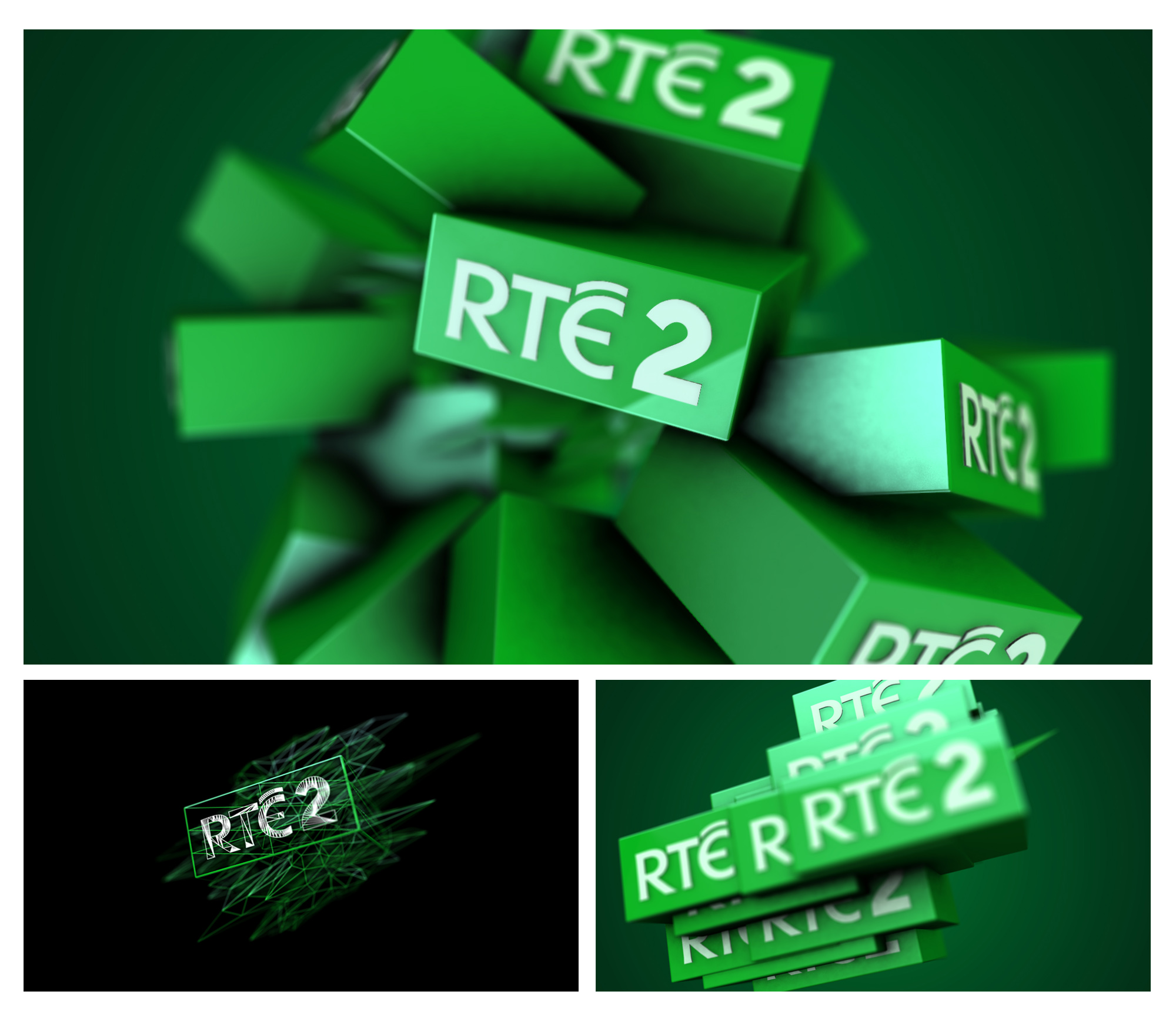
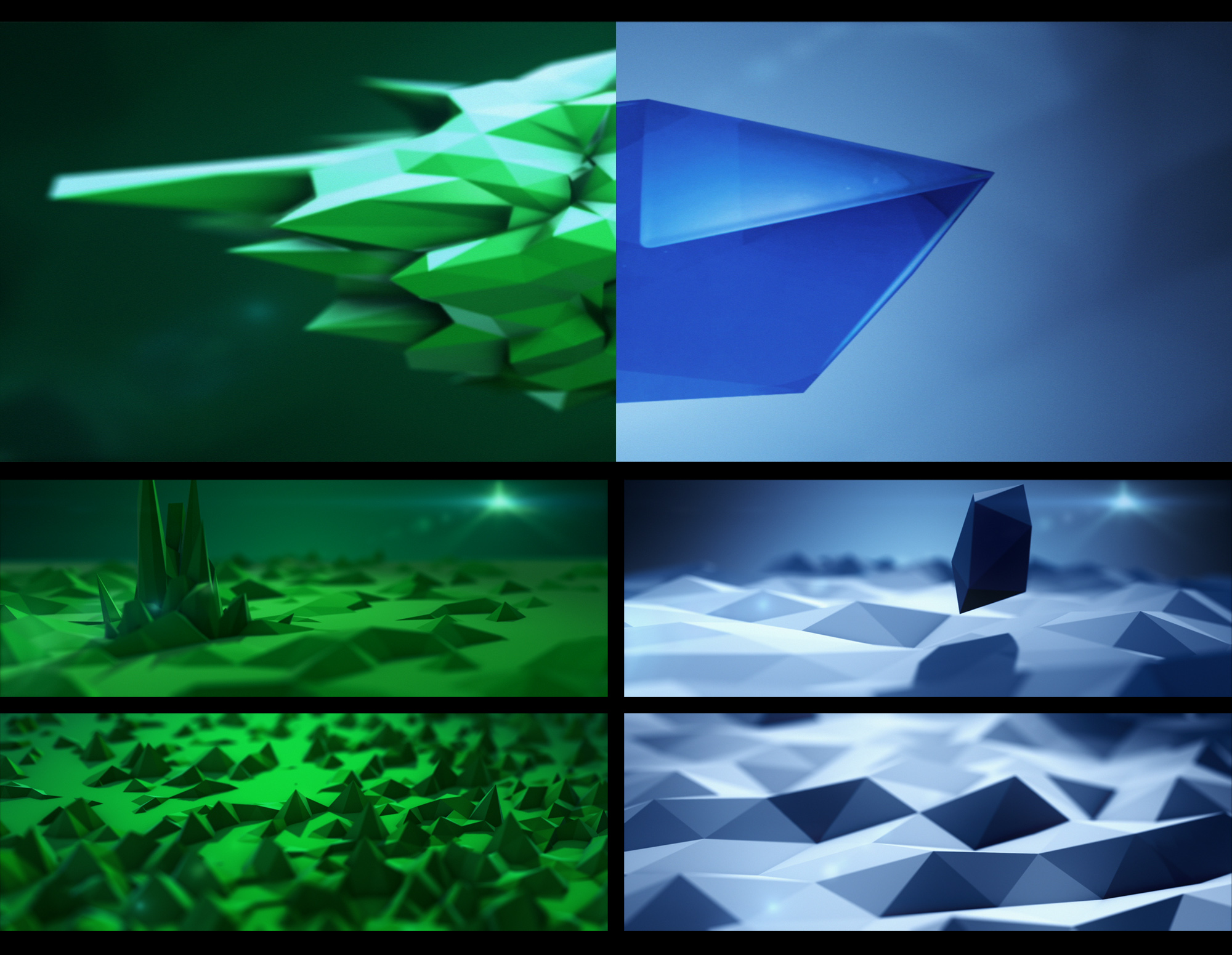
With RTÉ One taking a very polished gem it’s motif RTÉ2 distorted this shape, giving it an edge to echo it’s rawer content. Once the core look was decided this was then rolled out across all the necessary outputs, from the animations for the on-air promotions and their the chapter headings, specially created endboards to online and print templates to reflect a cross platform look for the new season.
For the press launch held at RTÉ the audience were brought into a remodelled Studio 4 with a huge video wall. To get there they were first brought through a reflective tunnel which had abstract animations playing on loop and reflected on all sides as a way to throw their senses before the entered the vast white studio which let the new programming be the centre of attention.
