Remnant
2024
Designed by Louise Reddy (Freelance)
Photography and Video Stills: Willie Doherty
Author: Willie Doherty
Publisher: Solstice Arts Centre
Printer: SYL L’ART GRÀFIC PREMIUM
Categories: Printed Publication / Print / Editorial / Publication
Industry: Cultural
Tags: Contemporary art / Photography / Typography / Visual art / Art
Remnant was published to accompany the exhibition of the same name by Willie Doherty at Solstice Arts Centre in April–June 2024. The exhibition’s multi-layered installation—incorporating voice, soundscape, still and moving images— investigated the interconnectedness of place, time, and memory. The publication’s format and materiality directly reflect these themes.
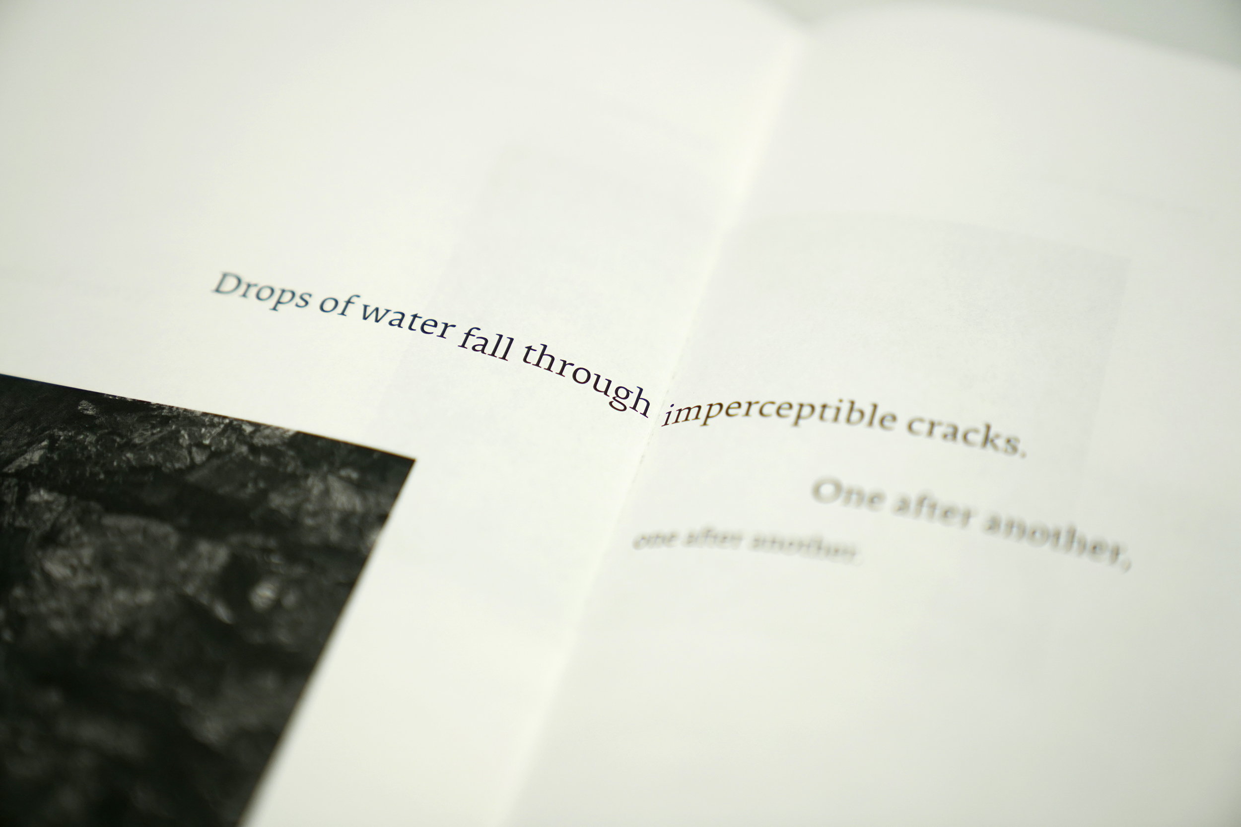
The primary function of the publication was to provide printed record of three spoken-word texts authored by Doherty, performed by Stephen Rea, and presented as simultaneous audio recordings within three interconnected spaces. Design decisions draw inspiration from the fluid, fragmented nature of recollection, engagement with memory, temporality, and spatiality.
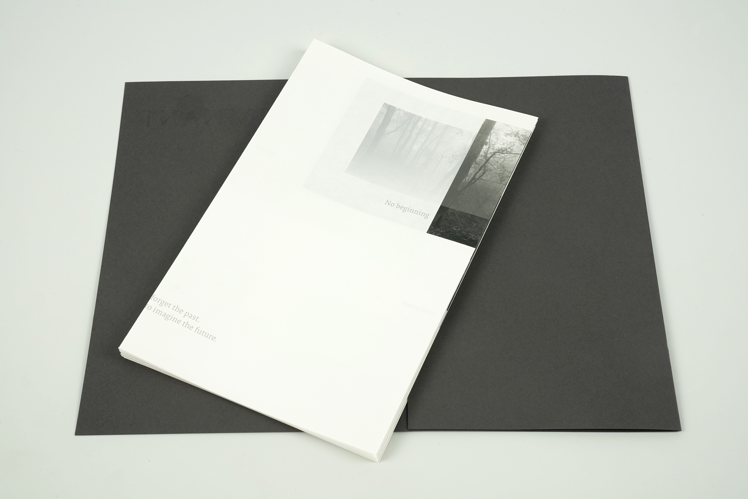
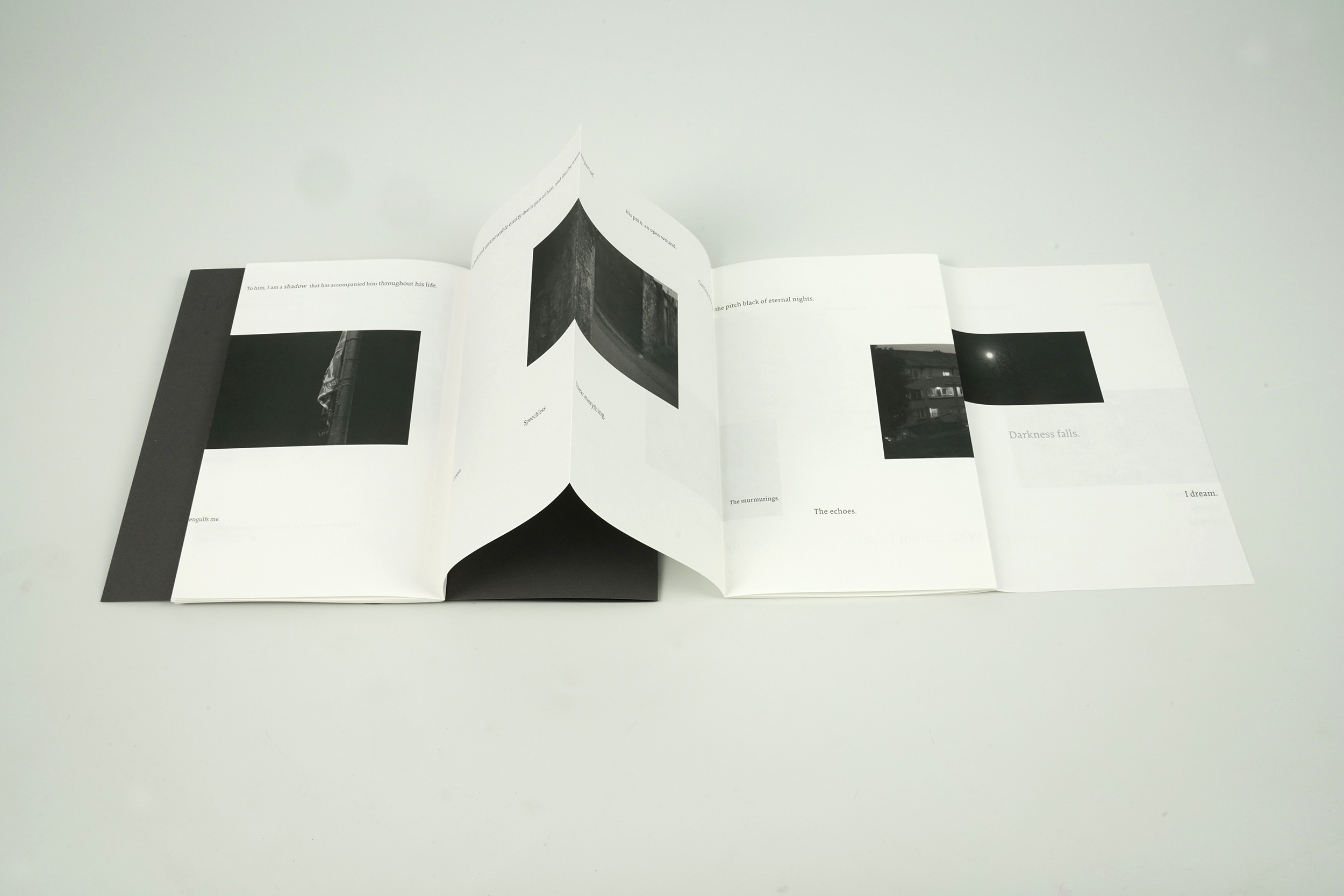
Adopting a leporello, enables a non-linear reading experience, reinforcing memory’s instability and open-endedness. The lightweight 90gsm paper further accentuates this ephemerality, with subtle translucencies generating an interplay between text and image as pages turn.
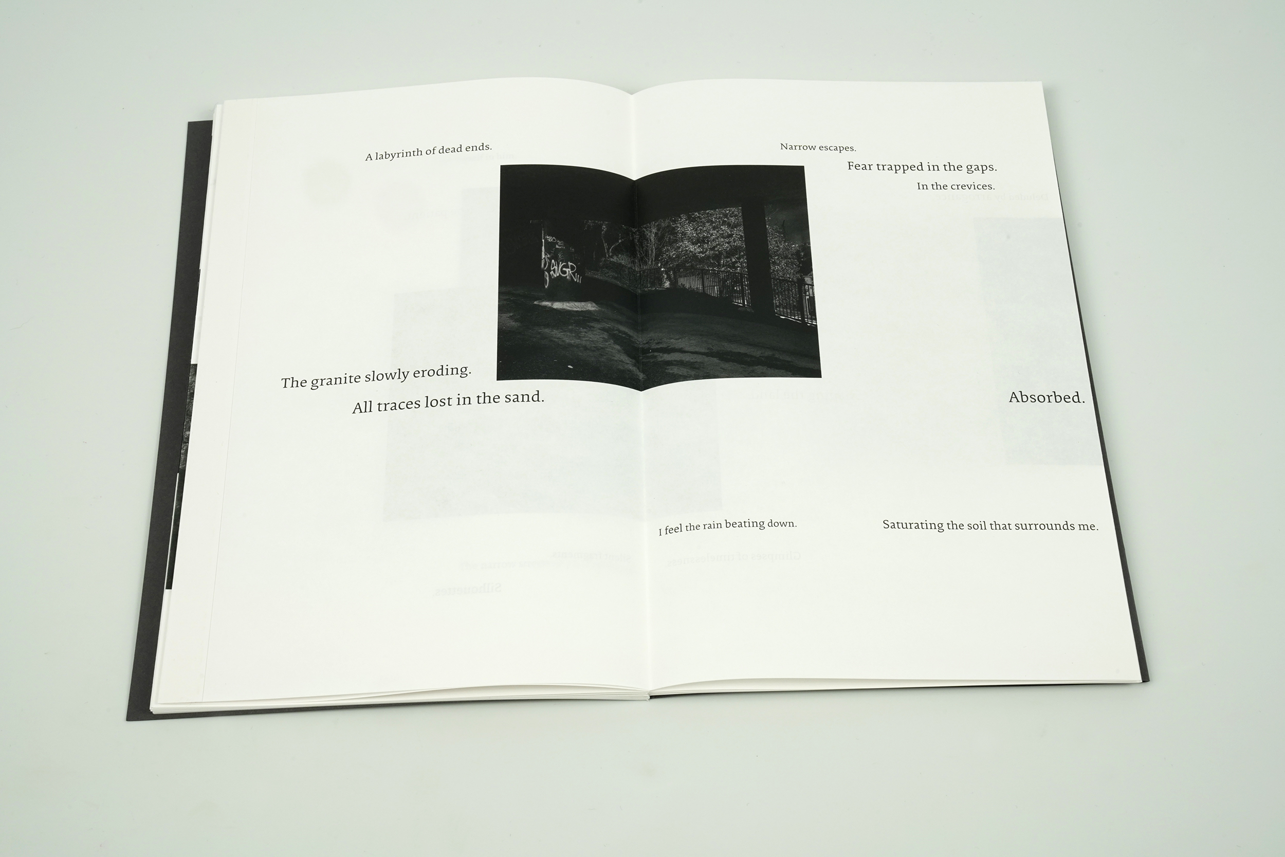
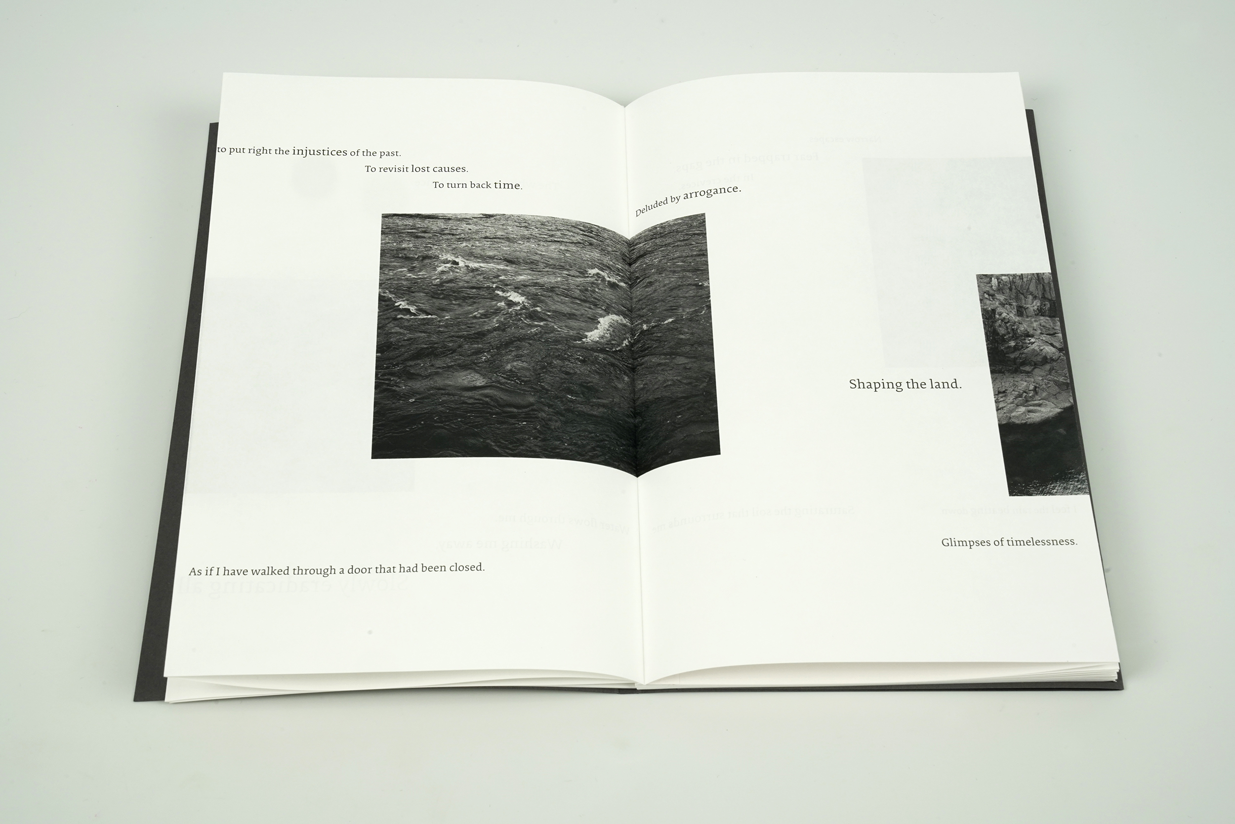
The three texts are consistently positioned within the leporello but begin at different points, mirroring the fragmented and discontinuous experience of memory. Typeset in Collis Roman at a uniform weight, the typography underscores recollection’s singularity, while variations in type size and the selective use of silver ink introduce shifts in emphasis, particularly in moments of introspection or enquiry. These typographic nuances reflect the mutability of memory, shaped by both time and perspective.
Accompanying the texts are images drawn from Doherty’s photographic works and video stills, establishing a dialogue between textual and visual registers. Strategically placed across folds—at times partially obscured—the images reflect the mechanics of recollection, where certain details emerge while others recede. The opening image employs distinct production techniques, with one segment overprinted in silver and another printed on the reverse, reinforcing the multiplicity and impermanence of memory.
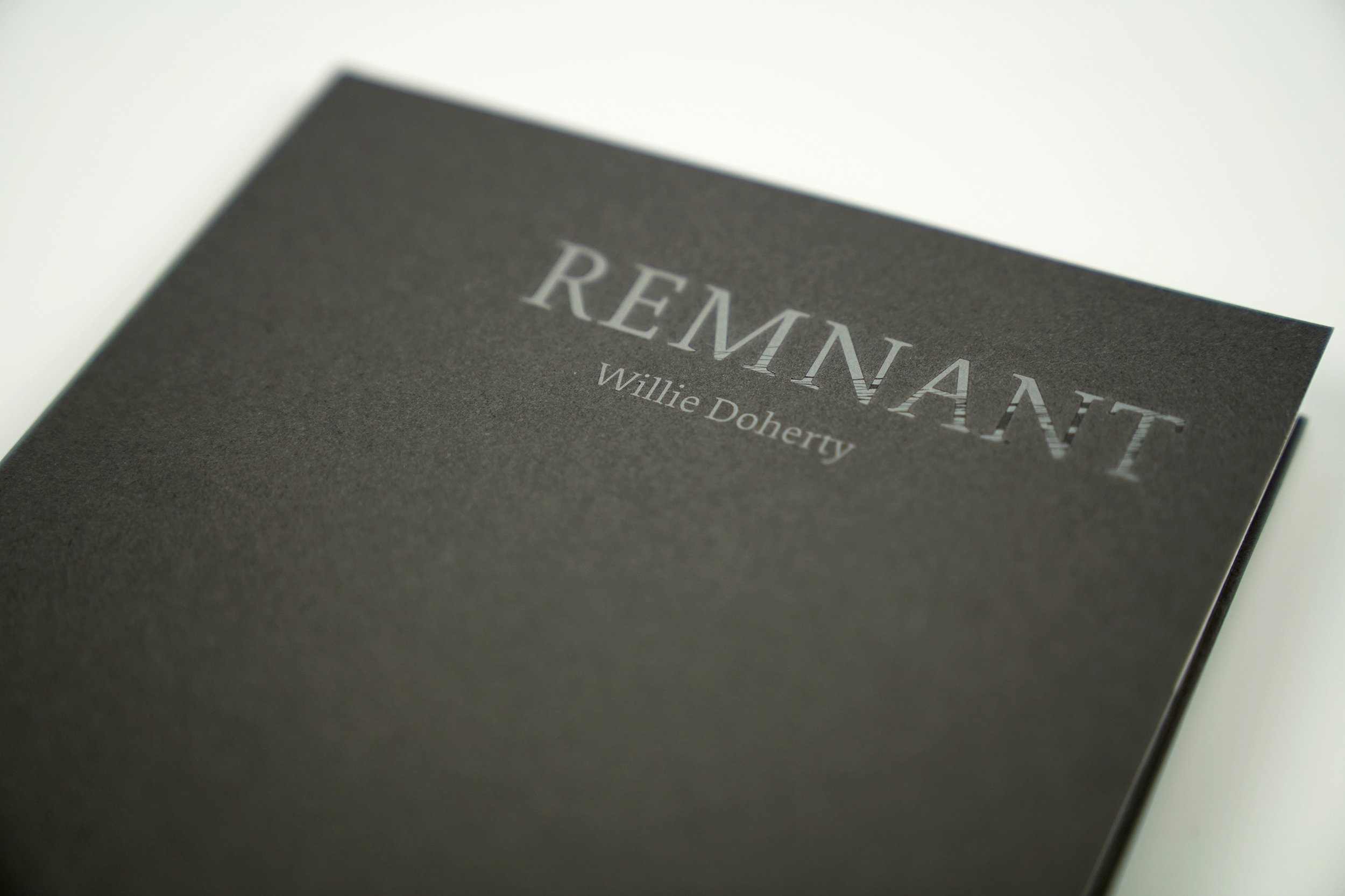
The publication’s minimal grey cover, with its debossed title, echoes the exhibition’s themes of erosion and temporal passage. The leporello remains unbound within this cover, leaving fragments visible at the foredge—reinforcing memory’s dual nature: persistent yet elusive, always shifting in form.
210mm X 2830mm leporello folded to 135mm, Lithographic printing, full colour both sides plus Pantone metallic silver. Typeset in Collis Roman designed by Christoph Noordzij. Substrate used in production: 90gsm Arena Natural Smooth, Debossed cover: 290gsm Sirio Color Anthracite, Printed at SYL.