Reckham
Designed by Max Phillips at Signal Type Foundry
Categories: Typeface
Industry: Commercial
Tags: Typography
Website: signalfoundry.com/typefaces/reckham
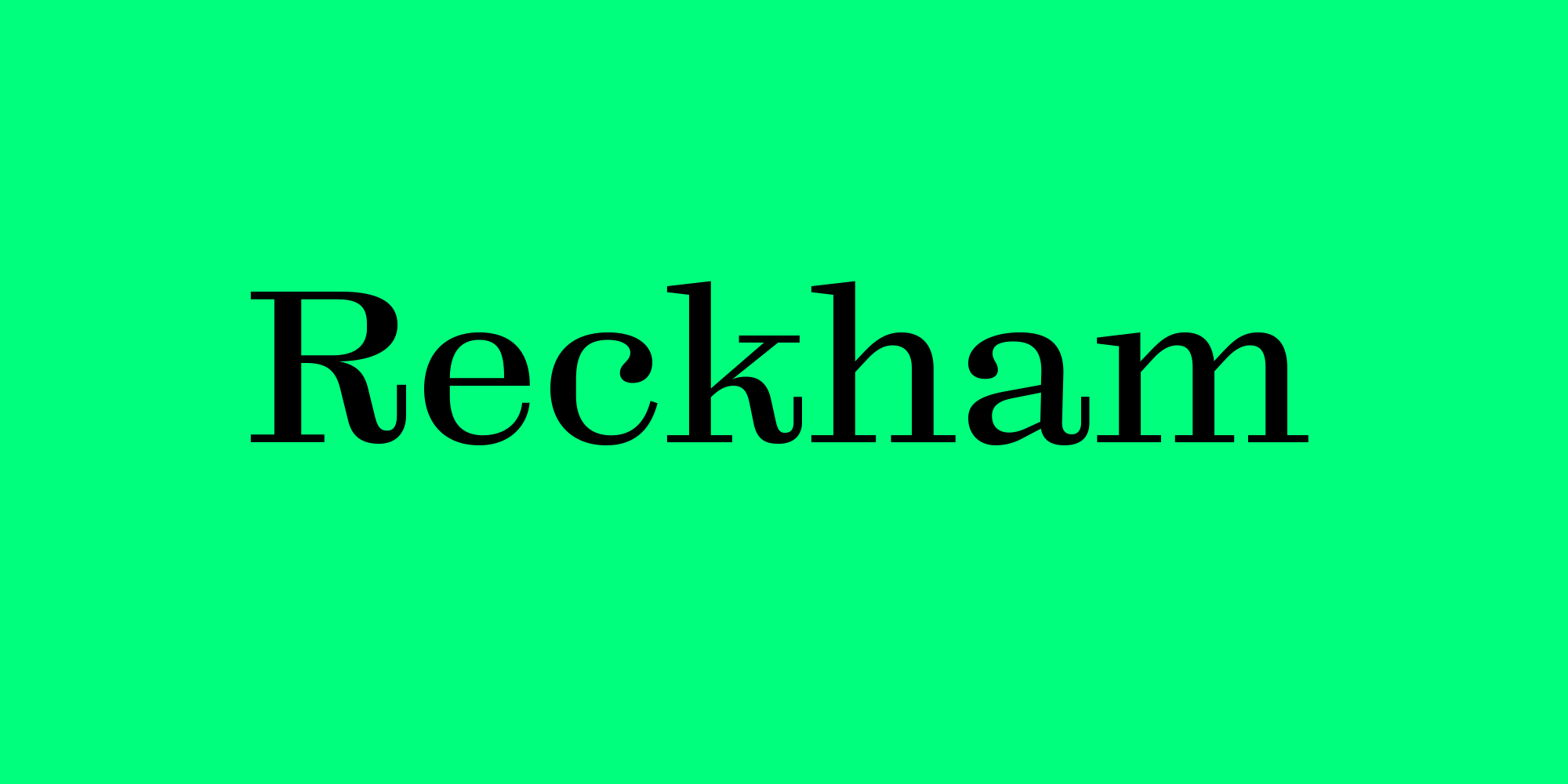
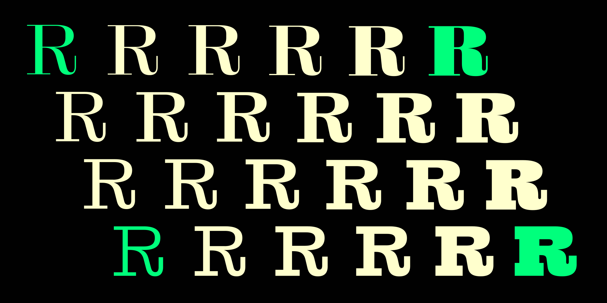
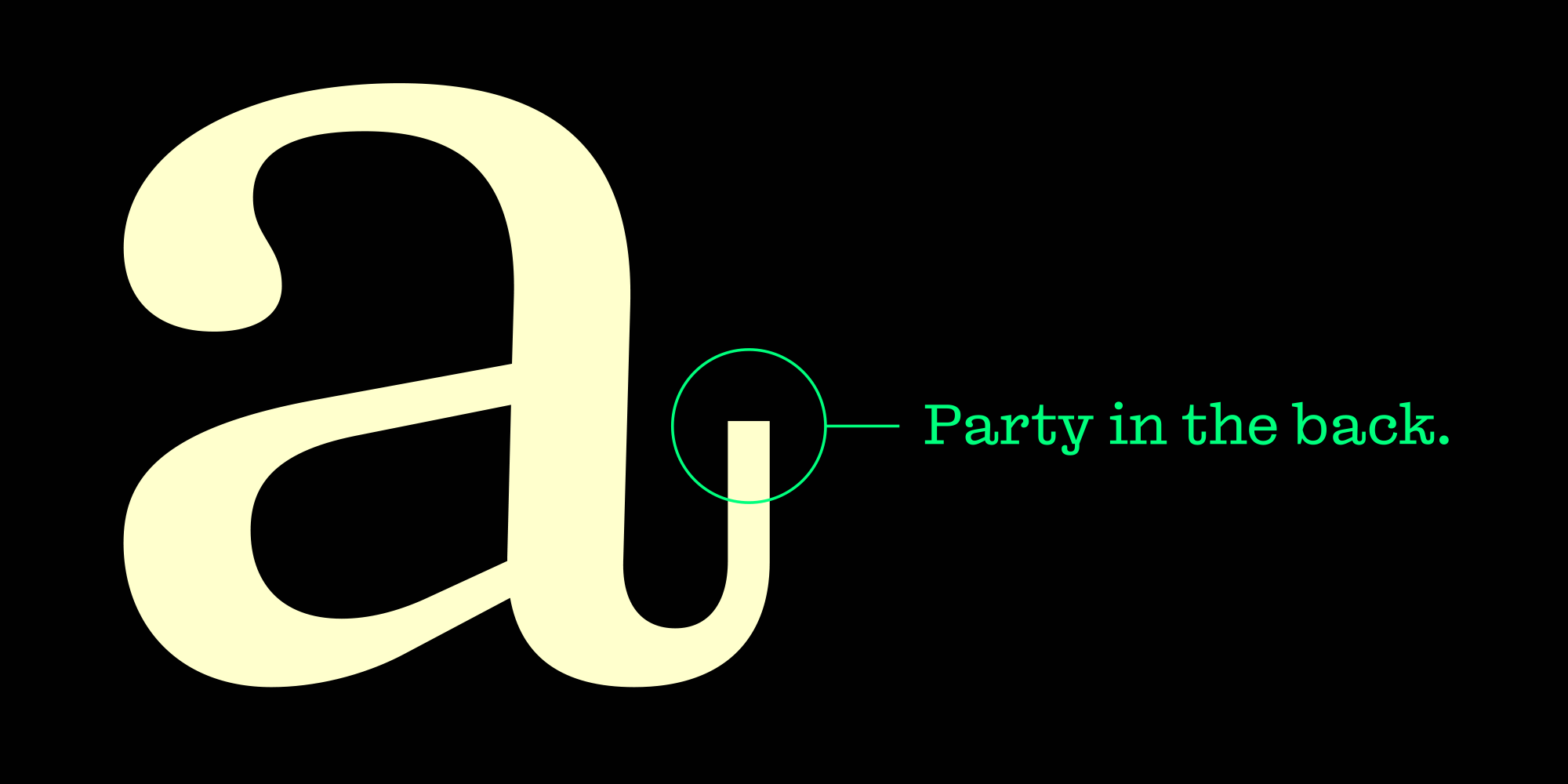
Reckham is a mutant Scotch Roman. We wanted to draw a Century Expanded that turned Clarendon when it got bolder, but somewhere along the way the serifs came unbracketed and our ideals of clarity and rigour had to make room for a few eccentric details. Then we couldn’t decide on a degree of contrast, so we went with all of them. The №1 Series, with its hairline thin strokes, is nearly Didone, and its blackest weights are Fat Face. The nearly monoline №4 Series is typewriterish in the lightest styles and Egyptian in the darkest. №2 and №3 Series represent sturdy and quite readable steps along the way. Along with 24 static styles, the full Reckham family includes a variable font so that users can fine-tune weight and contrast themselves.
