Pure Brazen (2011)
Designed by Rachel Kerr at CI Studio
Creative Director: Mel O'Rourke
Categories: Identity / Packaging
Industry: Commercial
Website: purebrazen.com
The objective of the project was to create a consumer brand for a new range of natural Irish stock including a name which reflected the personality of the two guys behind it and which communicated the product and its strengths without the use of the word stock which may have restricted the company/brand’s growth down the line.
Pure Brazen was born…‘Pure’ referring to the wholesome aspect of the brand and ‘Brazen’ alluding to the braising of meat which conjures up taste. Also “brazen’ is suggestive of character and attitude, reflecting the sentiment of the two founders as they endeavour to challenge the big players in this market segment.
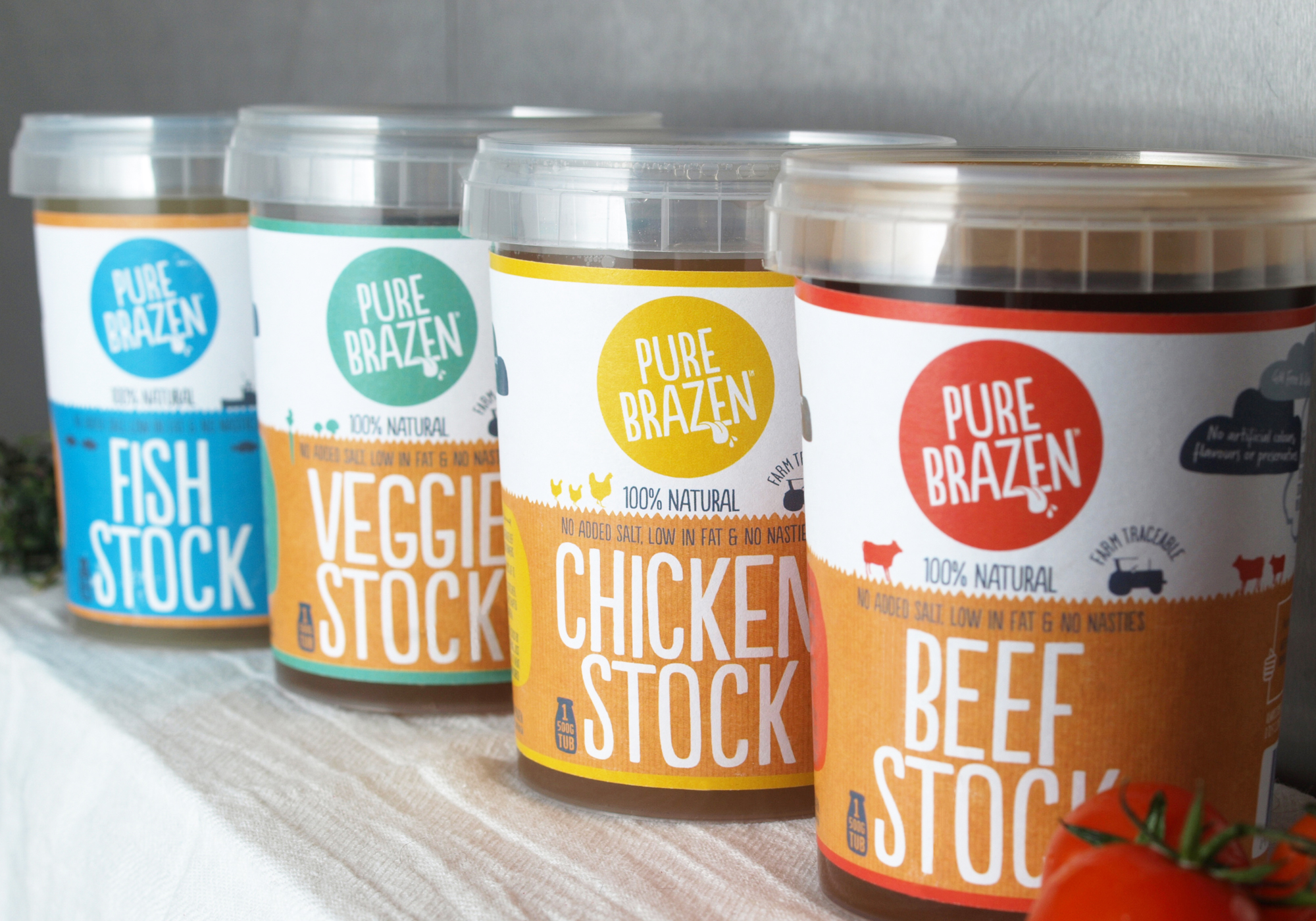
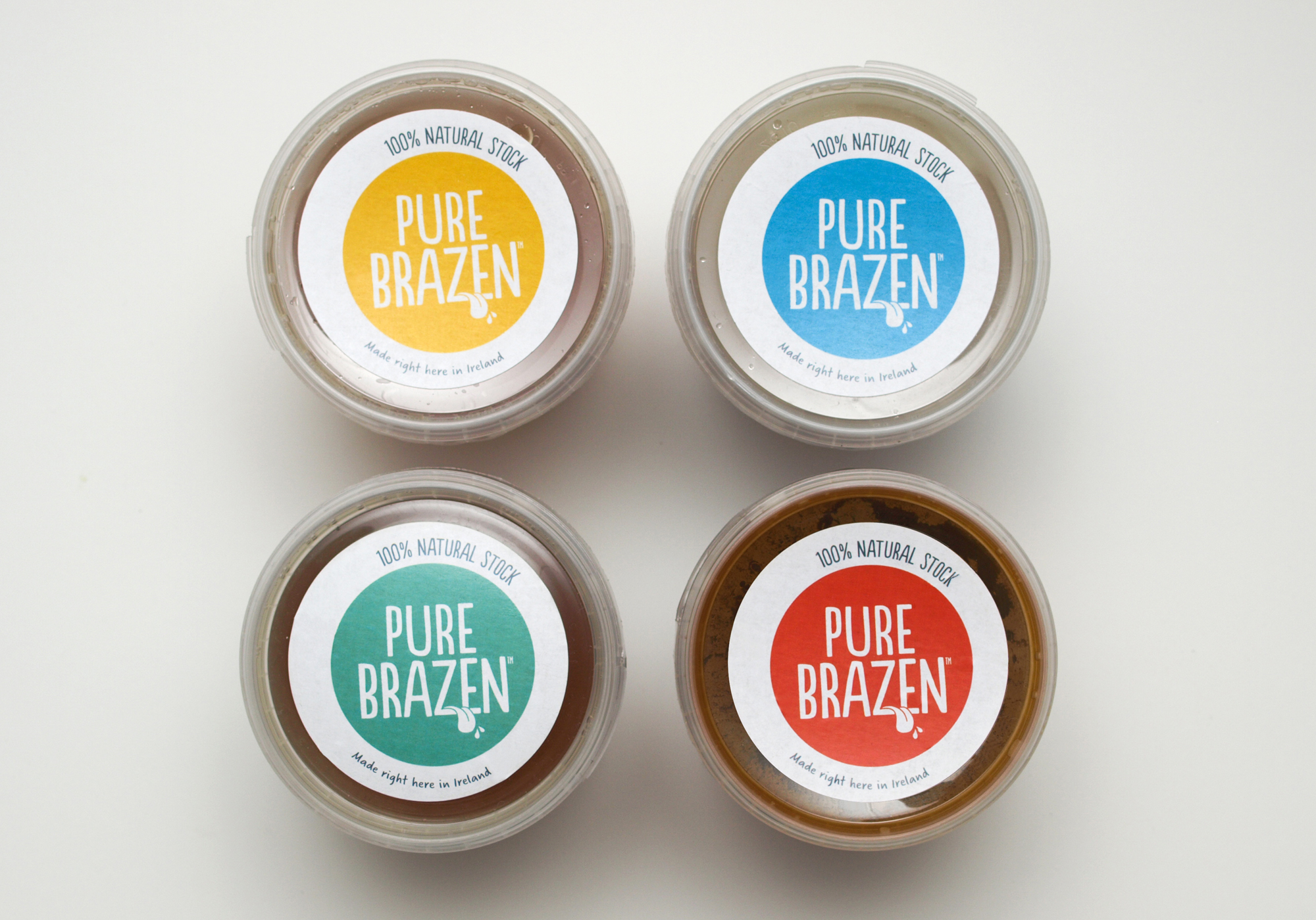
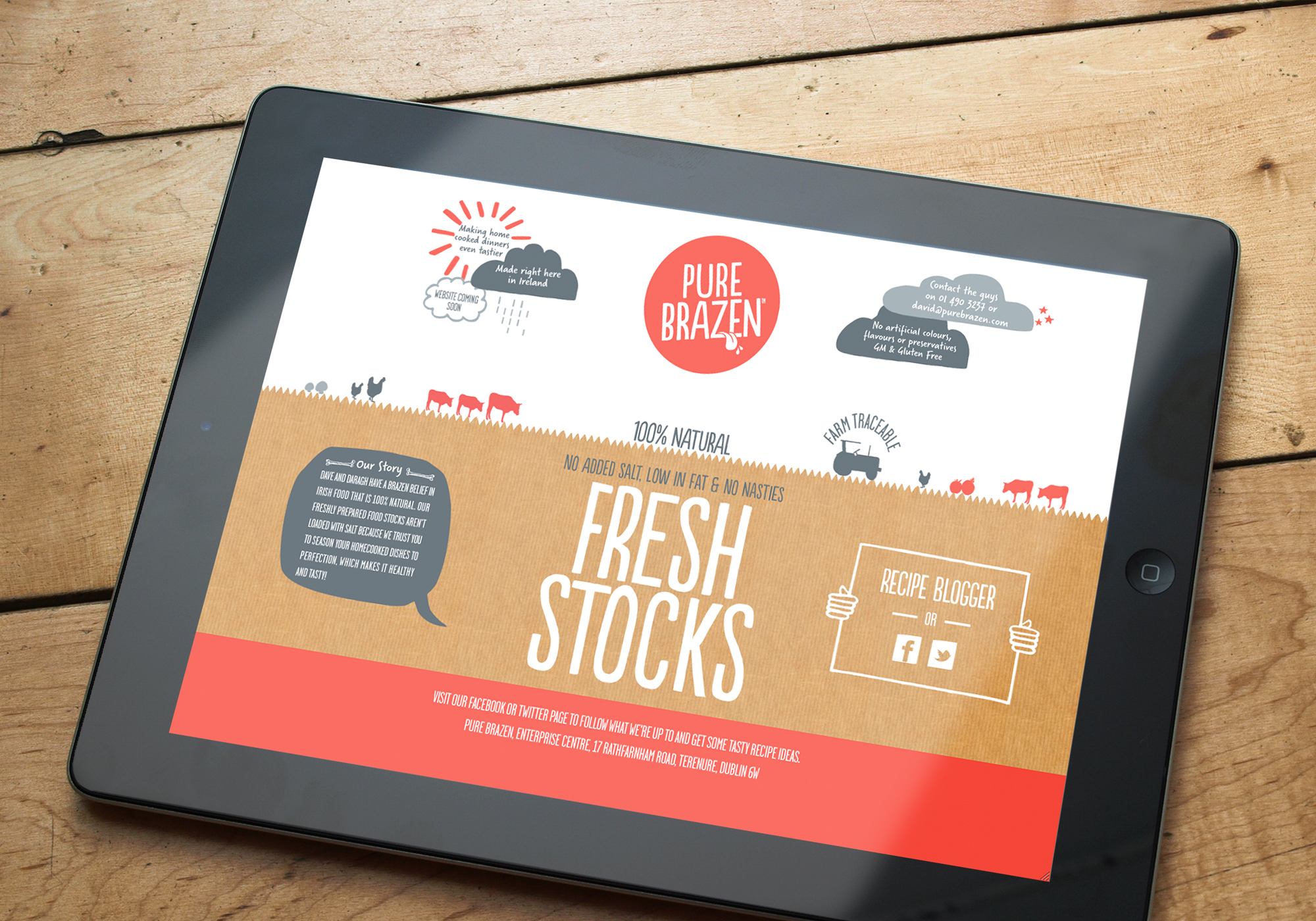
The logo was designed to stand out in a retail environment. It behaves like a large sun that sits above the landscape. The tongue is a nod to both taste and sentiment. What can seem like mundane details are integrated into the overall design so that the whole brand has a consistent and memorable feel. A landscape scene has been created for each pot referencing either a farm landscape for all the meat and vegetable products or a seascape for the fish stock with strong colour used to differentiate each.


