PTSB Serif & Italic
Designed by David Torpey, Éanna O_Shea and Bobby Tannam at Image Now
Type Designer: Bobby Tannam
Categories: Typeface
Industry: Corporate
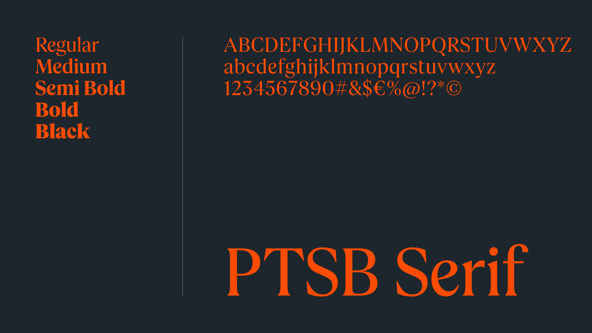
During the rebranding of Permanent TSB to PTSB, our goal was to develop a contemporary, approachable typeface that projected confidence with a customer-centric touch. An audit of the Irish banking landscape revealed that many competitors were opting for sans-serif typefaces, and very few were utilising serif typefaces. Recognising this gap, we saw an opportunity to create a serif font that was not only modern but also enduring.
Simultaneously, as we worked on crafting a logotype for the brand, we aimed to find a typeface that would seamlessly complement it and serve as the new 'voice' for the brand.
In close collaboration with typographer Bobby Tannam, we prioritised the design principle of 'clarity with character'. We delicately softened specific characters such as the 'e,' 'b,' and 'p' with subtle curves and arches, ensuring a well-balanced, easily readable and accessible design. We experimented with the levels of serif-ness, aiming to strike the perfect balance between heritage and modernity.
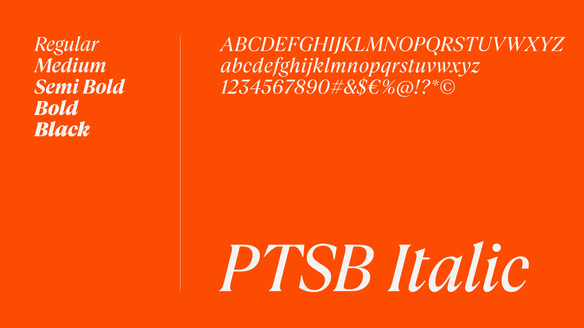
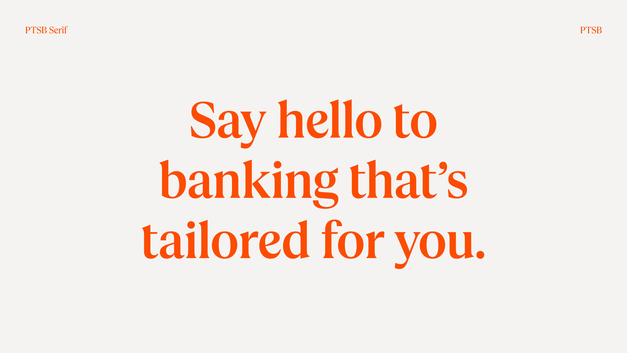
To infuse a touch of Irish heritage, we introduced a distinct detail by confining the cross to a single stroke in the letter 't.' This nuanced yet impactful addition adds a layer of cultural resonance to the brand and it was also a key feature in the logomark. The typeface, available in multiple weights, encompasses a decorative italic variant, fostering creative adaptability and introducing further nuanced tones to the brand.
The PTSB serif family comprises regular, medium, semi-bold, bold, and italic weights. Marking a significant departure from the generic fonts previously used, the newly crafted bespoke typeface, and logotype, have helped to reposition PTSB as an esteemed bank with a warm, Irish, and inherently helpful identity.


