Prosper² Brand Elevation
2024
Designed by Kerry Lyons at Ebow
Motion Design: Lucas Ribiero
Categories: Promotional / Print / Identity / Moving Image / Signage / Social Media
Industry: Corporate
Tags: Typography / Digital / Interactive / Campaign / Icons / Advertising
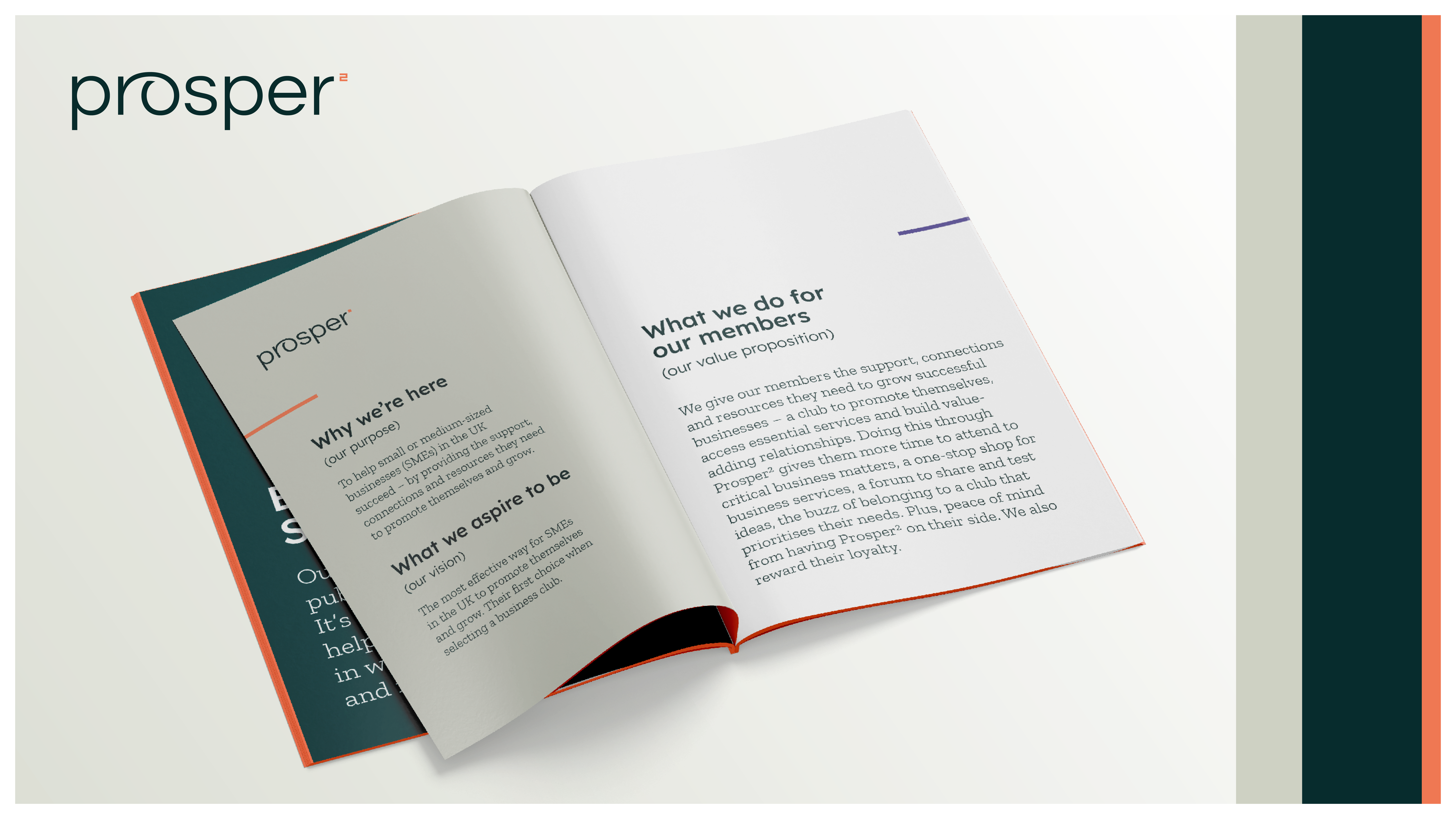
Prosper² (“Prosper Squared”) is a dynamic business club designed for UK entrepreneurs, innovators, and founders. It provides an ideal space – both online and in-person – for members to connect, grow their businesses, and feel supported in their journey.
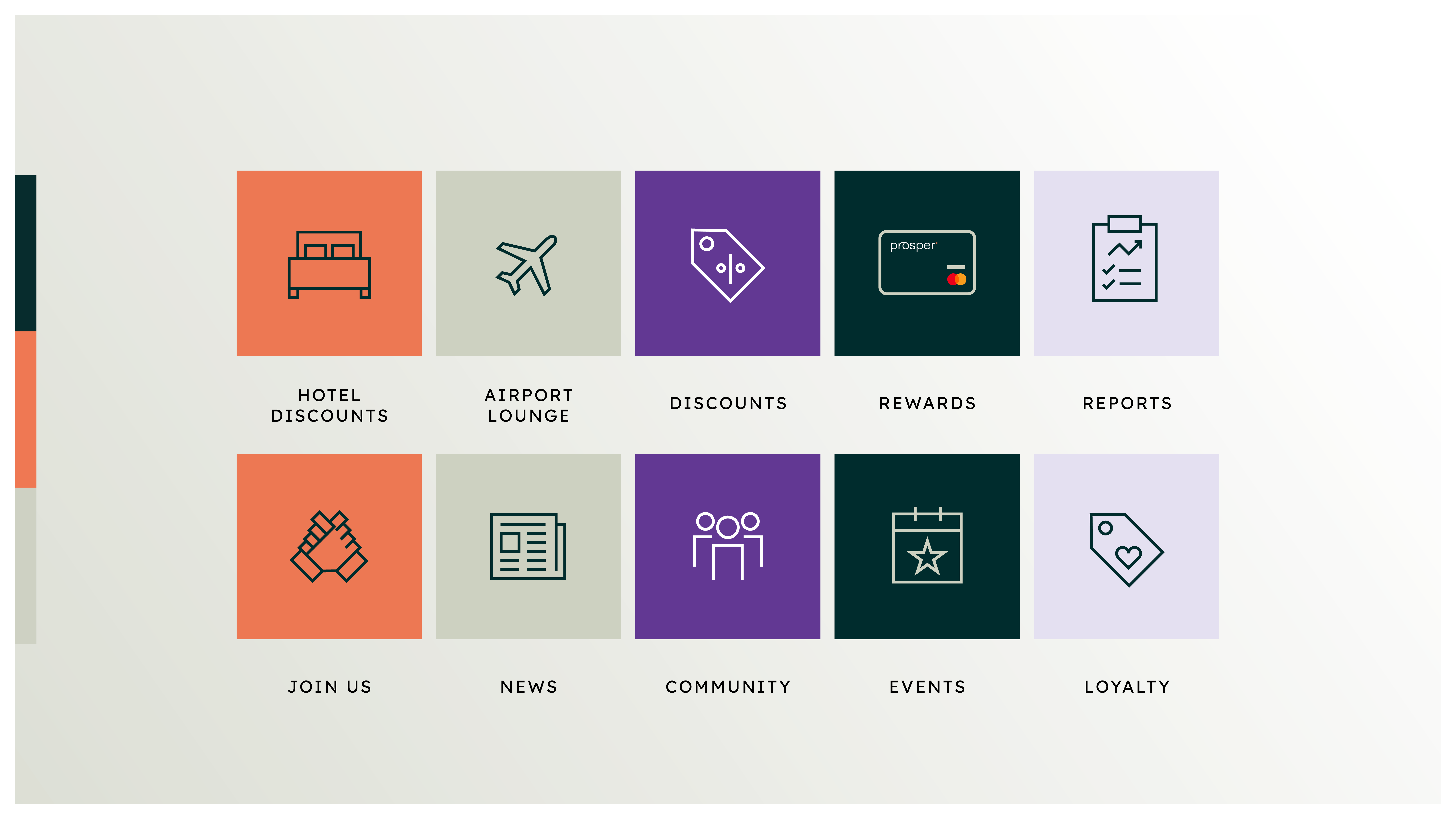
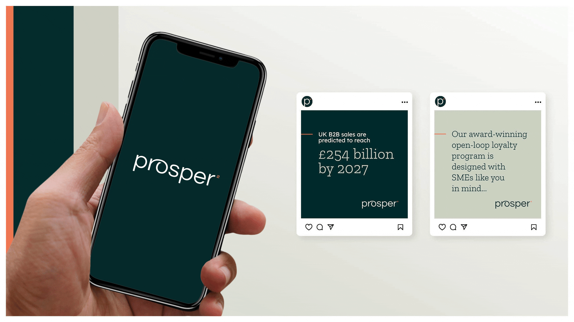
More than just a network, Prosper² enables collaboration, knowledge-sharing, and access to essential services. Members also benefit from a unique card-based rewards scheme, earning points for their loyalty while offering the same incentive to their own customers.
After many years with its signature brand marque, Prosper² partnered with Ebow to evolve its identity – one that reflects its growth and its ambition to be the business club of choice in the UK.
The brief was clear: position the brand as energetic, inspirational, and transformative, while staying true to its approachable and relationship-driven roots.
To achieve this:
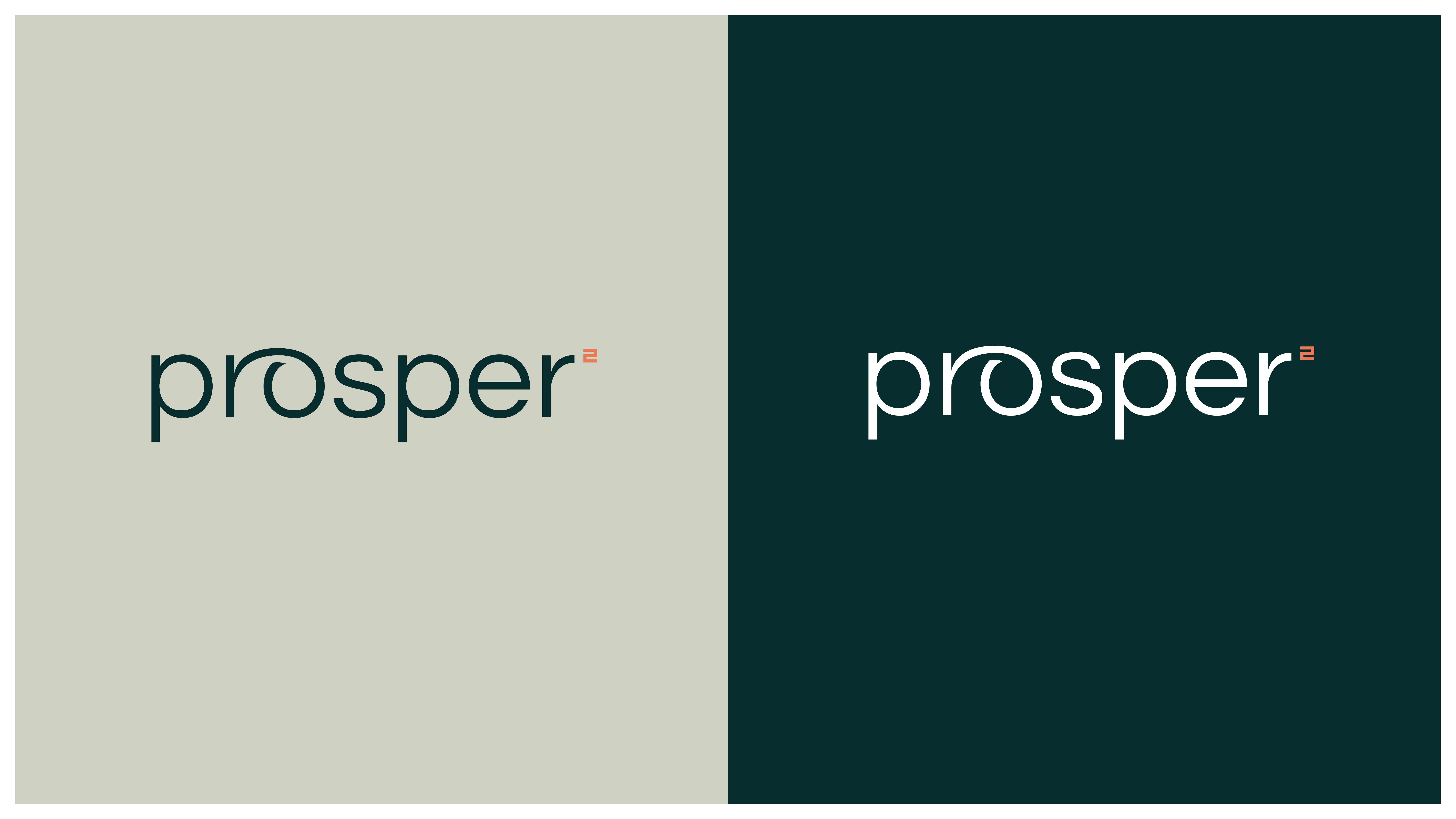
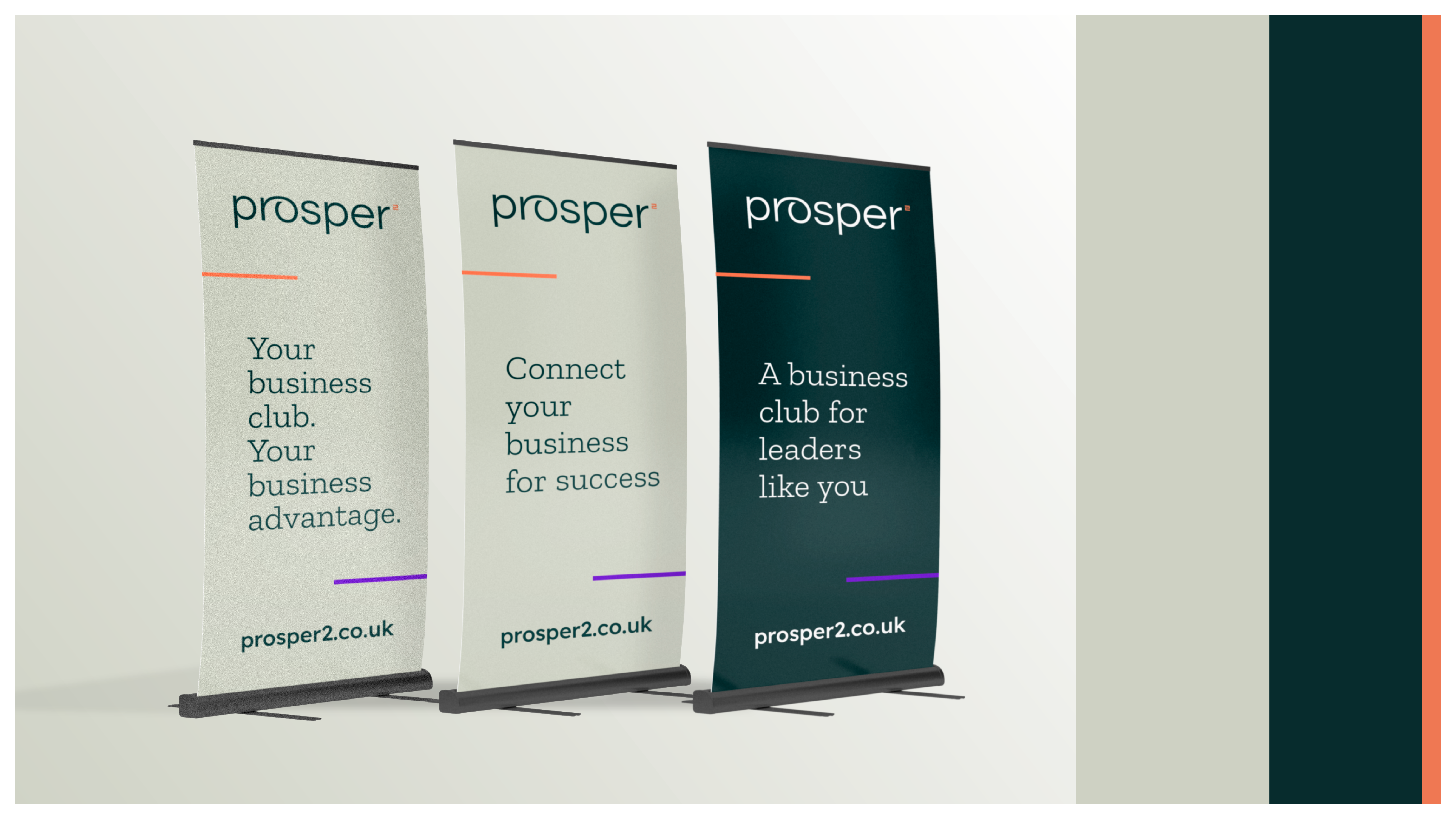
– We introduced a lowercase, sans-serif logotype to reinforce warmth and accessibility.
– The ‘reach-around’ device between the ‘r’ and ‘o’ symbolises movement and the supportive nature of the club – like a reassuring arm around the shoulder.
– The superscript ‘²’ in a perfect square ensures clear pronunciation of “Prosper Squared.”
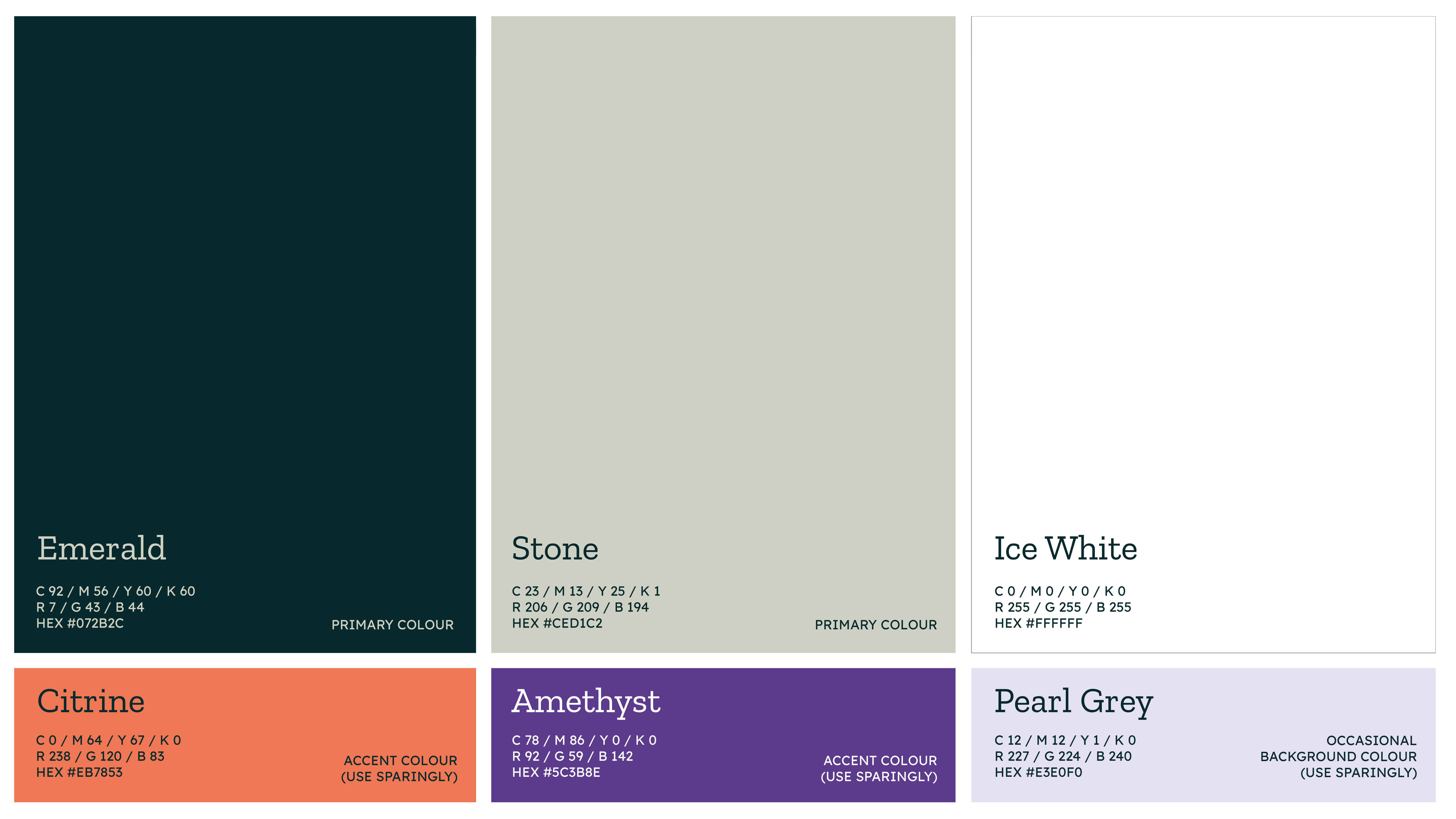
– A refined colour palette of emerald green and stone grey reflects stability and empowerment, with vibrant accents of orange and purple to express energy, transformation, and inspiration.
The result? A refreshed identity that embodies Prosper²’s purpose: a club built for its members – supporting UK businesses as they grow, connect, and thrive.