Pressio Typeface
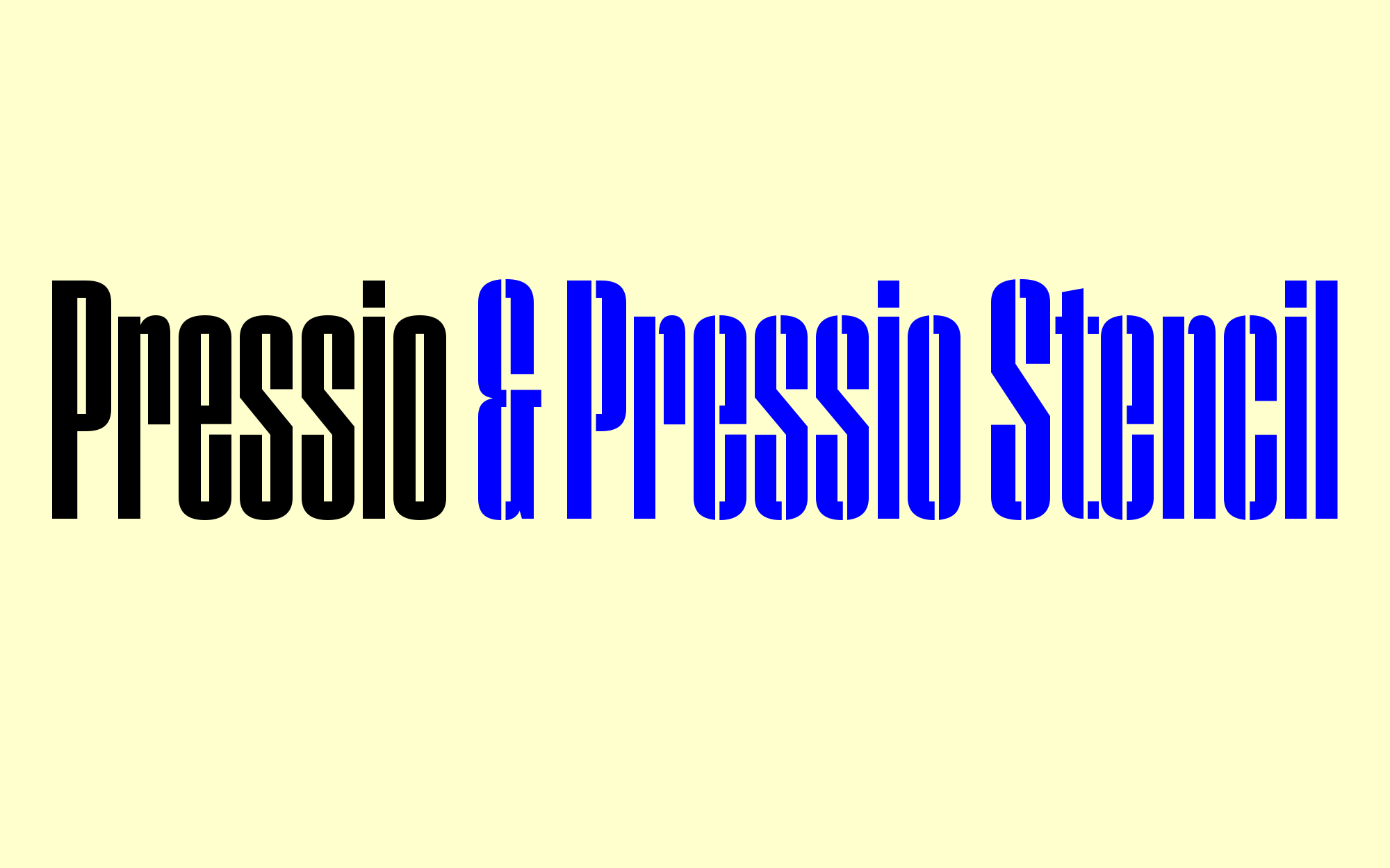
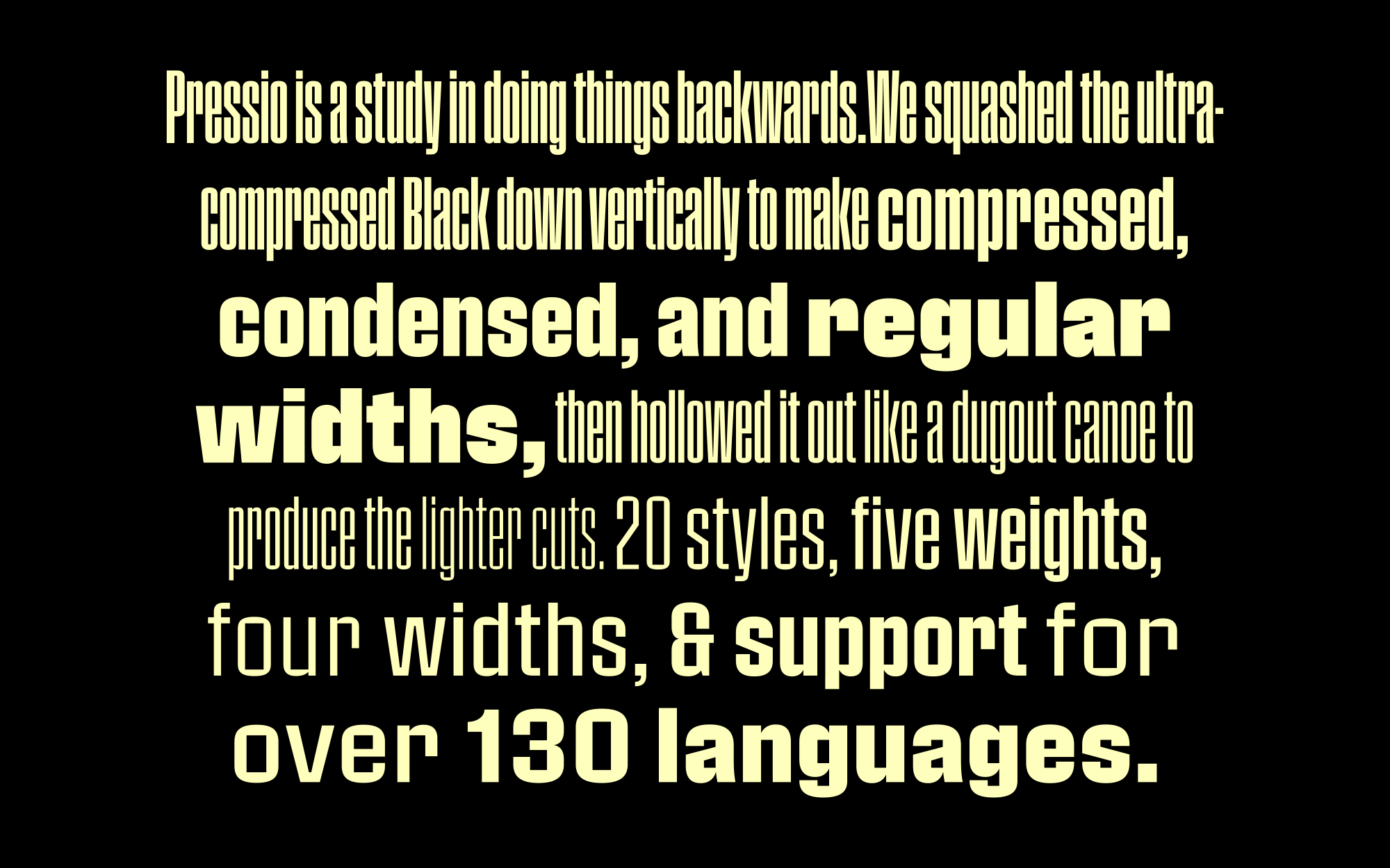
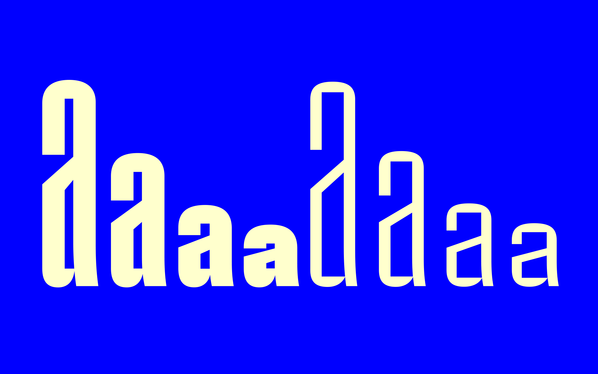
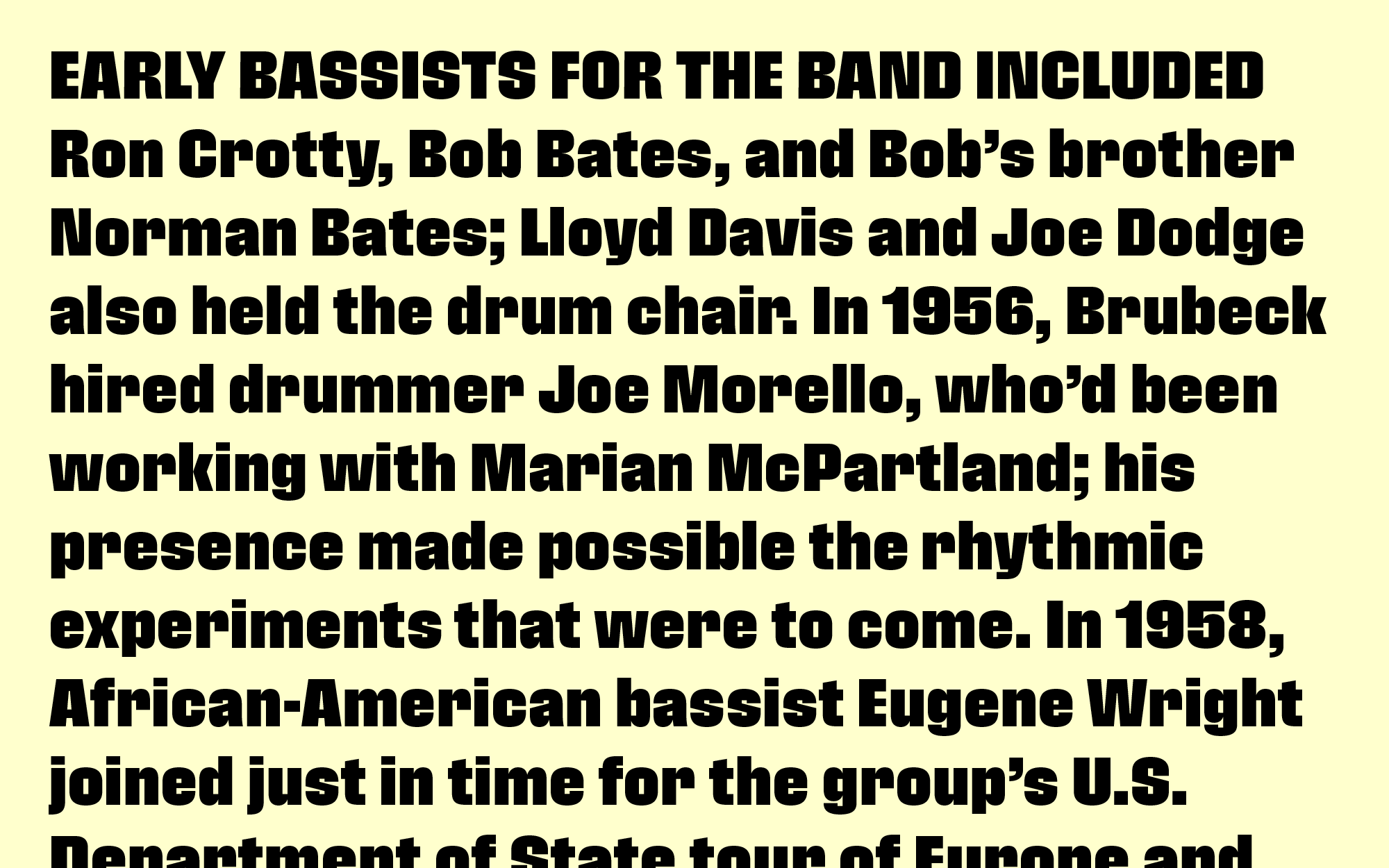
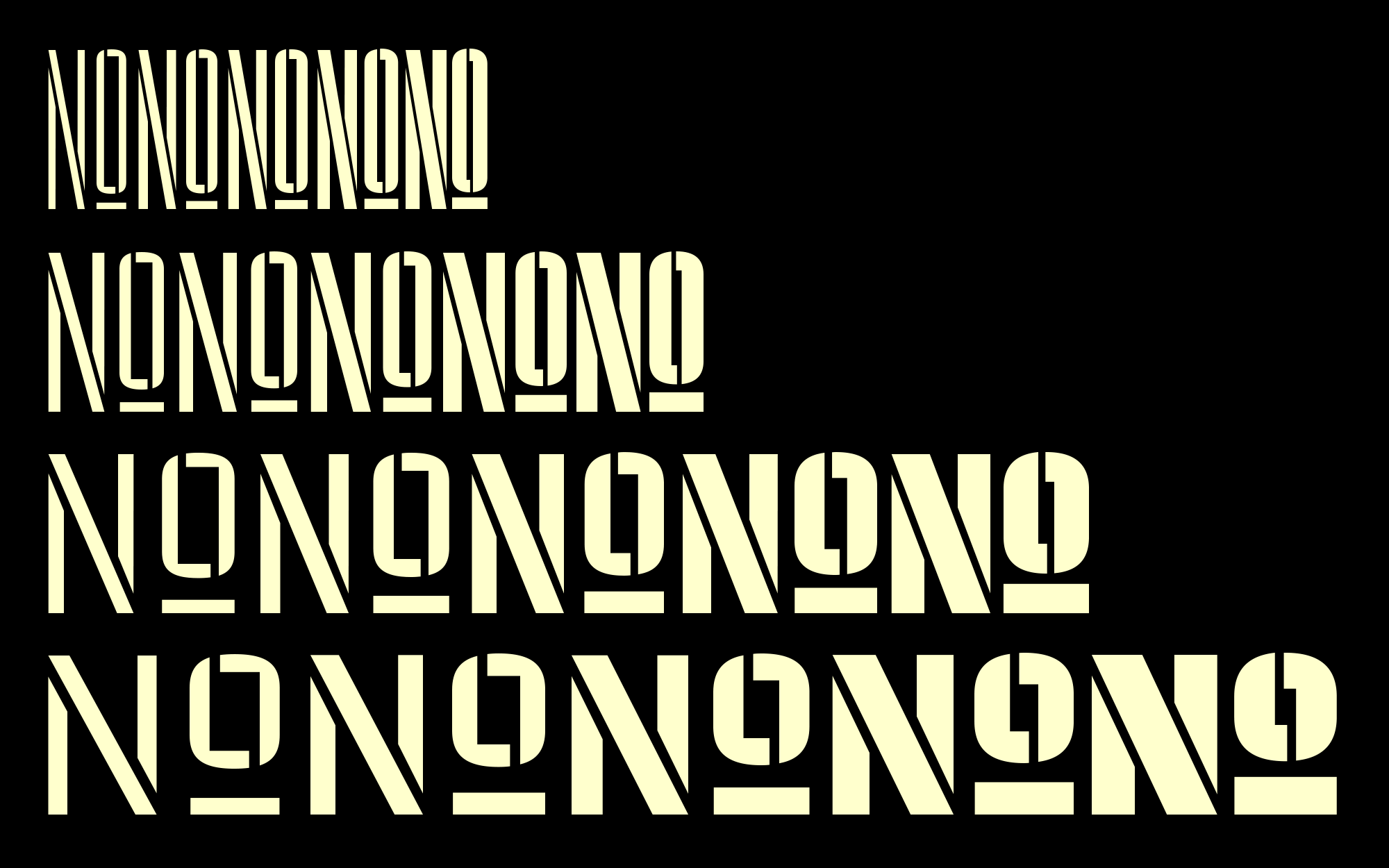
Pressio is a study in doing things backwards. It began with the weight that’s usually drawn last: the ultra-compressed black. This was squashed down vertically in increments to make the compressed, condensed, and regular widths, then hollowed like a dugout canoe to produce the lighter weights. The narrower bold cuts are inspired by the great mid-century skyline sanses. The widest cuts are stark, idiosyncratic, and intense. In between, 20 styles in five weights and four widths provide a broad range of expression. Forms are strict and modular. The x-height is high. Curves are subtly superelliptical, and square counters add crispness. Naturally, it goes well with its sister family, Pressio Stencil, which applies stencil cuts to all four widths and five weights for an additional 20 styles. The result is Mid-century Modern with a touch of packing crate. For those who prefer it, all 40 styles provide a set of alternates to round off some of the unexpectedly sharp corners of letters like S, s, and a. Case-sensitive punctuation and delimiters are included, and a full range of diacritics provides support for over 130 languages.
