Powering Purpose for Sustainable Impact: The Purpose Edge Identity
2024
Designed by Lorna Ryan McKeon (Freelance)
Strategic Partner: Sharon Edge
Categories: Identity / Experience
Industry: Corporate
Tags: Typography / Art direction
Introduction
Sharon Edge is a force of nature—a dynamic, purpose-driven leader with an award-winning track record across commercial and non-profit sectors. She founded The Purpose Edge to help organisations unlock their full potential through purpose, driving meaningful and sustainable change.
However, her existing brand failed to capture the depth of her expertise or the transformative impact of her work. She needed an identity that was as bold, connected, and forward-thinking as she is—one that visually represented her energy, ambition, and ability to align people, ideas, and strategy to create something greater than the sum of its parts.
This rebrand became a co-creative journey, developing a visual and strategic identity system that embodies the force of connected creative thinking.
Challenge
The new identity needed to:
- Symbolise connection and momentum, reflecting how Sharon helps clients integrate purpose into business strategy.Balance warmth with credibility, ensuring a professional yet approachable tone.Create a dynamic, engaging design system that felt fresh, strategic, and empowering.The concept of connecting the dots became central to the identity, reflecting what Sharon does best—aligning thoughts, ideas, and energy to create powerful solutions that work stronger together.
The Identity: A System Rooted in Connection & Clarity
The Brandmark: Joined-Up Thinking in Action
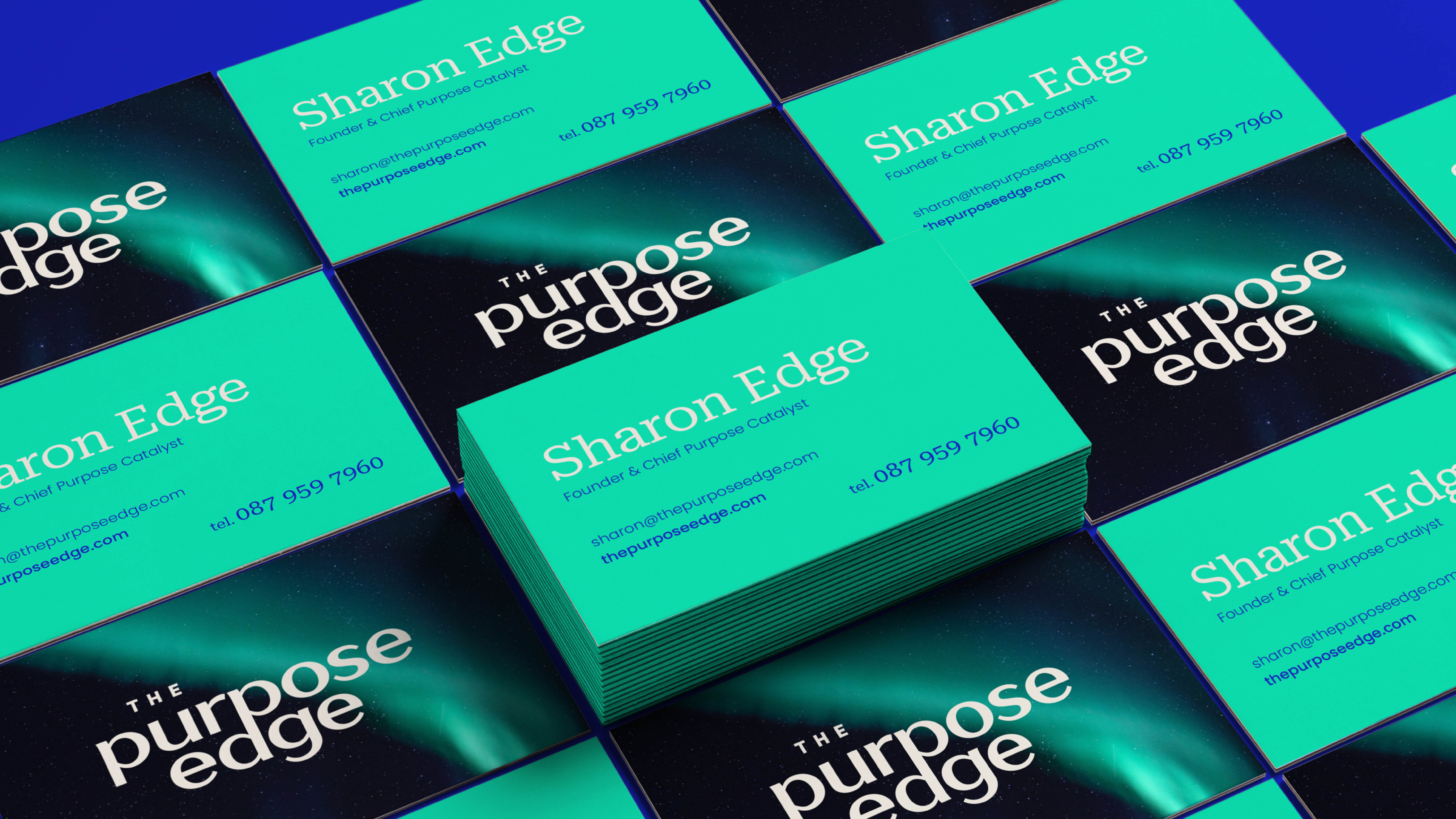
The brandmark is a sophisticated typographic lockup, crafted to echo the idea of connections creating a powerful, unified entity.
- Using lowercase letters ensures an approachable, engaging feel, reflecting Sharon’s warmth and ability to bring people together.The letterforms have been designed with subtle interconnectivity, symbolising how purpose-driven businesses thrive when elements align.This clean, bold, and intelligent wordmark becomes a beacon for clarity and ambition, perfectly representing Sharon’s role as a navigator of purpose.
Visual System: The Force of Connected Creative Thinking
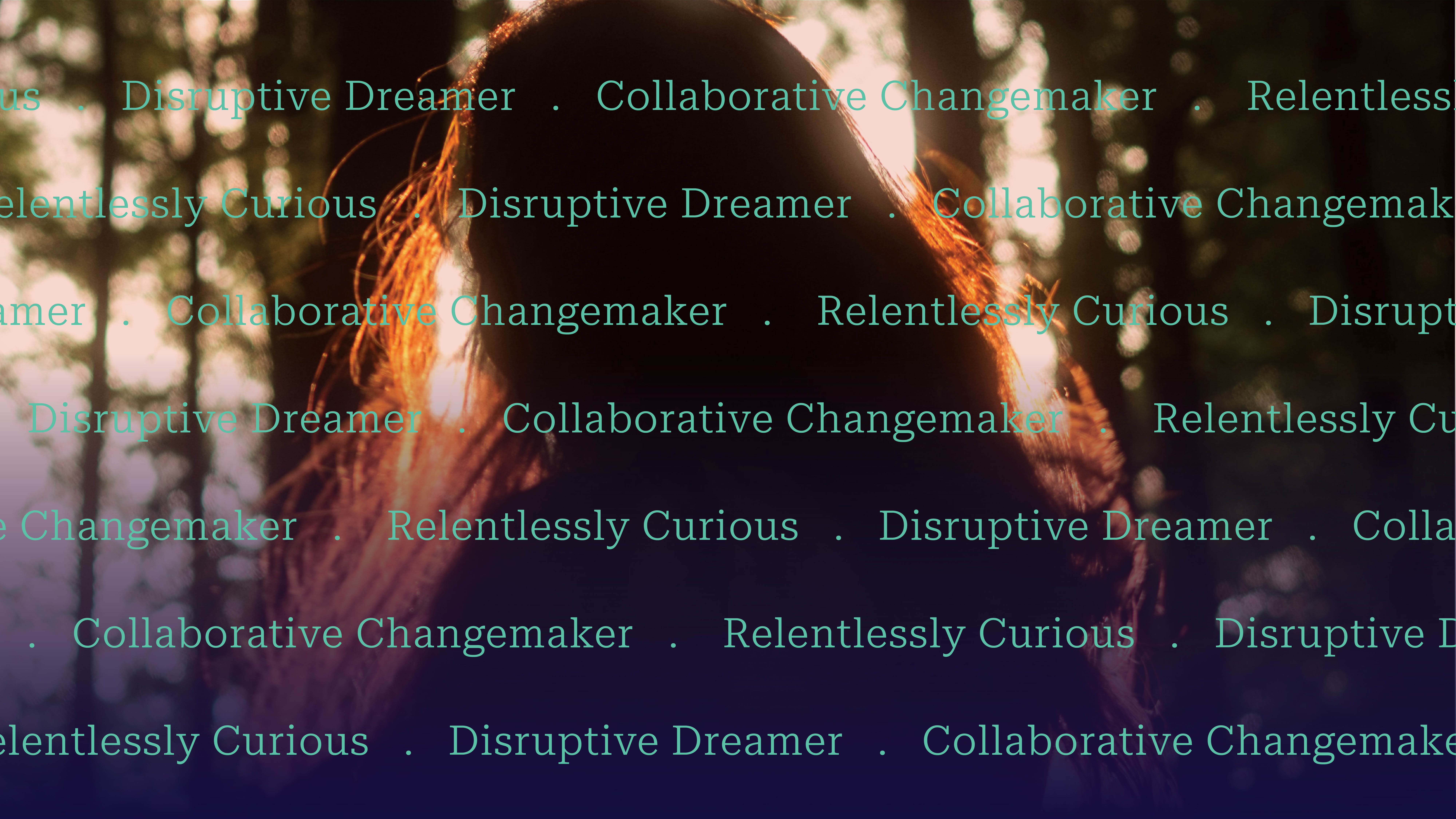
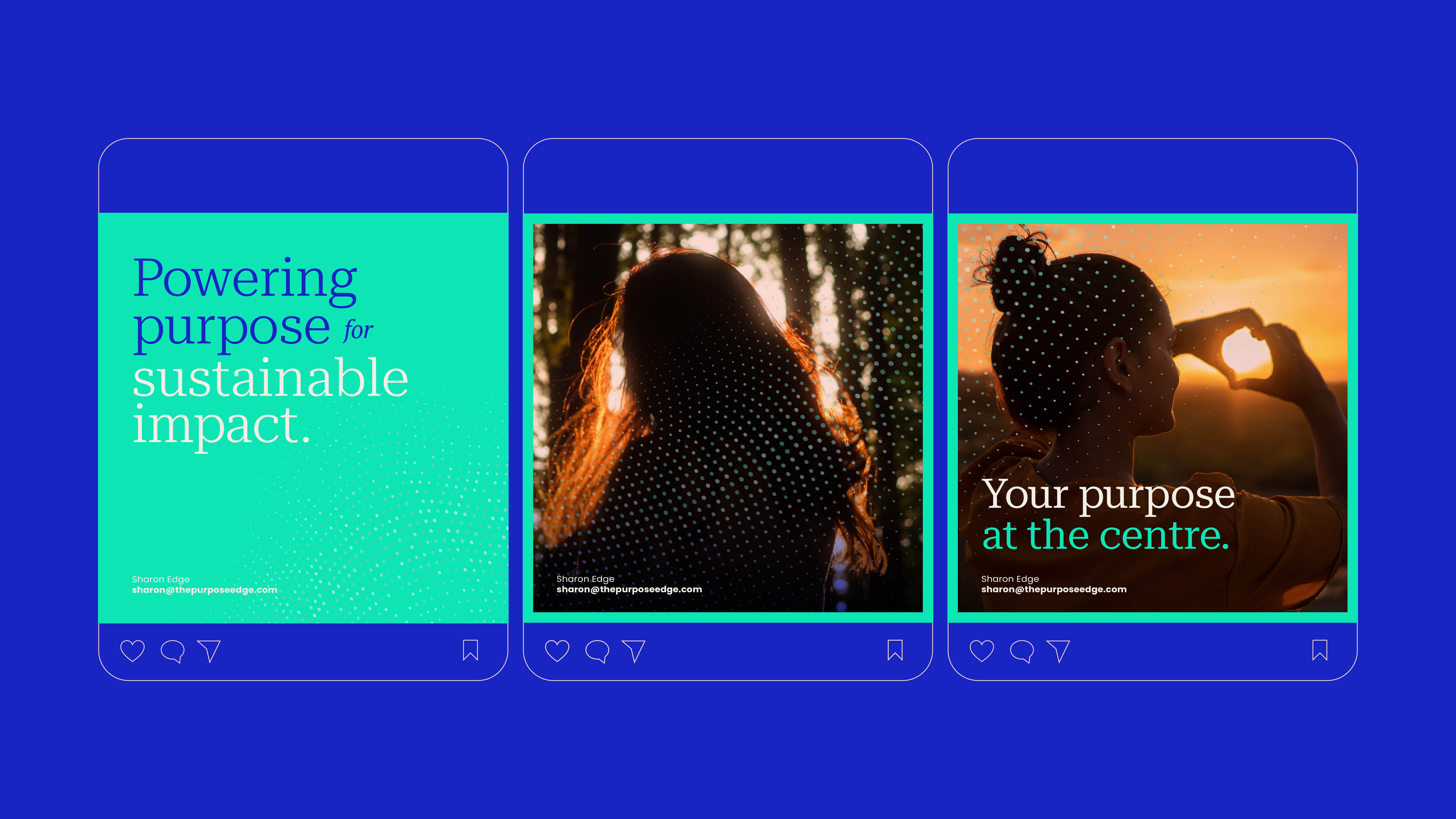
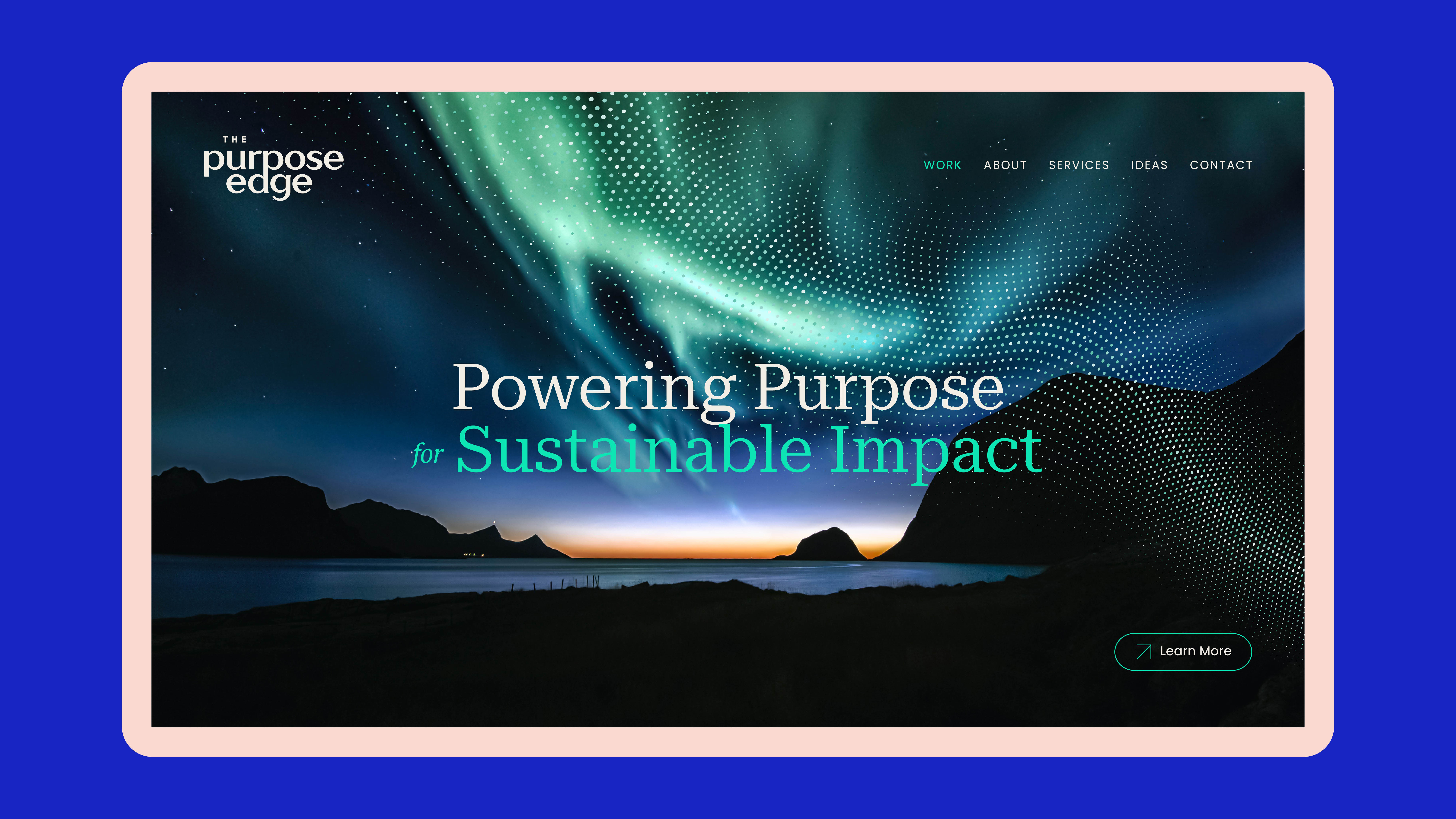
- The design system extends beyond the logo, creating a flexible toolkit that embodies The Purpose Edge’s mission and impact:The Colour Palette is Inspired by the Northern Lights, a metaphor for light, ambition, and guidance—just as Sharon illuminates the way for businesses to define and activate their purpose.The introduction of the wave of connected dots as a subtle graphic element mirror the movement of ideas, reinforcing the dynamic, ever-evolving nature of sustainable strategy.A structured yet fluid approach to typography and layouts ensures messaging is clear, accessible, and compelling, guiding audiences effortlessly through communication materials.
The Impact: A Purpose-Driven Identity for Lasting Change
This identity embodies the power of connection, clarity, and purpose in action.
- It elevates The Purpose Edge as a trusted guide, ensuring organisations can navigate sustainability and strategy with confidence.It provides a distinct, flexible system that reinforces Sharon’s ability to connect people, ideas, and businesses for greater impact.Most importantly, it demonstrates that putting purpose at the centre isn’t just a philosophy—it’s a strategy for real, measurable change.
This project was about more than a rebrand—it was about creating an identity that sparks transformation, builds trust, and turns vision into action. The Purpose Edge now has the clarity, energy, and visual strength to inspire and lead the way forward.


