POCO Re-brand
2020
Designed by Cillian Griffith and Shane Hyland at Midnight
Development: Hannah Roche
Strategy: Alan McGovern
Categories: Identity
Industry: Commercial
Tags: Website / Logo / Identity
Website: pocobypippa.com
POCO has been at the forefront of Irish fashion since 2016 and has become a household name. As the brand has developed and grown in size, the design styling was starting to feel a little too young for the brand and with an eye on future expansion POCO wanted to create a new, more grown up brand to help propel POCO forward into new markets.
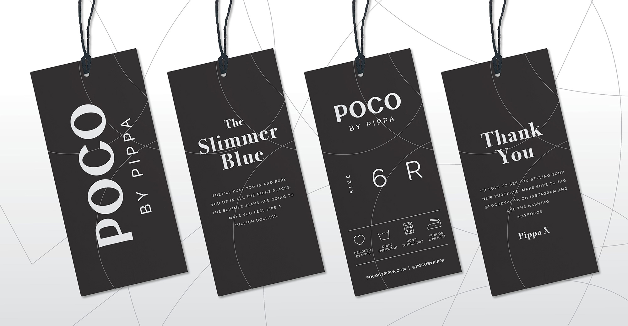
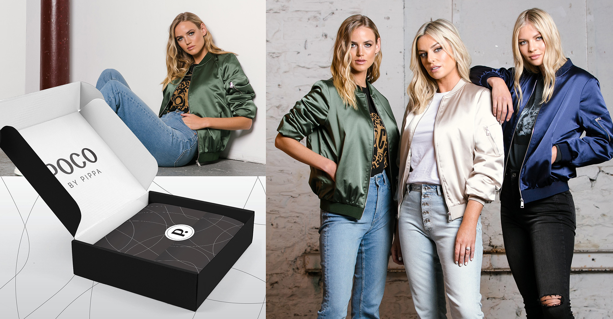
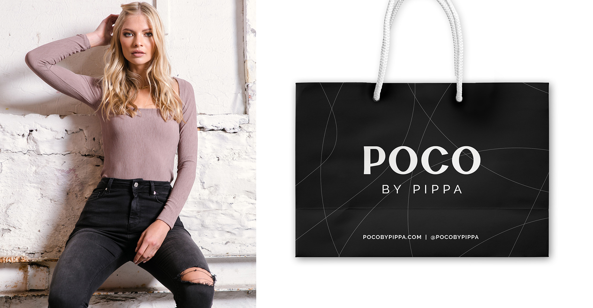
We were tasked with the design and development of a new logo, visual language, brand assets including product tags, packaging, shopping bags and other branded items as well as a new website and digital assets. We created a font with a little flare at the end of the characters, the P and C both have subtle flares to reference the brands history in jeans. The pattern was created from overlapping the main letters of the brand to create a unique brand pattern and was used on a number of pieces of packaging.
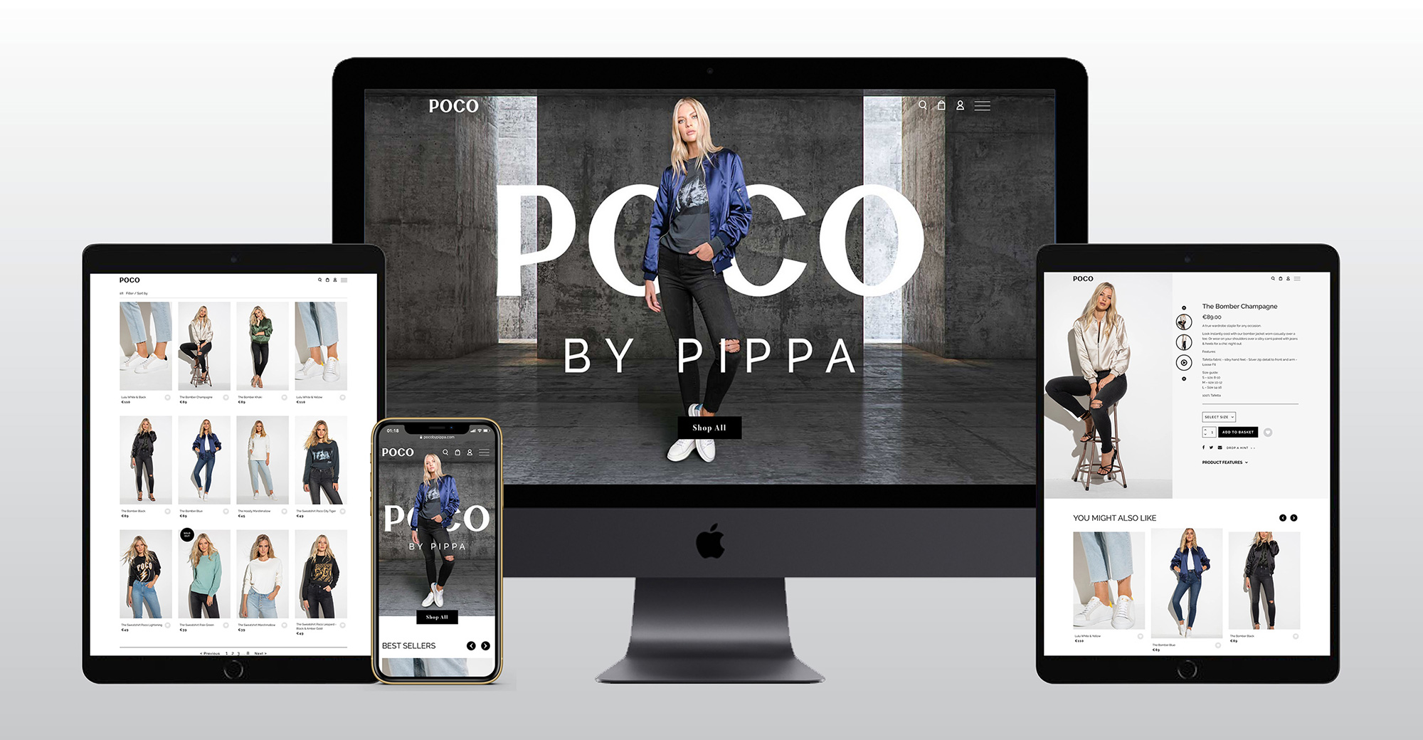
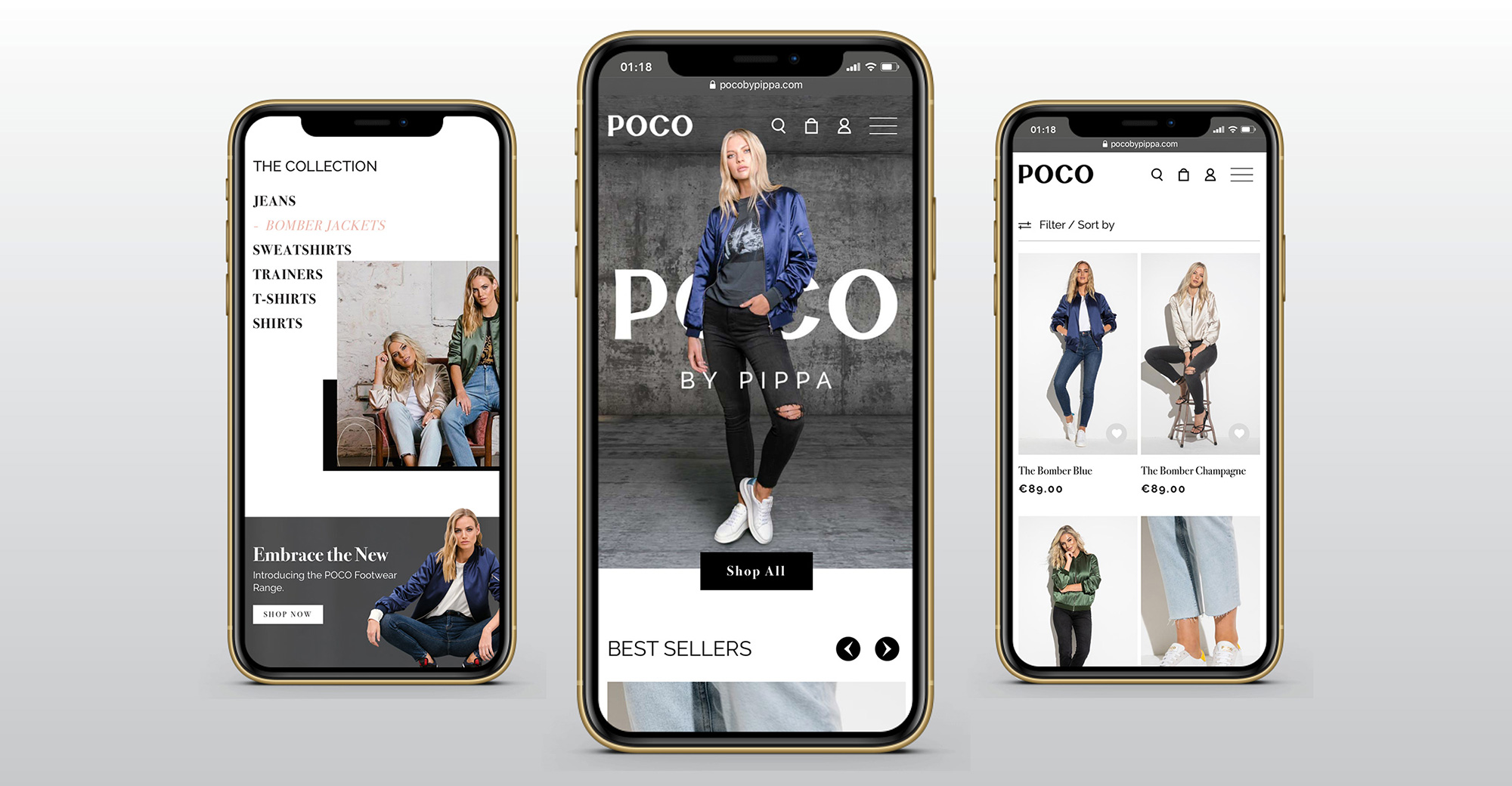
The new website includes a number of unique pieces of functionality, with liquid banner transition, rollover effects and a new clean layout with product features.
