Páipéar Exhibition (2022)
Designed by Noelle Cooper, Colin Farmer and Chris Fullam at Unthink
Videographer: Albert Hooi
Music: Kev Sheridan
Categories: Printed Publication / Identity / Signage / Exhibition / Social Media
Industry: Cultural
Tags: Contemporary art / Typography / Art / Programme
We have worked closely with Hang Tough on the evolution of their brand architecture to include identities for Hang Tough Framing, Hang Tough Contemporary and Hang Tough Editions. When they announced their intention to hold a large-scale contemporary art exhibition in the heart of the city, we knew it needed its own space within this framework.
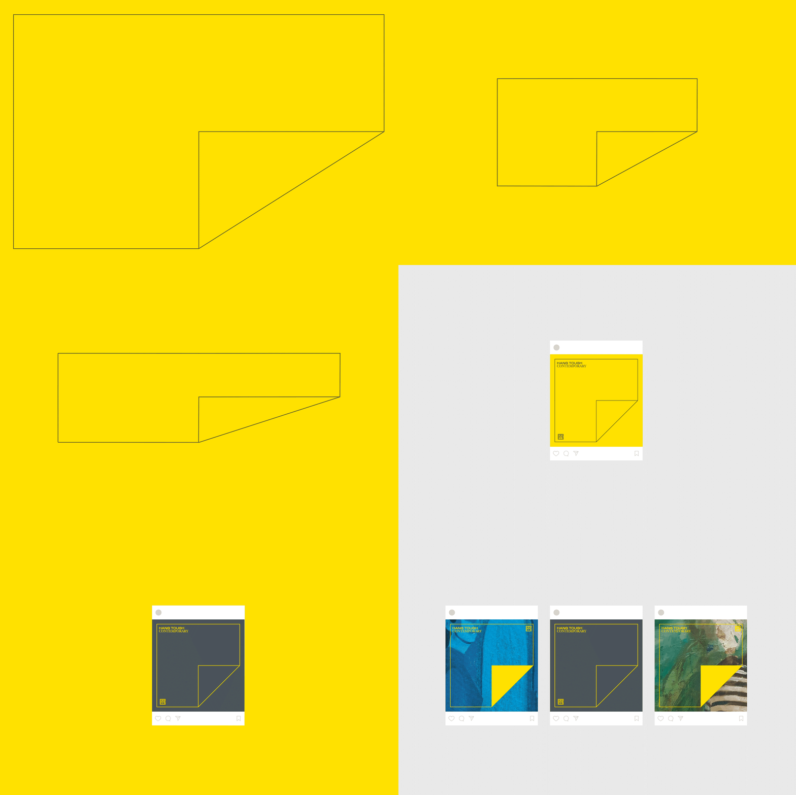
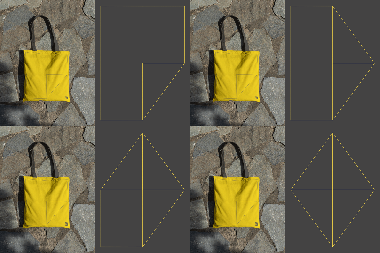
The name of the exhibition provided a natural starting point for our exploration. The folded corner motif nods to the handcrafted nature of the exhibition and creates a subtle ‘P’ letterform. The fluid P identity morphs and adapts to fill the space of every asset across print and digital mediums, whilst always maintaining the proportionate form of the P.
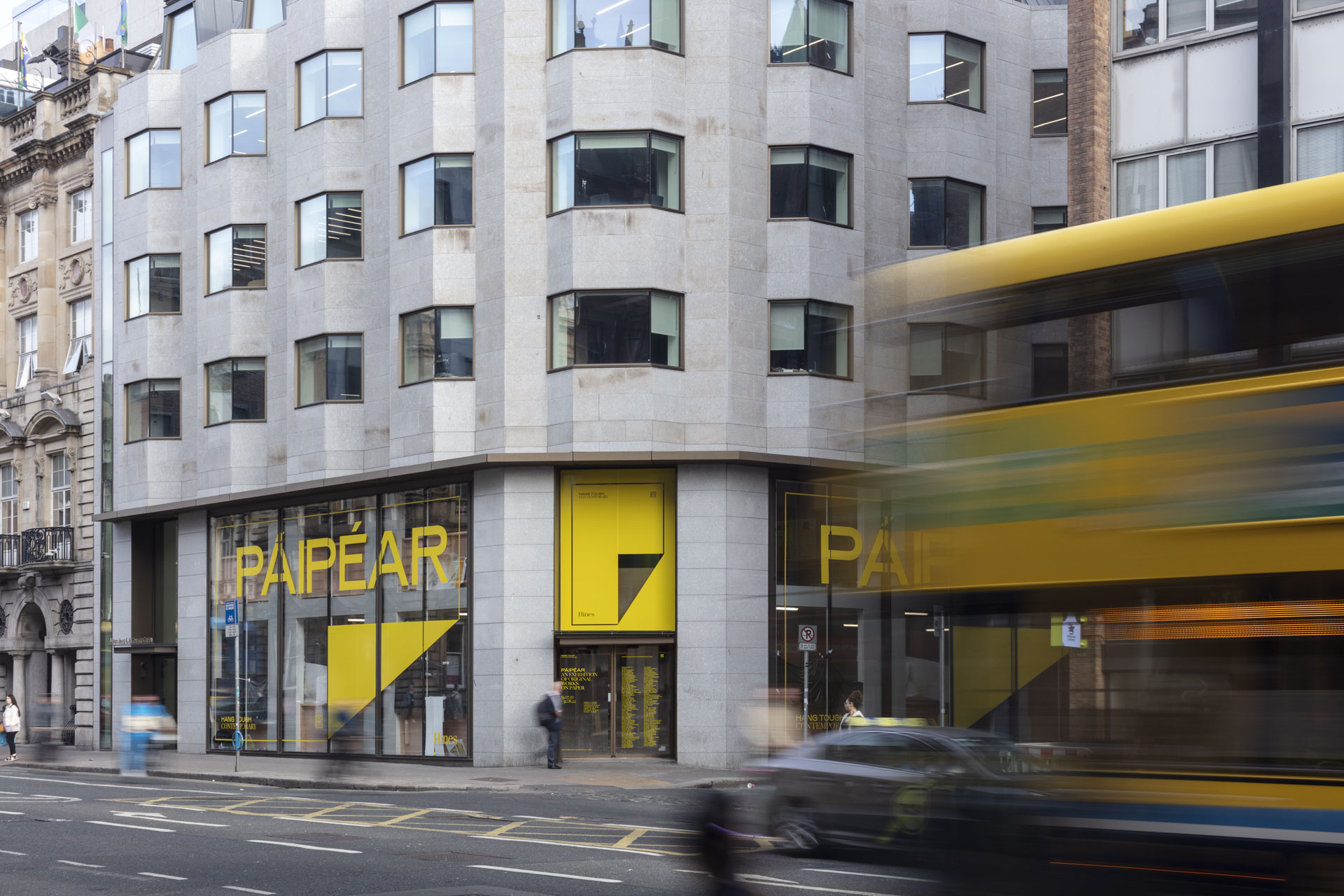
The exhibition was located on Dame Street, one of Dublin’s busiest thoroughfares. To take advantage of this, we designed oversized window graphics which acted as signage and created intrigue among the city’s footfall for the summer-long show.
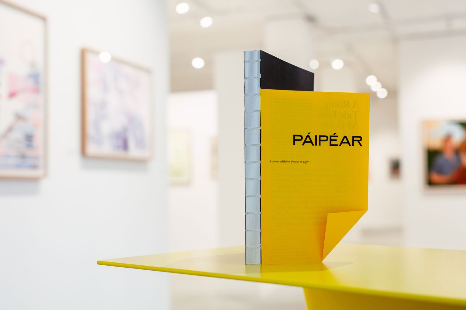
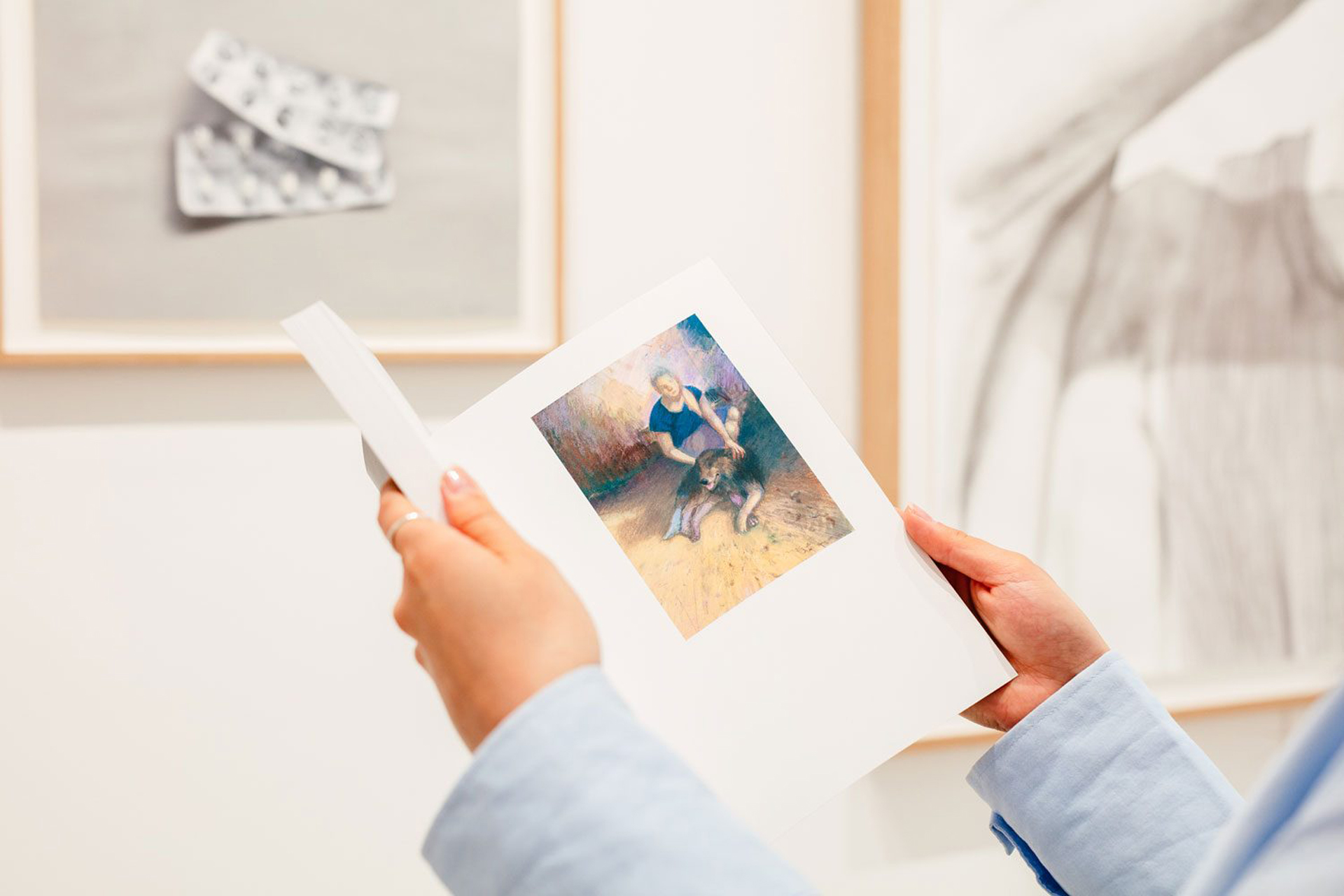
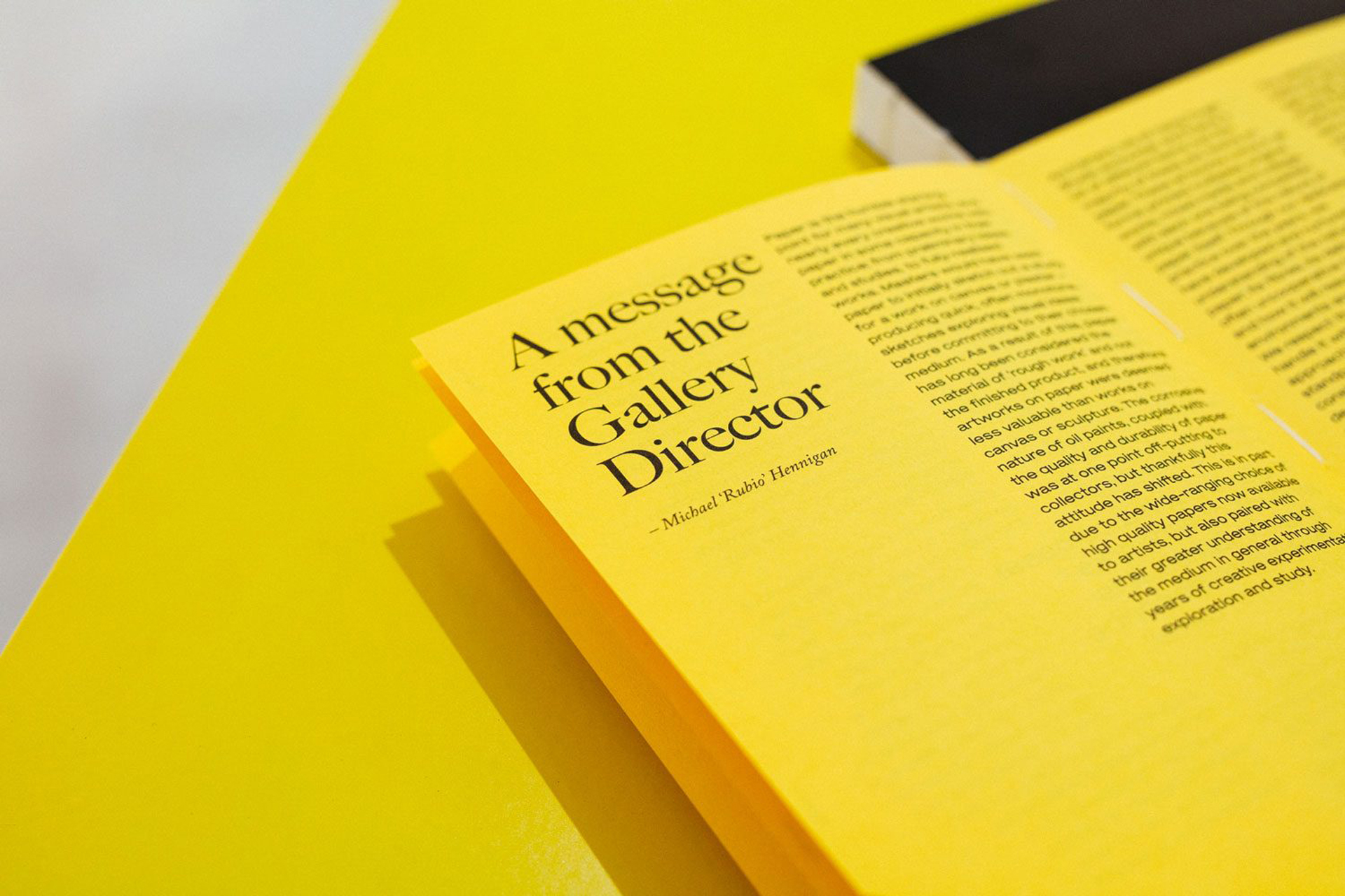
To support the ambitious exhibition which displayed 115 artworks, a 240 page publication was created. It was split into two distinct parts, the forward and invited essay, and the main catalogue of artworks. The form and flow of the catalogue was influenced by the scale of the overall project and the pop-up gallery space. Each artist was given a single page and the unadorned spreads, like the white gallery walls, allowed the artwork to take centre stage.
The separation in the form of the publication gave prominence to the artists and artworks included. Yet, the two printed pieces were hand sewn together, binding them carefully to create a unified publication which commemorates the work of artists, gallerists, writers and technicians who collaborated to create such a momentous event.
