Origin Chain Brand Identity
2013
Designed by Clare Lynch (Creative) at Clare Lynch Creative
Categories: Identity
Industry: Corporate
Website: clarelynchcreative.com/project/origin-chain-brand-identity/
Origin Chain addresses a key consumer need: trust, offering blockchain-enabled software solutions to problems of real world asset authentication / proof-of-origin in export markets. In a distributed trust system this info-flow is called the value chain.
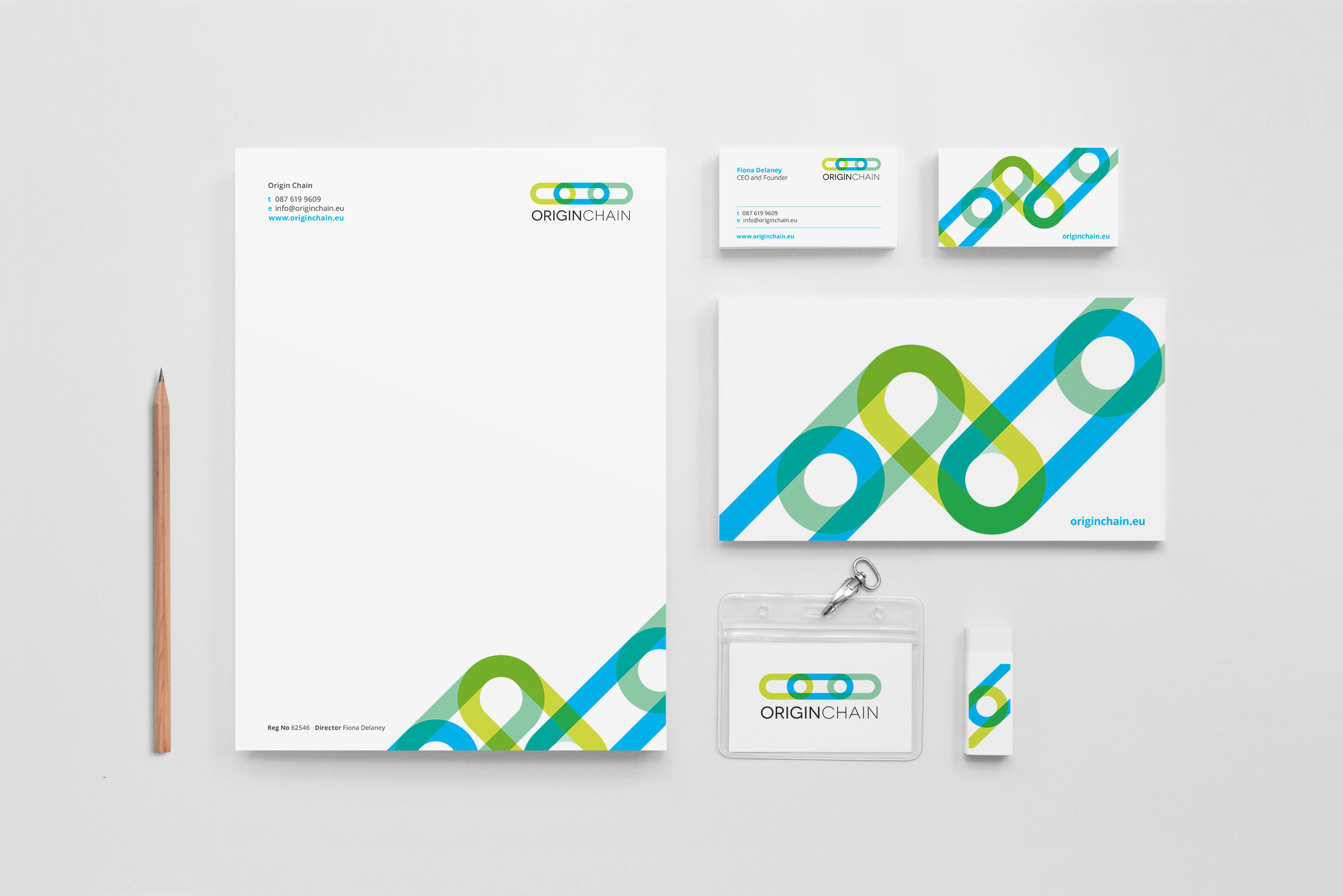
Origin Chain needed a brand identity created as they entered a more public phase of their company, where they would be business networking at events such as Enterprise Ireland’s ‘Innovation Arena’ at the National Ploughing Championships and tech summit event ‘Uprise’.
Not everyone understands areas such as blockchain, therefore they wanted the brand to be so well communicated that even a child could understand it, with the viewpoint that children are often quicker to absorb new technologies and communicate them to adults.
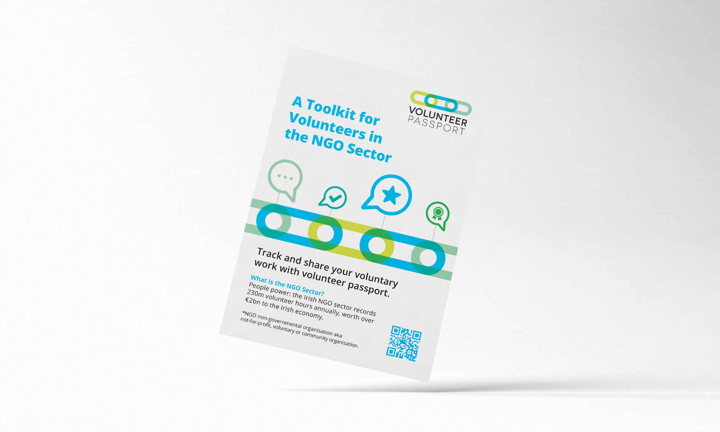
They have two sub-brands that sit under Origin Chain (Volunteer Passport and Verify by O.C.), and needed brandmarks for these in order for all three to work together as a family.
On reviewing Origin Chain’s needs and values, they wanted to be perceived as trustworthy, new-tech and user-friendly. Their software allows direct online transactions along a secure blockchain. These transactions are transparent and can be viewed by anyone.
A good way to envision this is to picture a value chain of a food item. E.g.; a banana you purchase with a barcode. On scanning the barcode, you can view the trail of where it has originally come from – from the farmer who picked it, to each input along the way, up until to the store delivery. It provides a sense of reassurance of knowing the root source of an item along the chain and be able to openly view it’s journey. With Volunteer Passport, it enables people in the volunteer sector to track and share their voluntary work. It enables a verification system, which allows one easy authorized and verified passport for all workplaces.
Factors considered were as follows:
– Representing the links of a block chain as a strong, graphic symbol. The links also representing trust and security, a key value of Origin Chain.
– The feeling of movement within the chain, emphasizing the interactive process of the blockchain technology.
– Overlays of colours within the logo represent the transparency within Origin Chain’s software – the trust of anyone being able to see everything within the process.
– Subtle hidden circles within the links represent eyes – the observing eye of the open visibility features of blockchain.
– Closed links locked in to each-other to show solidarity of how when data is entered into a blockchain, it cannot be removed and is there forever.
– Use of blue as the link colour, to further denote trust, the green tones signify the verification of the green light signaling approval.
– For ‘Verify by O.C.’, the same brand style is used to create a tick of approval of the verification process.
The client was very happy with how the end result met the brief requirements, her feedback was as follows:
“I’m very pleased with how they look together. It’s been a real pleasure to work with you. As well as being a wonderful talent, you’re sort of unflappable too. The very best kind of designer in my book.”
