OOST
2024
Designed by Mel ORourke, Rachel Kerr, Conor Flood and Philip Mitton at CI Studio
Categories: Print / Identity / Packaging
Industry: Commercial
Tags: Sport / Digital / Food and drink
Website: oostnutrition.com/
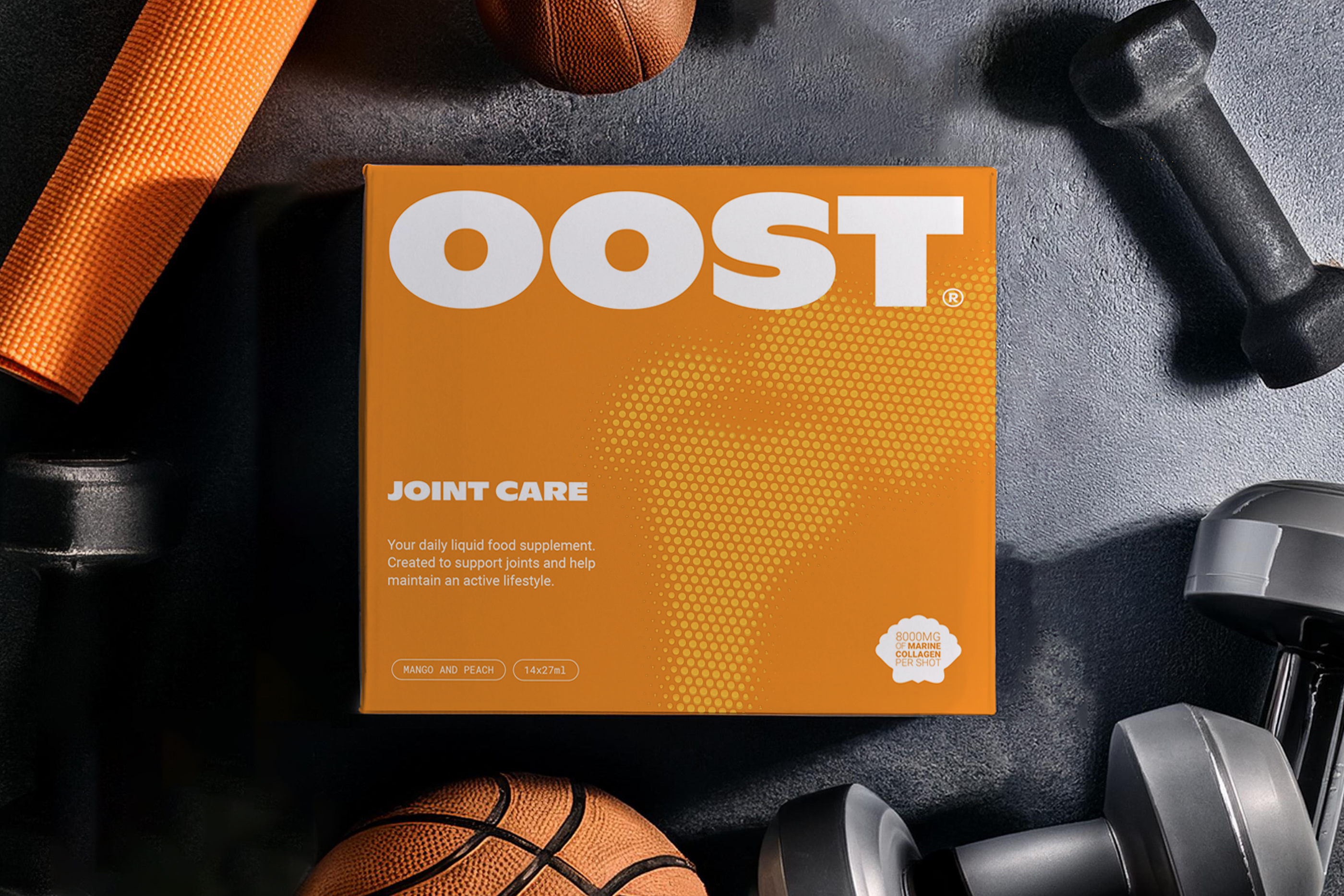
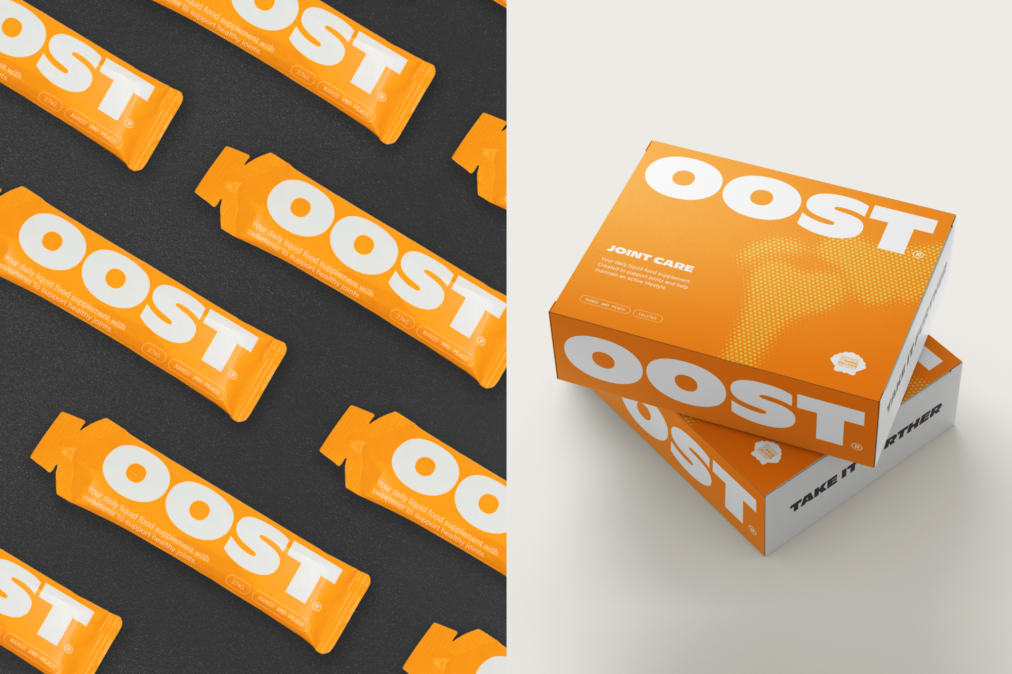
Oost is a new innovative sports supplement, made from scientifically chosen natural ingredients and conceived to help individuals who wish to maintain an active lifestyle for as long as possible.
We were tasked with creating the brand from the ground up. Working with its two founders, dedicated to providing a unique supplement solution to the problem of ageing joints, we devised the name OOST which communicates the brand benefit simply and effectively.
The logotype is formed from a distinct and playful typeface, with tension between the circular and rectangular forms creating a sense of energy. The heavier weight is necessary and useful for maintaining visibility in an online environment.
A strong visual language embodies the bold narrative. Orange as the brand colour was a natural choice, being typically associated with vitality and energy while also giving a sense of the product flavour. Bold typography is carried through messaging, often italicised and combined with a dot graphic of the area of the body the product is for, conveying a distinctly sporty visual aesthetic.
The project involved design of all touchpoints from packaging through to the website and promotional material.