Offscript Brand Identity
2011
Designed by Vanessa Fay at Epsilon
Creative Director: Karen Price
Strategy Lead: James Dunne
Account Manager: Ian Whelehan
Categories: Identity
Industry: Corporate
Offscript was established with the vision of creating broadcast quality, narrative-driven branded and sponsored content. They are raising the bar on the quality and variety of content that brands serve to their audiences, and they needed a look that would back this up.
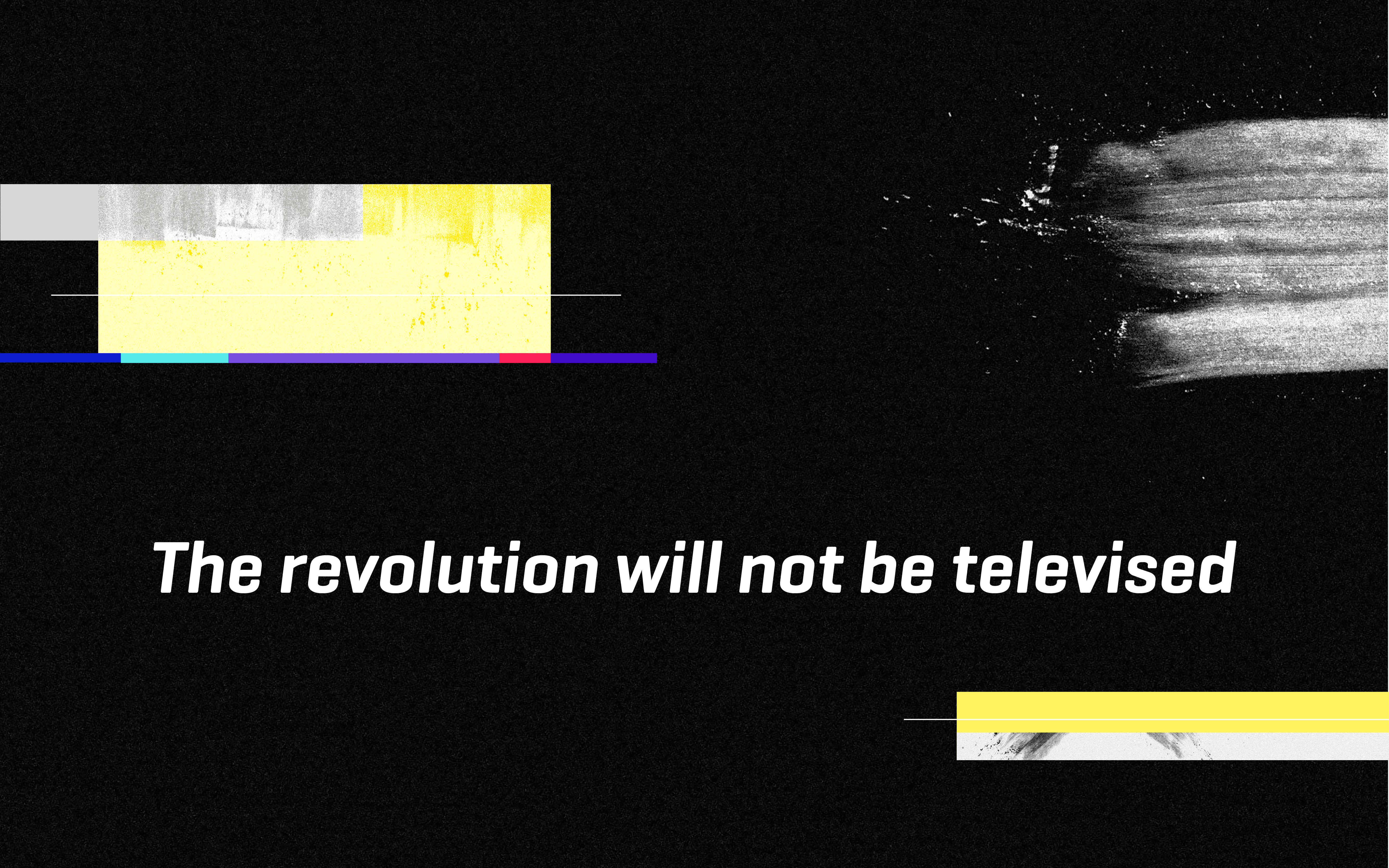
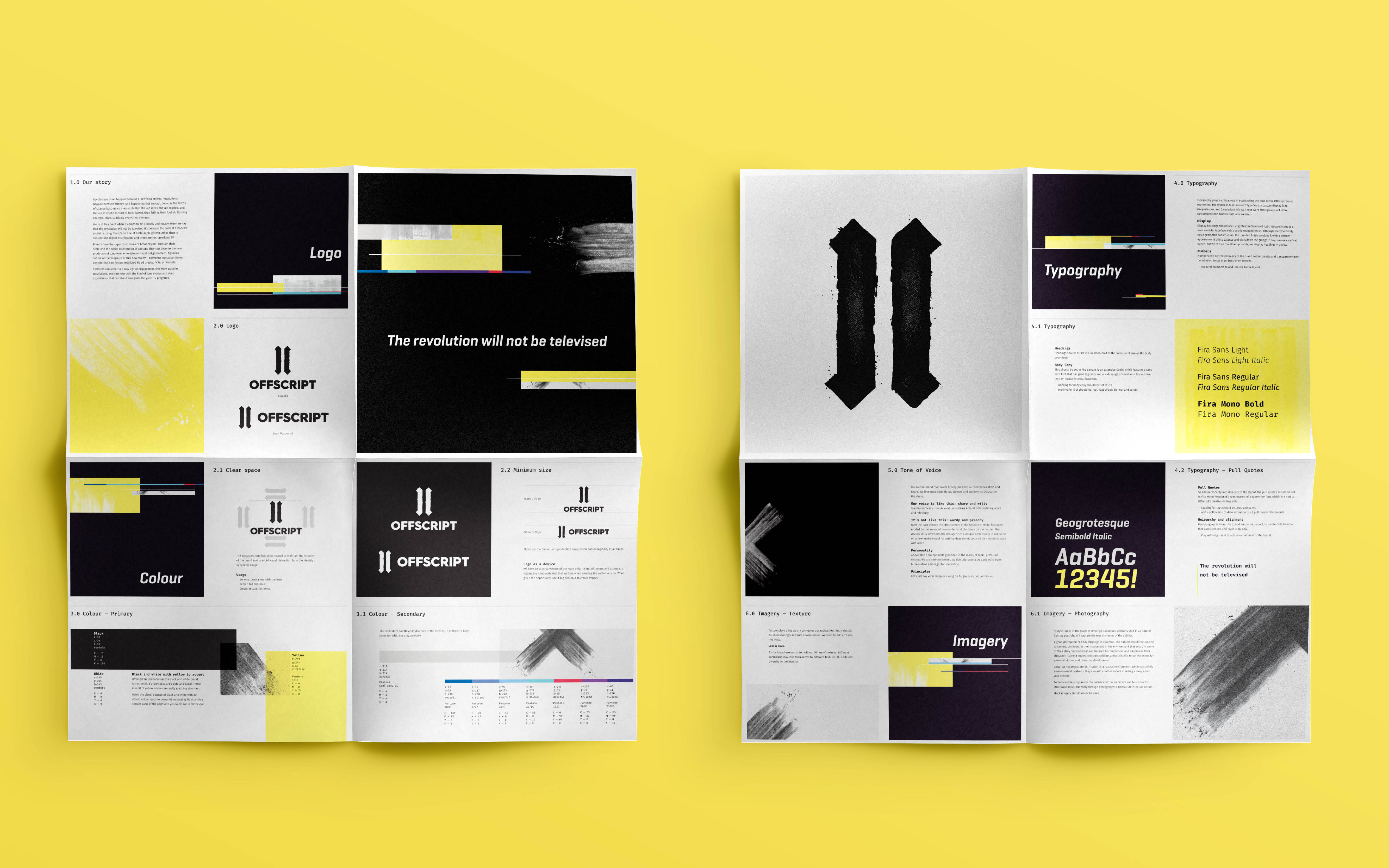
We wanted to create a logo that looks at home on a protest placard or a business card. It needed to be direct, disruptive, and driven, and at the same time trustworthy. Music has fueled countless thoughts and ideas in our studio, and this time as the words “The revolution will not be televised” flowed through the speaker, magic happened. Music met inspiration as paper met ink, and charcoal, and spray-paint and scalpel as we took our work away from the screen in favour of a more guerilla approach.
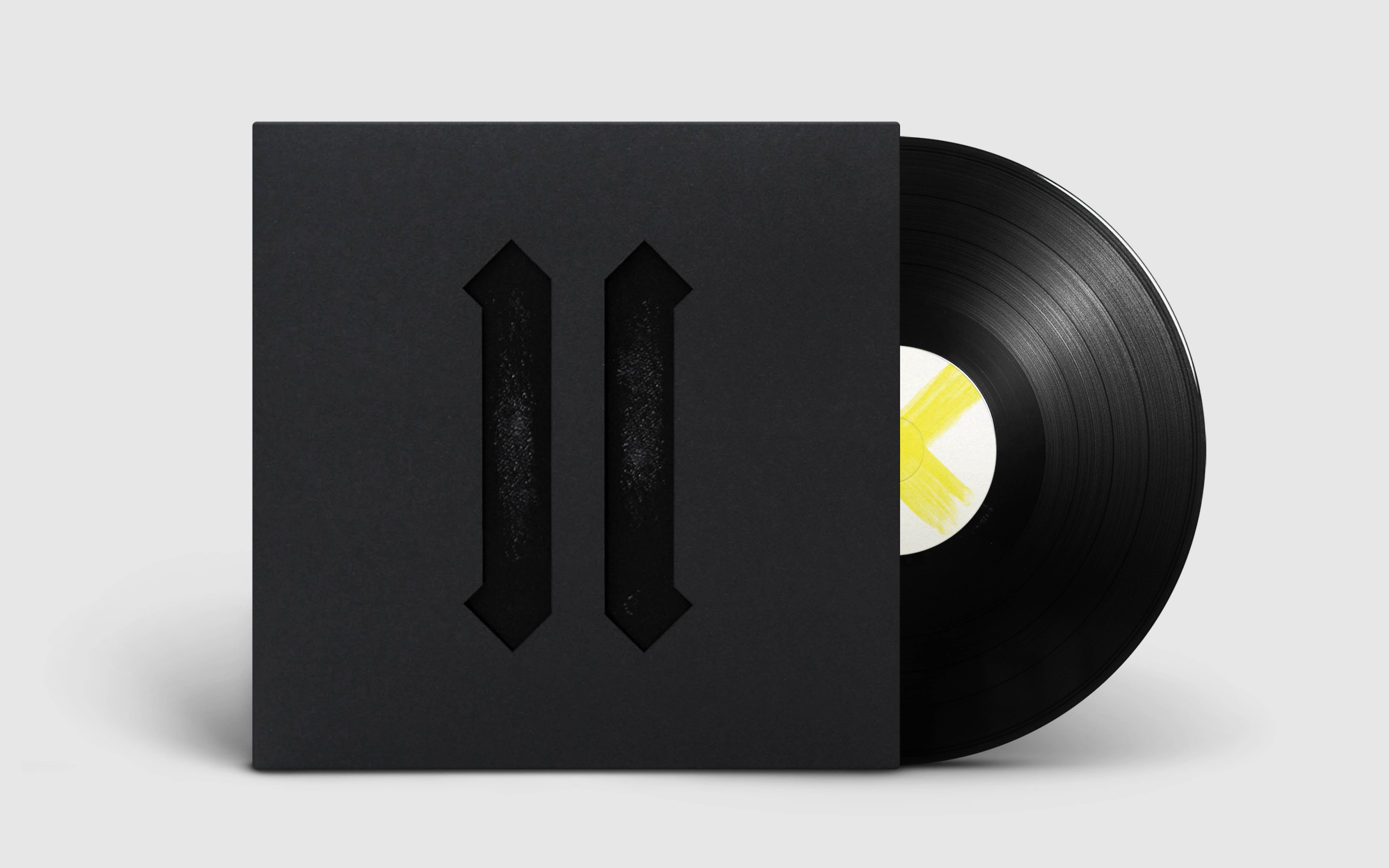
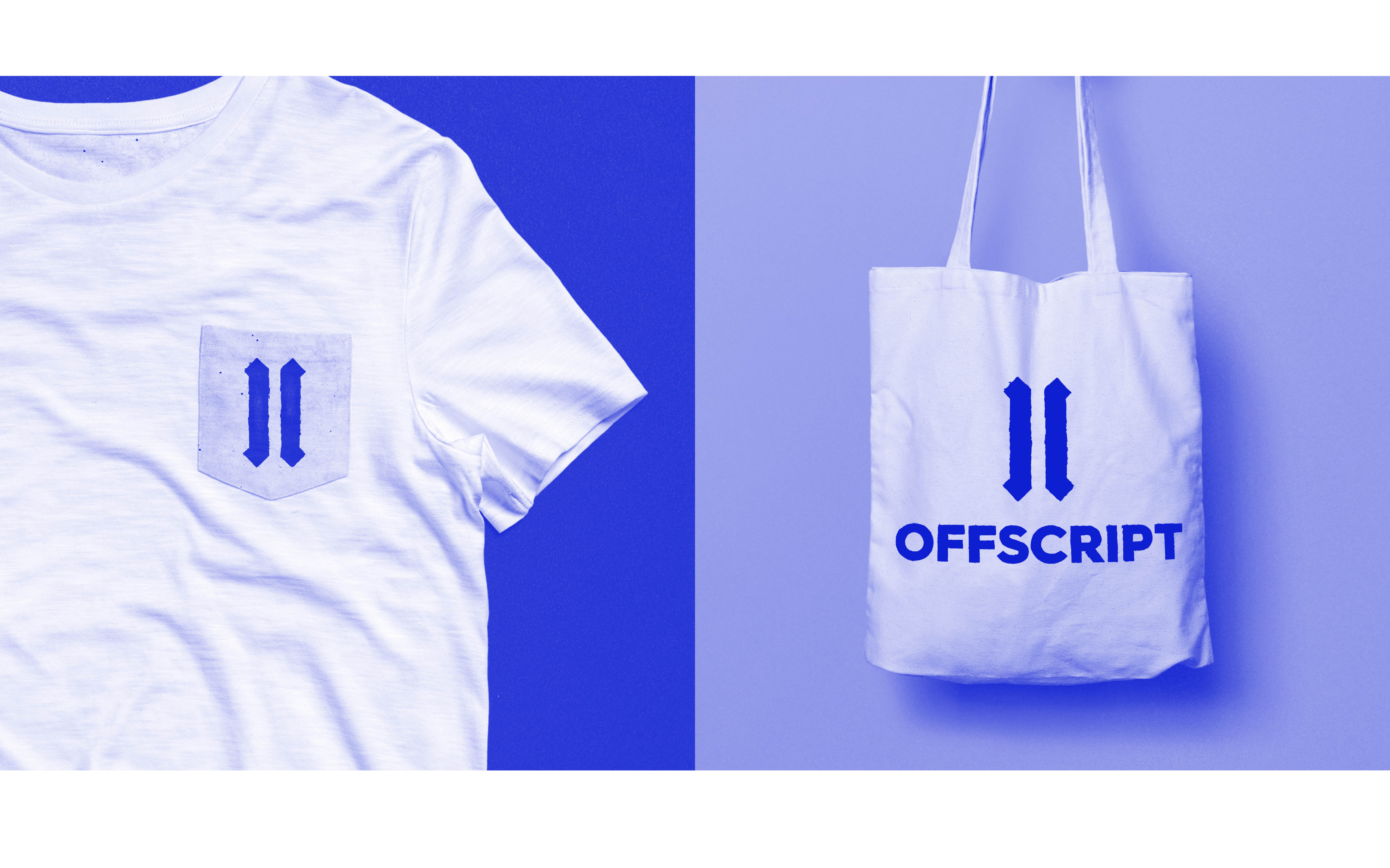
The result is the sharp open brackets of the Offscript mark. It turns the normally clean-cut combination of black and white on its head with the rough edges and lines, while the yellow elements stand for the stories which bring colour to the brand. Textures are hand created but used in a subtle way – bringing personality to the visual language.
