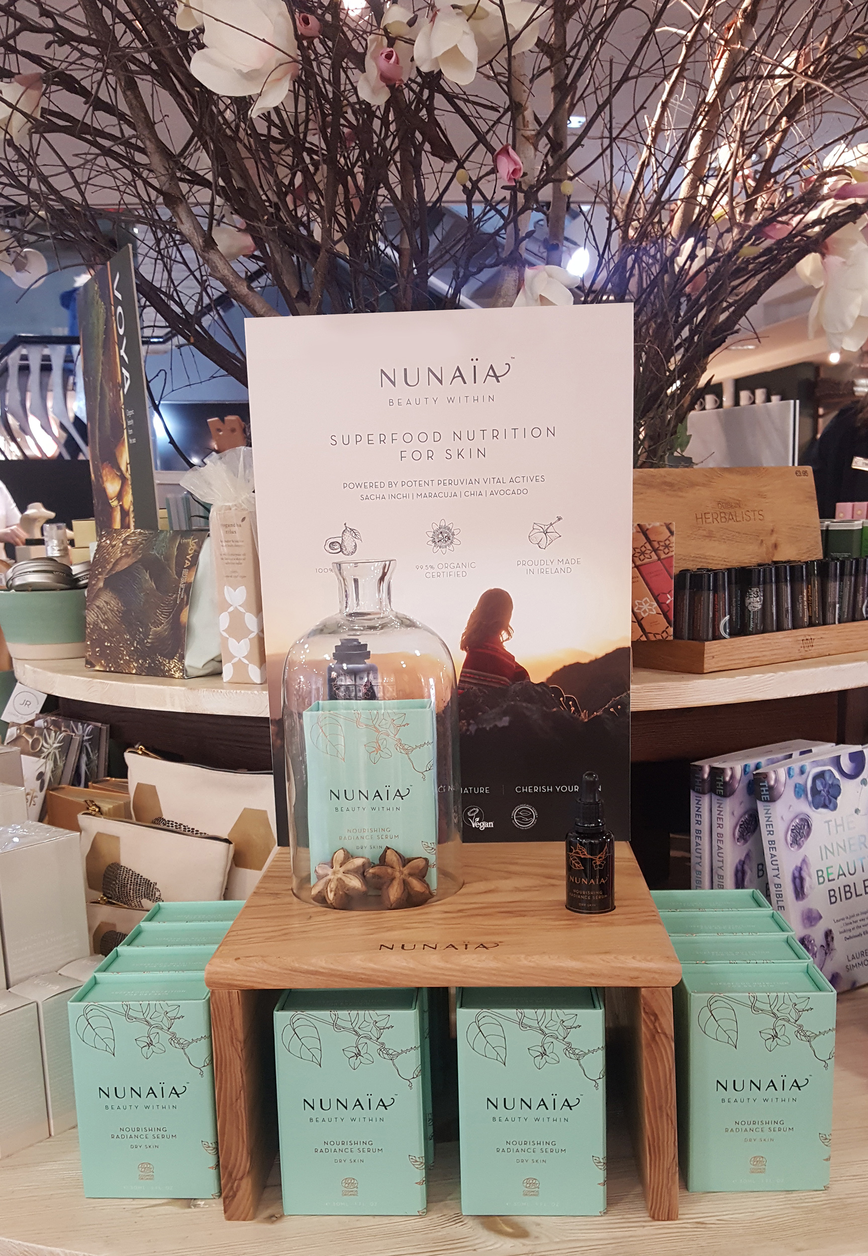
Nunaïa Beauty - Packaging
2013
Designed by Bridget Kerrigan
Photographer: Diego Gavilan
Illustration, Packaging Designer: Bridget Kerrigan, Bammedia
Categories: Packaging
Industry: Commercial
Website: nunaia.com
BACKGROUND
**Nunaïa** is the brainchild of herbalist Nicola Connolly who developed her business idea, a wellness beauty brand, whilst living in the harsh arid climate of Peru. Immersed in Peruvian botanicals, Nicola was inspired to create a range of beauty products with these active ingredients. As a strong believer in wellness / ethical consumption, Nicola wanted to bring a sense of her holistic values and sustainability to her packaging.
Nunaïa's debut product is a **Nourishing Radiance Serum Ritual** (a 30ml oil), designed to moisturise, protect and restore dry, sensitive skin. It is the first of a capsule product range that will form an evening ‘self-care skincare’ beauty ritual, designed to rehydrate dry sensitive skin.
BRIEF / CHALLENGES
Key challenges outlined in the brief stated that customers are increasingly confused about skincare products, beauty regimes. They are untrustworthy of claims - certification is important to them. Customers are also tired of conventional beauty industry messaging “look younger” and “be beautiful” - they feel disconnected from their true self.
The brief was to create the visual identity and premium packaging that told Nicola's unique brand story, summarised the ingredients / benefits, was clearly organic and radiated with the brand essence of wellness and authentic ‘beauty within’.
PROTECTIVE PACK CONCEPT:
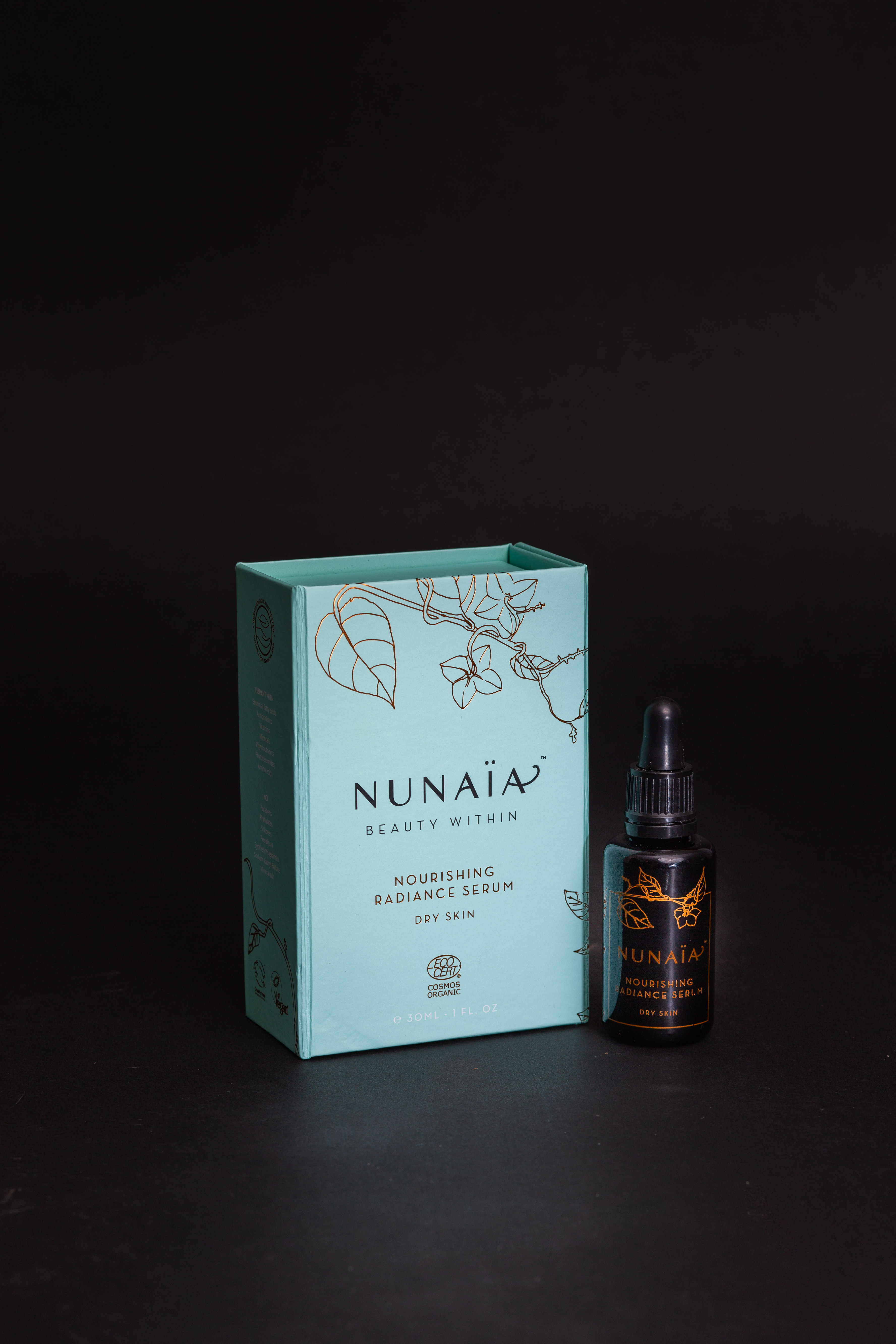
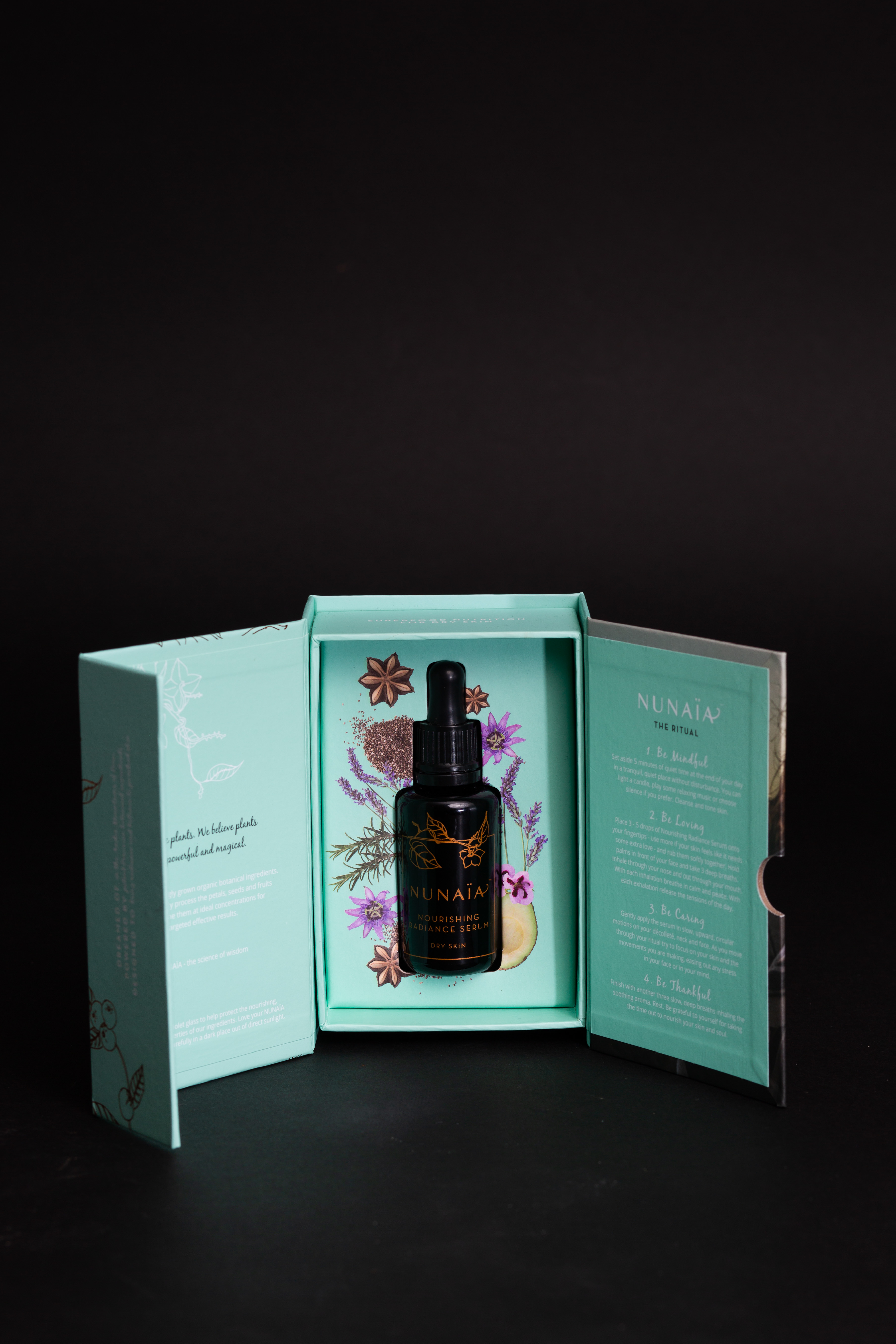
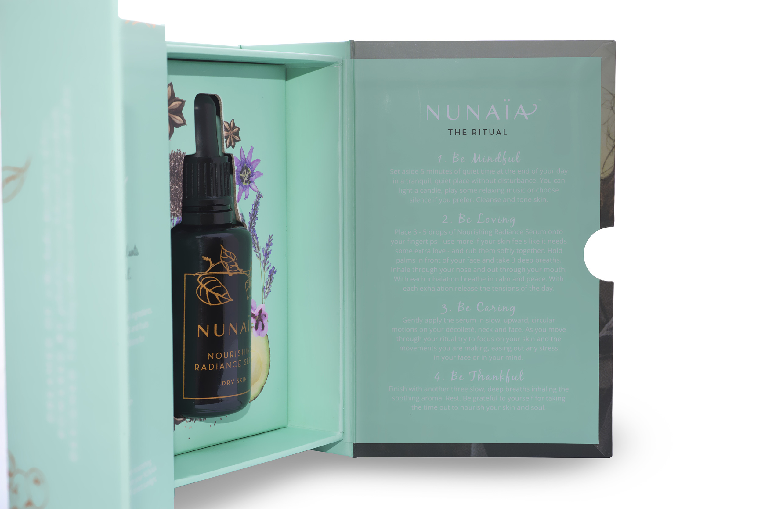
The basis of our packaging concept was to create a beautifully crafted rigid protective box enclosing the ‘beauty within’ – the delicate precious oil. As well as offering obvious protection in transit, our rigid box and indeed the dark Miron glass bottle were chosen to reduce the amount of UV light hitting the oil, as this would reduce the potency of the active ingredients over time. The rigid box has an additional panel to create an unboxing / revealing element for the customer. As the debut product, we had a lot of info to relay to customers (the brand story, ritual information and the therapeutic and beneficial ingredients) and our chosen packaging format was designed specifically to allow us to communicate this effectively.
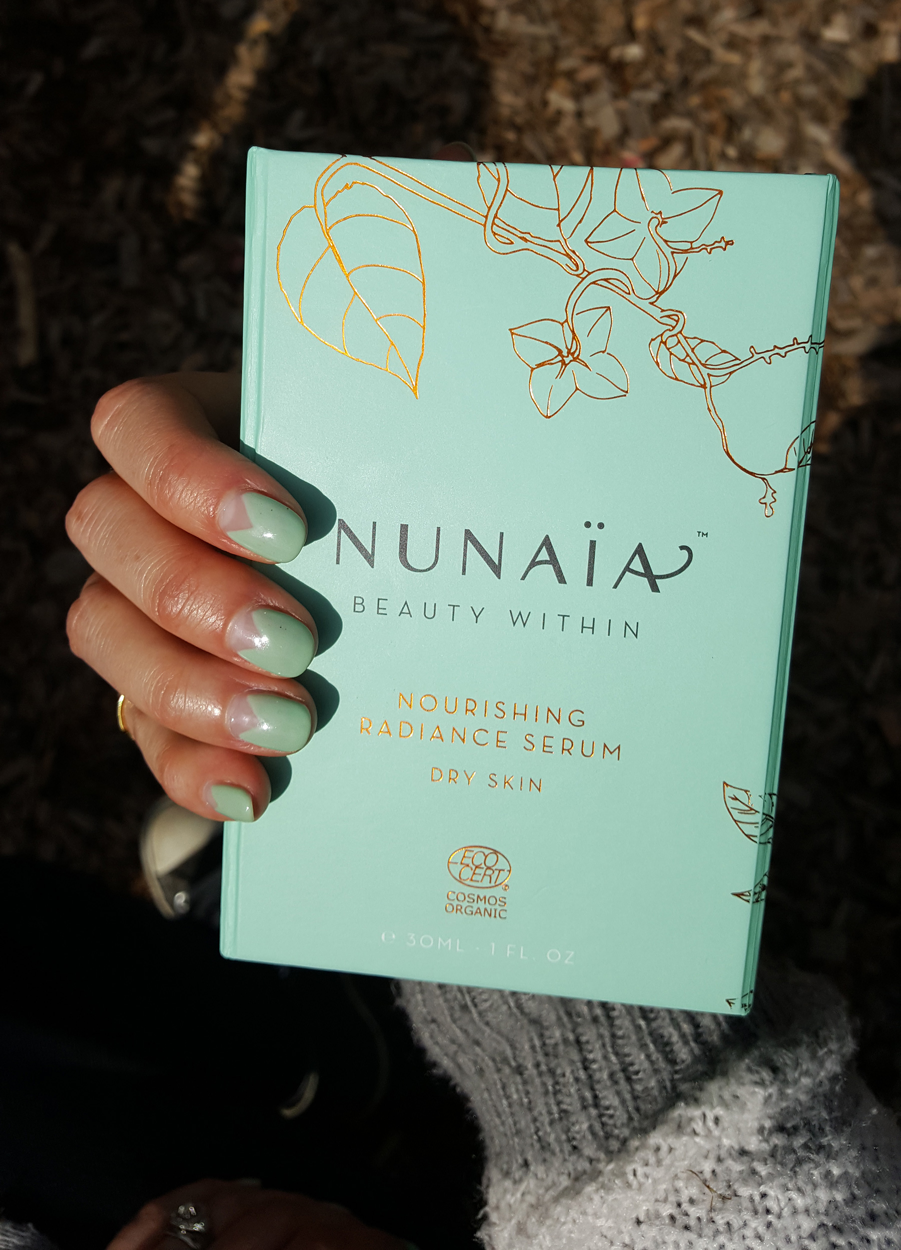
The graphics were hand illustrated here in the studio to reflect the key ingredients - the SACHI INCHI and MARACUJA plants. The photograph on the inner panels are of the founder Nicola in Peru and were art directed (from afar) by our creative director. The overall calm and simple design is given a pop of colour on the insert which showcases images of actual ingredients. Offset against a bright vibrant yet calming and tranquil turquoise, we opted for a bronze foil on both box & glass to further highlight the premium luxury nature and pricepoint of the product.
PACKAGING SPECIFICATION:
Inner Bottle: Miron Black Glass with organic Ink.
Box: Rigid Paper with removable insert. Opens 3 panels wide. Flat size - 275mm wide x 115mm high. Magnetic Closure on right side.
Printed 5 colour plus Bronze Cold Foiling on Front & side.
FSC sourced card, printed with environmental friendly ink.
