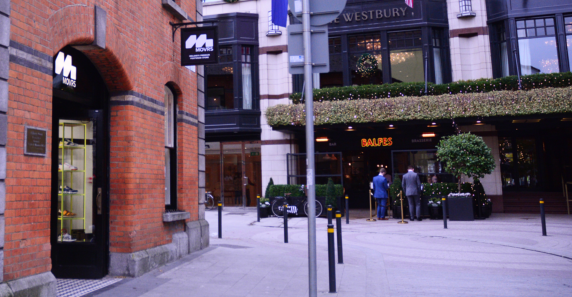
Movrs Shop Design
2021
Designed by Cillian Griffith at Midnight
CGI Design: Ian O'Shea
Categories: Environmental
Industry: Commercial
Website: movrs-store.com
How do you approach designing a shop for a new footwear store with a strong sustainable footprint?
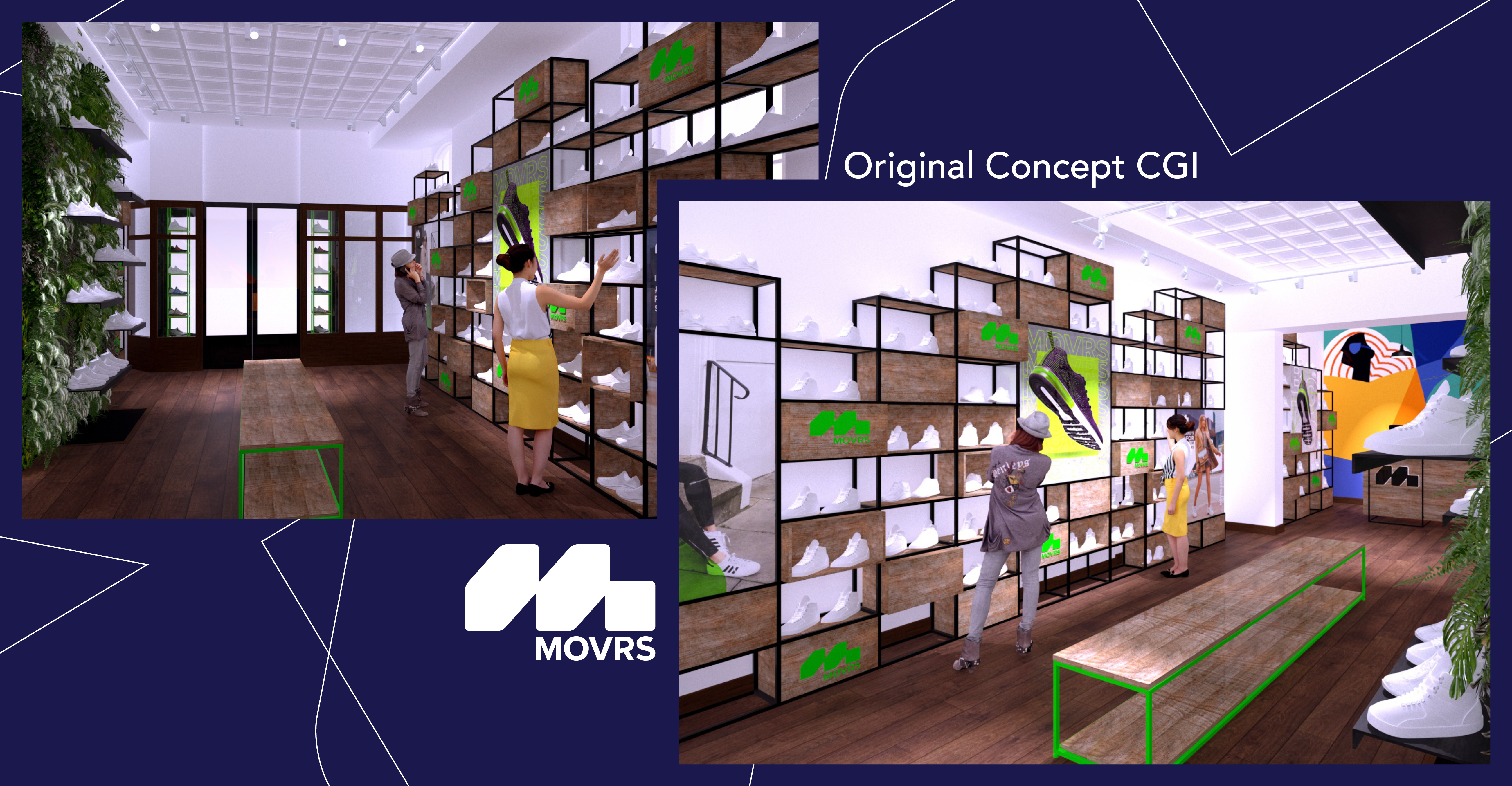
Our approach was to concentrate on three main criteria 1) where possible, reuse and epicycle what we could from the current shop to avoid unnecessary waste, 2) to create a unique design with custom built features, 3) clearly define areas of the store to highlight the shops sustainable and exclusive ranges.
As the flagship shop on Harry Street, the design needed to offer a unique store experience but also highlight the brands sustainable stance.
We worked closely with the Movrs team and with our fitout partners to bring initial concepts to life and ensure we had covered the main points above. We created a number of key design focal points within the store to engage customers but also allowing create unique spaces for brands.
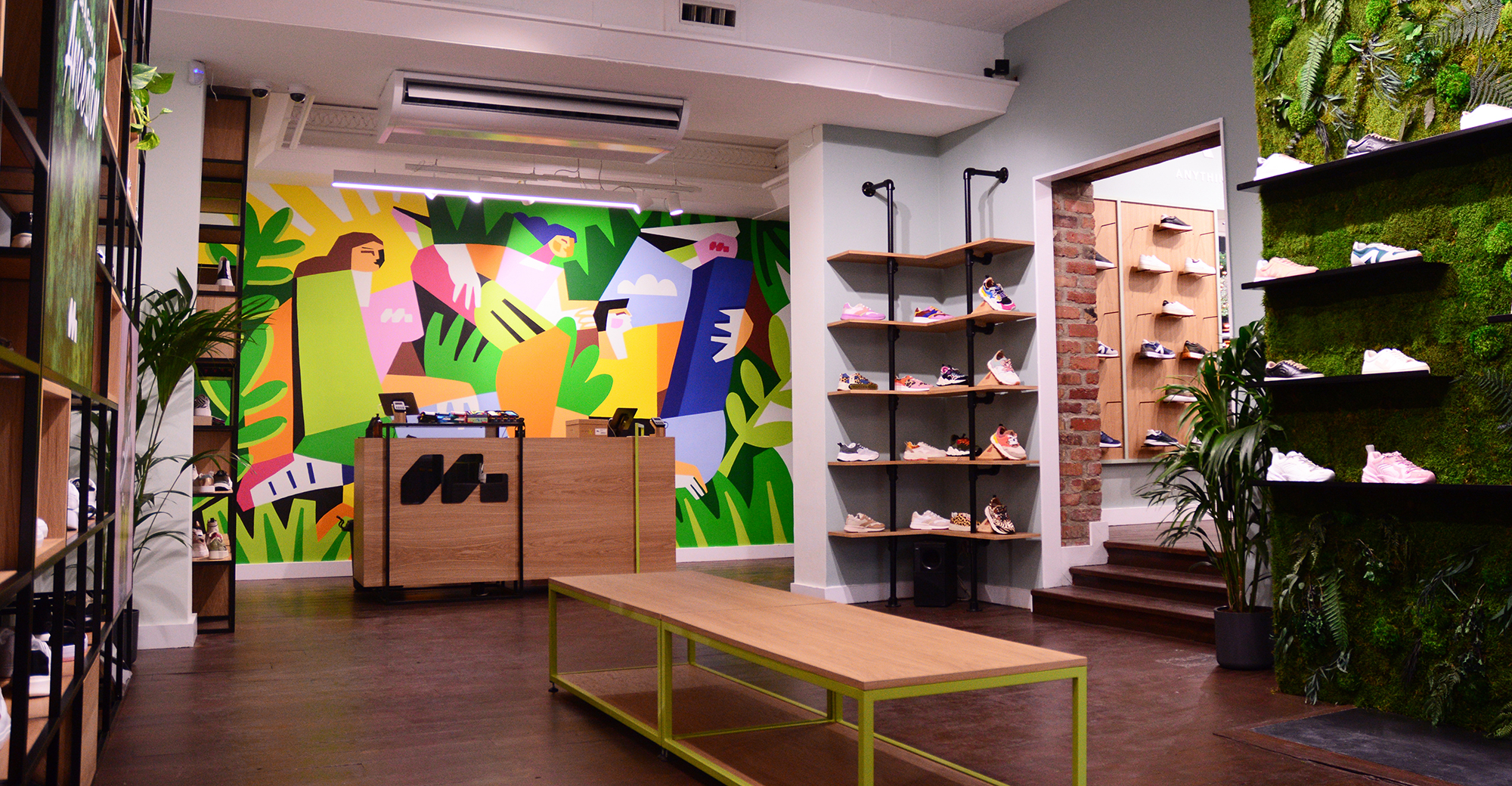
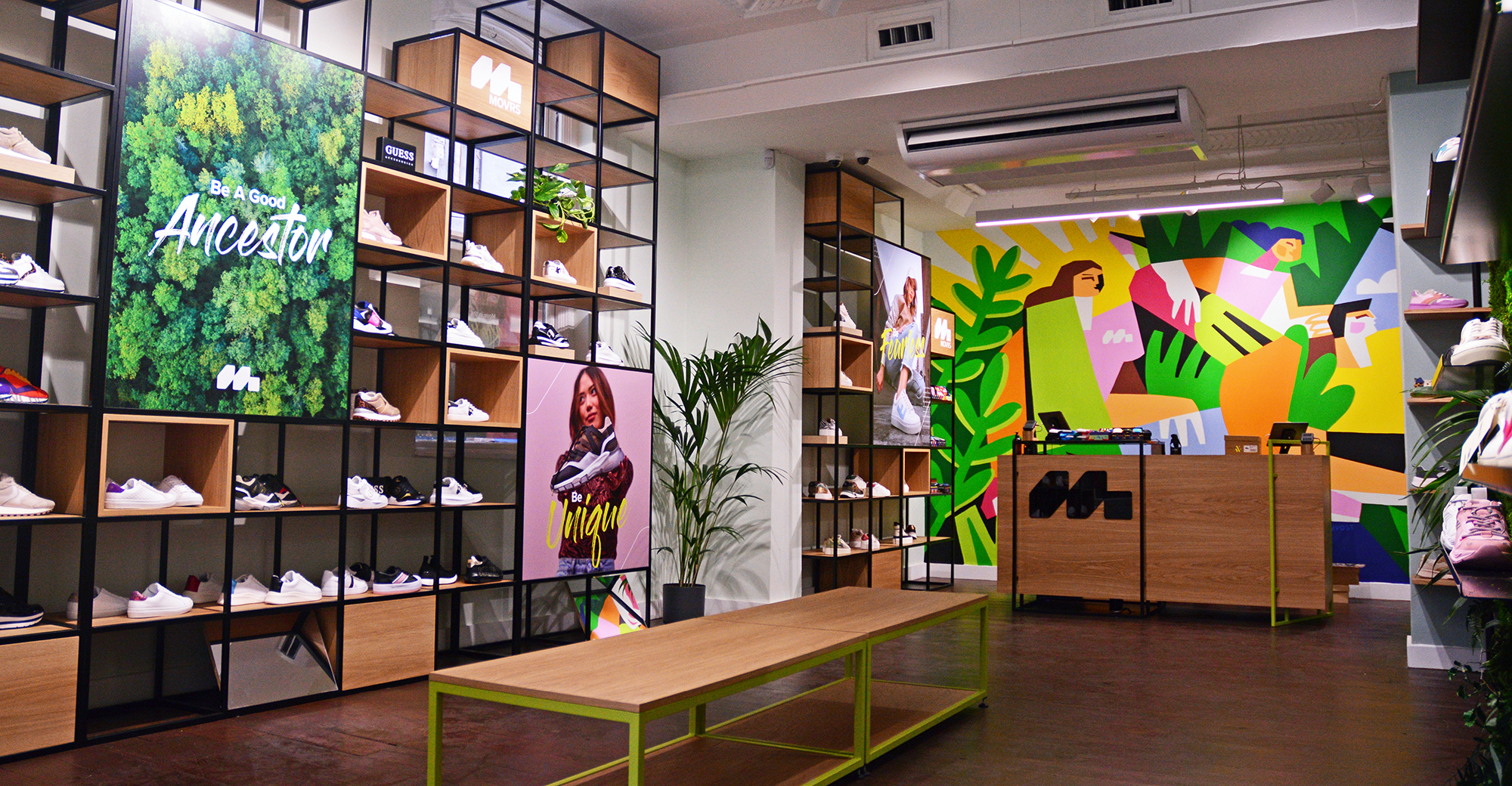
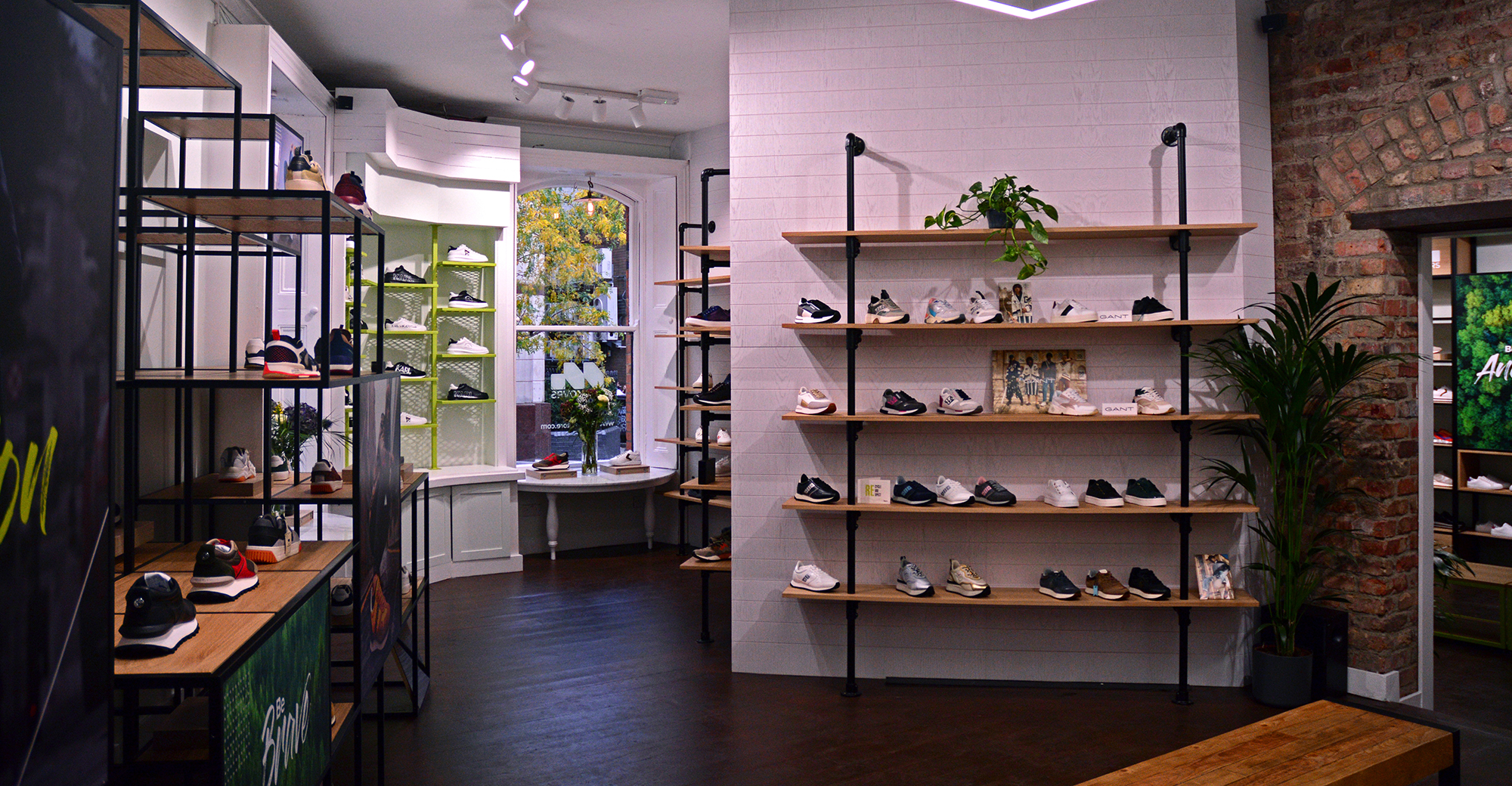
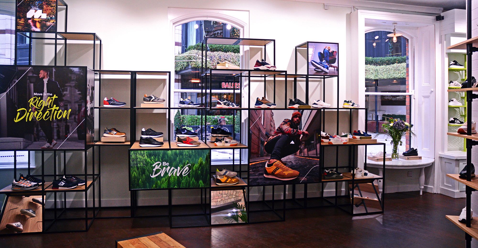
We designed custom units with oak shelves and metal frames for each room on the ground floor. Each carries branded graphics to highlight key messaging. We installed a large moss wall with shelving to compliment the sustainable elements of the brand and also created some unique shelving sections like the key clamp units in both rooms and the ACBC wall design.
We also commissioned Claire Prouvost, a Dublin based French artist to create a one-off mural for behind the till. The design reflects the vibrant and varied brands and customers Movrs has.
