Maurice Ward Notebook
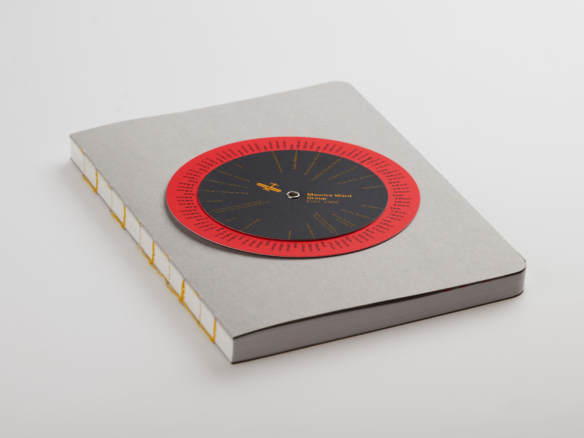
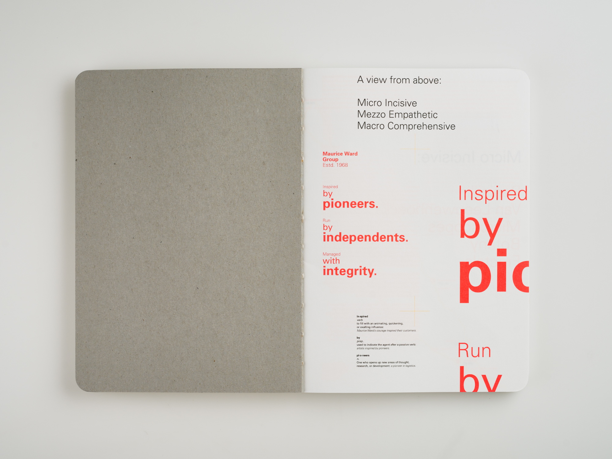
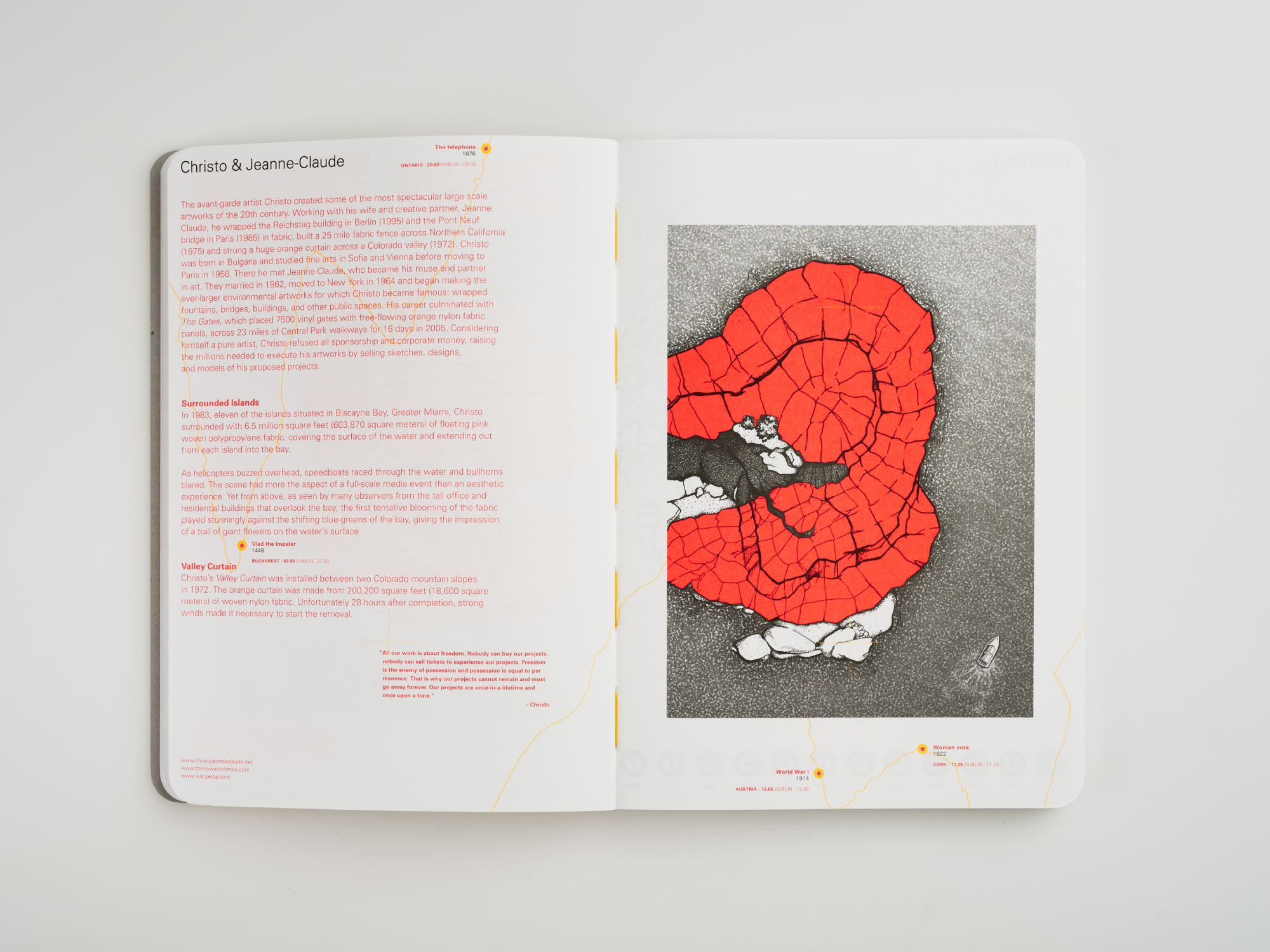
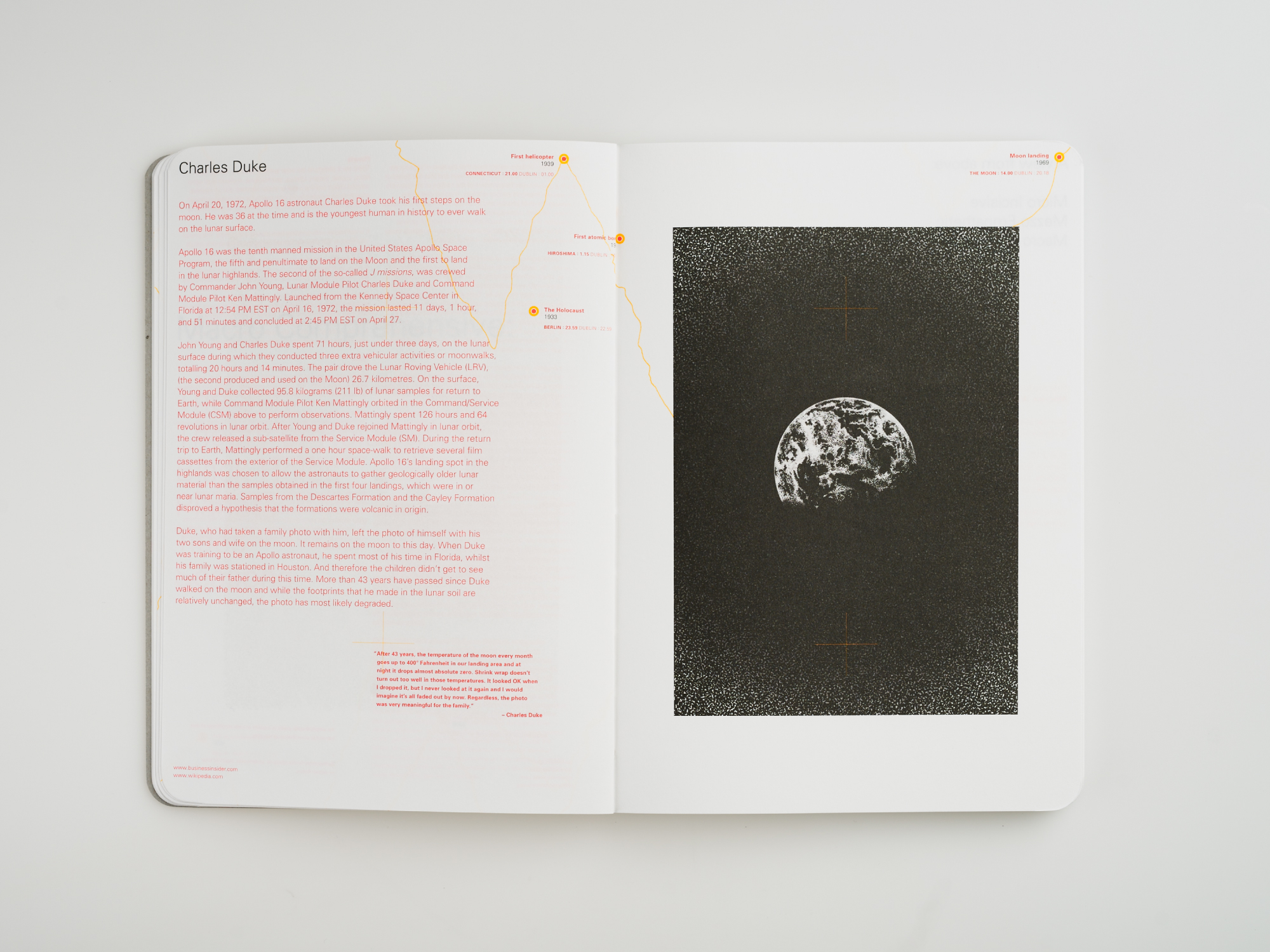
Our brief was to design a notebook to be given as a gift at a global logistics conference. Our inspiration was to comprehensively look at the Maurice Ward bi-plane logotype, Identity structure, process and products. It was here the idea of a notebook with a view from above was born. Logistics look at the movement of things through a macro comprehensive, mezzo empathetic and micro incisive lens. The Maurice Ward bi-plane also has this ability to move from one level of analysis to another.
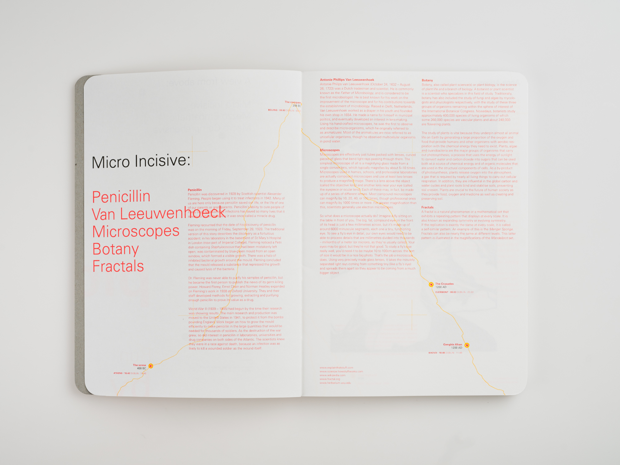
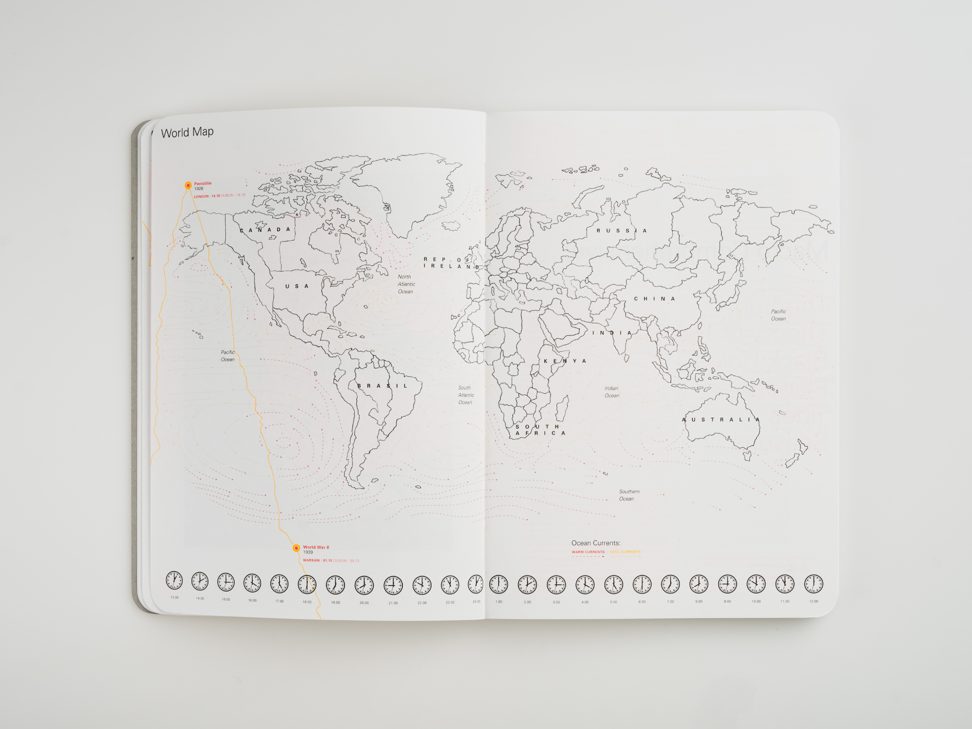
The notebook’s stories were researched and edited by ourselves and supplemented with thematic illustrations, a timeline of culturally significant events and a cover wheel created to identify timezones across the globe.
