Mani
Designed by Seán Mongey, Lorcan Rush, Amber Redmond, Andrew McNamee and Robert Farrelly at Post Studio
Illustration: Amber Redmond
Categories: Promotional / Identity / Packaging / Signage / Livery / Social Media
Industry: Commercial
Tags: Typography / Food and drink / Restaurant
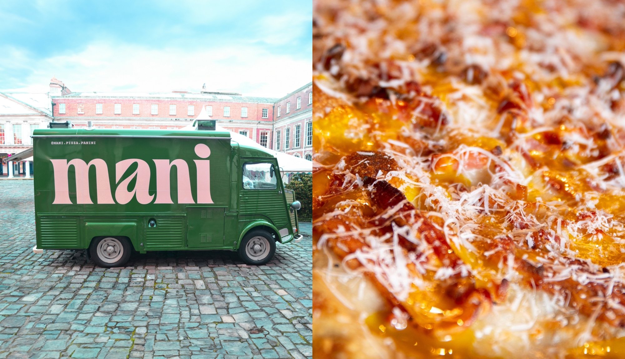
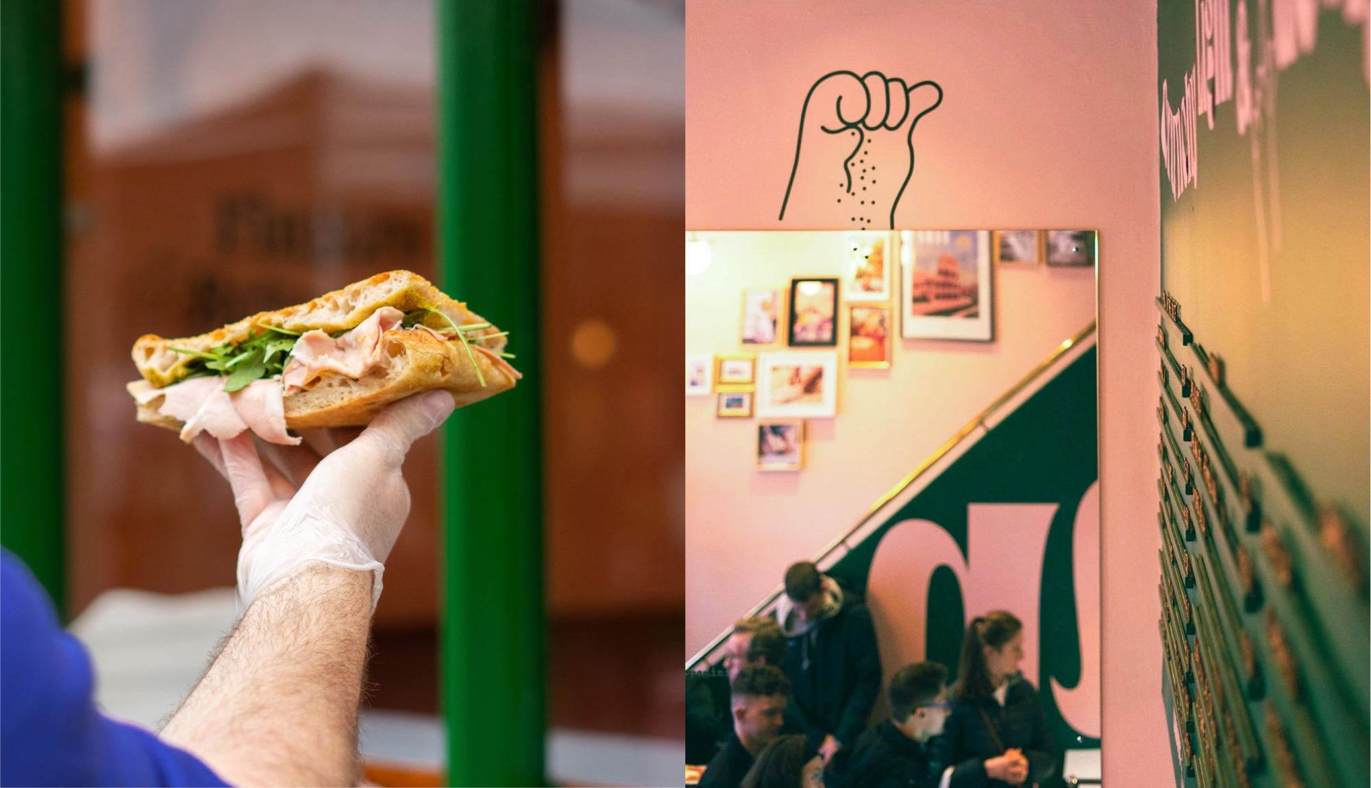
Mani is the latest brainchild from Ciaran Mc Gonagle of Catch Events. Ciaran engaged us to help develop an identity for a new concept around Roman Style Pizza and Panini. Mani (meaning fingers in Italian) is all about good food, eaten on the go. Food is prepared, eaten and cut by hand, the traditional Al-Taglio way.
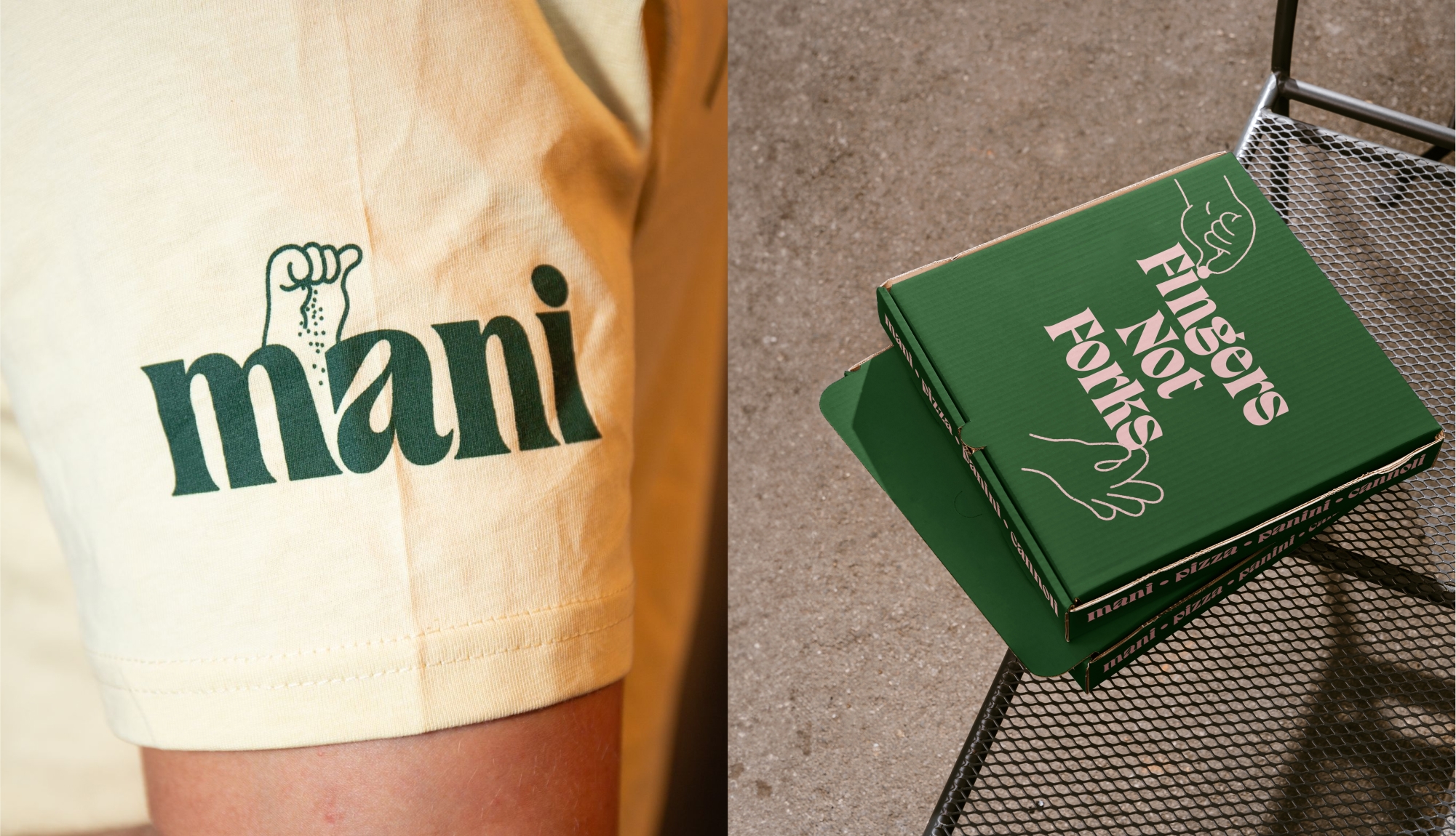
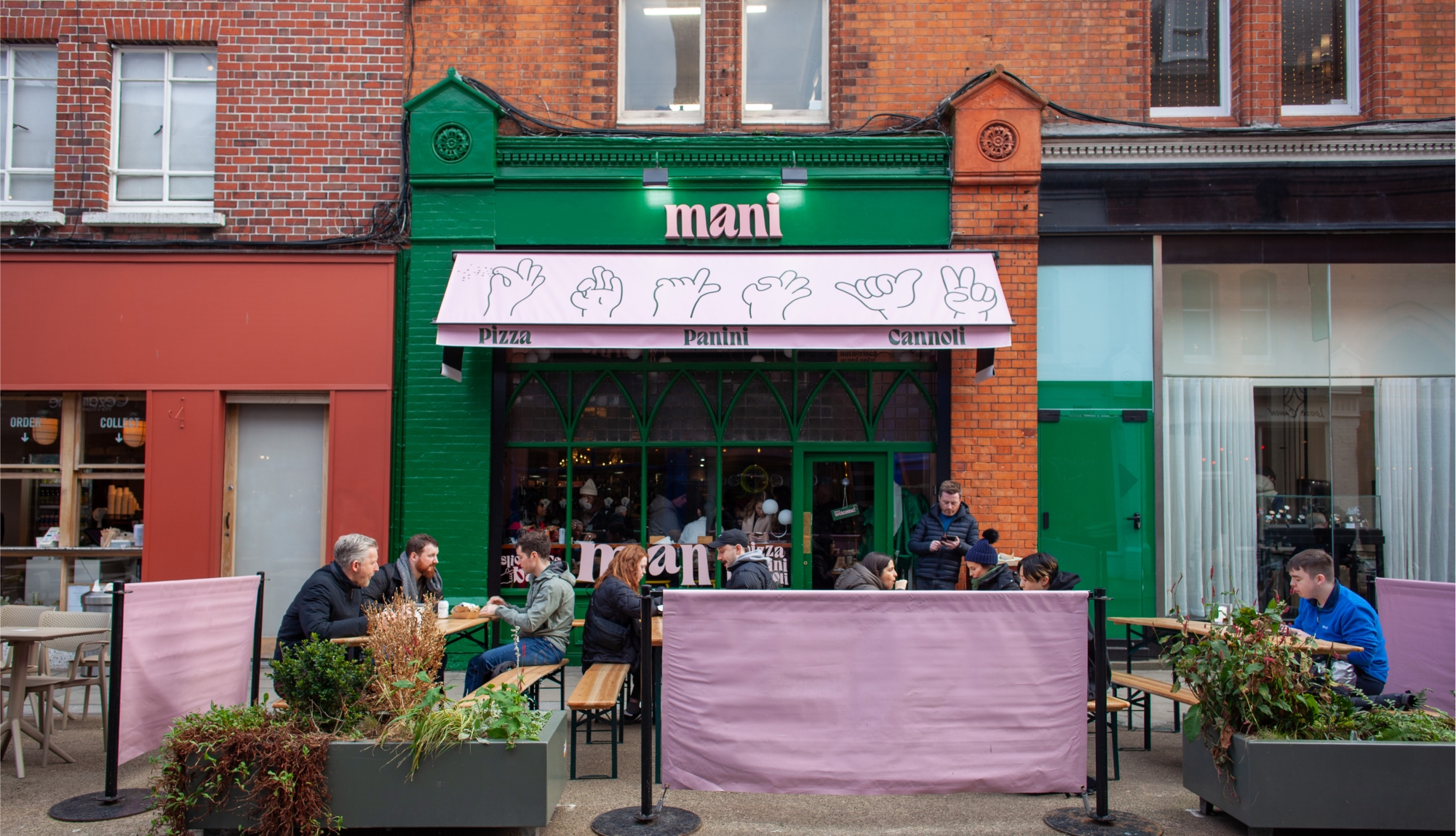
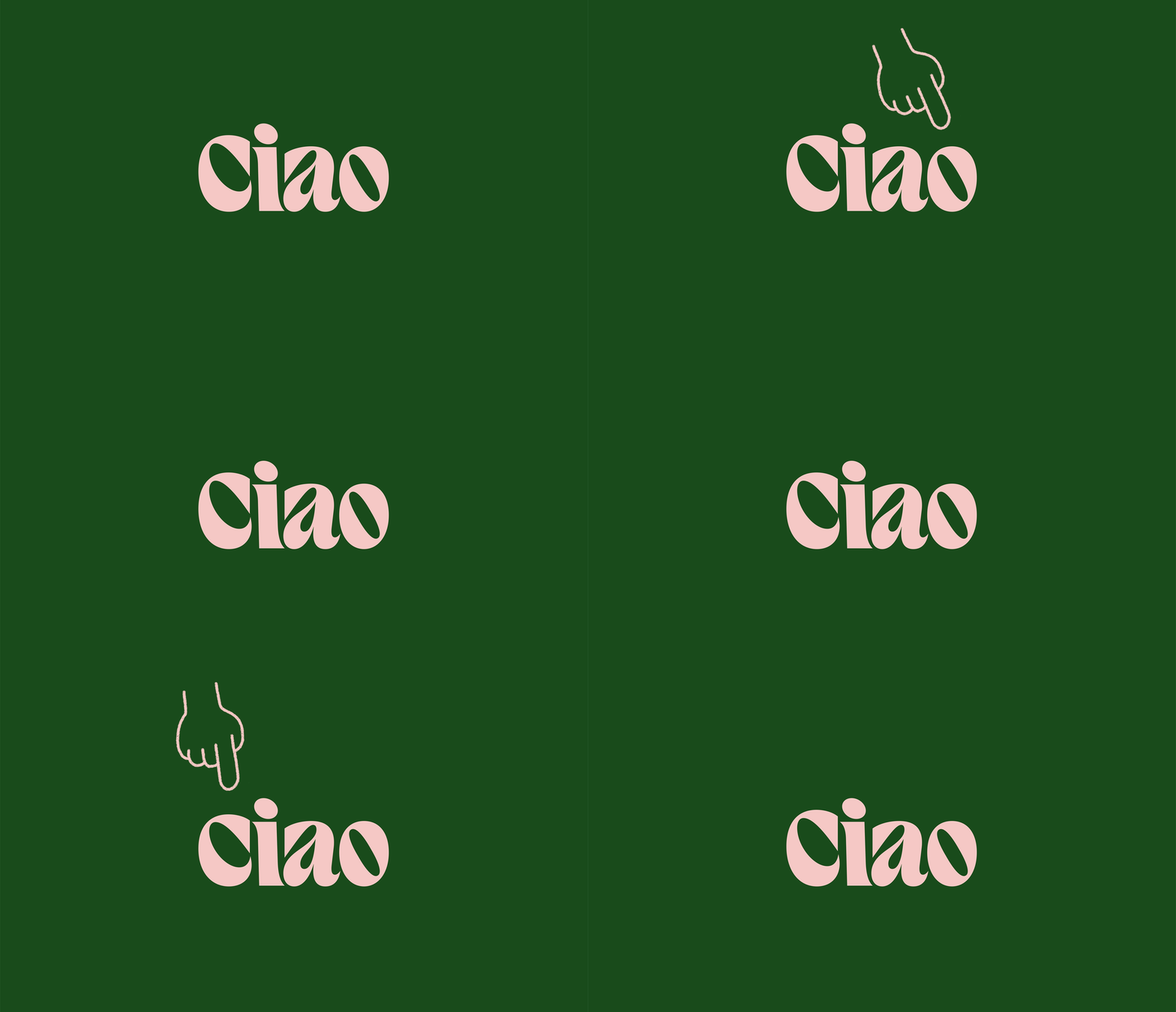
We created a simple typographic and playful identity inspired by the bubbly high hydration dough used for the pizza. Mani’s primary typeface (Gela by polytype) is paired with illustrations of a plethora of hand gestures inspired by Bruno Munari’s book Speak Italian: The Fine Art of the Gesture.
