Le Petit Parisien
Designed by Richard Seabrooke and Dynamo Design at Dynamo
Illustrator: Steve Doogan
Categories: Identity
Industry: Commercial
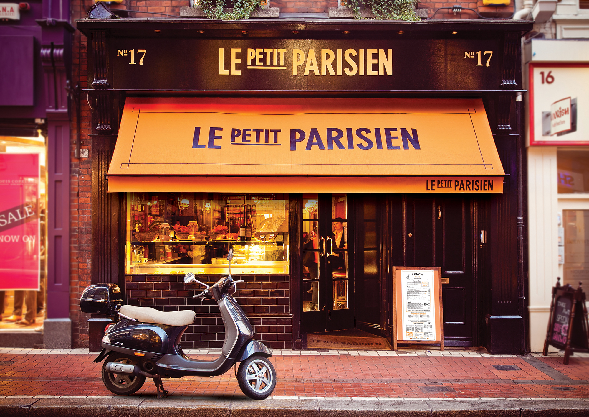
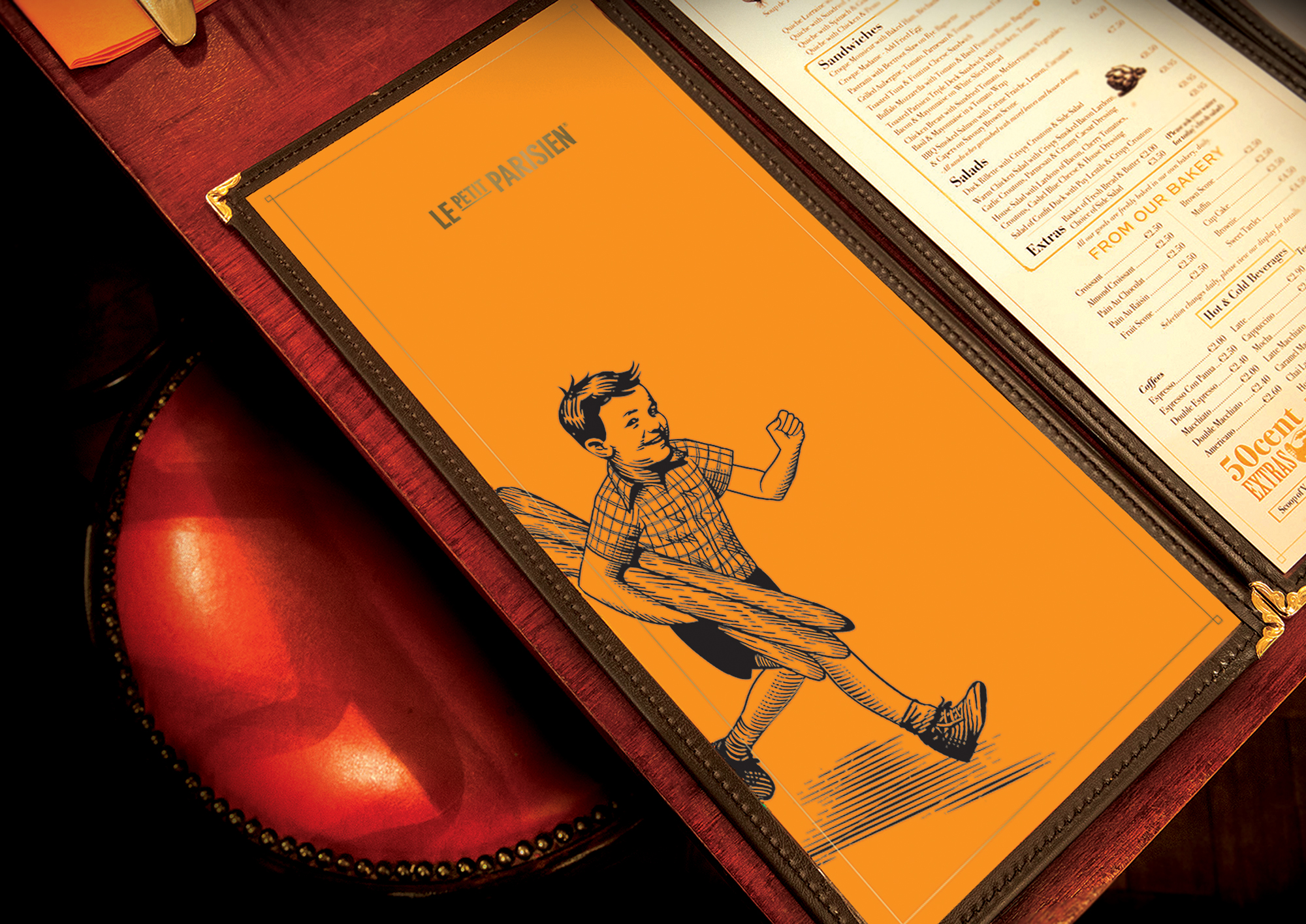
Le Petit Parisien was borne out of our genuine love for French fare. The bakery, the patisserie and the unique culture that is the French coffee shops of 1920s Paris. What we set out to create is a slice of Paris life, a warm corner of aromatic France in the heart of Dublin. In settling on a name we looked, at the quintessential French names, food provenance and finally settled on Le Petit Parisien.
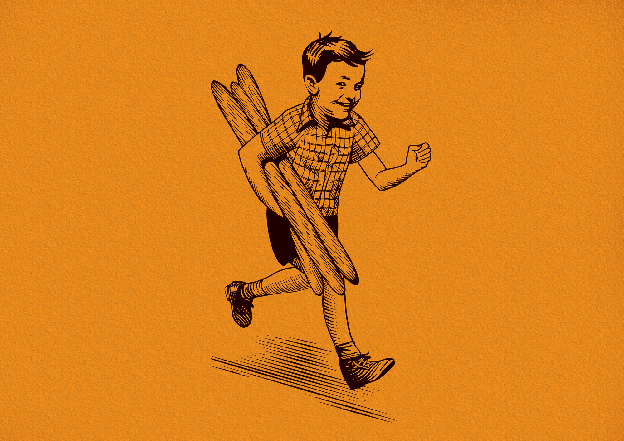
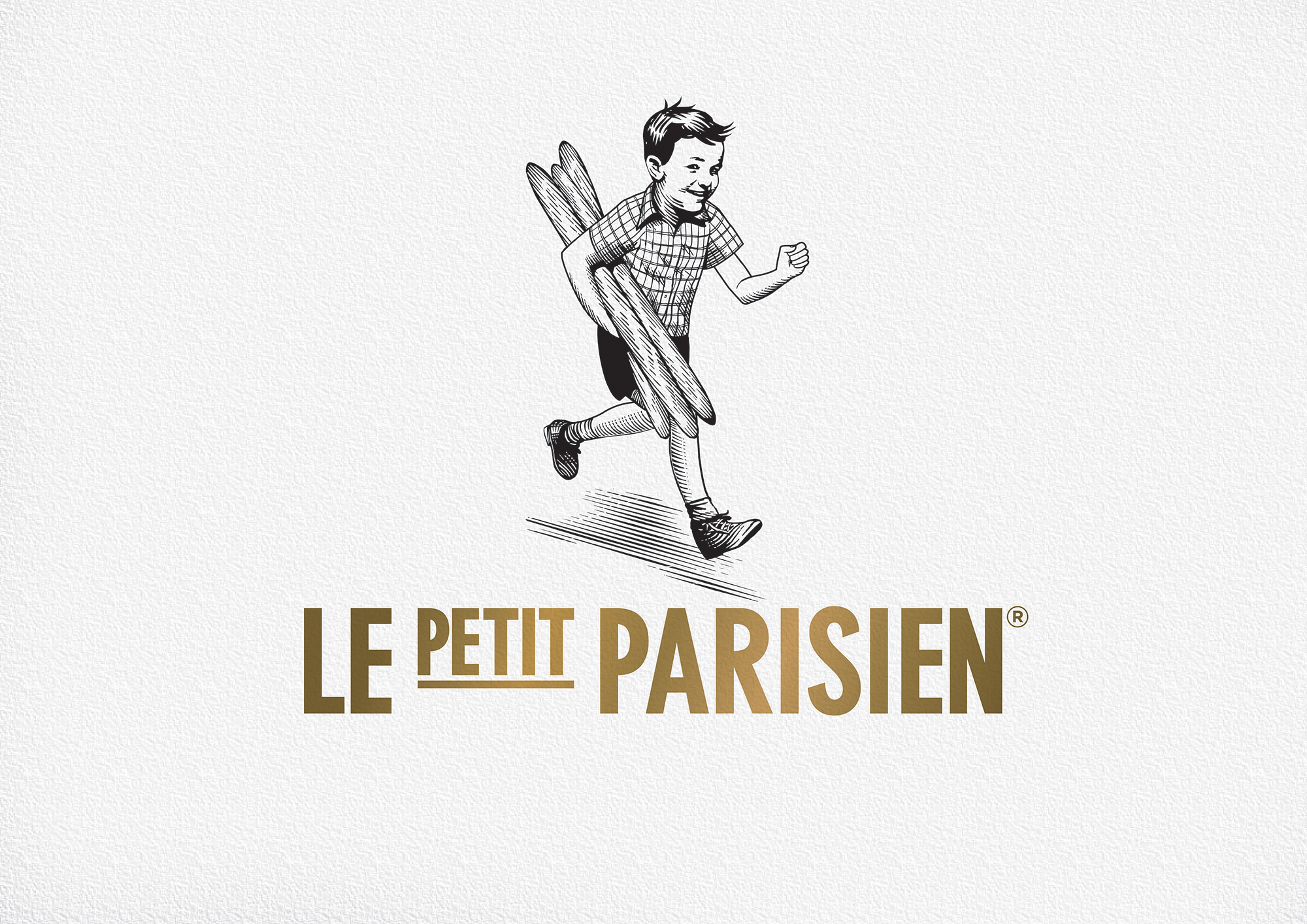
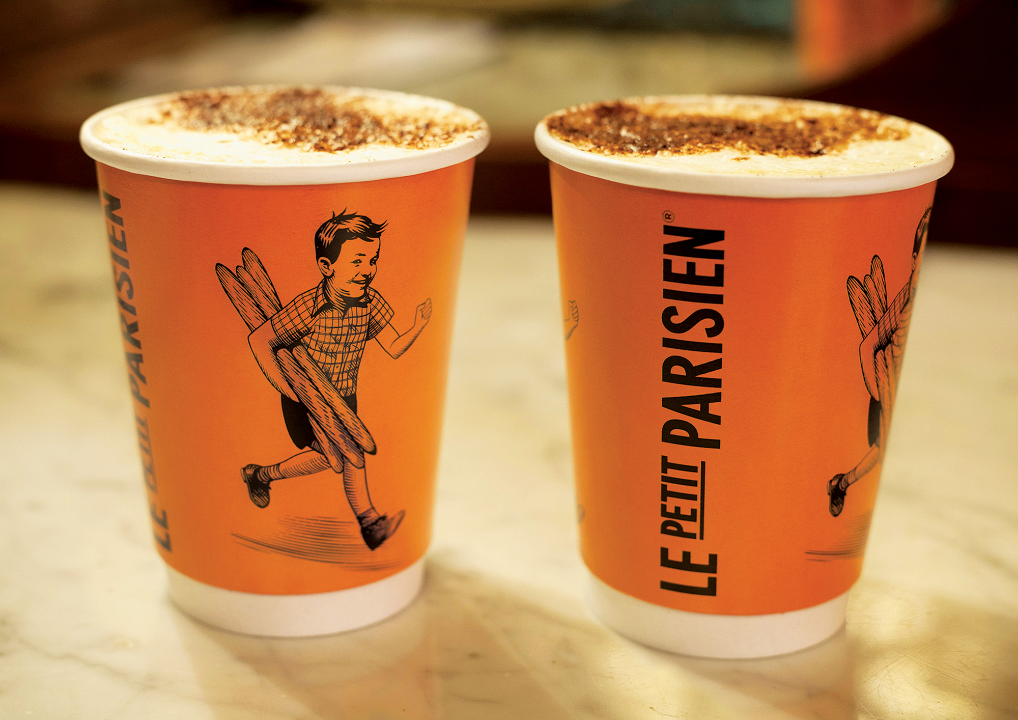
With these rich influences, our illustrator created a logo of a wood carved image of a young boy, our Le Petit Parisien. We feel he not only communicates charm, gaiety, warmth and a by-gone innocence, but it’s his utter glee that he’s in possession of something special.
So whether it’s a coffee dash at our espresso counter, a delicious French sandwich to take back to the desk, or to take home a little piece of Paris for an after-dinner treat or a gift for someone special, we want our customers to feel, even an inkling, of the abandoned joy of our Le Petit Parisien boy.
