Klaas Kickz
2022
Designed by Finan Callaghan at Finan Callaghan
Categories: Website / Identity / Packaging / Social Media
Industry: Commercial
Website: klaaskickz.com/
Background
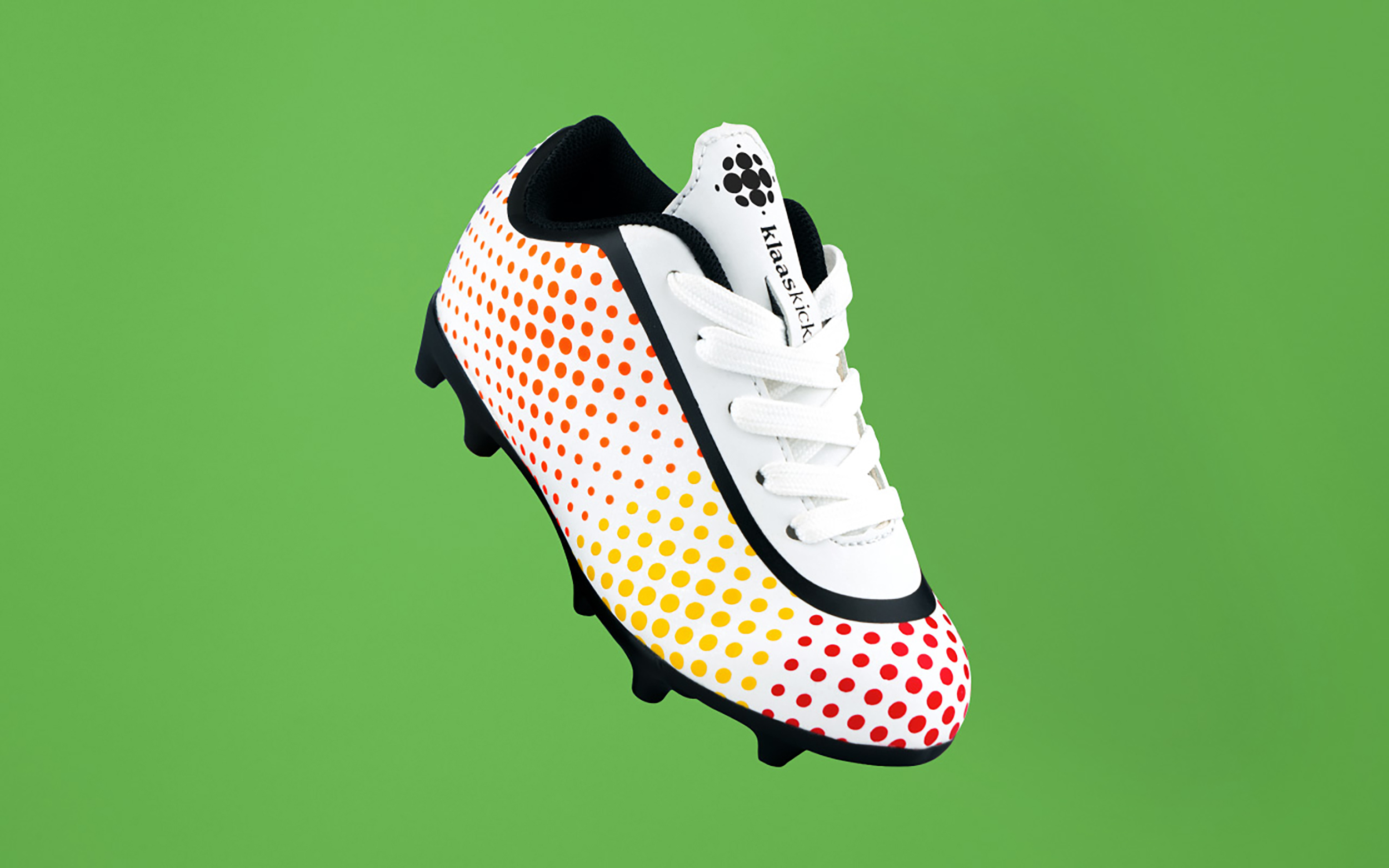
Klaas Kickz is a football boot brand targeted at children aged 4-8. The Klaas Kickz boot is colour coded to help teach young children who are interested in playing football how to use each part of their foot effectively.
The Brand
The goal was to create a brand that empowers young kids to be whatever they want to be. Klaas Kickz believes that by playing football as a child you learn much more than football skills, you learn important life skills. The Klaas Kickz boot helps to teach kids how to play football in a manner that’s familiar to them and helps make joining a football team less intimidating.
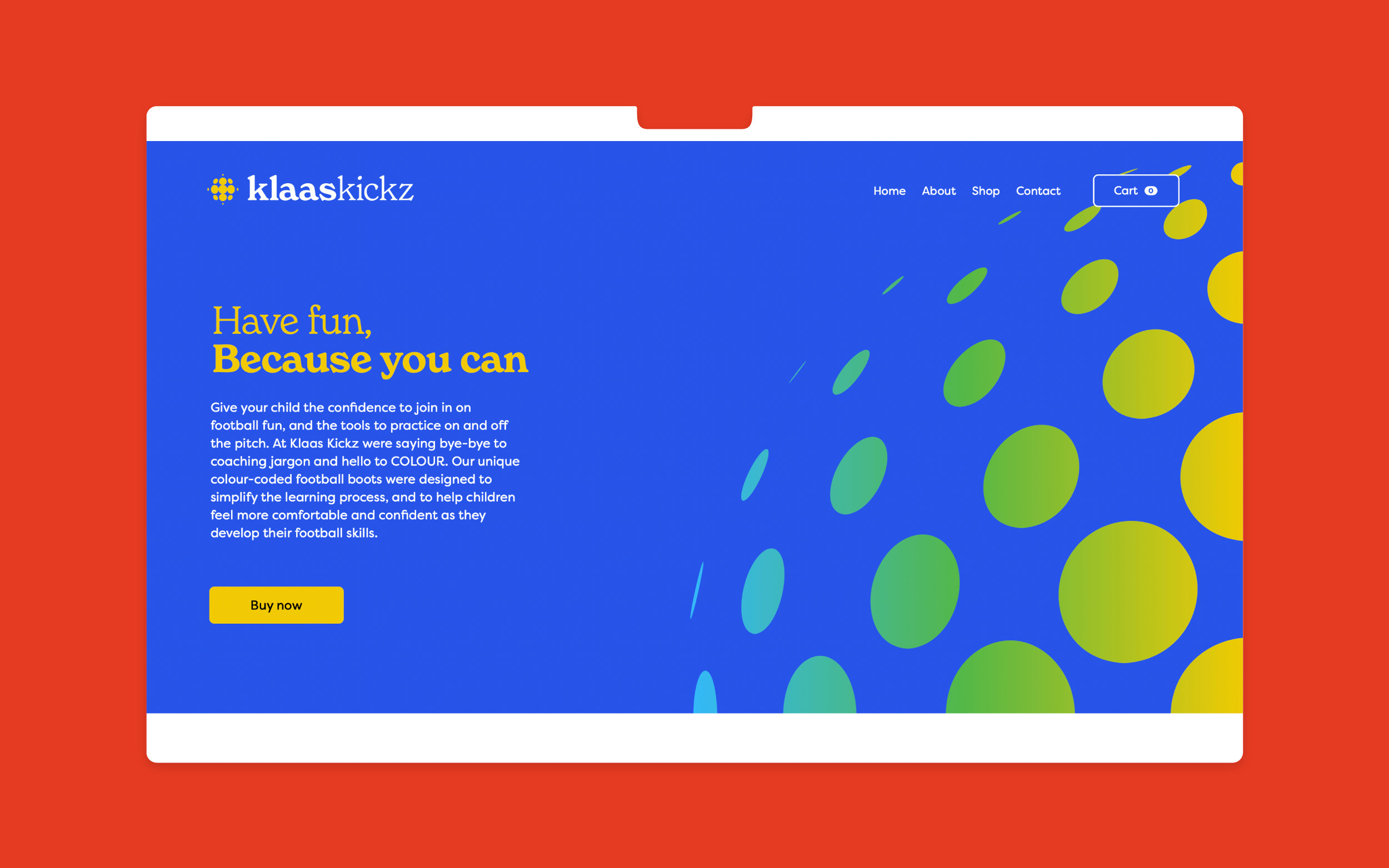
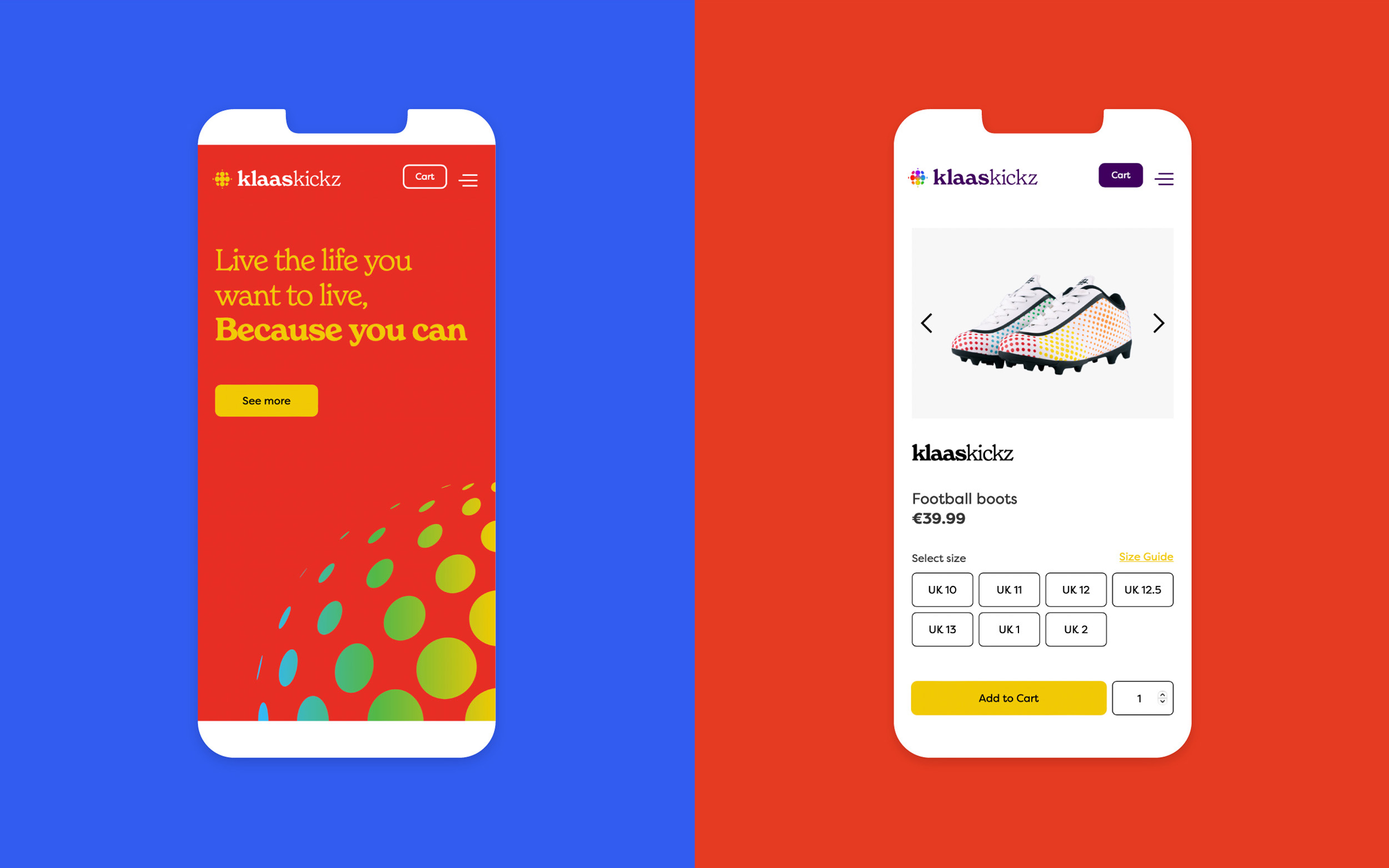
With the idea of empowerment in mind, we developed the Klaas Kickz tagline, 'Because you can'. This tagline embodies everything Klaas Kickz stands for as a brand.
We felt this tagline worked well for a number of other, functional reasons too:
1. It’s versatile: The tagline strikes a balance between playful & motivational, meaning it can be used in a variety of marketing endeavours depending on the subject matter
2. Good mouth feel: It's fun & easy to say
3. It works well as a standalone, or as part of a sentence (e.g. Dream big, Because you can)
Visual Identity
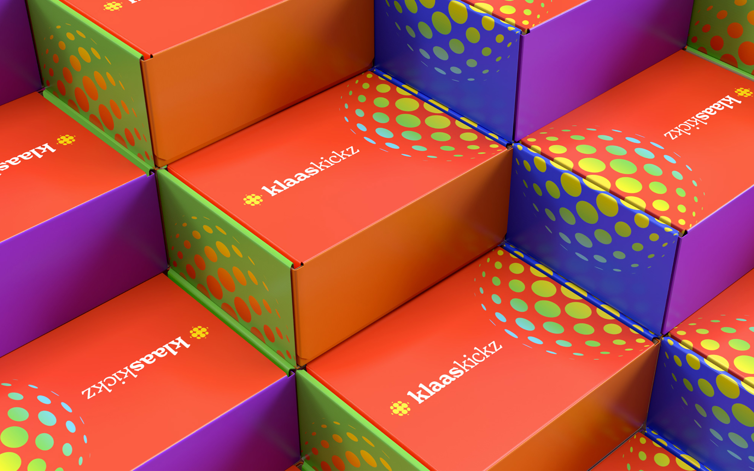
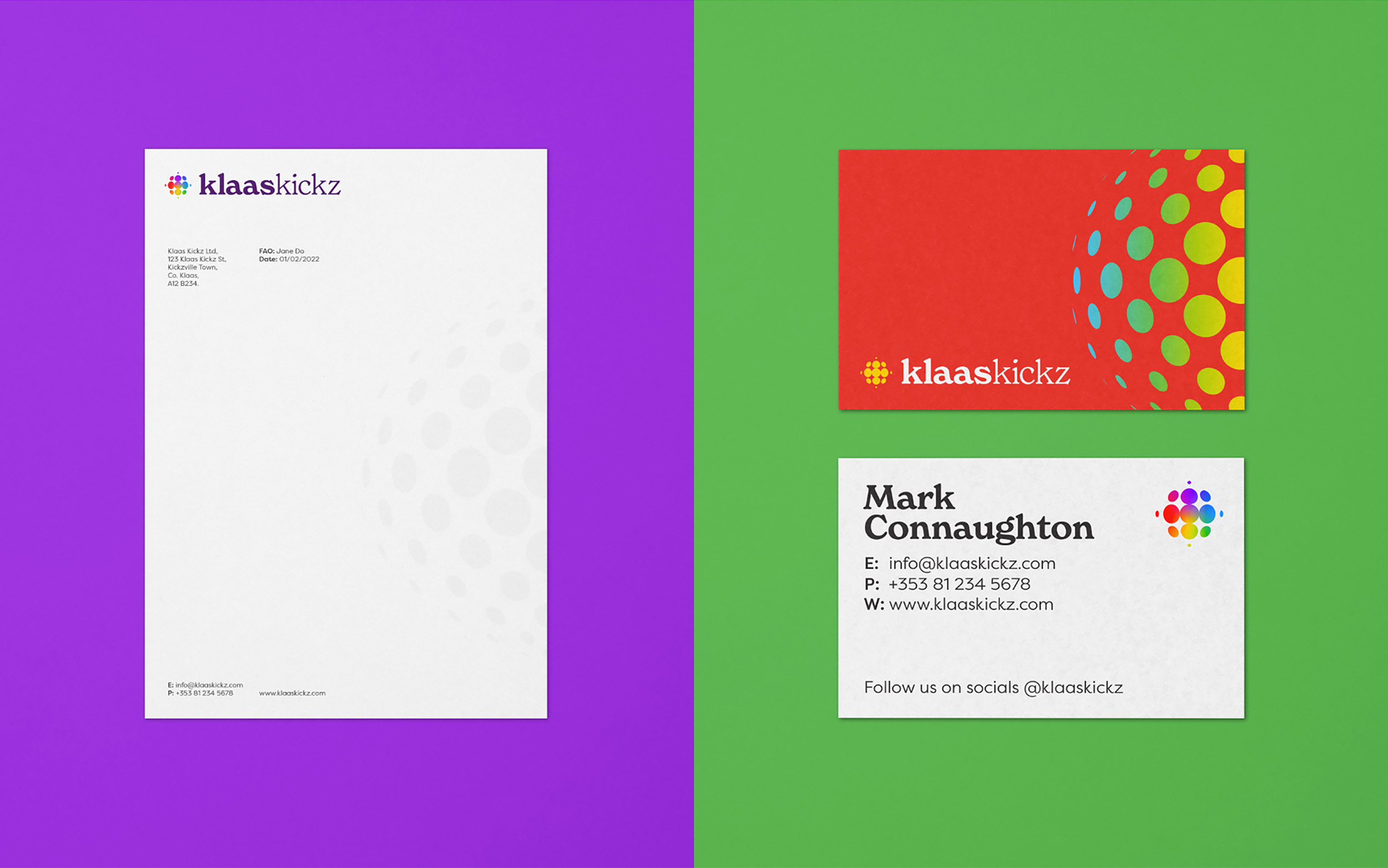
In terms of a design challenge, we needed to design a visual identity that was deemed cool by our target audience. As this is a brand that sells football boots, an important consideration was to create a logo that kids would be happy to wear.
The Klaas Kickz logo was designed to evoke action, motion, progress and, more literally, a football. The logo occupies a visual space previously left vacant in the Irish football boot market, and while Klaas Kickz consider training aid brands more likely competitors than larger sport brands, it was important to ensure they could hold their own in either situation.
The Klaas Kickz visual identity is all about colour. The importance of colour in this identity is, of course, derived from the nature of the product, but it also symbolises inclusivity, something Klaas Kickz values greatly.
