KittyHawks
2013
Designed by Alice Greene, Brendan Boyle and Ciaran Moran at TAP Creations
Interior Architects: Gaffney Associates
Categories: Identity
Industry: Commercial
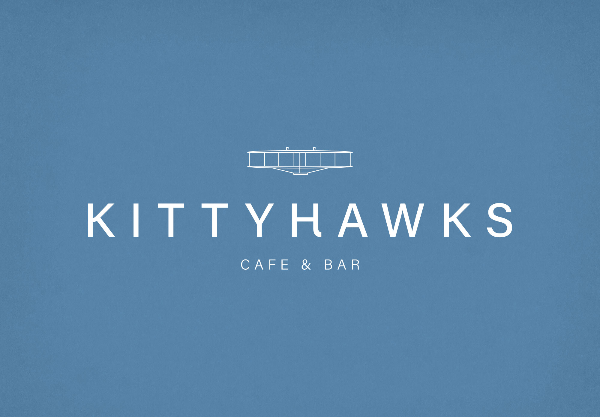
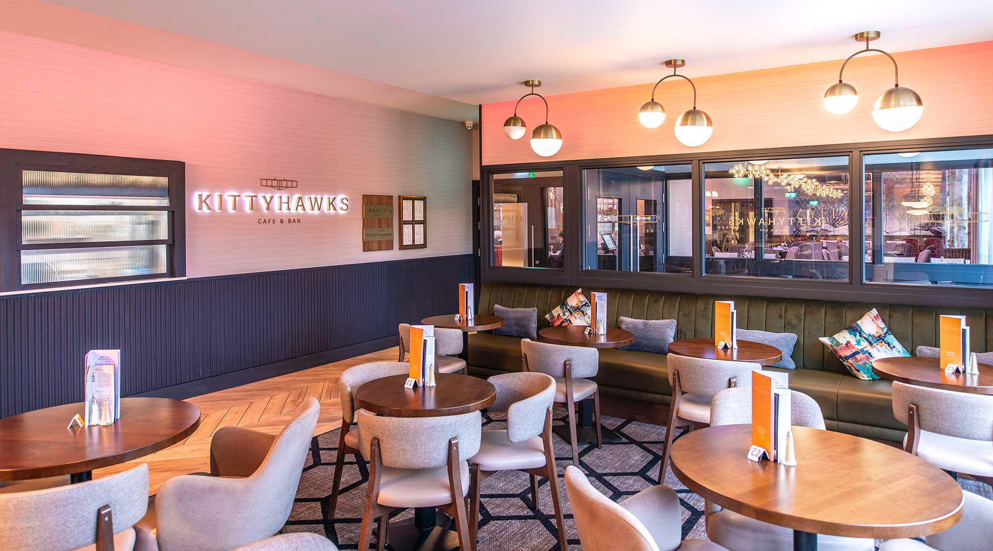
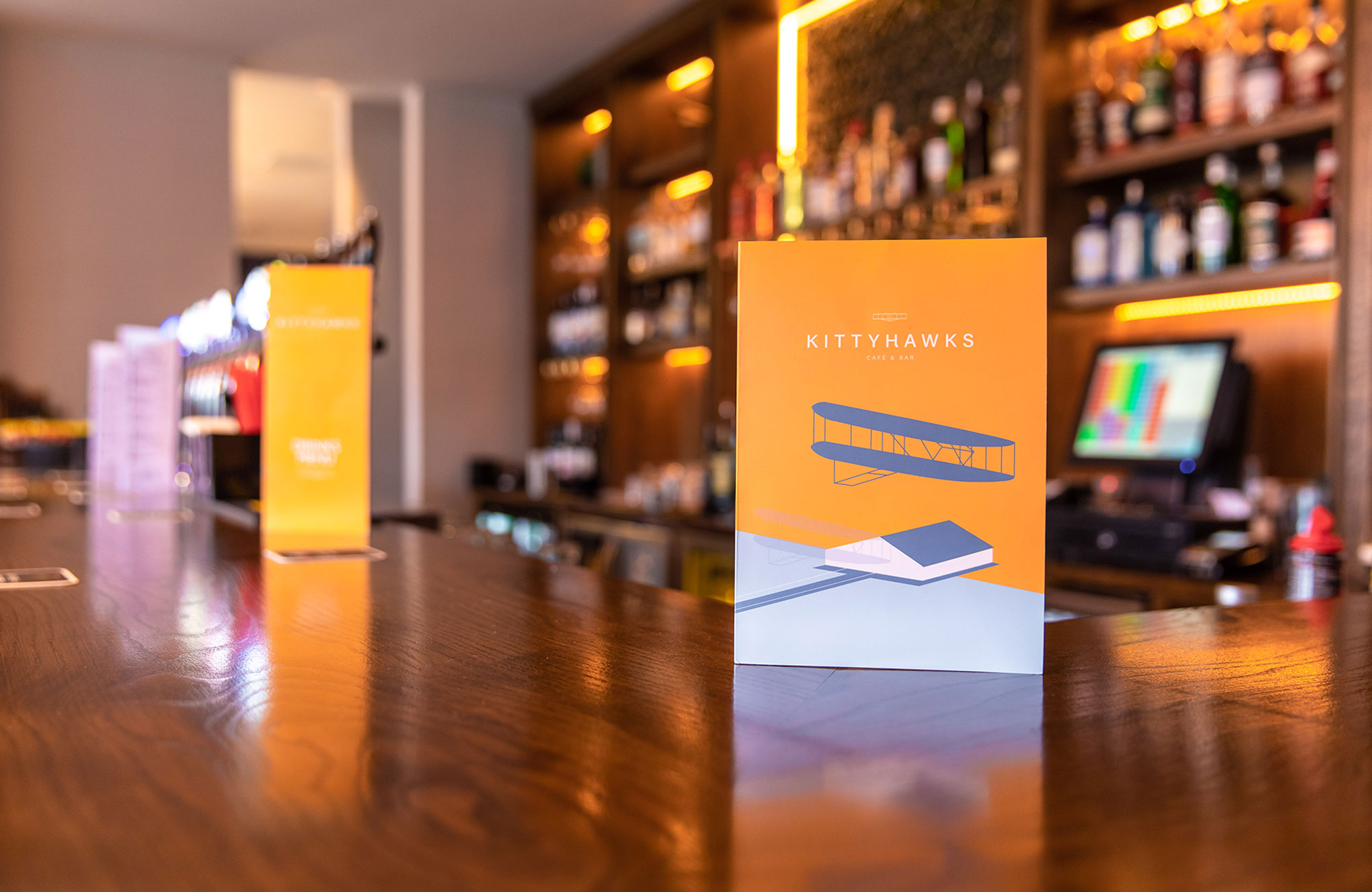
Continuing the aviation theme for their ground floor refurbishment, the Carlton Hotel engaged TAP to refresh their existing bar and café brand - Kittyhawks. The name was derived from Kitty Hawk, North Carolina - the location where the Wright Brothers made the first controlled powered airplane in 1903. Working closely with architects Gaffney Associates, we fused a sense of this heritage with modernity, creating a simplistic yet elegant logo composed of a robust logotype crowned with a minimalist profile of the original Kittyhawk aircraft.
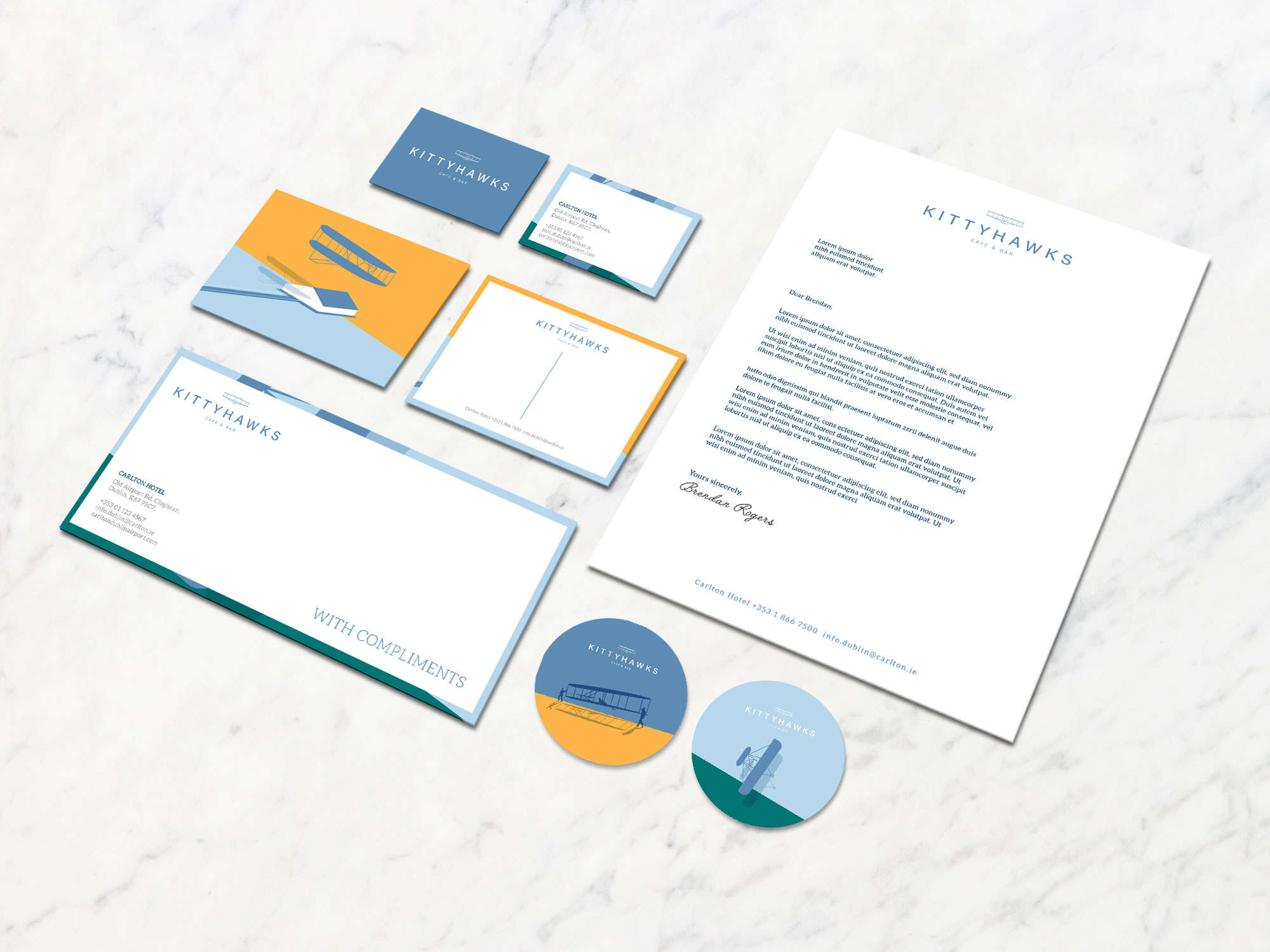
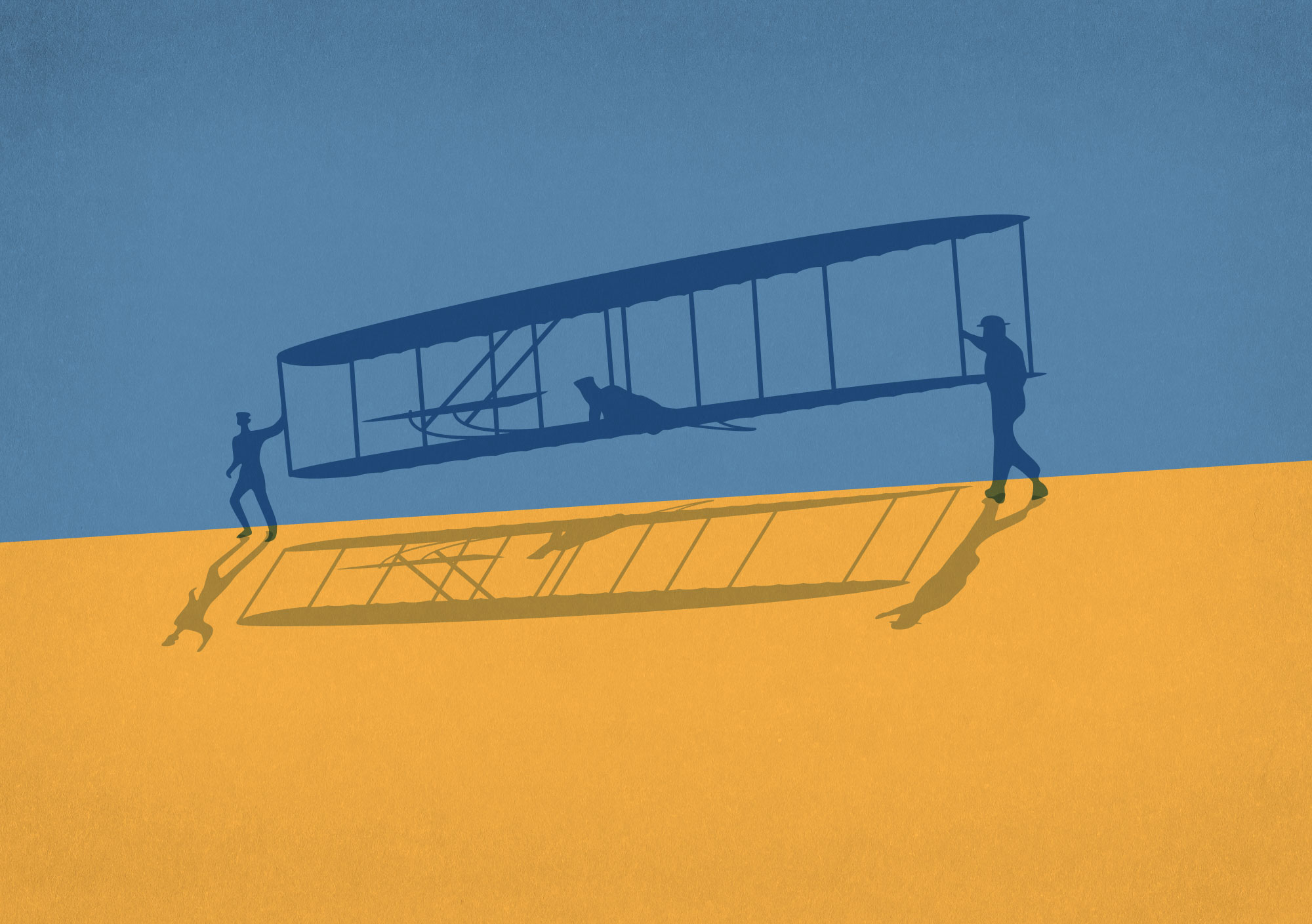
‘Curved’ points in the arm of the K and tail of the H within the logotype soften the effect so it doesn’t appear too mechanical and lends another level of depth to the overall mark. A complimentary suite of vibrant, 2D illustrations depicting seminal moments from the Kittyhawks aircraft cycle, build the personality and story of the brand.
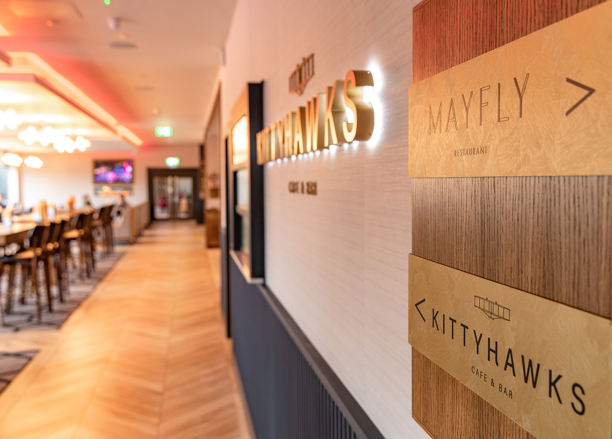
Menus, uniforms, stationery, internal signage were all designed as part of the final range with robust underlying principles for future development.
