King Koil Rebrand
2013
Designed by Paul Guinan, Adam Gallacher and Nik Dillon
Illustrator: Mel O'Carroll
Categories: Identity
Industry: Commercial
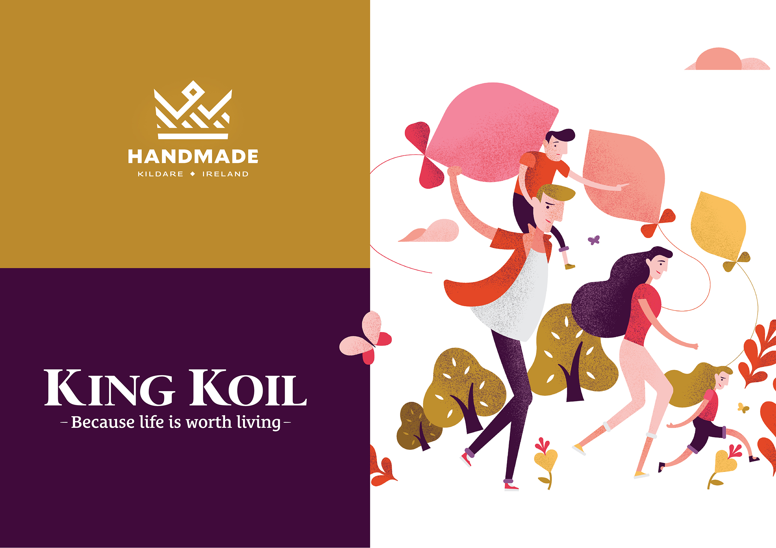
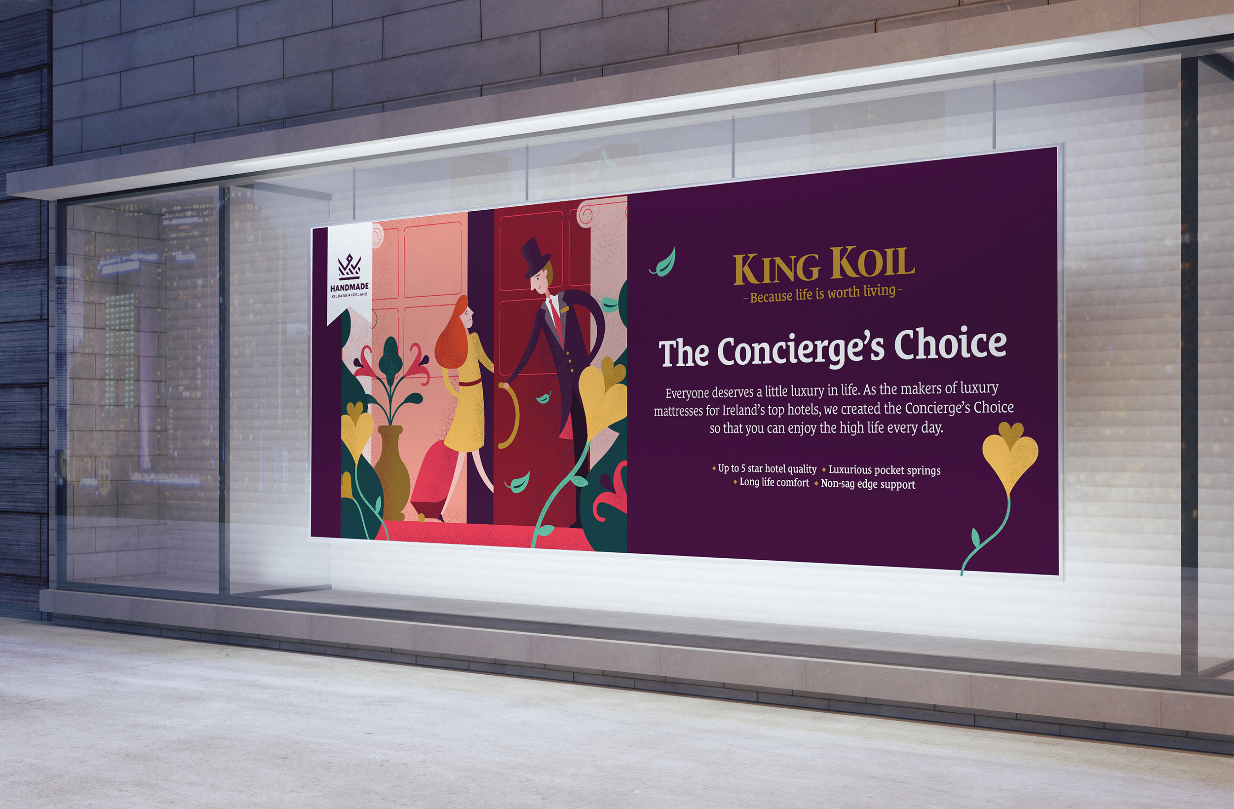
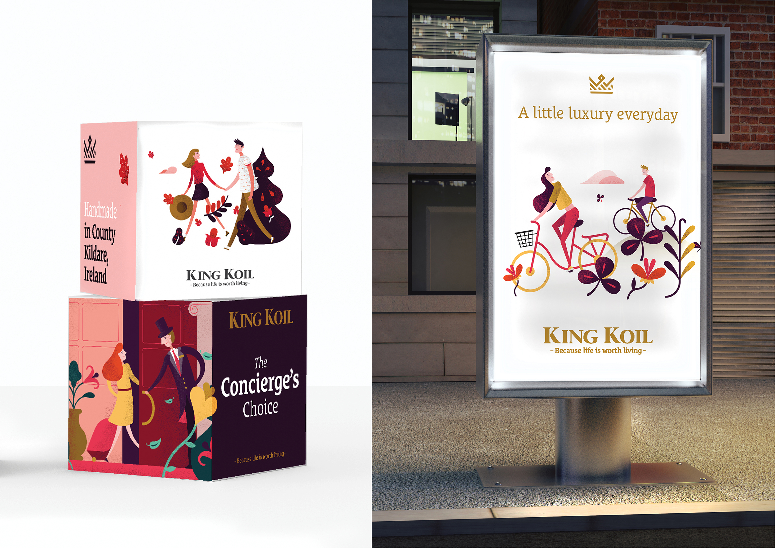
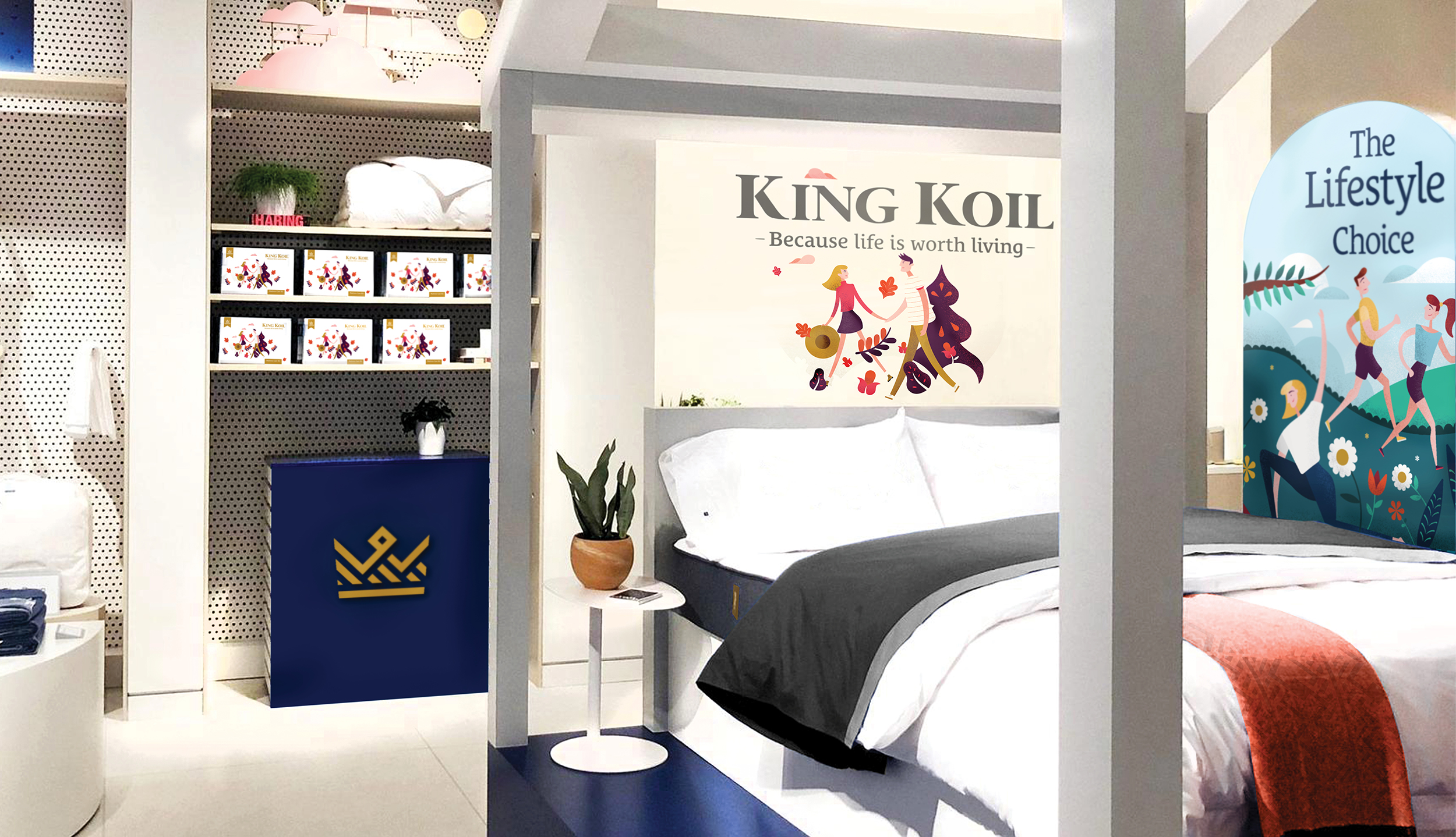
Bed brands so often adopt the same imagery, palettes and approaches, this makes it a dull consumer experience, we decided from an early stage to take a different approach. King Koil are the dominant suppliers to the luxury hotel trade and this is an affordable piece of everyday luxury, bought for that little bit of personal pleasure. We worked with the manufacturing team to simplify the multitude of confusing products into 3 product areas. The Lifestyle Choice: back support and health, The Concierge’s Choice: luxury beds from the hotel range and finally The Craftsman’s Choice: where products filled with all natural fillings are gathered. We created illustrations to help clarify these offerings. We redrew the core logo and we created a crown motif that we could use as our quality symbol and futher reinforce the handmade and made in Ireland quality of our brand. The kit of parts are designed to be used simply, masterbrand is colour on white, ranges are aligned against new palettes, beyond this the brand is completely flexible, warm, friendly, personable and above all totally unique in the category.


