Jacob’s Cut Straight Bourbon Whiskey – Legacy Batch
2024
Designed by Christopher Lee at Brand Hatch Creative
CGI Renders: Tricycle Studio
Categories: Print / Identity / Packaging
Industry: Commercial
Tags: Typography / Food and drink / Art direction
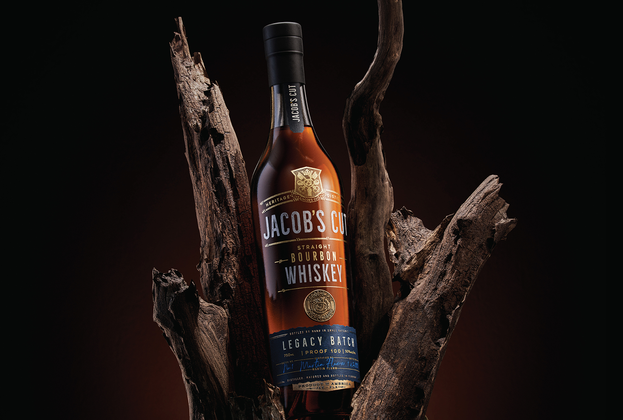
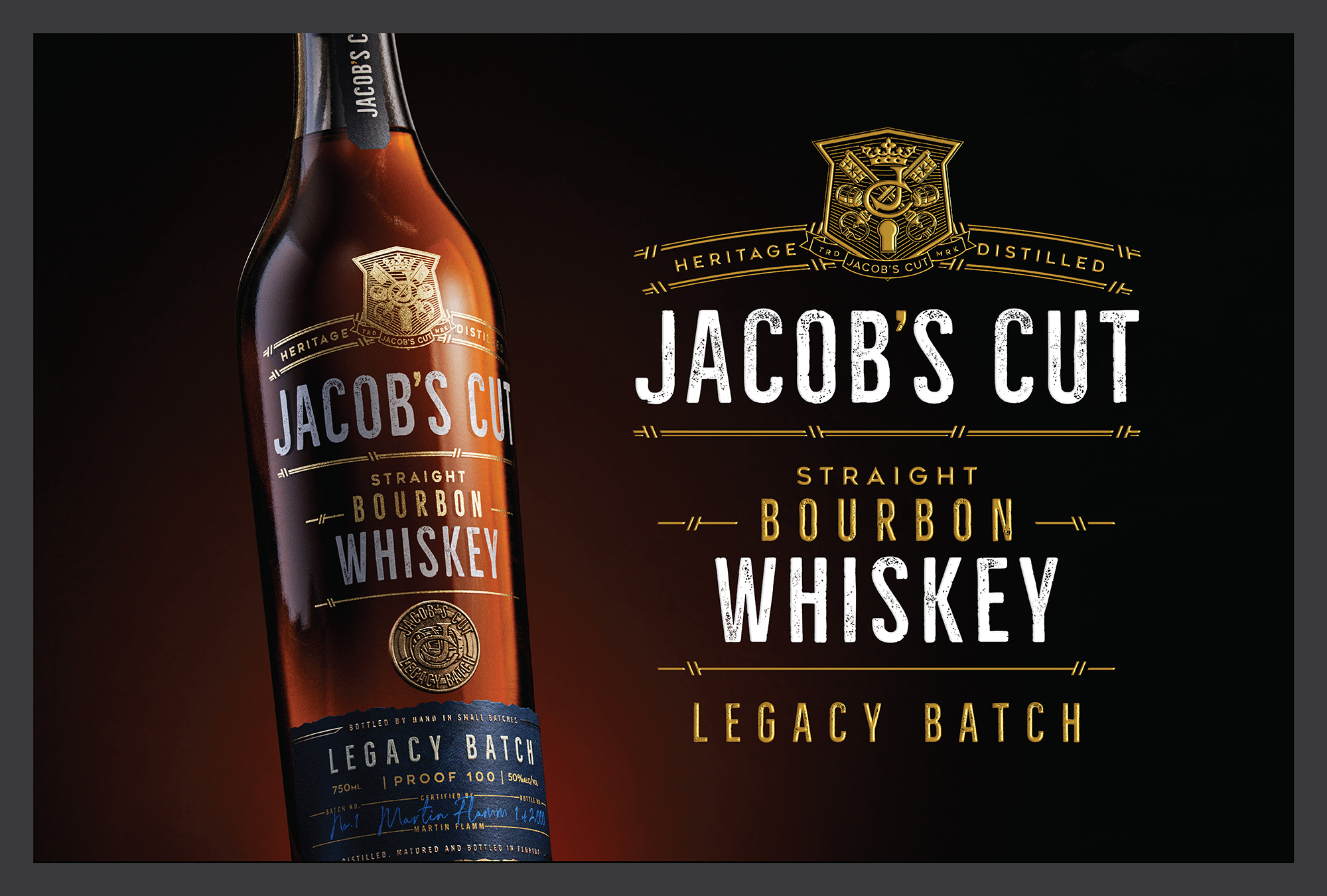
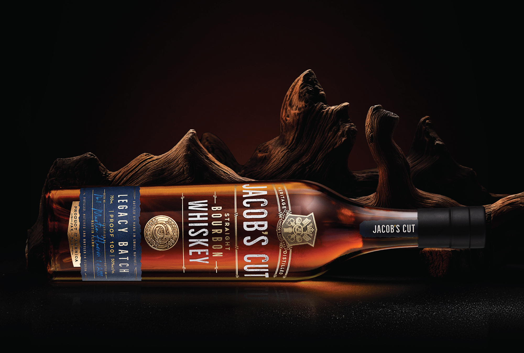
Introducing Jacob’s Cut Straight Bourbon Whiskey, Legacy Batch—a tribute to a family’s rich heritage, tradition, and generations of passion for whiskey. Crafted by a current family member, Jacob’s Cut represents the passing of a treasured recipe to a new era, blending tradition and innovation.
Named after Jacob, the beloved grandson and heir to the family legacy, Jacob’s Cut embodies the continuation of this proud tradition.
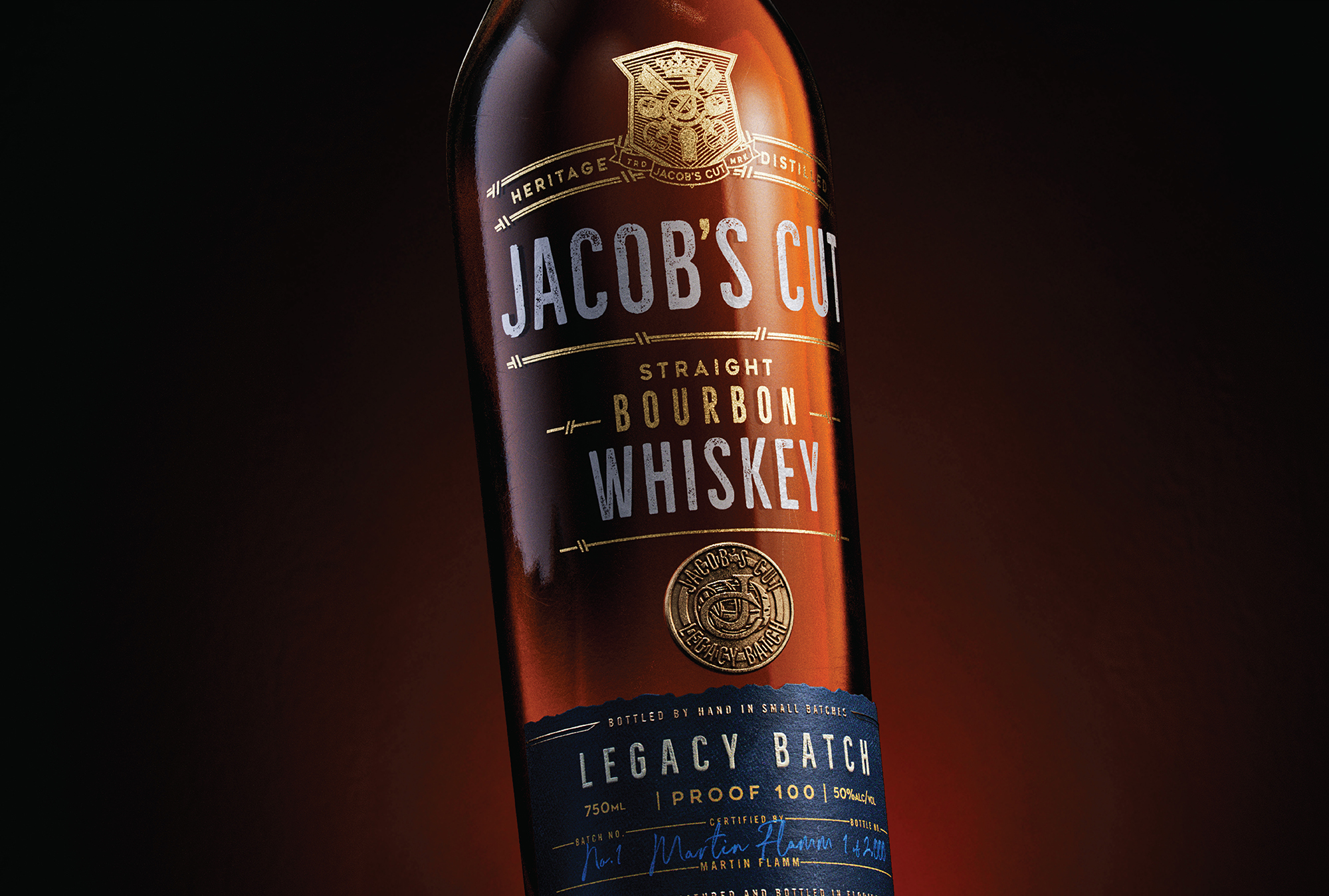
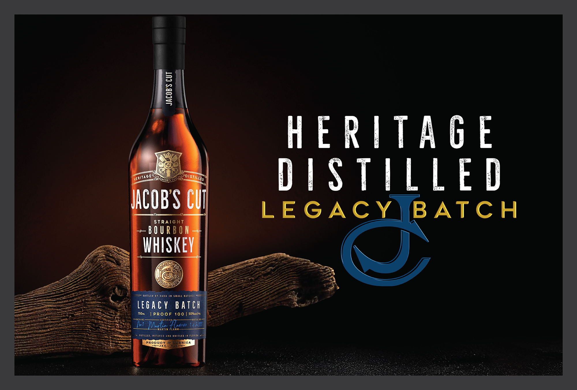
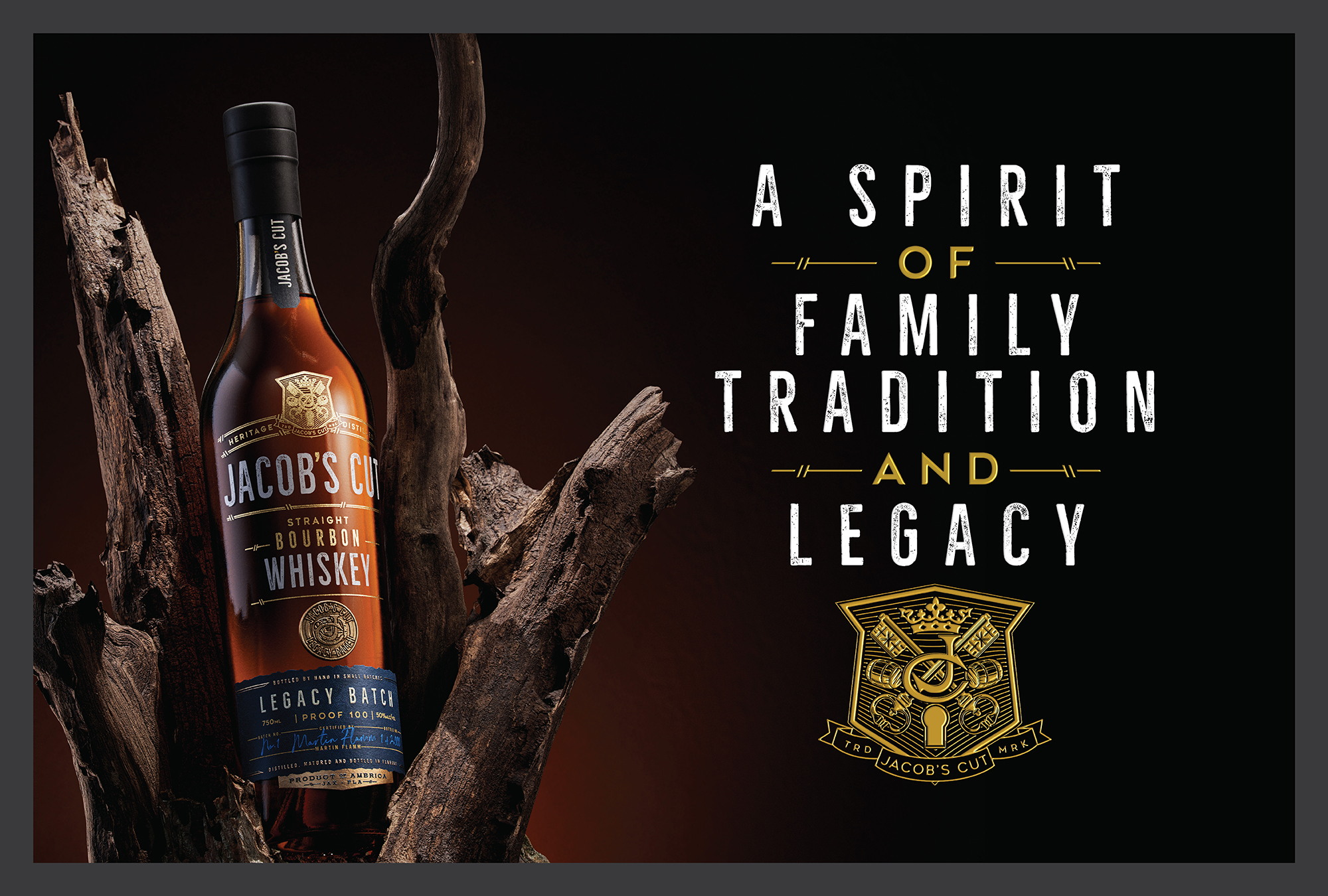
The packaging reflects the whiskey’s deep story. A screen-printed bottle exudes modern elegance, adorned with a symbolic coin charm representing the family’s history. An uncoated label with a custom die-cut evokes the wear of time, offering a tactile connection to the legacy. A black shrink wrap caps the neck strap, adding a refined finish.
The brand mark, a custom-designed crest, celebrates the family’s heritage. At its centre, two crossing keys represent the convergence of generations, while a “JC” honours Jacob’s Cut. Whiskey casks symbolise both the product and its legacy batch, and a crown signifies the passing of the torch, with a keyhole at the base representing new beginnings. Framed by “Heritage Distilled,” it is a proud emblem of the family’s distilling tradition.
Beyond packaging, we developed the name “Legacy Batch,” the brand narrative, tagline, and website, ensuring every detail resonates with the family’s history and enduring spirit.
Jacob’s Cut: Heritage Distilled, A Spirit of Family Tradition and Legacy.