JAAR Single Malt Whisky — Embrace Whisky’s Fire
2024
Designed by Christopher Lee at Brand Hatch Creative
CGI Renders: Tricycle Studio
Categories: Print / Identity / Packaging / Signage / Experience
Industry: Commercial
Tags: Illustration / Typography / Food and drink / Art direction
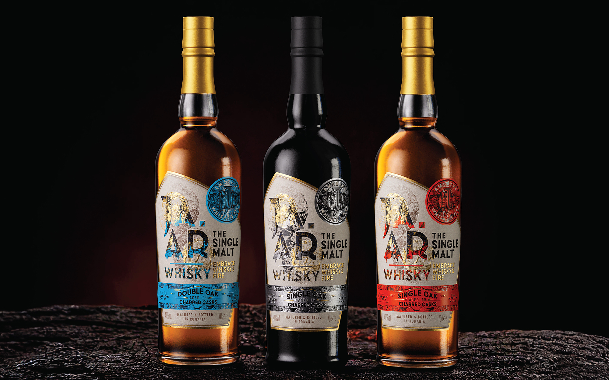
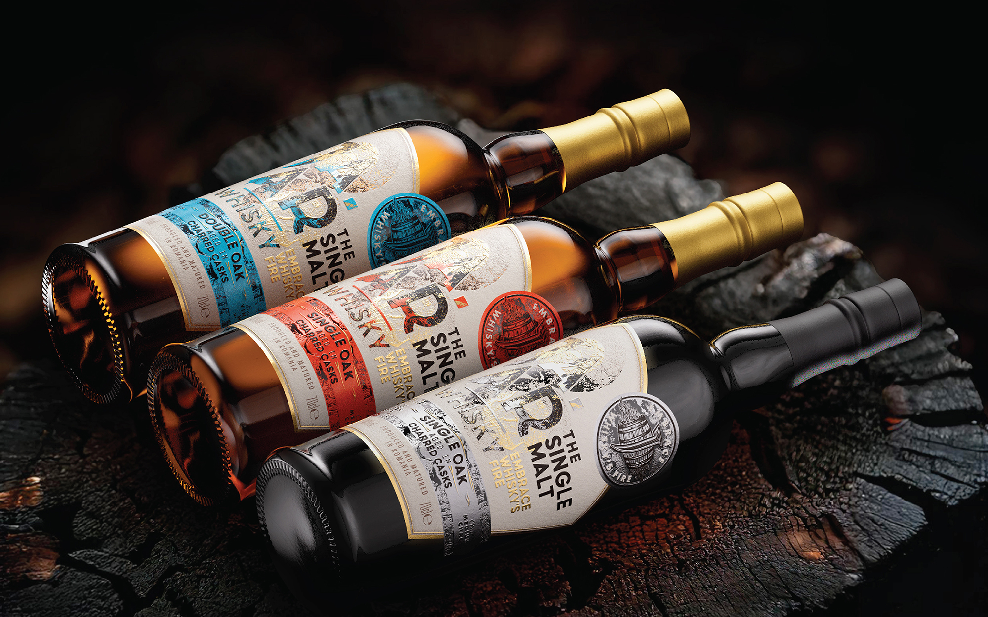
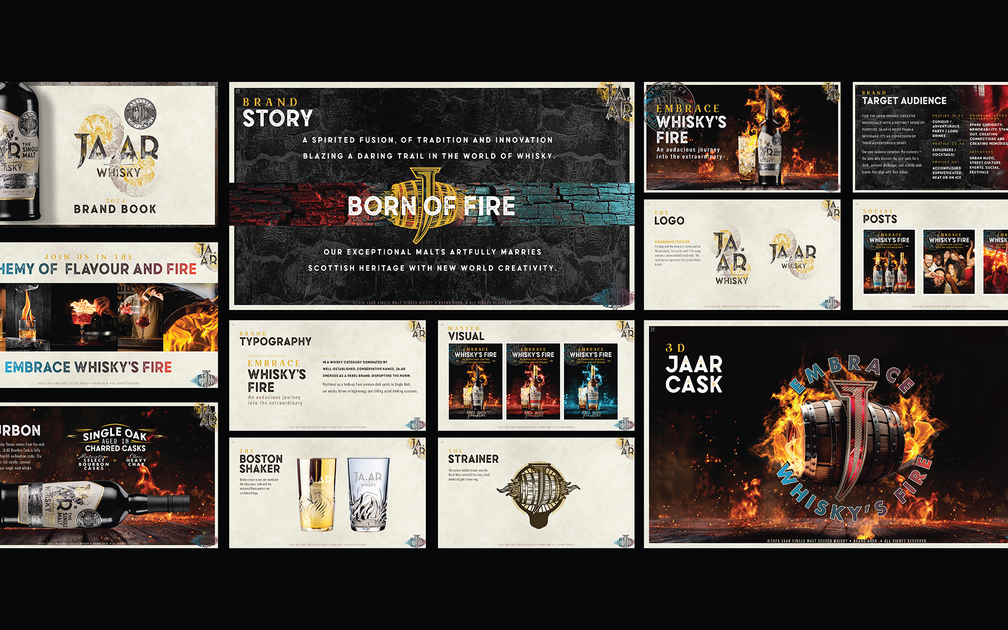
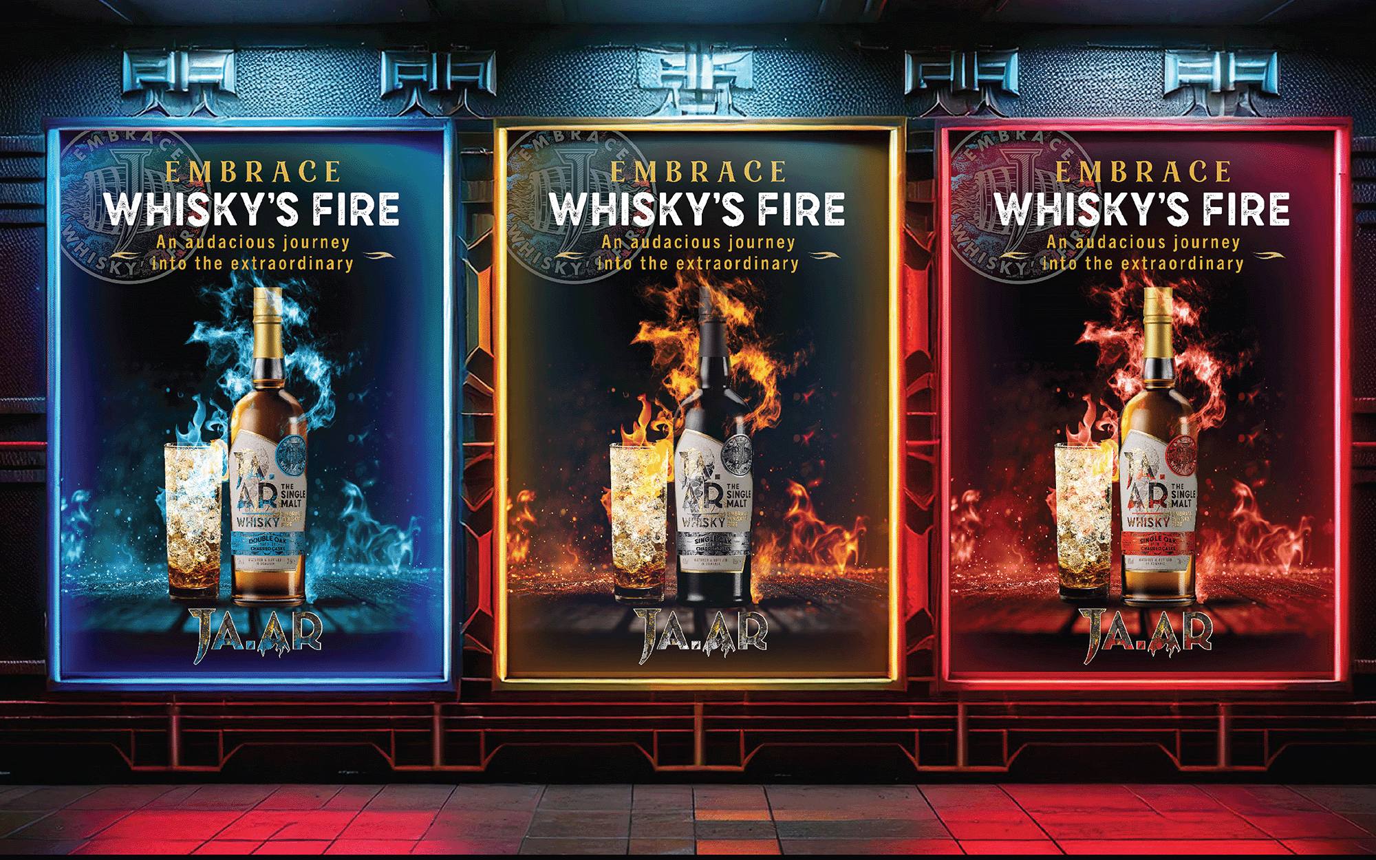
At Brand Hatch Creative, we thrive on bold visions and clients who embrace innovation. JAAR Single Malt Whisky was just that kind of project. Tasked with building a whisky brand from the ground up, we transformed the concept of "JAAR," meaning “fire” or “ember spark,” into a globally resonant identity. This became the foundation for a story where tradition meets modernity.
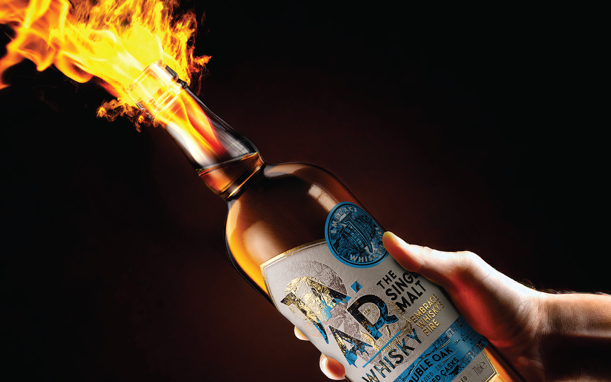
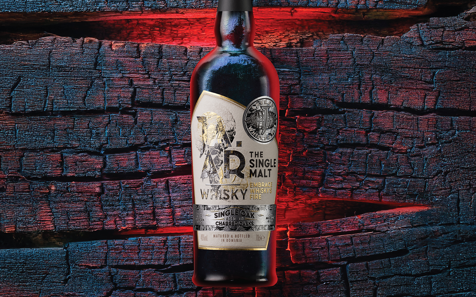
Born out of fire, JAAR is a spirited fusion of heritage and creativity, designed for those who see whisky as a journey of discovery. With roots in time-honoured whisky-making traditions, JAAR offers a fresh, modern perspective, redefining what it means to enjoy Single Malt whisky. Its tagline, Embrace Whisky’s Fire, reflects this bold, transformative ethos.
Fire, essential to whisky-making, inspired every aspect of the brand’s identity. From the charring of barrels to the unlocking of complex flavours, fire is central to JAAR’s story and process, celebrated as a symbol of transformation and innovation.
Our work on JAAR went far beyond visual design. We developed the brand strategy, messaging, tagline, and narrative that shape its bold identity. We also created a comprehensive brand style guide, key visuals, and CGI renders, ensuring a cohesive and impactful presence across platforms. Additionally, we designed branded barware, cocktail kits, in-store displays, and bar concepts to elevate consumer engagement and bring the brand to life.