ITMA Rebrand
2011
ITMA holds the largest collection of Irish traditional music in existence and collects, preserves, organises and disseminates materials relating to it. Although much of their focus is on the past, traditional music is very much a living artform and ITMA wanted to reflect that in their new identity. The process began with a series of workshop sessions and interviews that formed a comprehensive brief.
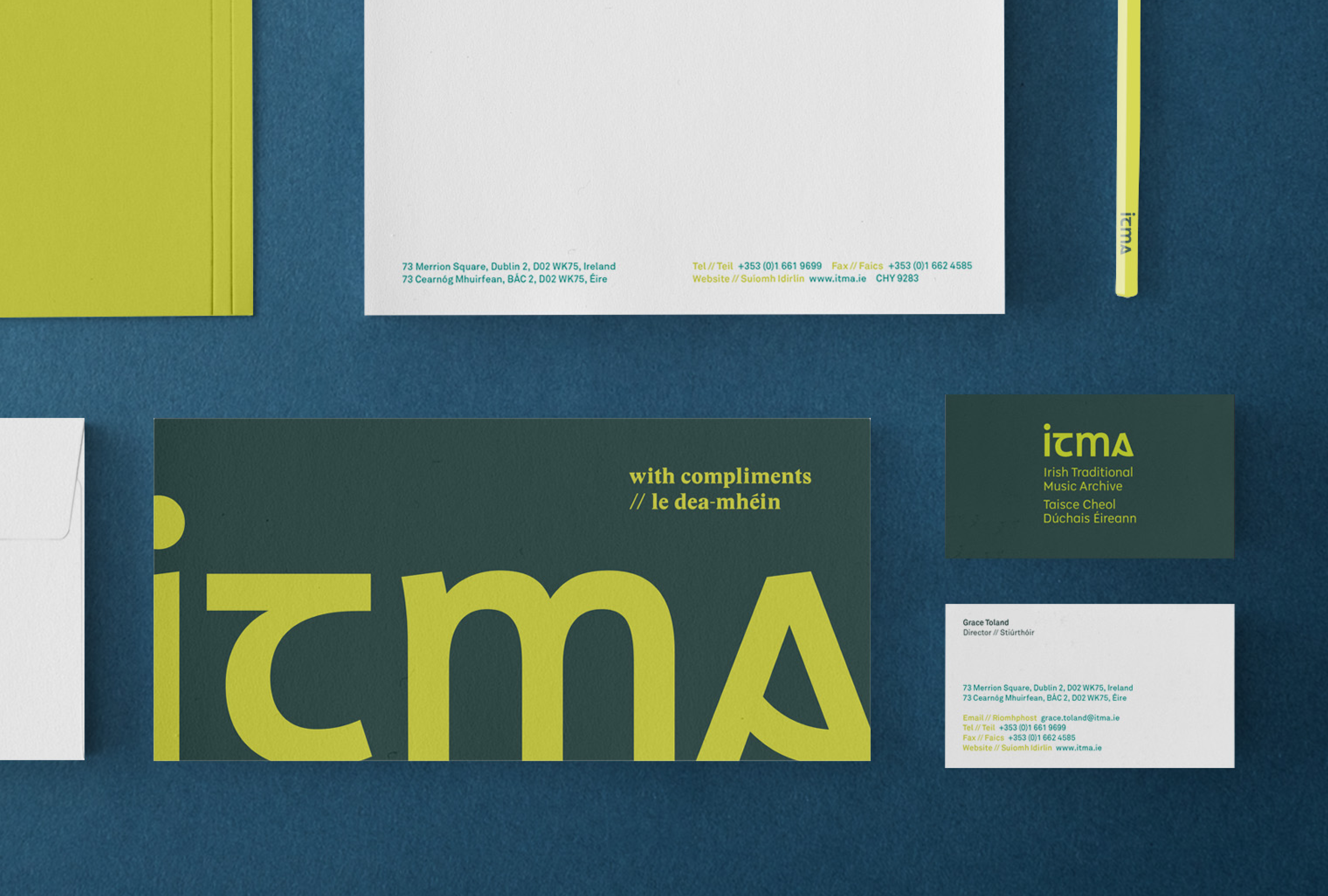
Our team visited ITMA, exploring their trove of music, instruments, articles, and manuscripts. We noted the extensive use of Gaelic / uncial typefaces, which featured heavily throughout Irish traditional music from songbooks to pub signage.
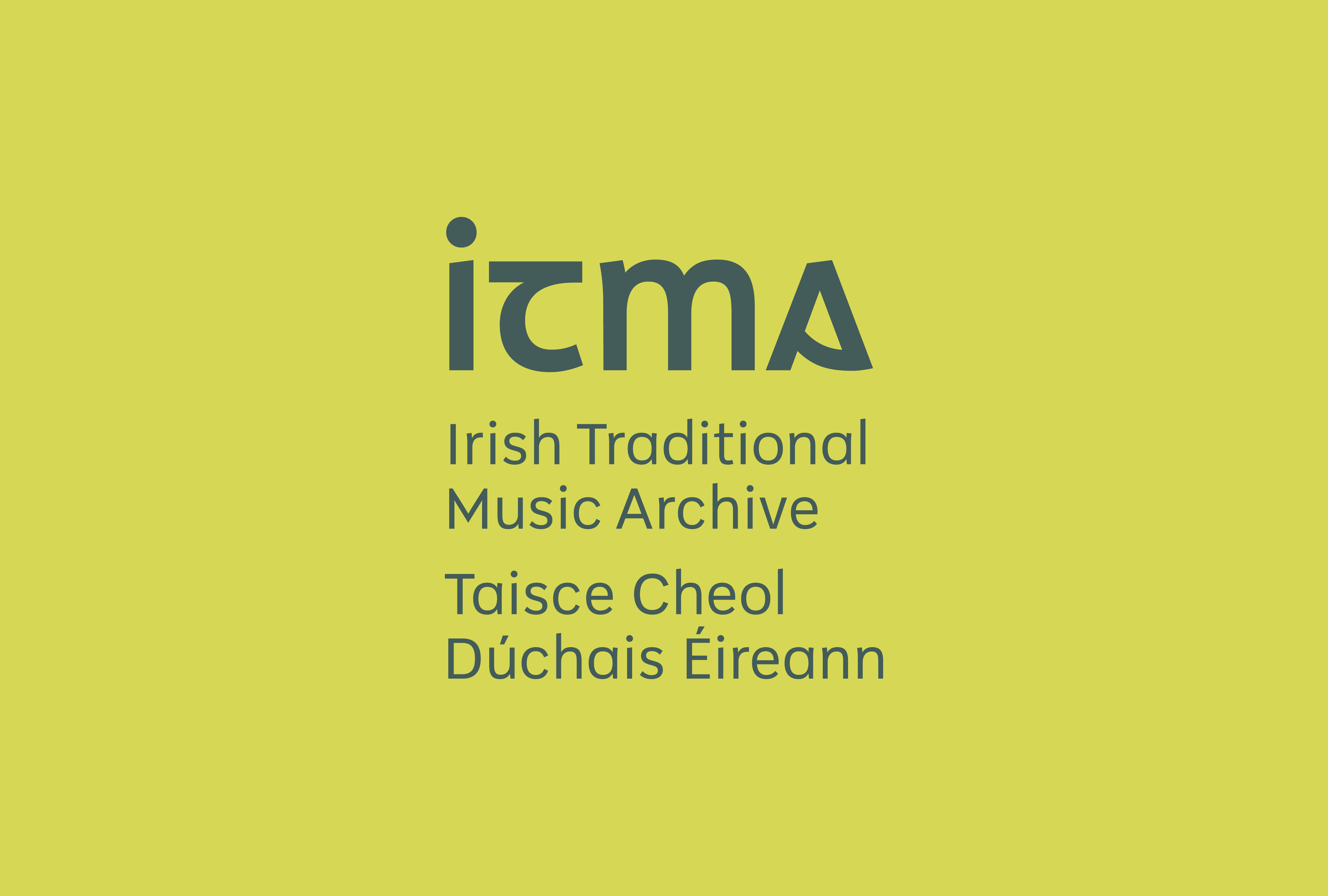
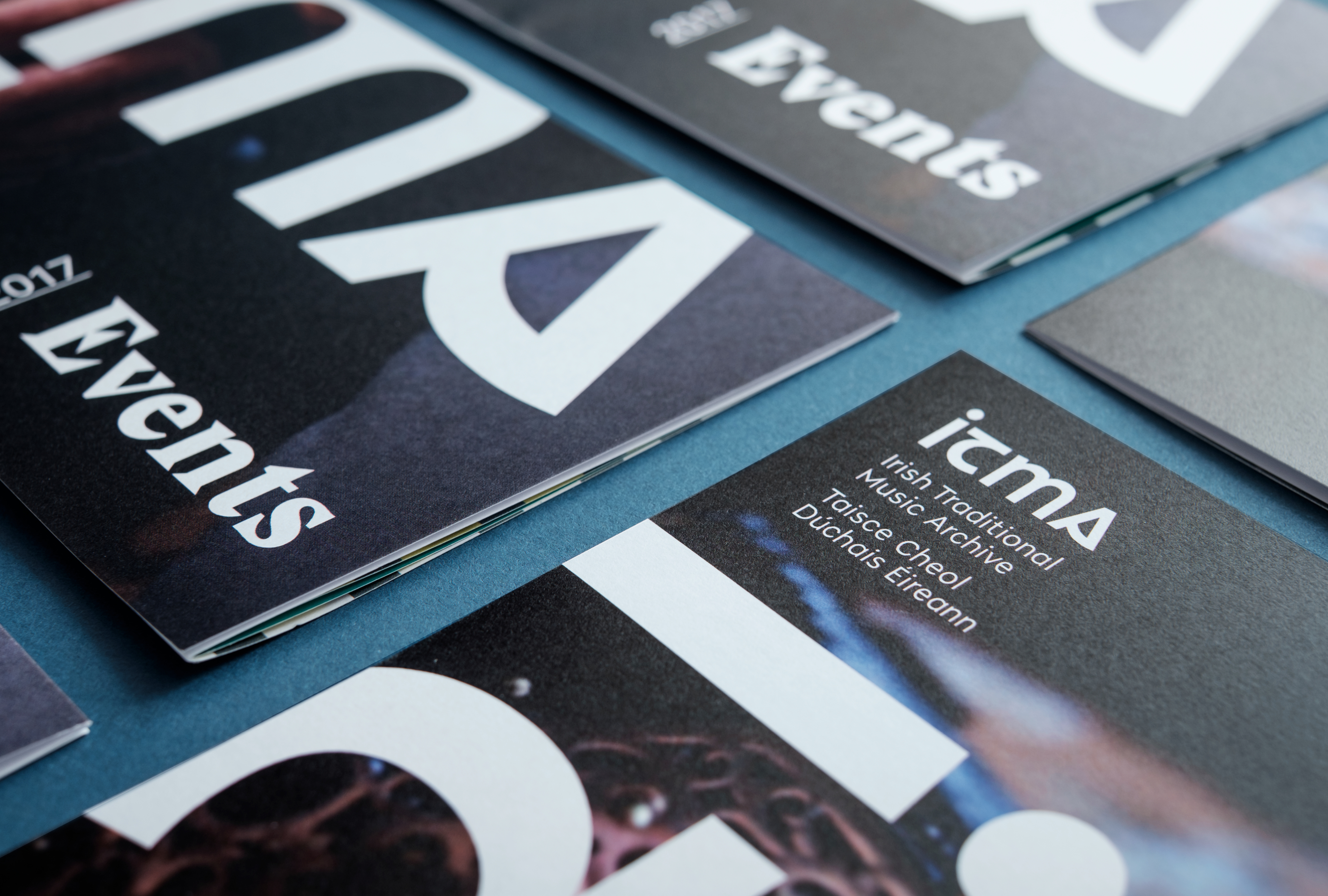
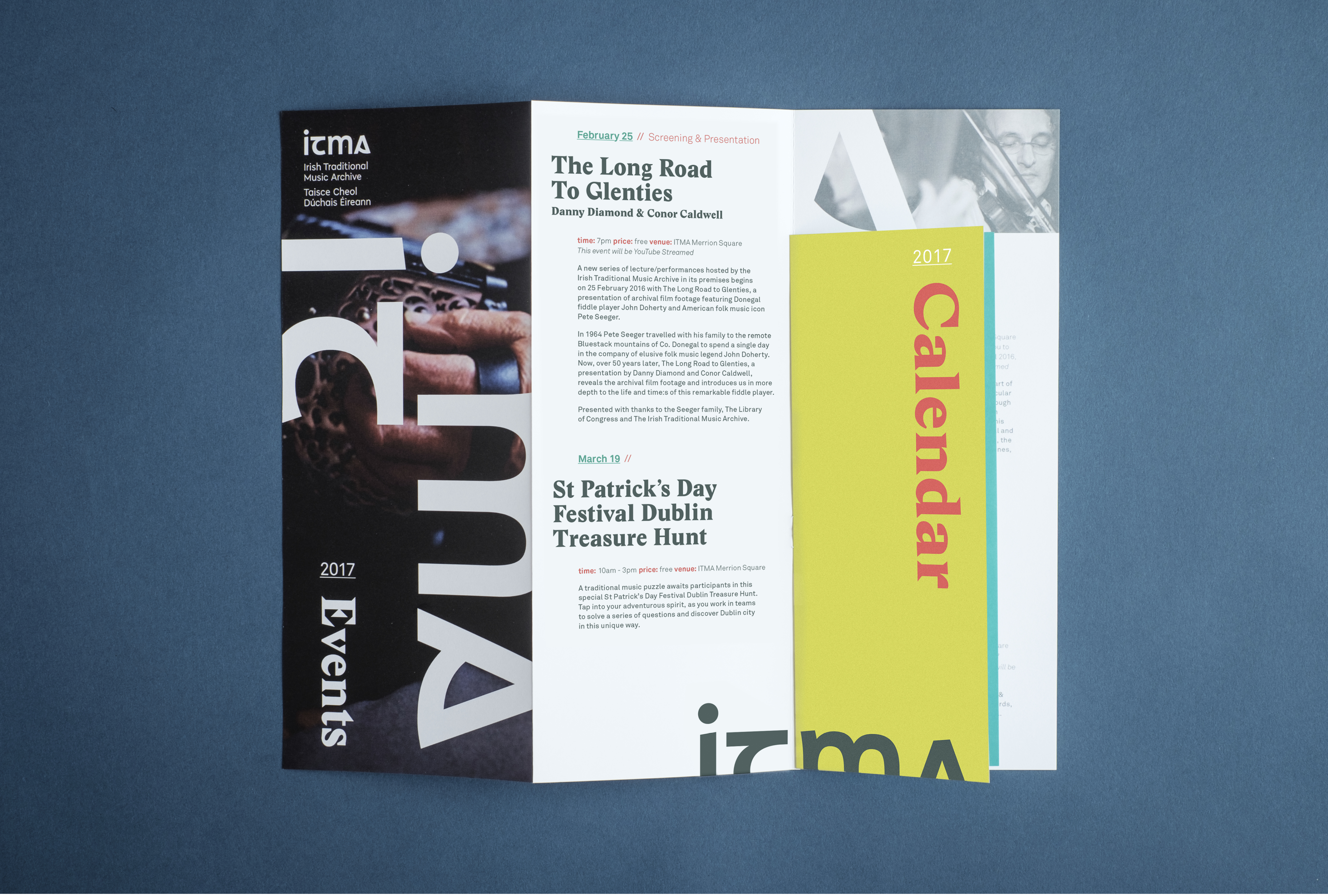
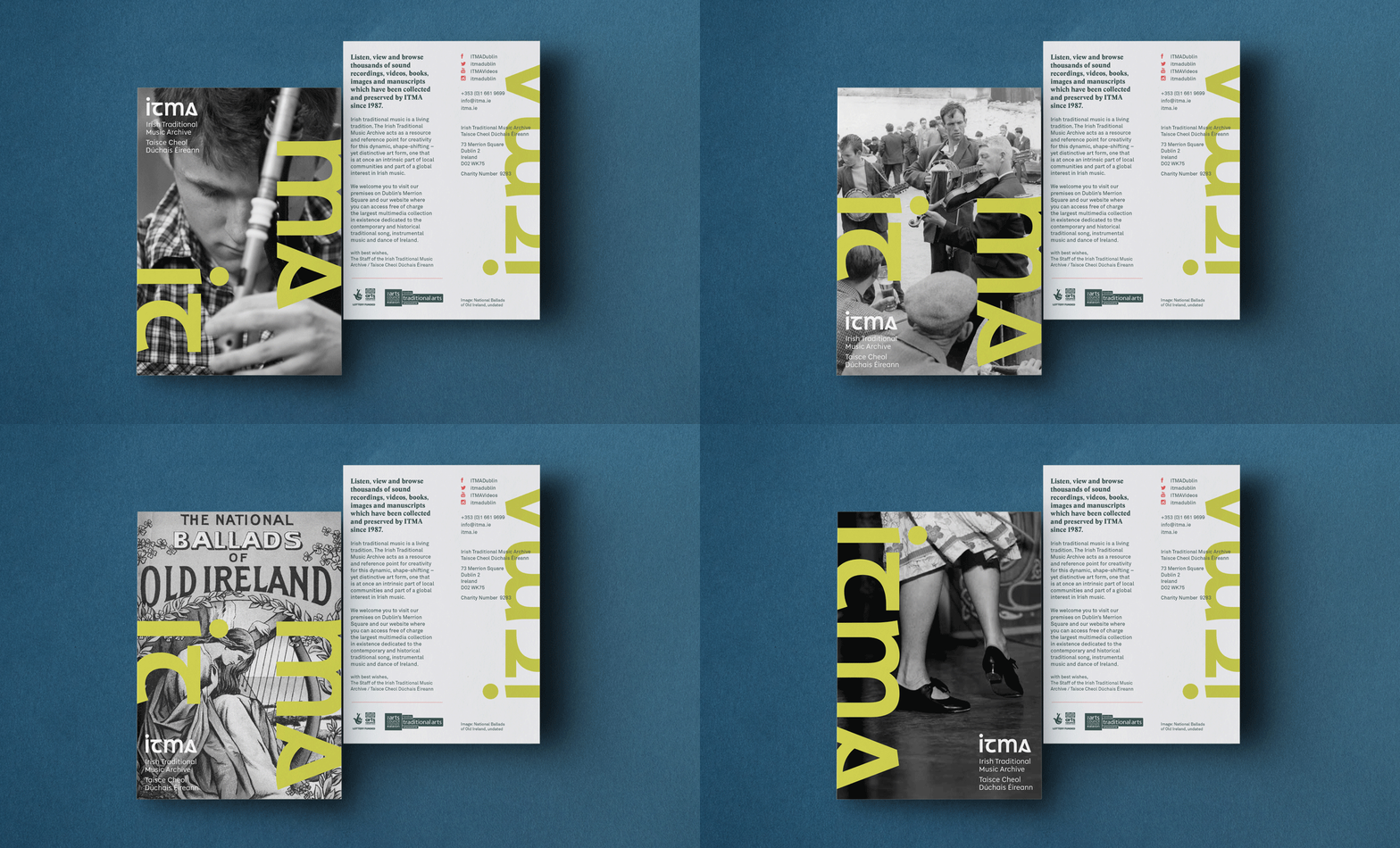
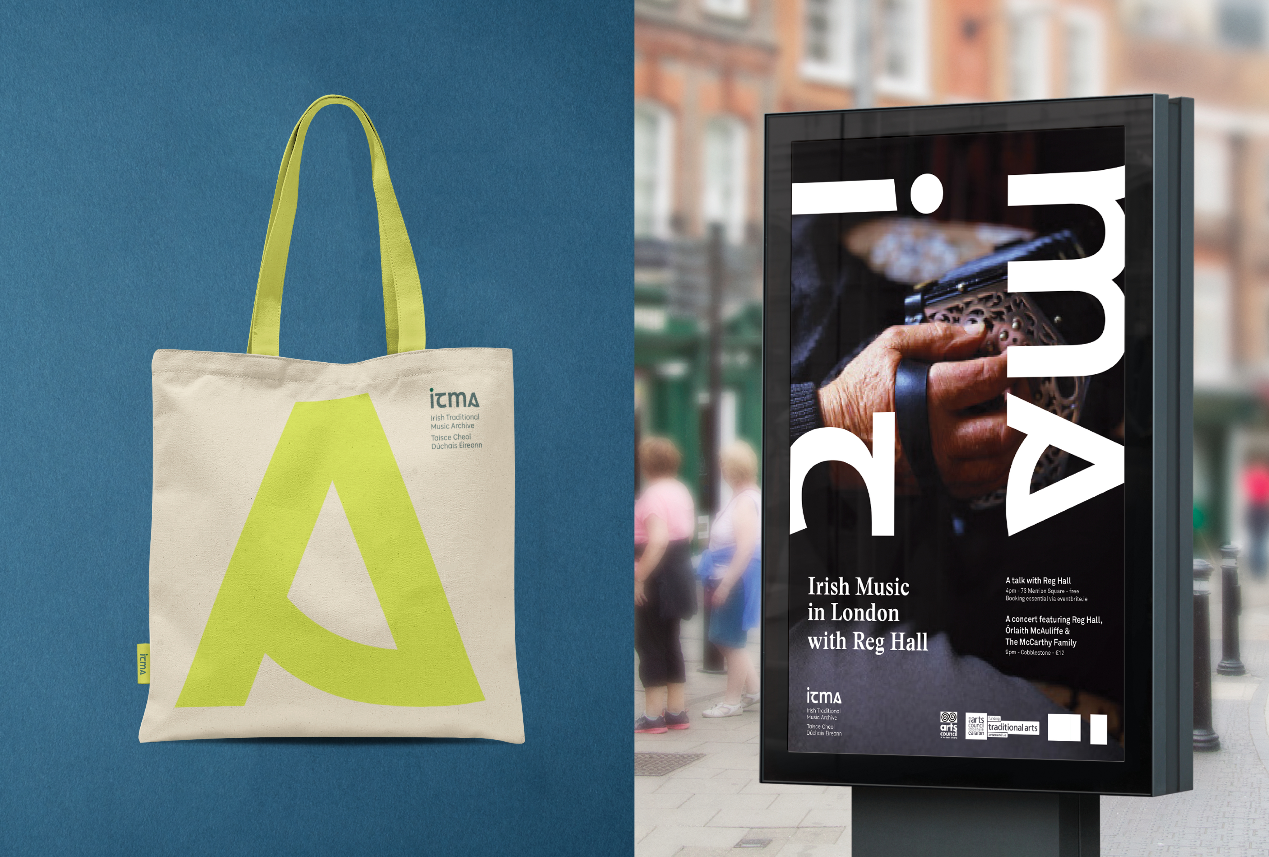
This inspired a modernised interpretation of this style of lettering for the logotype, which was crafted to be contemporary, while paying homage to its historic origins. The letter “A” features a ‘bow’-like detail inspired by traditional instruments like fiddles and harps. Across the roll-out the letterforms are configured in different ways –essentially dancing – and giving a real sense that Irish Traditional music is a living and relevant artform.
