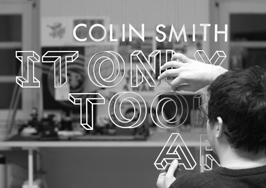
It Only Took A War
Designed by Maurice Redmond at Design Studio Maurice Redmond - Berlin
Categories: Packaging
Industry: Cultural
Tags: Typography
Mentioned in:
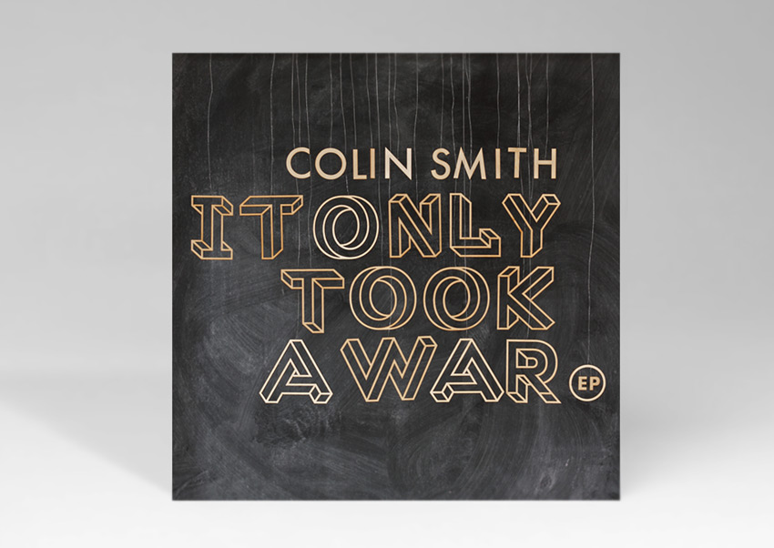
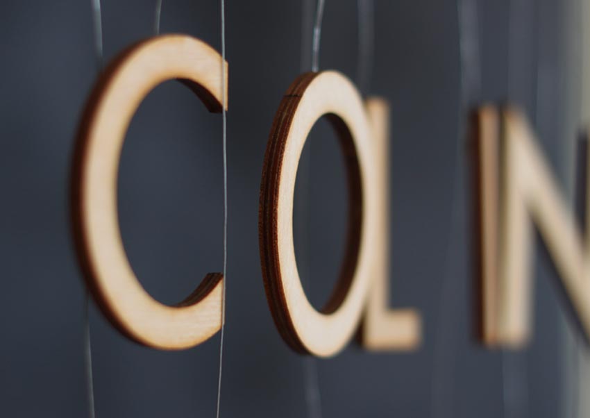
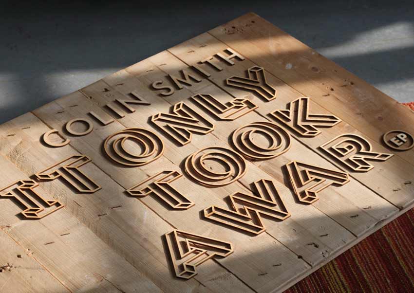
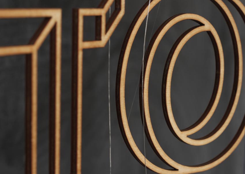
The first of a series of 3 artworks. The title font is based on the ‘impossible’ Penrose triangle (or Penrose tribar). Each 12cm high letter was cut from 4 mm thick plywood and individually suspended by a wire from a 2 meter wooden frame, then the typography was positioned and adjusted by hand and judged by eye.
