IBU Beer
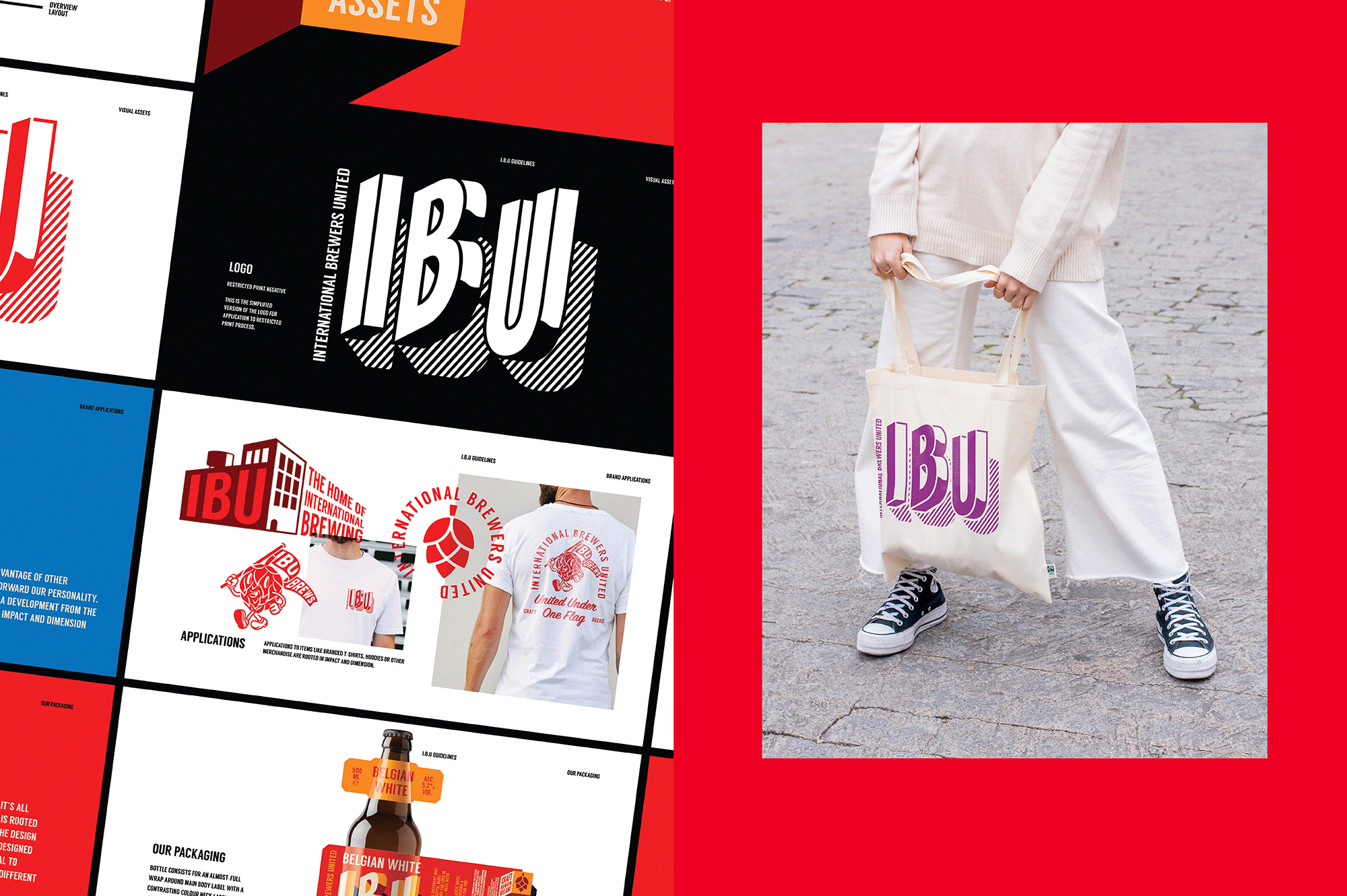
Designed by David Walsh at Greenhouse
Typography: David Walsh
Illustration: David Walsh
Creative Direction: Richie Ryan
Naming: Greenhouse
Categories: Packaging
Industry: Commercial
Tags: Illustration / Typography / Food and drink / Retail
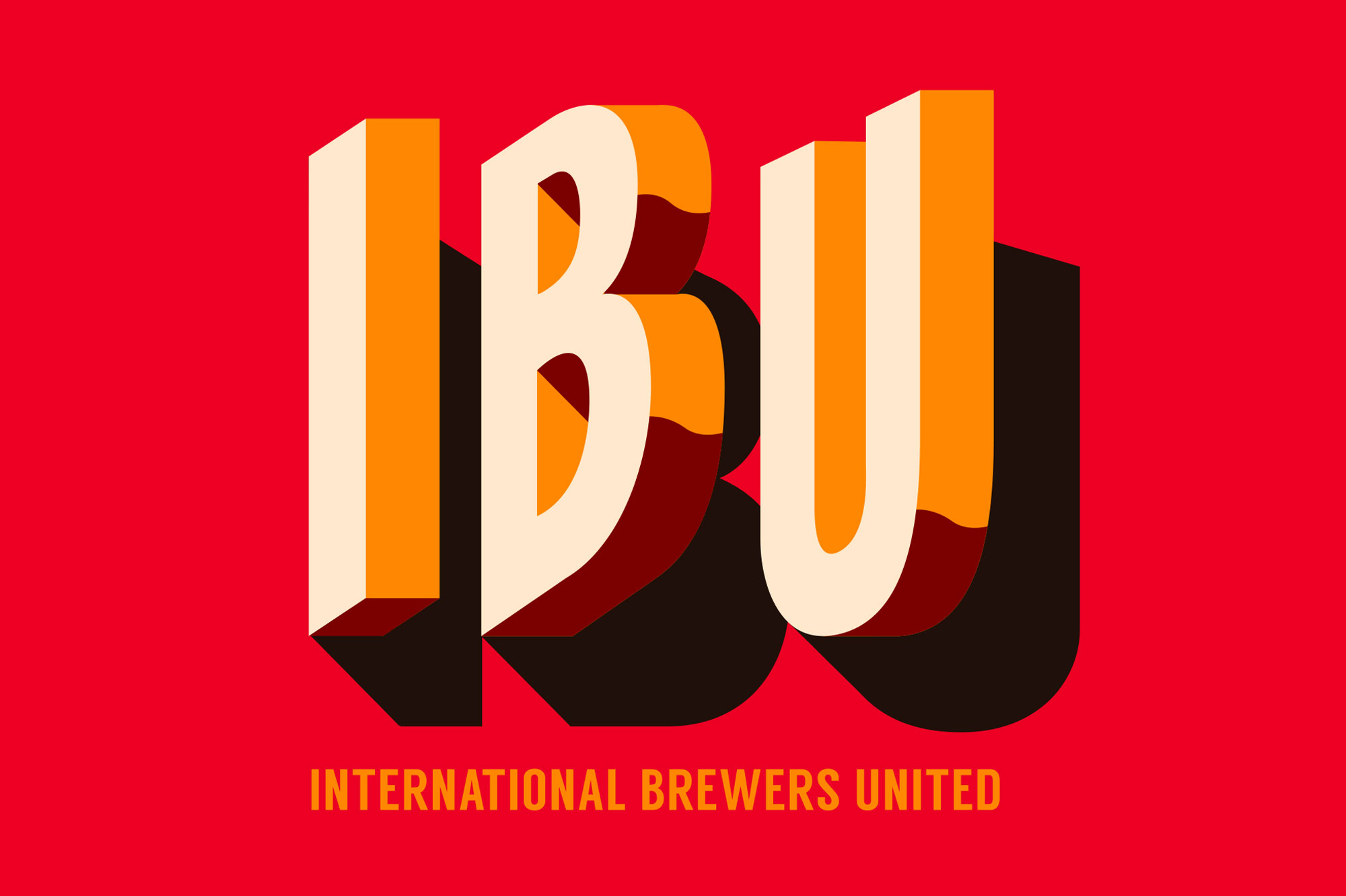
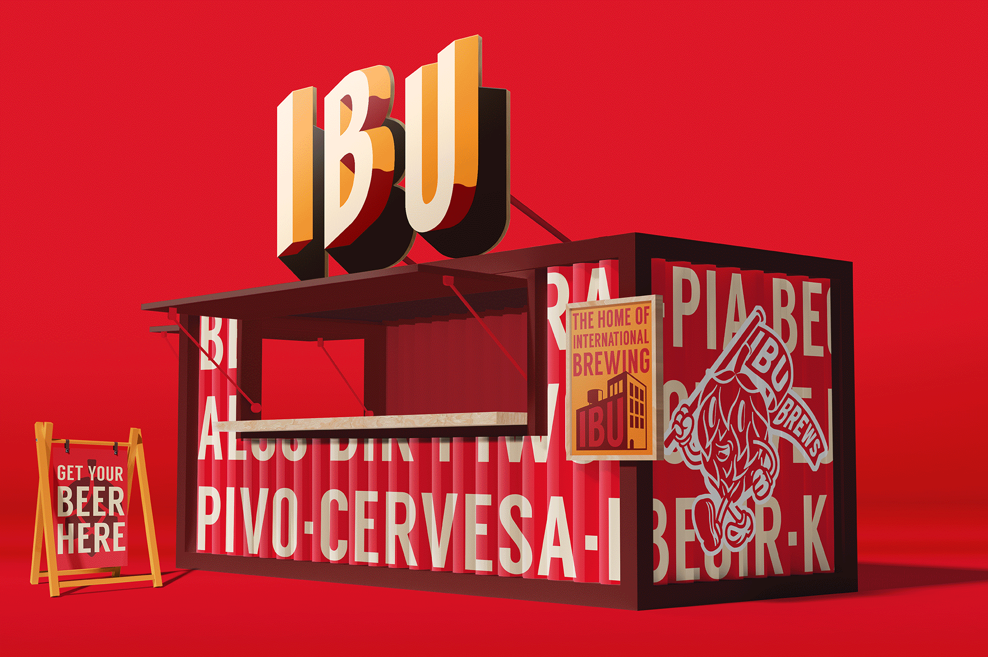
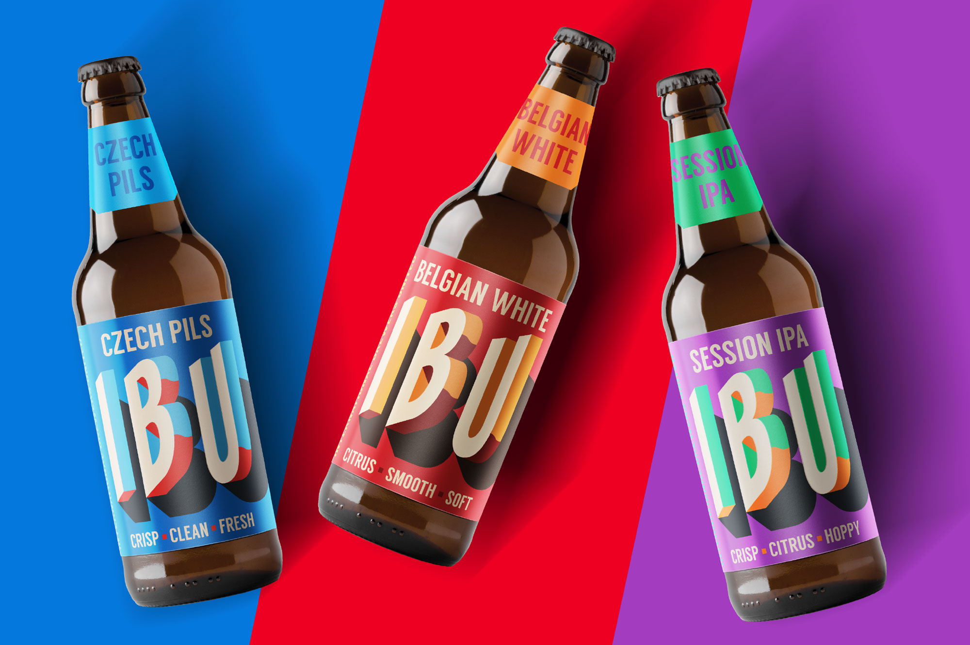
Wanting a brand that would stand out on shelf and punch through in a cluttered category, IBU was developed with a forthright and ‘jumping out’ attitude.
Initially tasked with naming this new brand that retail in Tesco Ireland and UK, we wanted to bring a small bit of the brewing world into a category that was more entry level… just enough to make people feel valued and not intimidated. IBU stands for International Brewers United which resonated with the guys in Rye River Brewing Co. as they have a very diverse brewery staff and they felt that having a brand that reflects them would make it an easier proposition to stand over. It is also a unit for measuring the bitterness of beer which meant the brewers really related to it!
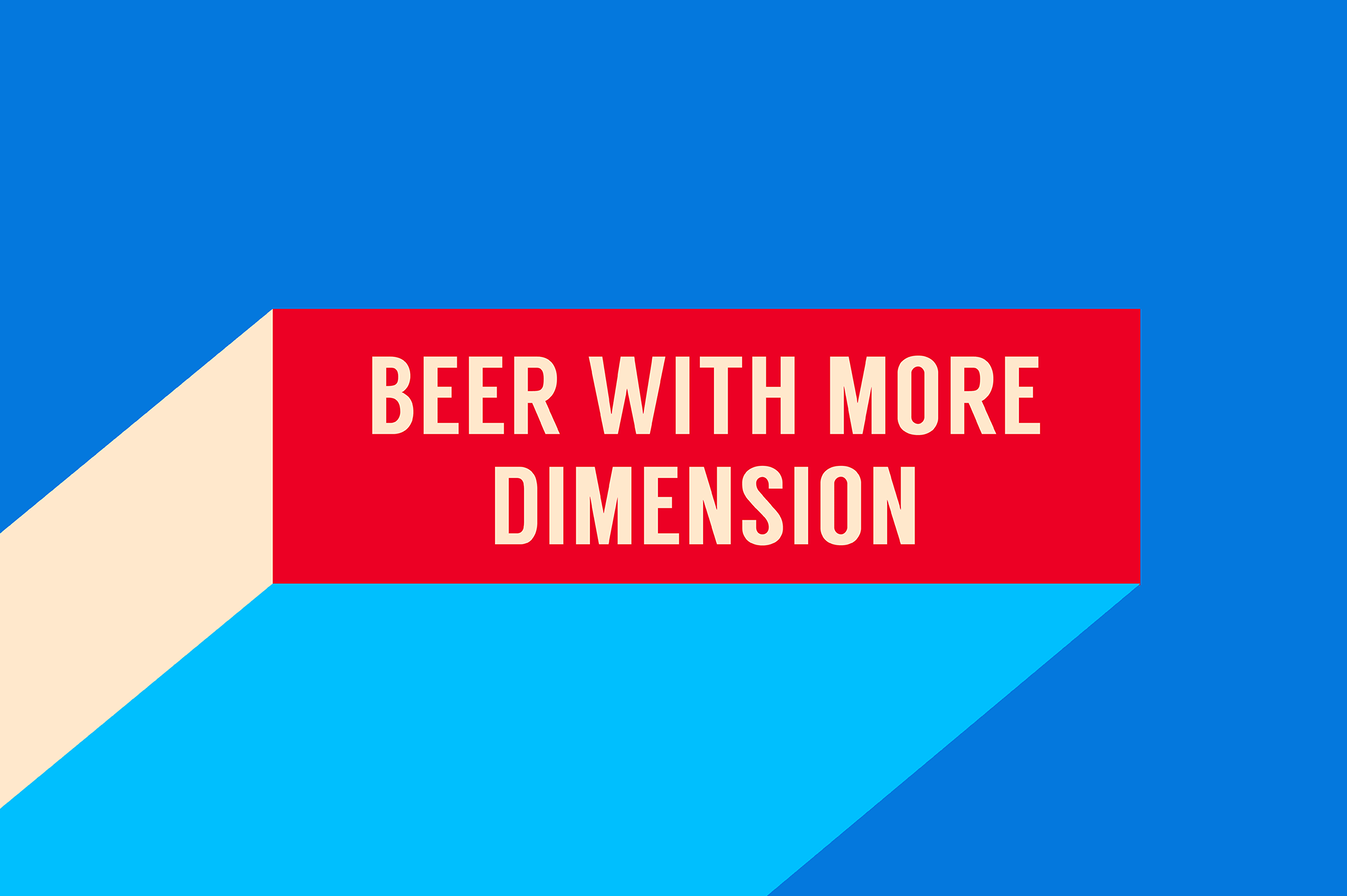
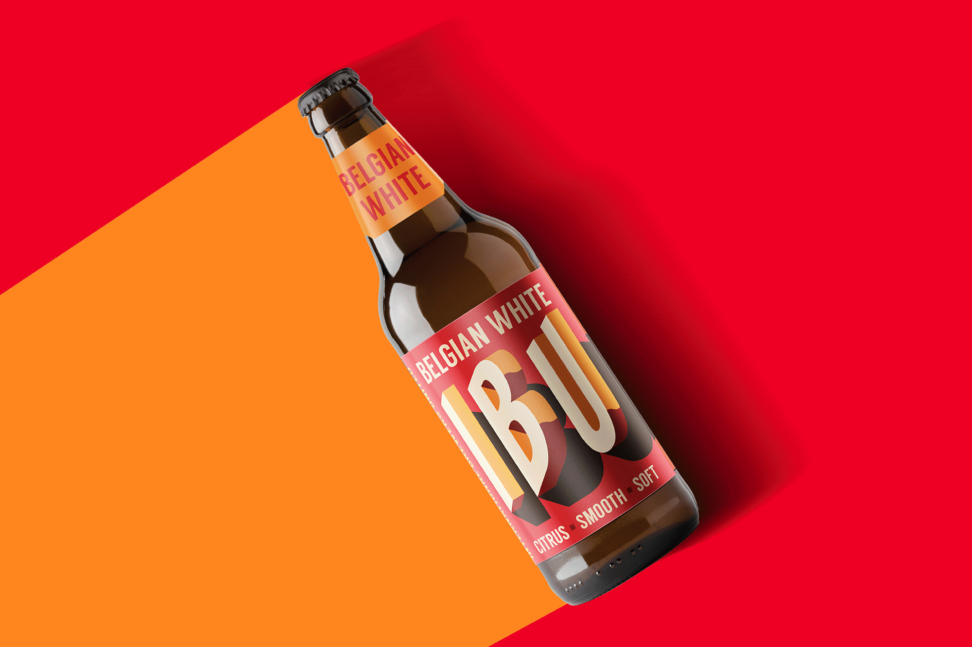
The three letter lock up was perfect for living on a tall cylindrical surface and was a great start to creating something visually impactful and full of depth. Landing on the brand ethos of ‘Beer with More Dimension’ not only emphasised this but also communicated clearly that these were not just normal beers, they were a step above.
Illustrating a brand mark that is almost protruding from the surface of the label gave the brand significant stand out and accompanying this with colours that relate to the beers origins or character gave that extra contemporary edge and punch on shelf.
Surmising each beer in three words was also key as it is a quick thinking environment that the designs will live in. It also makes it much easier to choose!
Finishes like a matte varnish accompanied with a raised tactile varnish also give the label an interactive element that invite you to thumb over the design and feel the changes in finish each design element has.