IAF Fourth Wall
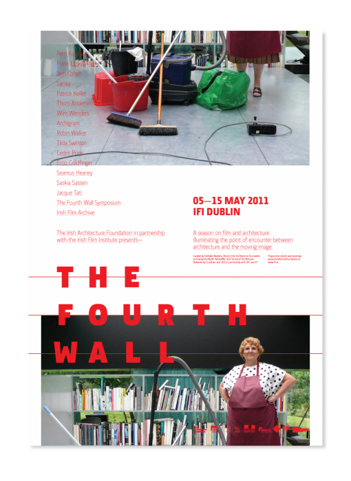
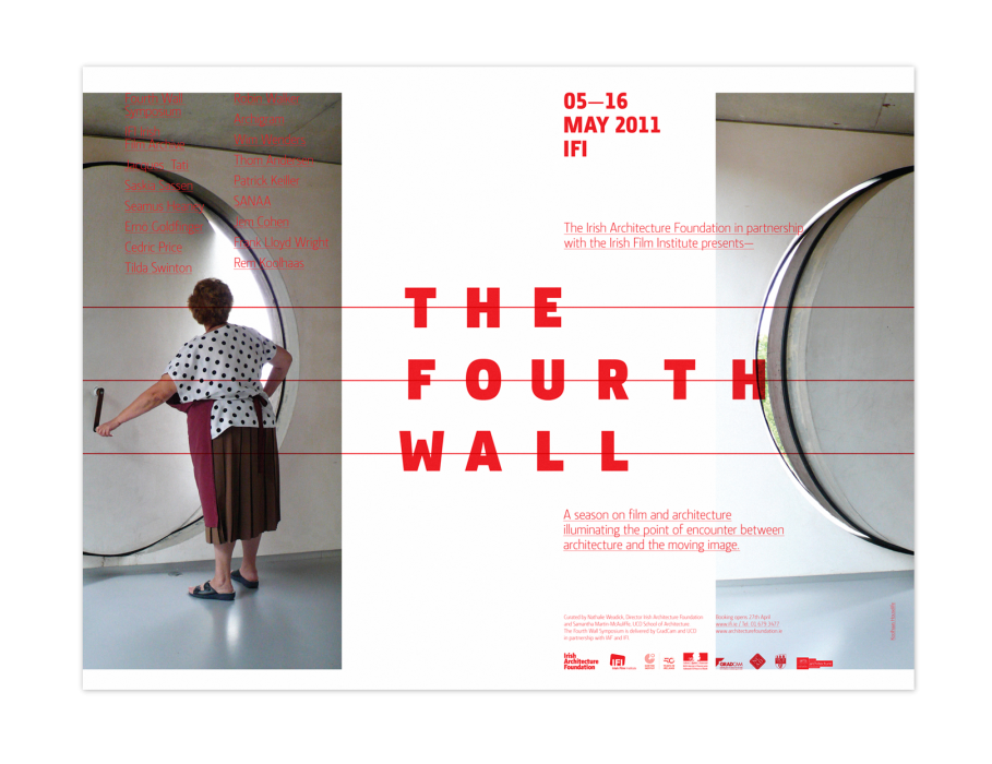
We created an identity and series of posters for a fascinating collection of architecture themed films, which were screened in the IFI. The identity took its inspiration from old cinema marquee signs, with the mono-spaced type reflecting the often rudimentary placement of the movable letters.
The posters feature seemingly mundane domestic situations which highlight the unusual nature of the space. The layout of the posters played on the cleaners unconventional routes through the building and hinted at the festival’s unconventional take on architecture and its place in cinema.


