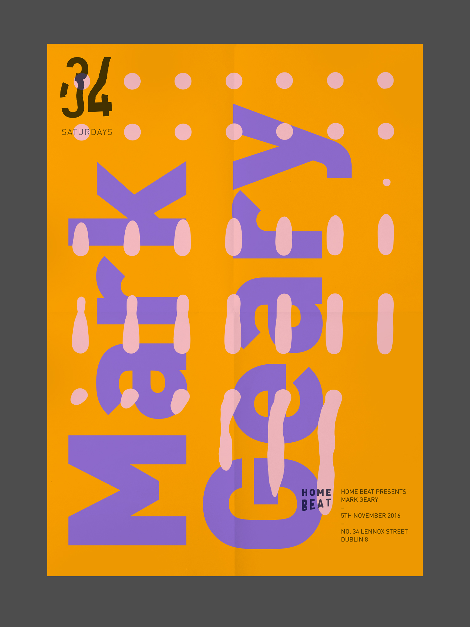
Homebeat + 34 Identity
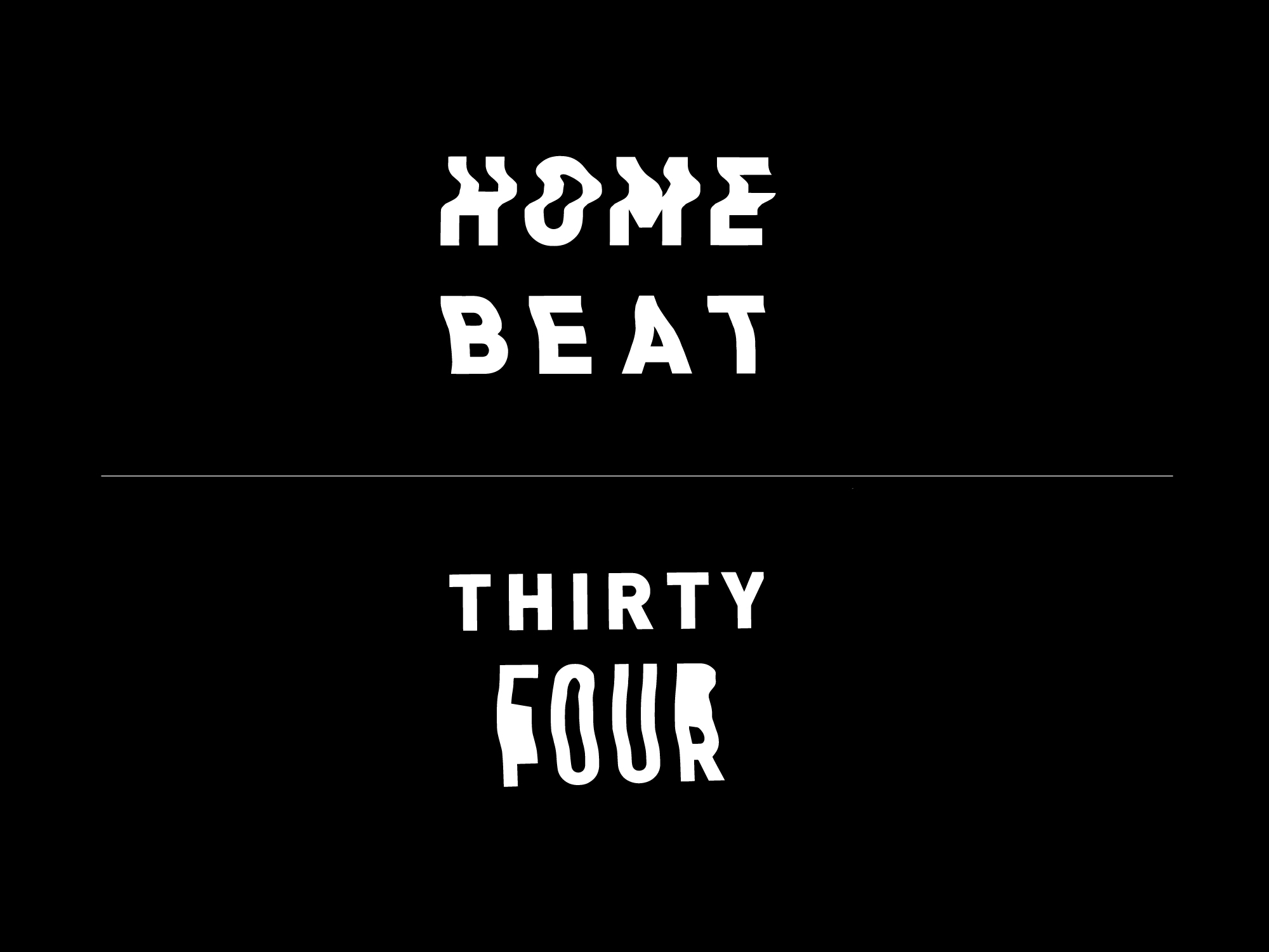
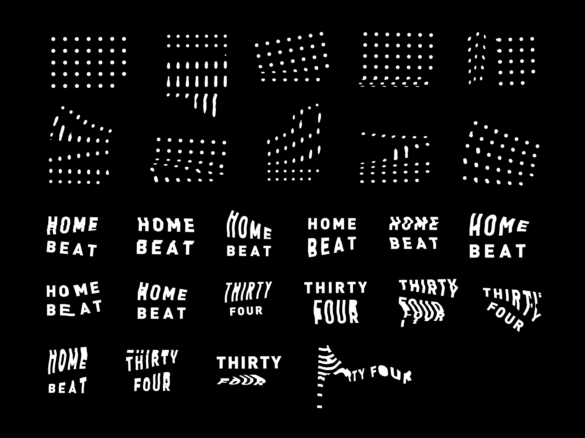
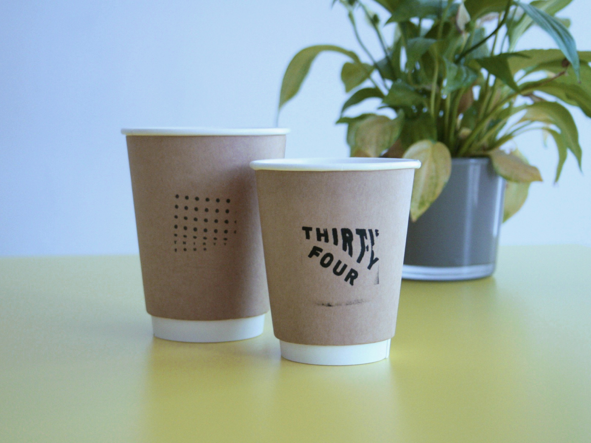
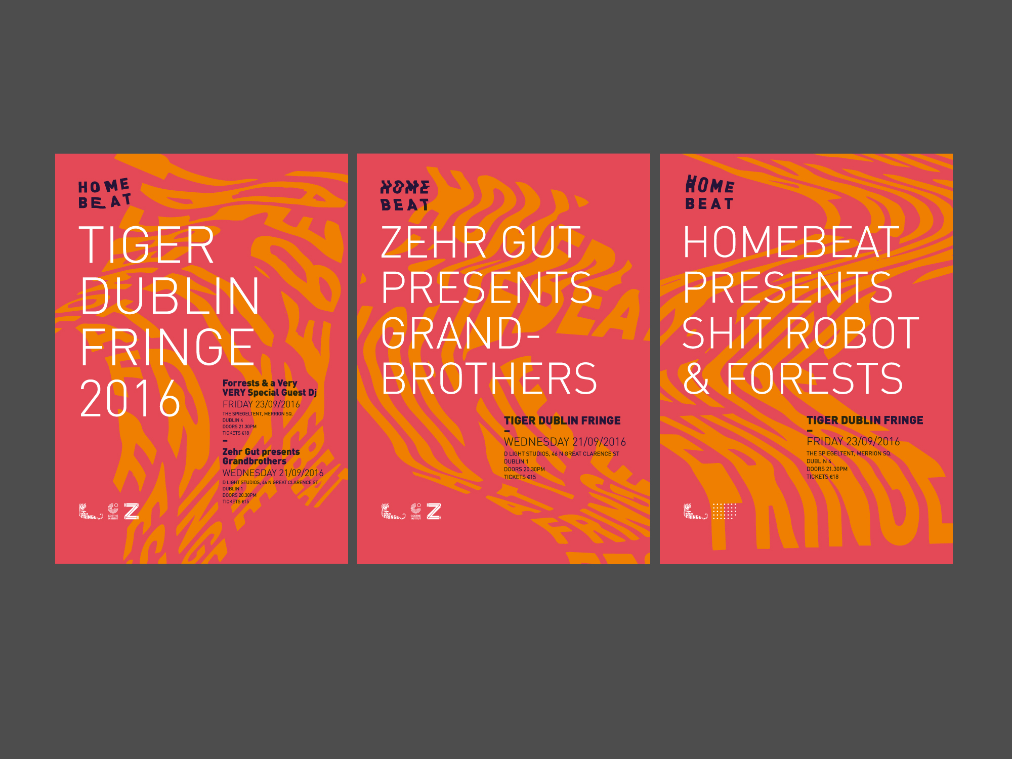
An independent Irish music promoter moved in next door to our studio and decided to sell coffee from his workspace. The owner tasked us with designing a duo of versatile identity logotypes/systems that underlined his adaptable methods and creative approach to public events. Both identities, Homebeat and 34 (Homebeat HQ/Café) needed to compliment each other whilst remaining independently distinct.
The process began by looking at music manuscripts and the constant movement and evolution of Homebeat’s events. Through a series of physical research techniques; making, painting, stretching, photocopying stretching, scanning etc. we began to develop an aesthetic that matched the fluidity of Homebeat.
