Hali
2021
Designed by Nicole McMahon and Chris Flynn at In the Company of Huskies
Creative Director: Damian Hanley
Art Director: Ross Giles
Copy Writer: Robert McBride
Categories: Identity
Industry: Commercial
Our challenge was to create a brand for a new build-to-rent property company based in Dublin. Our identity not only needed to stand out from its Irish competitors but also appeal to a large audience of potential renters, from professionals and young families to empty nesters.
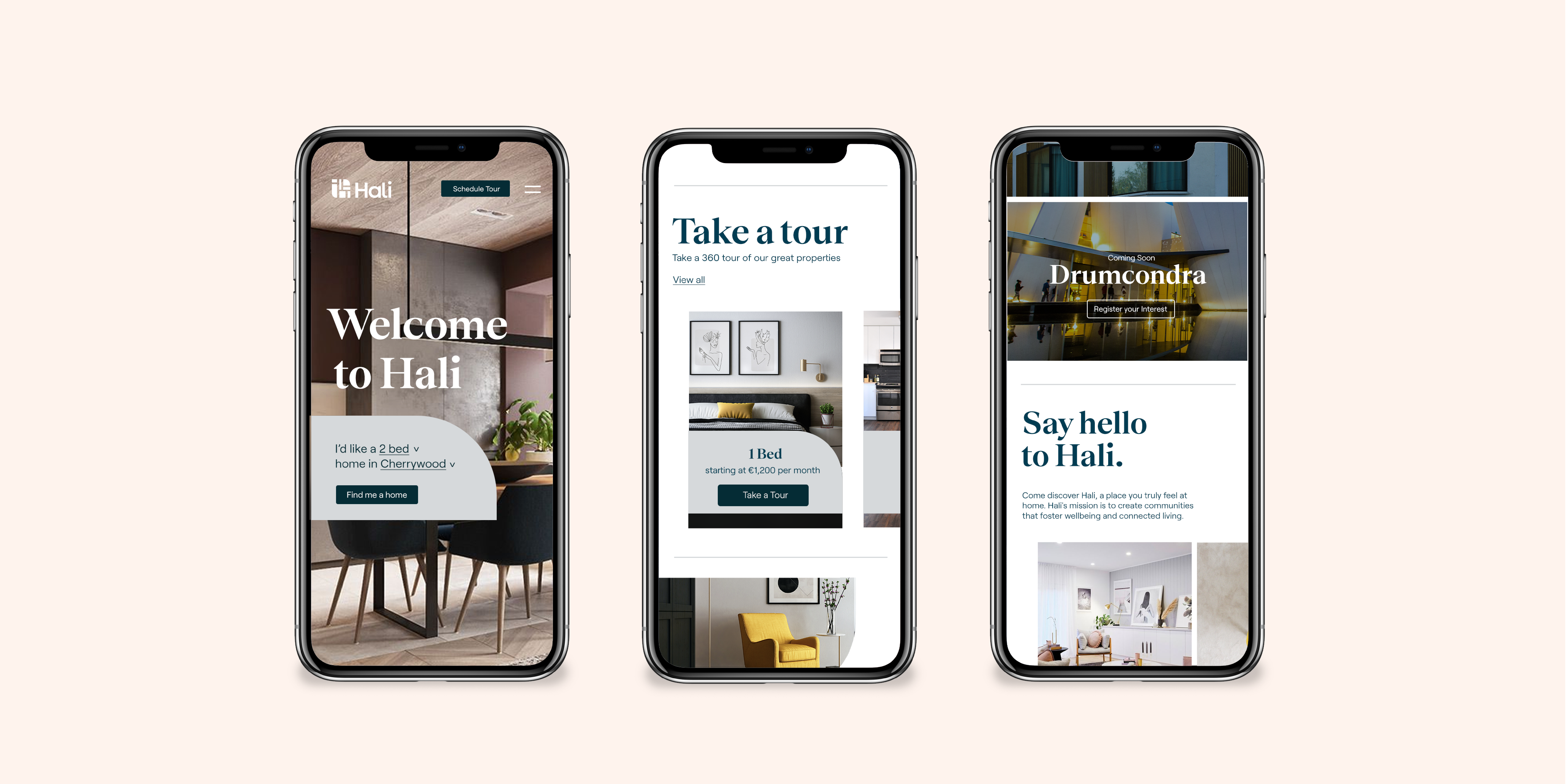
Our key aim was to challenge the idea that rental properties do not lend themselves to a strong sense of belonging. Hali is not just a place to live, but a community for people to grow in – with that being said, it was important for the brand to feel relatable with community at the heart of everything we do. Just like our homes, the Hali brand has been designed to be warm, inviting and contemporary. Appealing to all ages and stages of life. Much like every aspect of the rental experience with Hali, the brand is uncomplicated and clean with small quirks and fun details.
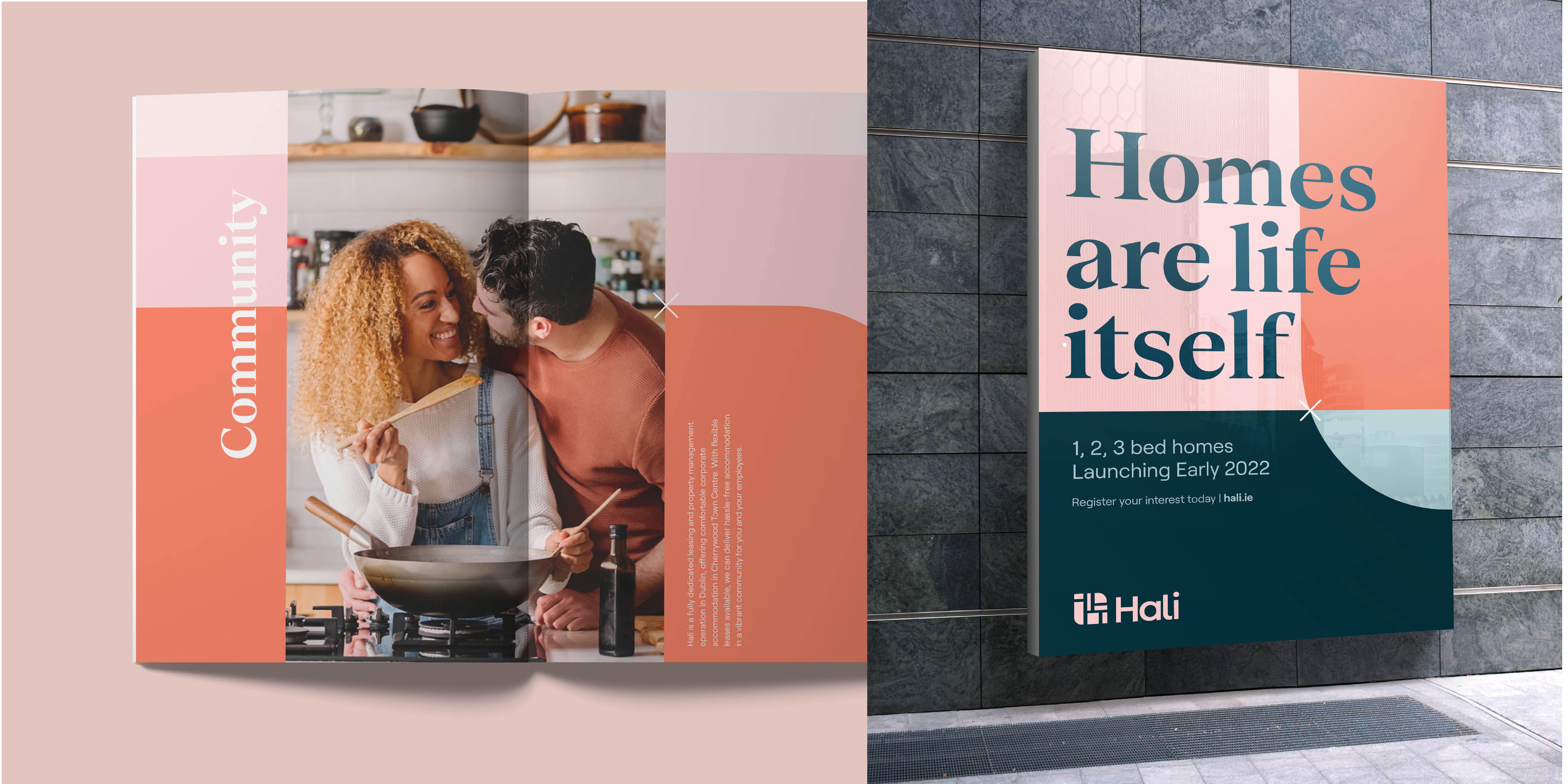
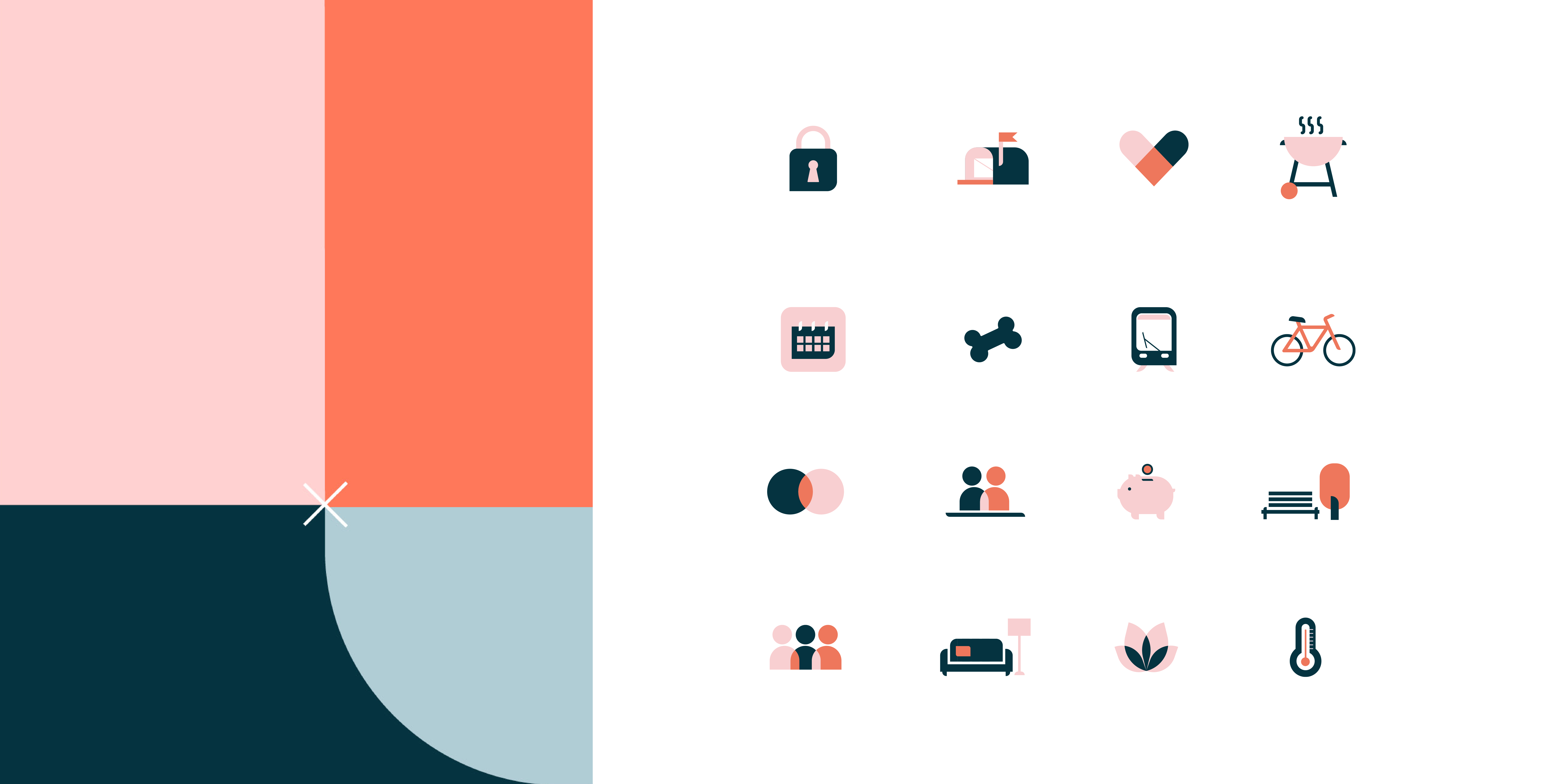
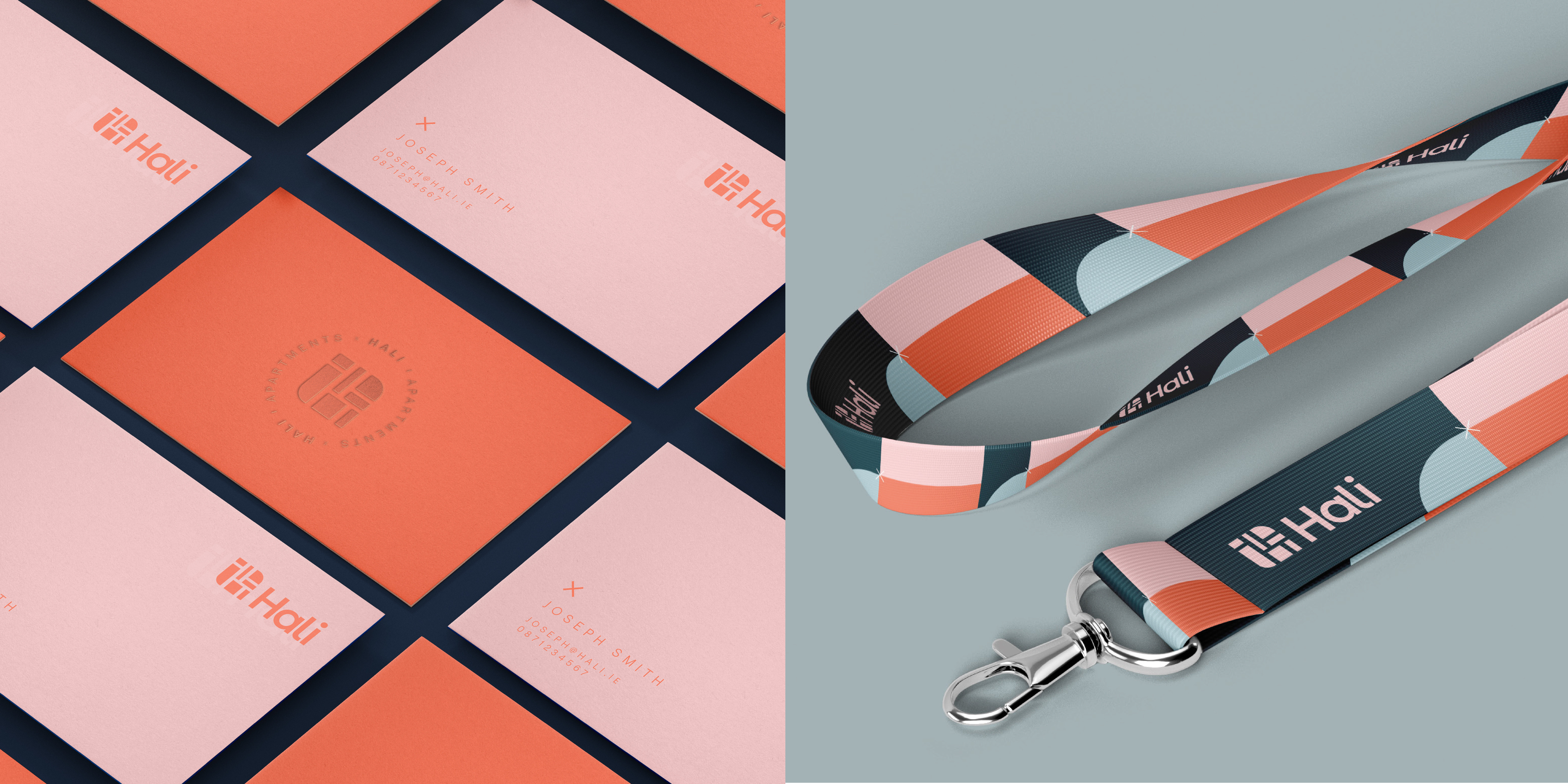
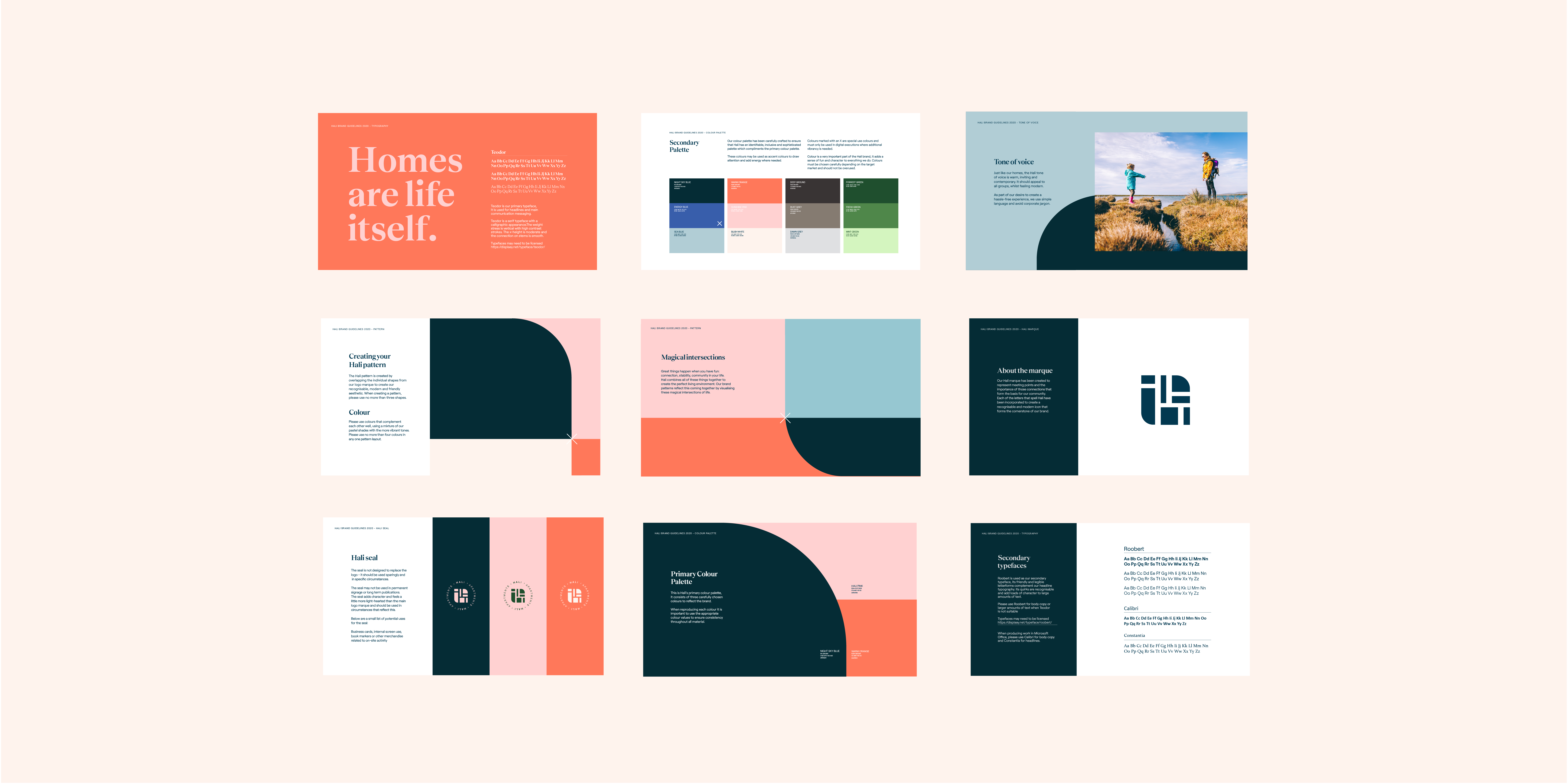
Great things happen when community, stability, connection and joy all come together, and Hali is the meeting point of each of these elements. This coming together is visually represented through our colour block pattern. It not only creates a strong system to allow for any multitude of consistent collateral, but more importantly acts as a striking almost flag like identity to encourage a sense of belonging and community.
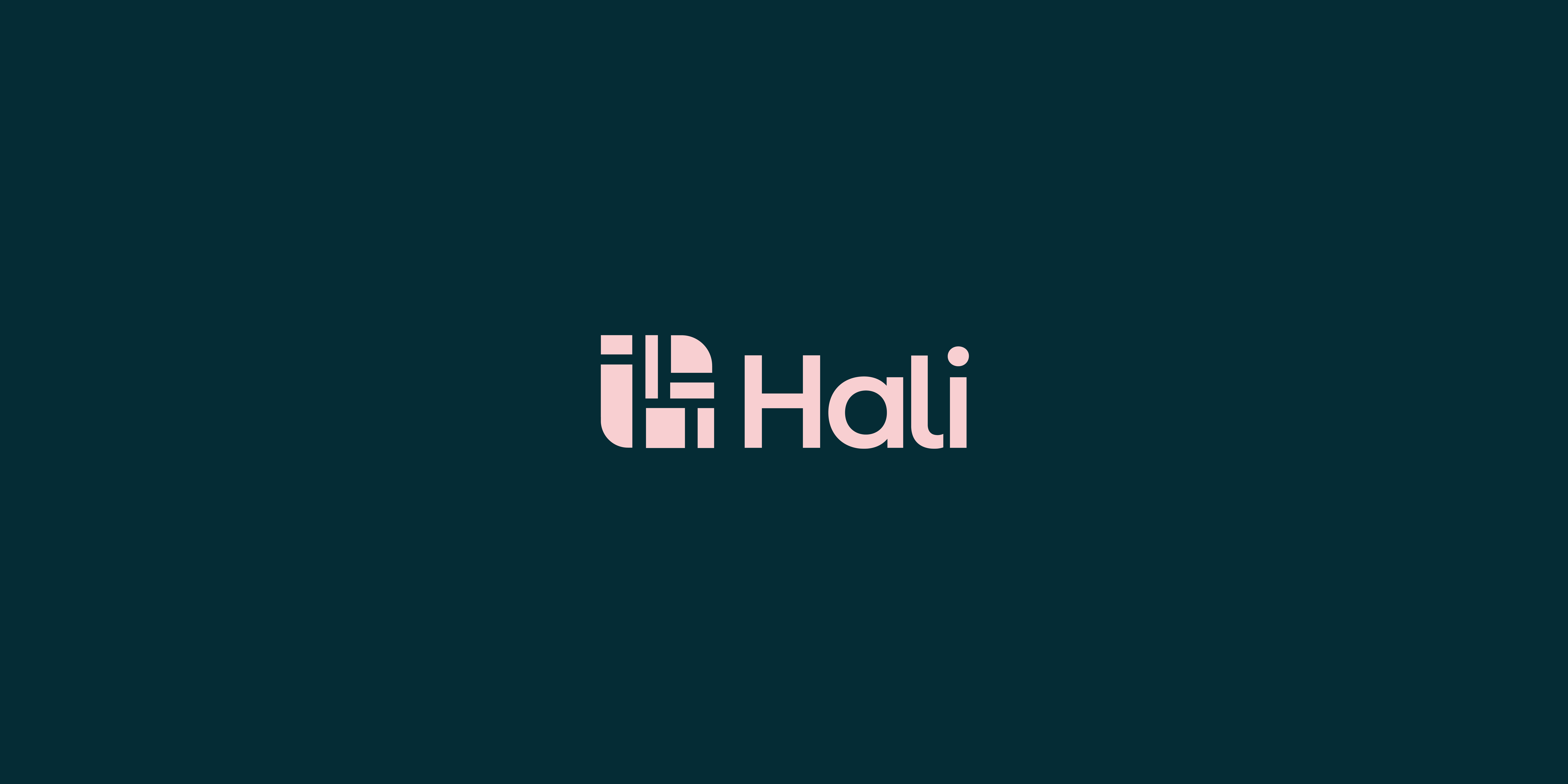
Our logo has been designed to encompass our key ideas of warmth, approachability and quality through our friendly letterforms and curved edges. Our marque is inspired by the combination of architectural floor plans and traditional makers marks which again serves to emphasise the care and craft in everything we do.
Soft, rounded corners and our vibrant colour palette seen throughout give a unique visual language which is carried from our logo through to all touch points of the brand including the custom icon suite.
