Green-Schools Handbooks
2024
Designed by Lisa Dooley and Jonathan Barr at The Factory
Categories: Printed Publication / Print / Typeface / Publication
Industry: Education
Tags: Illustration / Typography / Publishing
The challenge was to redesign An Taisce’s 11 Green-School handbooks, giving them a fresh look, appealing to both students and teachers, while ensuring the digital version and printed copies were as light on the environment as possible.
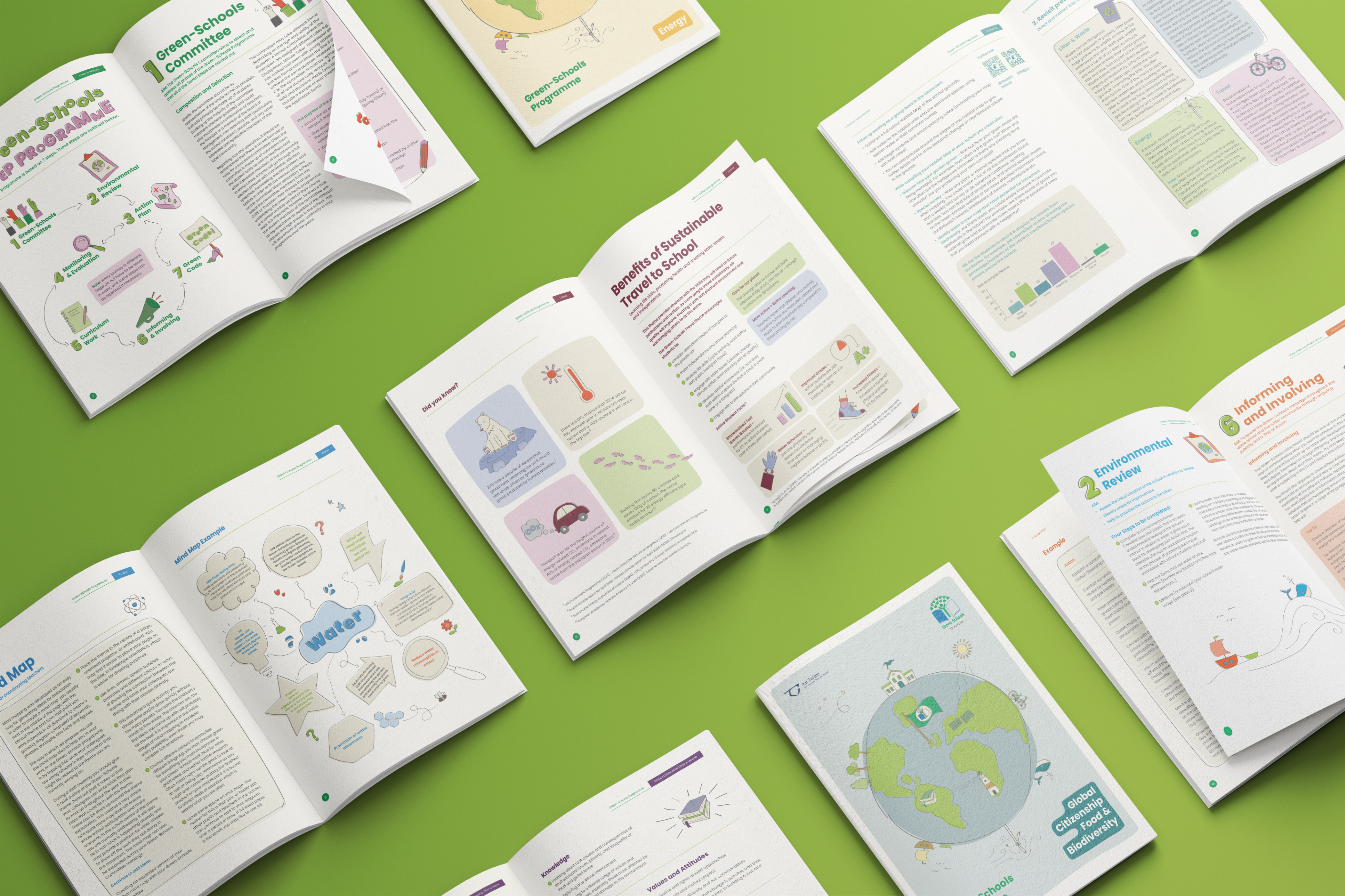
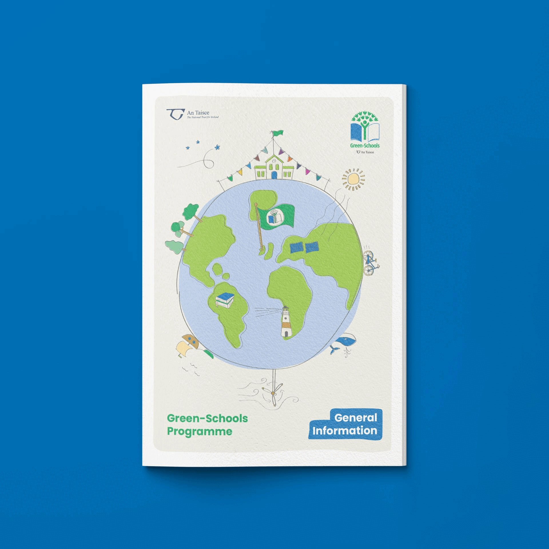
Along with the Green-School’s General handbook, that gives details on the overall Green-School Programme, there are 10 main handbooks, each of which offer information and learning opportunities about specific themes, such as Energy, Water, Biodiversity, etc. Each theme is represented by its own bright, bold colour. To ensure visual harmony, a complimentary colour pallet was developed for all 10 themes. Inspired by hues seen in nature, this diverse array of tones offered more scoop to create visually pleasing layouts, while allowing each theme to maintain its own identity.
With the colour palettes in place it was decided to create a series of bespoke illustrations, to give a playful appearance, engaging the school students. The illustrations were drawn digitally, but with a naive quality, outlines were offset adding movement and character. The illustrations were composed of simple shapes so they could be vectorised, as a vector image has a lower file size compared to jpeg and png formats. This played a significant role in reducing the file size of each handbook, meaning the combined digital size of these newly designed handbooks was 63% less than the previous series.
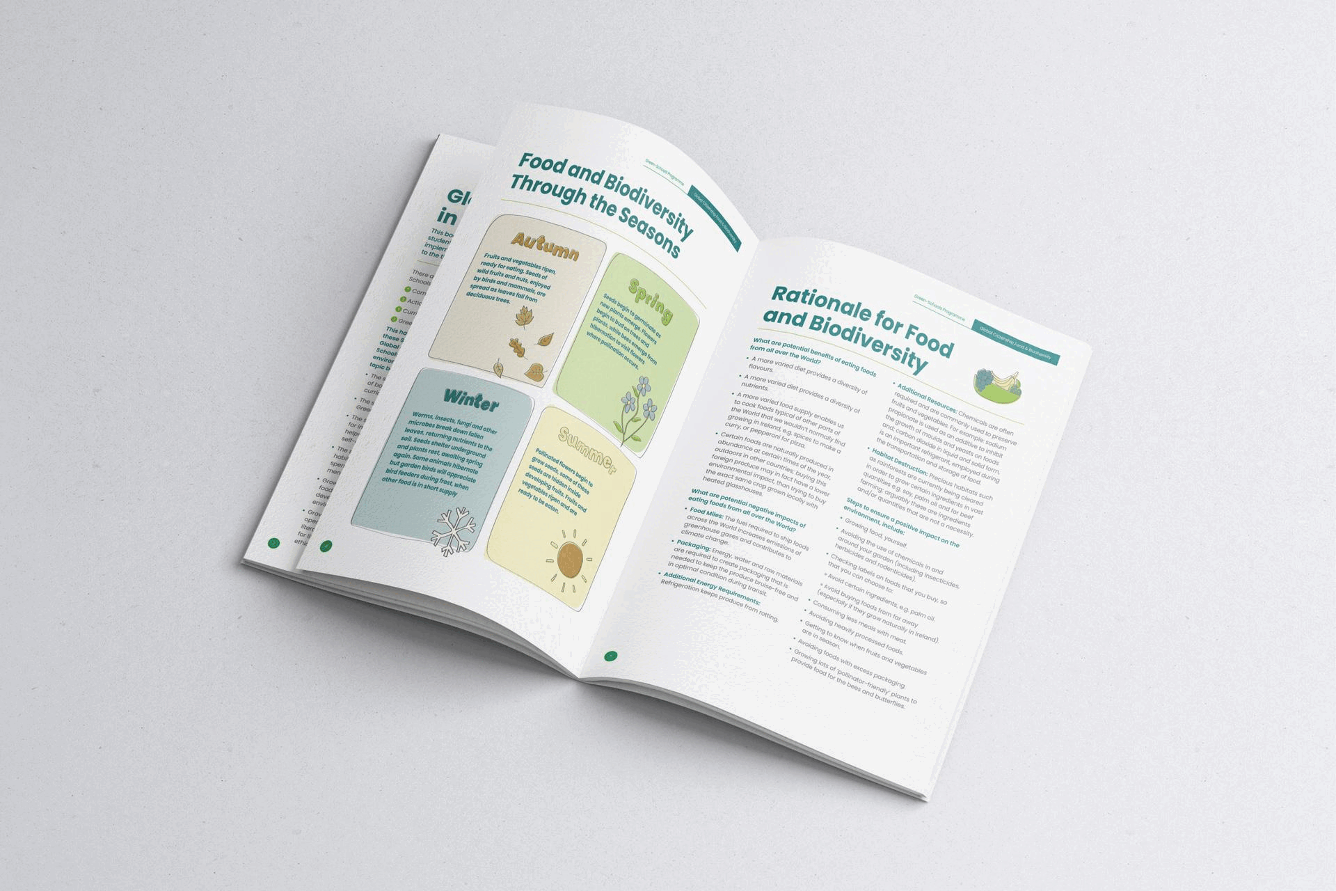
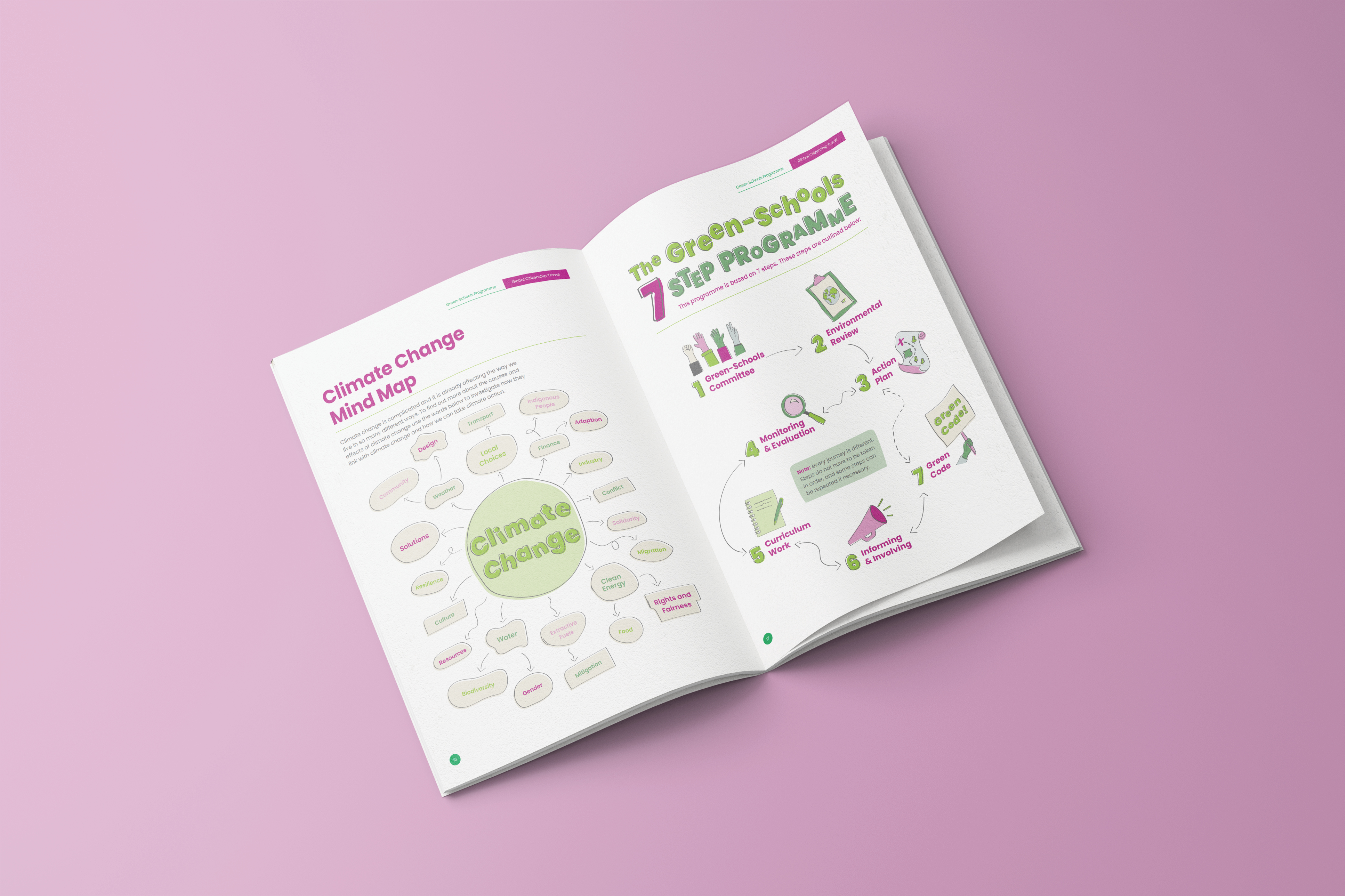
This free-style imagery was contrasted against a structured layout design, with clean typography, as to not alienate older readers, also increasing legibility. To reduce ink consumption the work was consciously designed to avoid highly-saturated, solid background colour, which was very prevalent in the previous iteration of the handbooks. This resulted in layouts where content was primarily housed within white space which enhanced appearance and legibility, therefore using less ink did not compromise aesthetics or function. It can be seen that text is sometimes housed within organically shaped boxes to highlight important content, these colours are very desaturated, to further mitigate ink consumption.
A custom font, echoing characteristics seen within the illustrations was developed to add a playful and emotive feel to quotations and other highlighted text.
We also considered how teachers would inevitably print or photocopy the handbooks using standard office printers, for this reason we opted to not bleed artwork to the edges, meaning if pages were printed on standard A4 paper the reproduction would more accurately represent the original designs. For similar reasons the layouts were designed so they would work well as both spreads and single pages.
We encouraged the client to only offer physical copies of the handbooks to those who had ordered by a certain date. This print-to-order initiative resulted in far less copies being produced, reducing material and energy consumption. Information about a take-back-scheme was also included on the inside cover, encouraging users to post the books back to An Taisce at the end of the academic year, giving each copy the opportunity to live multiple lives, aligning with circular principles.