GASP!
2023
Designed by Hugh Heffernan, Conor Smyth, Jack McKeon and Victoria Brunetta at Piquant Media
Marketing and Communications: Lyndsey Hall
Head of Development: Pawel Bogucki
Frontend Developer: Amy O’Shea
Sign Painter: Tom Collins
Categories: Website / Environmental / Identity / Moving Image / Social Media / Screen
Industry: Cultural
Tags: Digital / Campaign / Social / Conference / System
Website: gasp.ie/
GASP! is a Creative Industry Conference in Limerick City, the Midwest of Ireland. With rapid changes in the Irish creative sector as well as emerging technologies and communication practices this conference sought to celebrate national growth within the creative industry and explore the relationships between creativity, technology and story while keeping the human element of creativity at the very core of all topics and events.
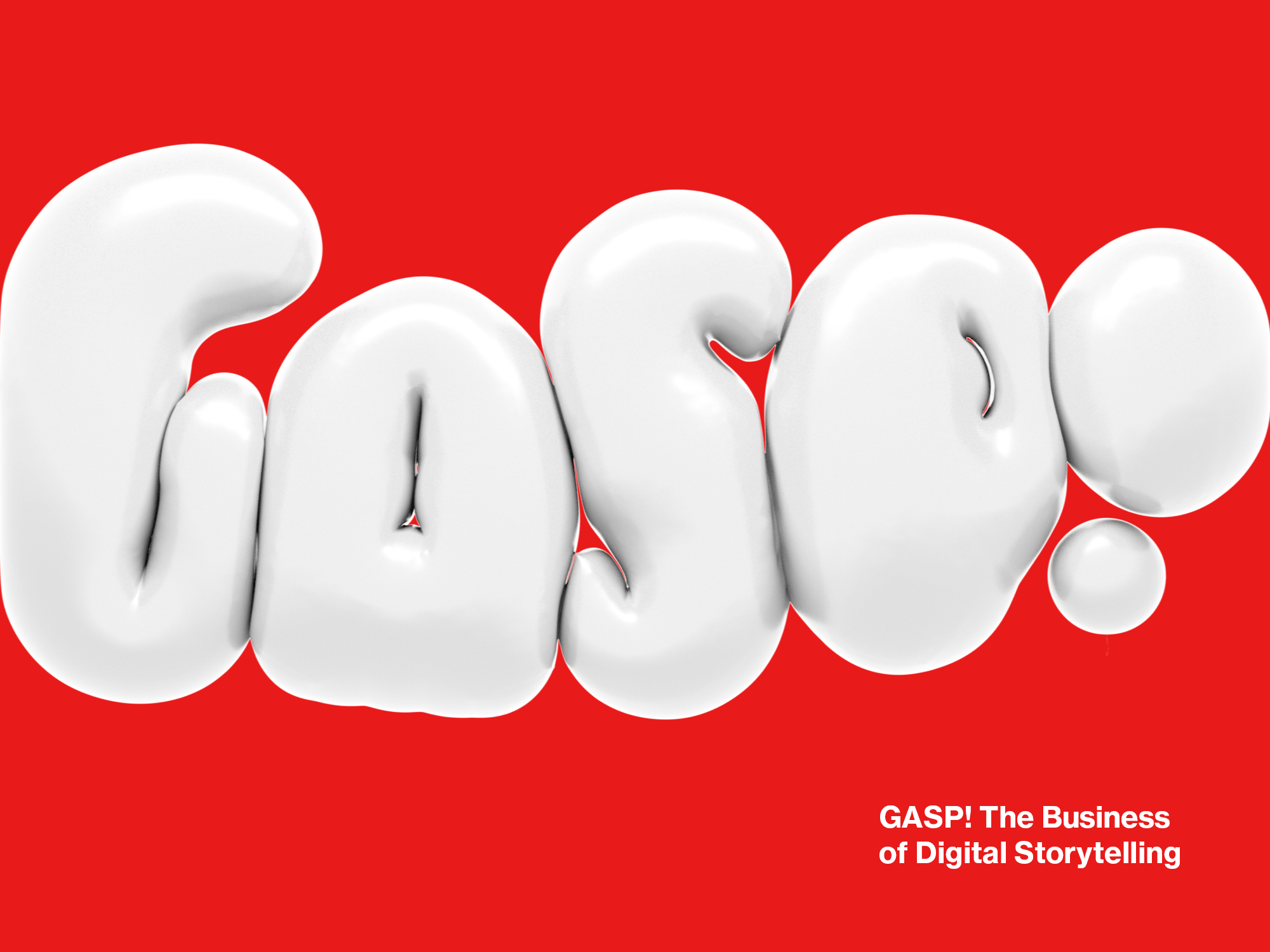
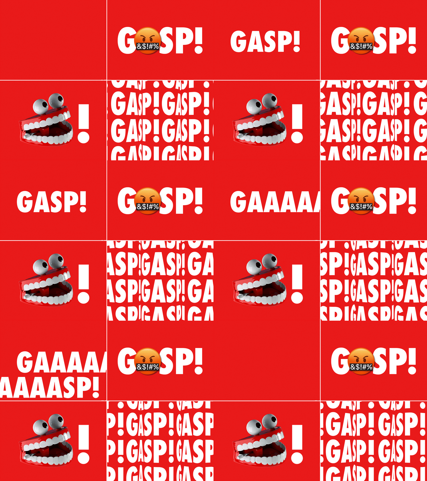
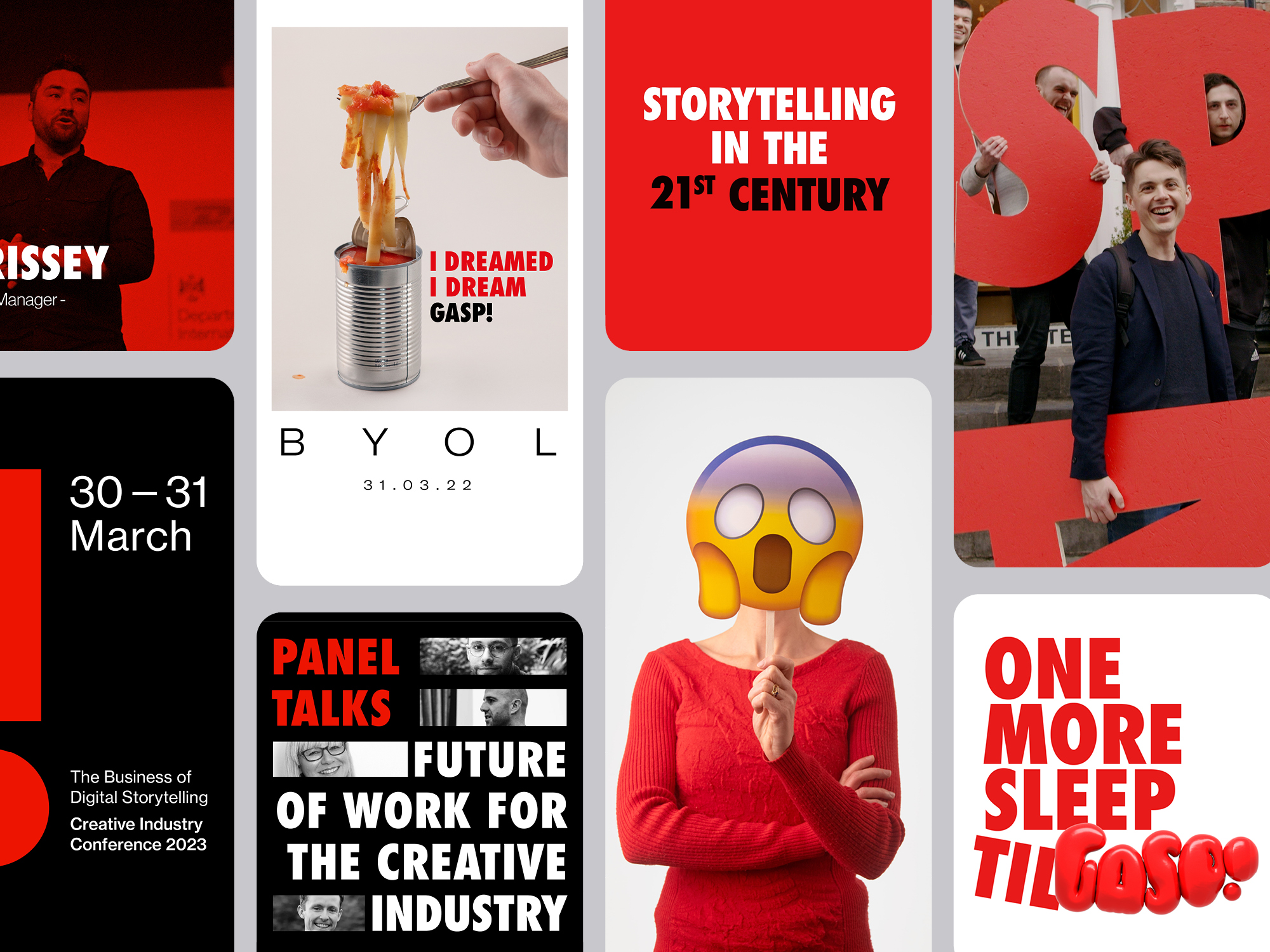
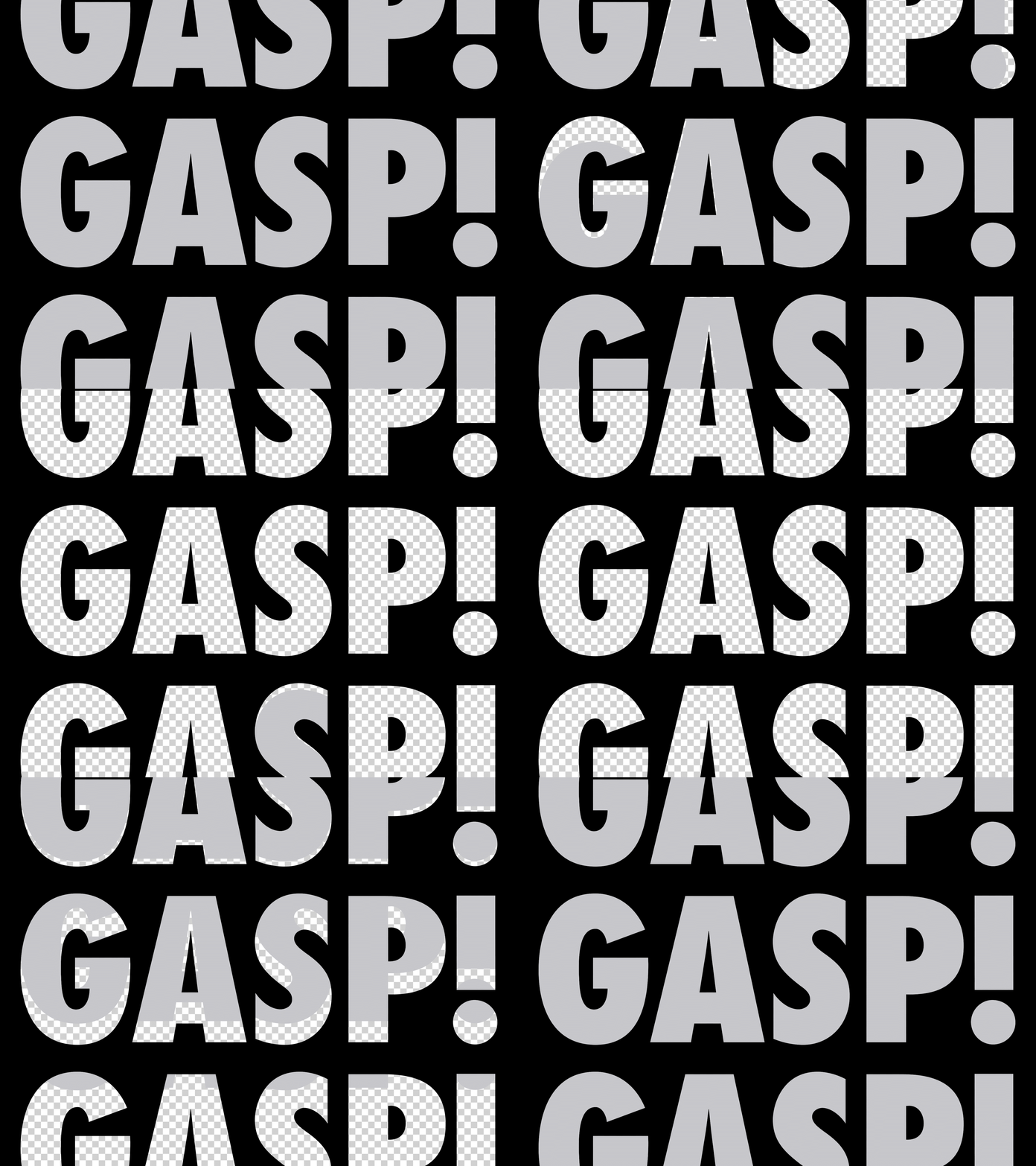
We developed an expressive visual identity that was designed to be flexible and adaptable while retaining brand recognition. The dynamic system, which was primarily composed of clean typography and a minimal colour palette, allowed for a bombastic approach that could thrive across digital, print and environmental platforms.
We pursued a dynamic and idiosyncratic approach to imagery, utilising found imagery, AI-generated visuals, 3D models, emojis and professional headshots to help convey key themes explored at the conference in a playful manner.
Motion design played a vital role in the activation of the brand, both in online communications and on screens during the conference. A wide range of techniques were utilsed to achieve a dynamic motion brand such as 2D animation, 3D modeling and physics engines. Typographic animations were developed with the aim of creating moments of surprise, a brand that could gasp!
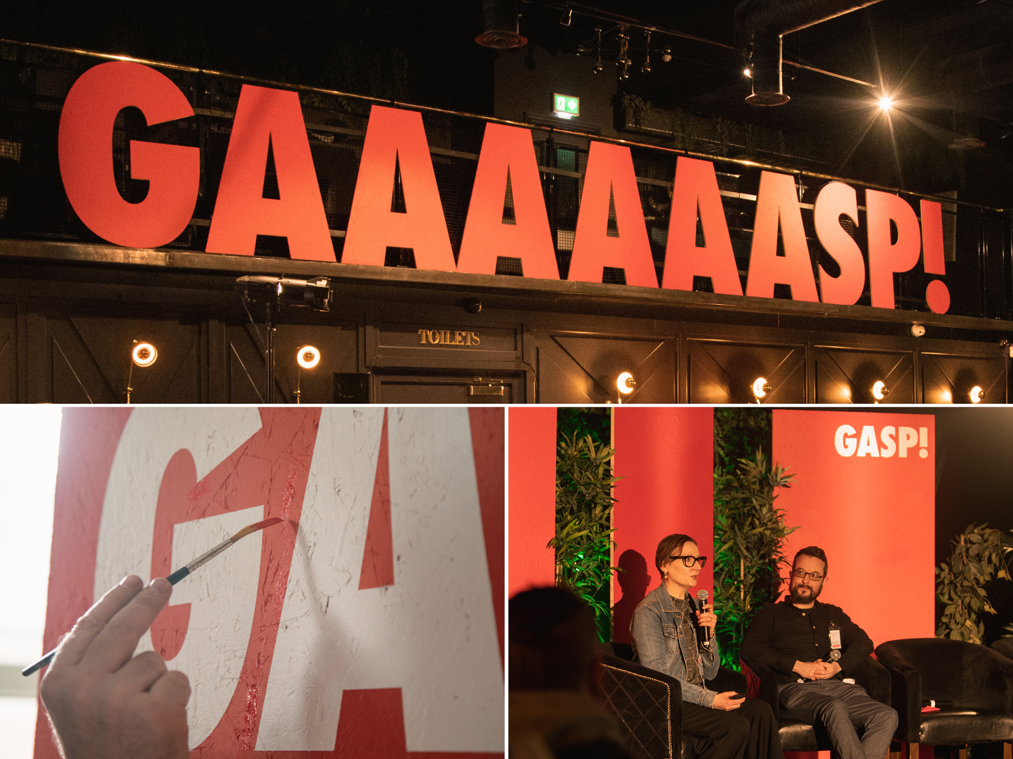
Expressing the brand in the conference environment was carefully considered with the aim of creating a seamless transition from an online digital experience to the event environment. We prioritised sustainable solutions, such as machine-cut oversized wood lettering, hand-painted wooden stage backdrops, coloured lighting, and large on-screen motion graphics introducing each event.
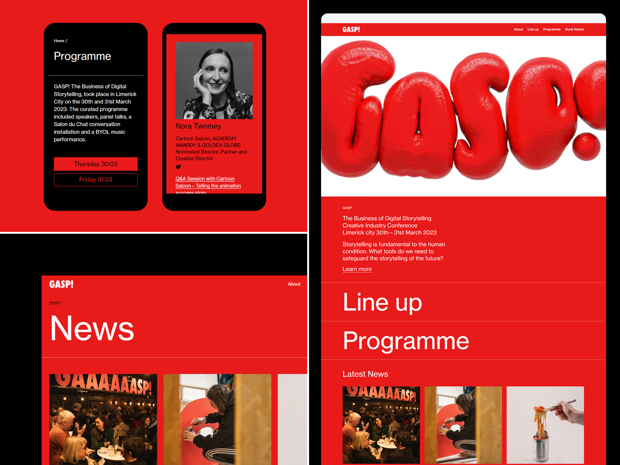
We developed a microsite, using Drupal, as a destination for all campaign content. The website was developed to showcase speaker profiles, event pages, news items, contact page, as well as key information pages including “About” and “Plan Your Visit”. We created a dedicated book tickets landing page which linked to separate Eventbrite pages for the conference and student focused event.
