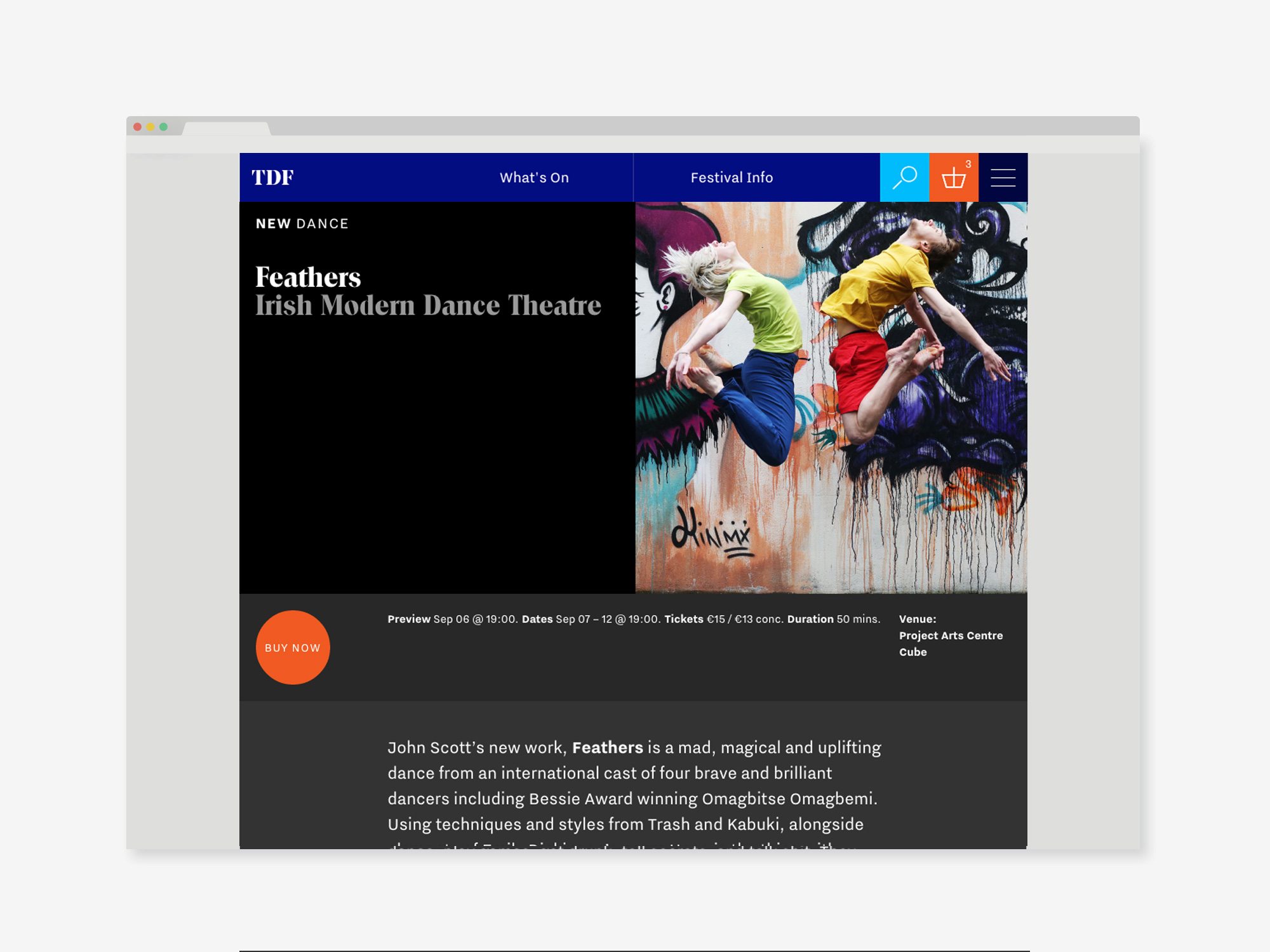
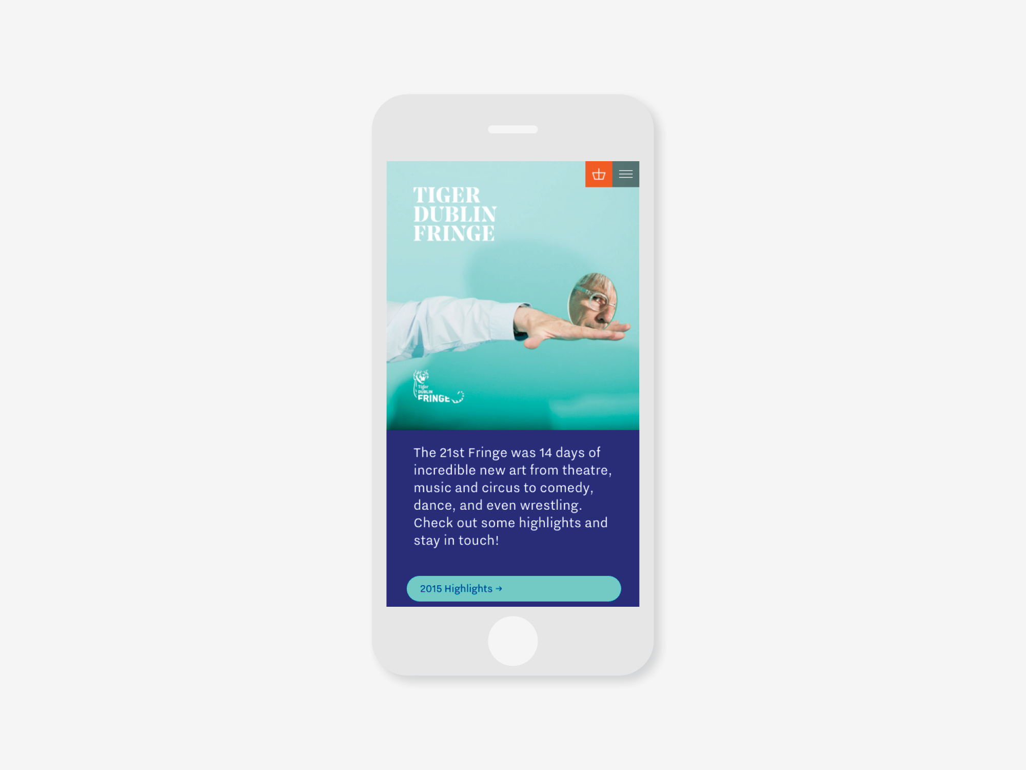
Fringe Website
Designed by Scott Burnett, Kevin Horan and Rory Bradley at Aad
Categories: Website
Industry: Cultural
Tags: Festival
Website: fringefest.com/
The big challenge with developing a website for the fringe is the sheer number of events, across a wide range of categories over a two week period. This means that many traditional ways of presenting festival events end up being overwhelming and confusing, favouring either the person with a specific show in mind, or the fan happy to spend time exploring every show.
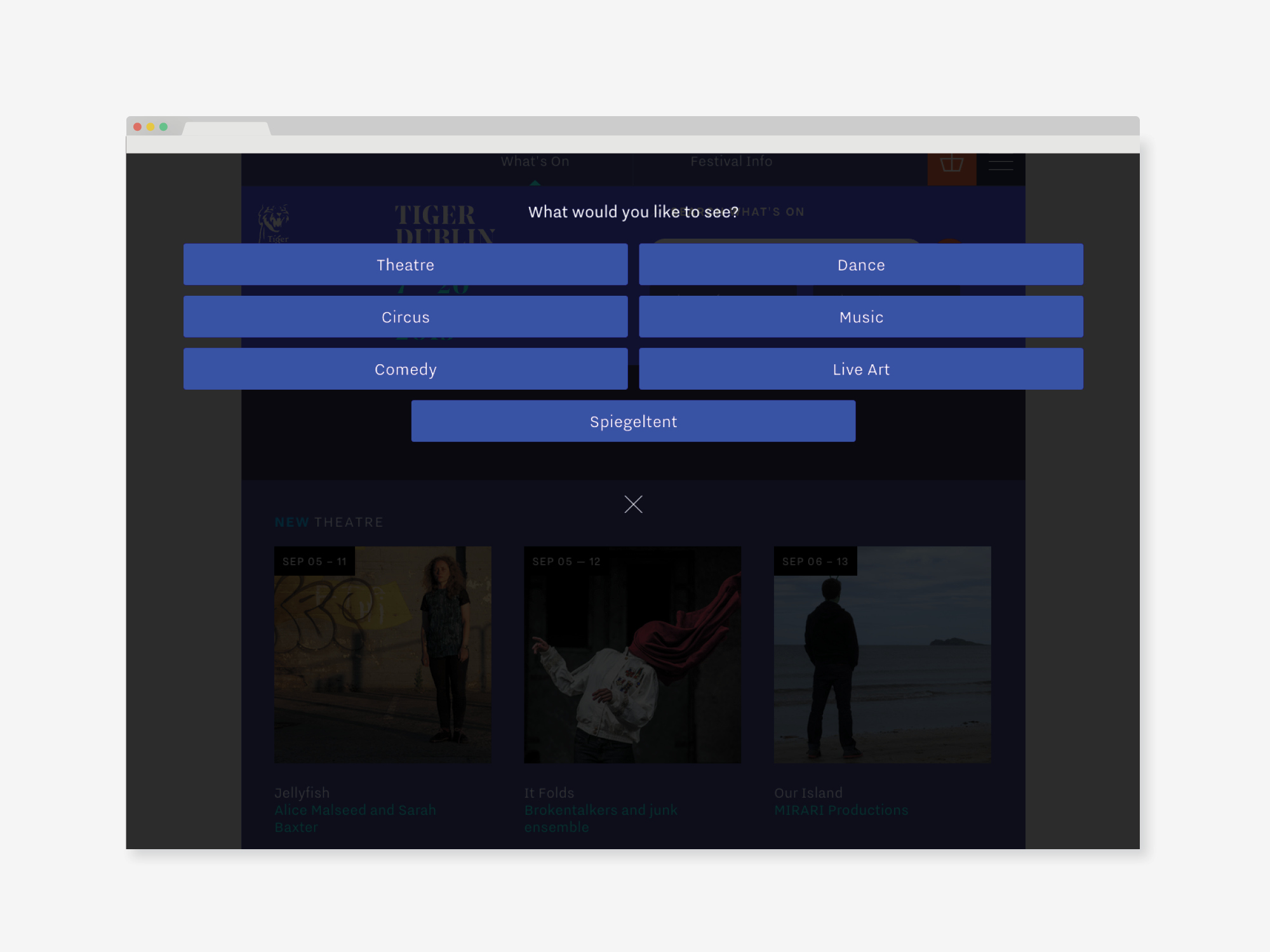
Our strategy was to flip the traditional experience. Rather than defaulting to a complete festival overview and expecting a user to make sense of it in a headspinning number of ways, we made the decision to lead the user to a manageable set of results by helping them make decisions along the way. While it’s still possible to see the whole festival in one view, you have to actively seek it out. For all other users they’re only ever presented with events that they’ve chosen to view, whether by date or category.
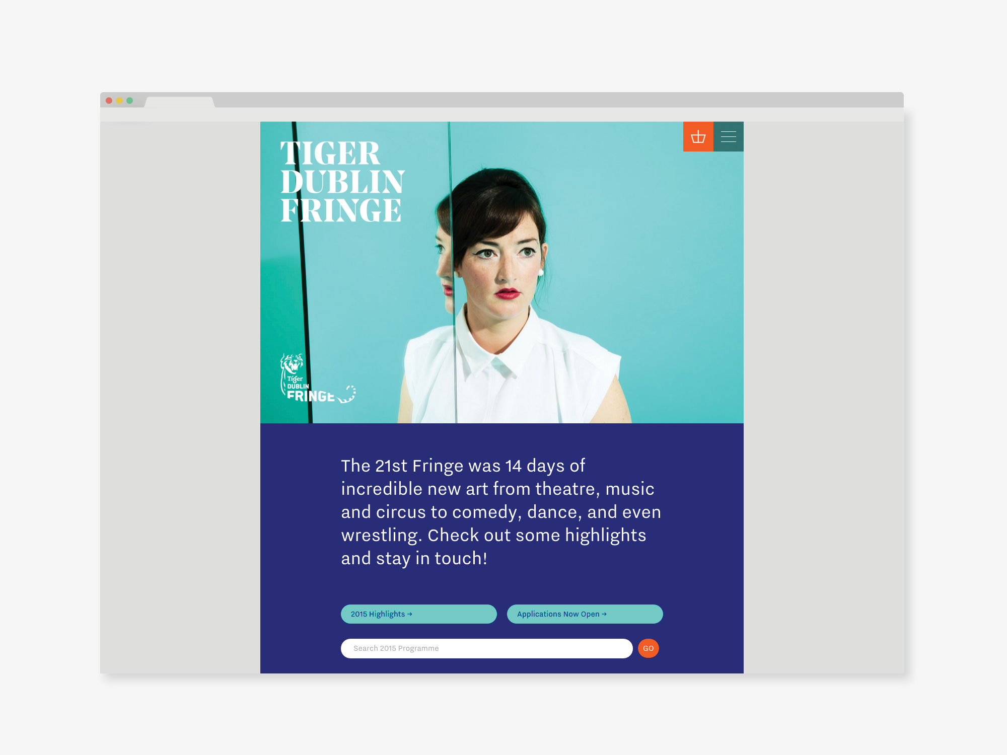
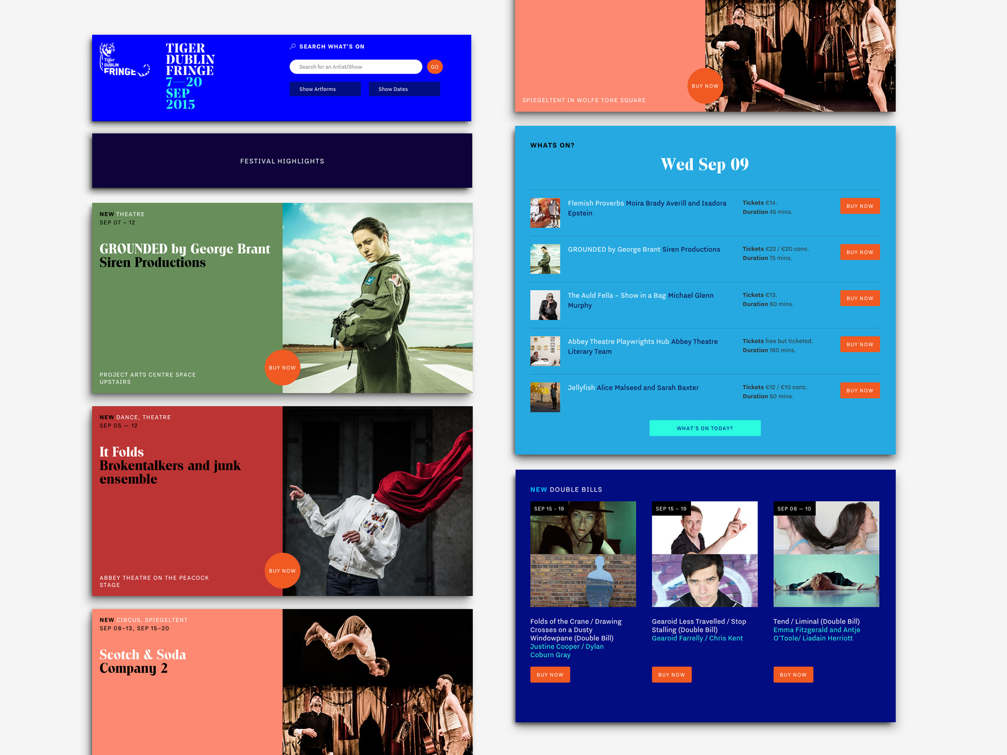
This strategy also allowed us to create a useful and modular festival homepage. Removing the default full festival view allows them to have a much more active role in outlining, signposting and promoting events, allowing them to shape the homepage on a daily or even hourly basis to get the most relevant information to users during their visit.
A short screencast of the site during festivaltime can be seen here — https://vimeo.com/153626232
