Foundations for the Future
2022
Designed by David Wall at McCann Dublin
Finished Artist: Andrew Corbett
Designer: Patrick Kelleher
Designer: Rachel Lonergan
Categories: Publication
Industry: Civic
The Commission on Taxation and Welfare was established as an independent body tasked by Government to “review how best the taxation and welfare system can support economic activity and income redistribution, whilst promoting increased employment and prosperity in a resilient, inclusive and sustainable way and ensuring that there are sufficient resources available to meet the costs of public services and supports in the medium and longer term.”
The Commission concluded its work in July 2022 when a copy of the report containing 116 recommendations was given to the Minister for Finance.
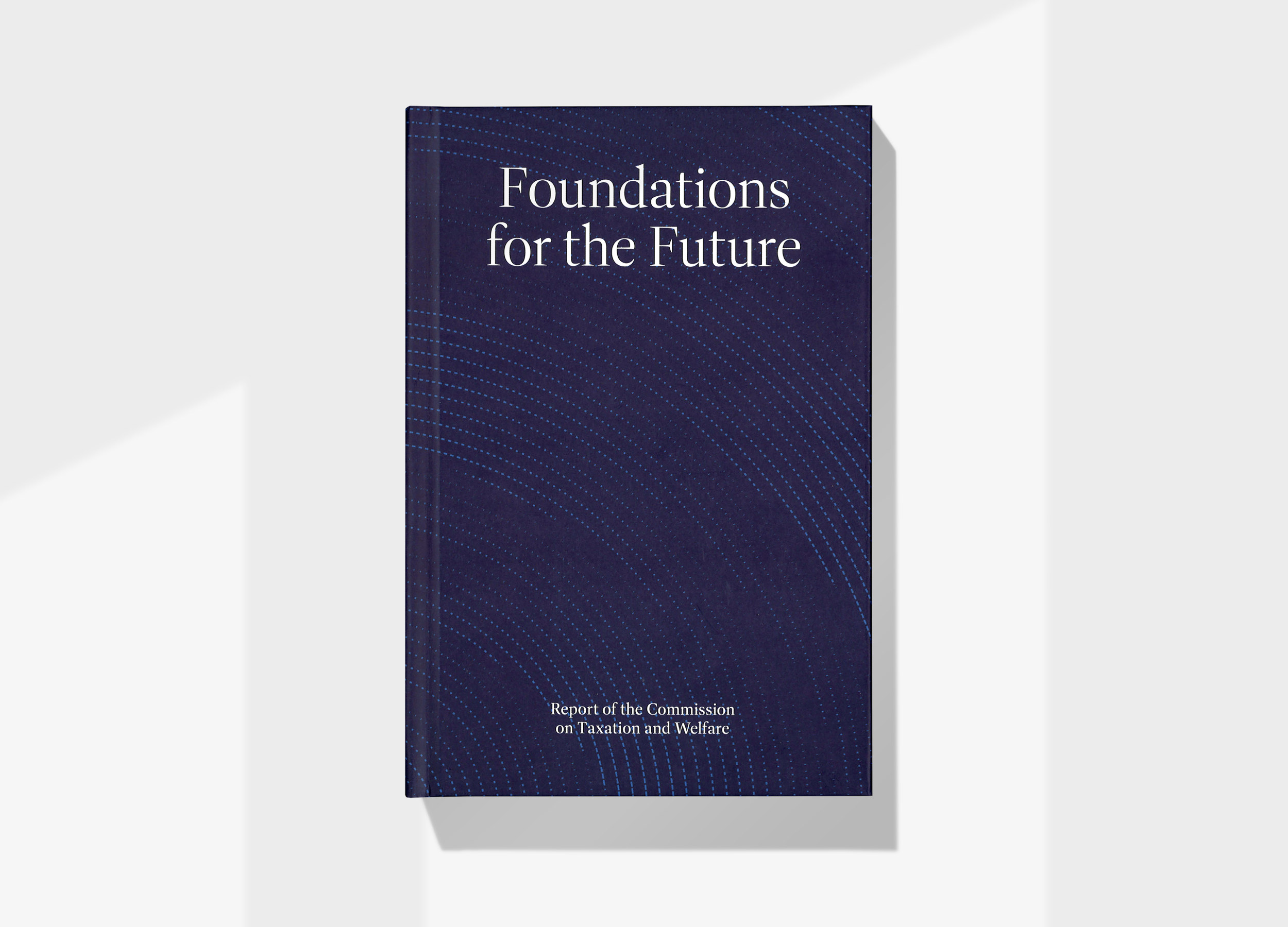
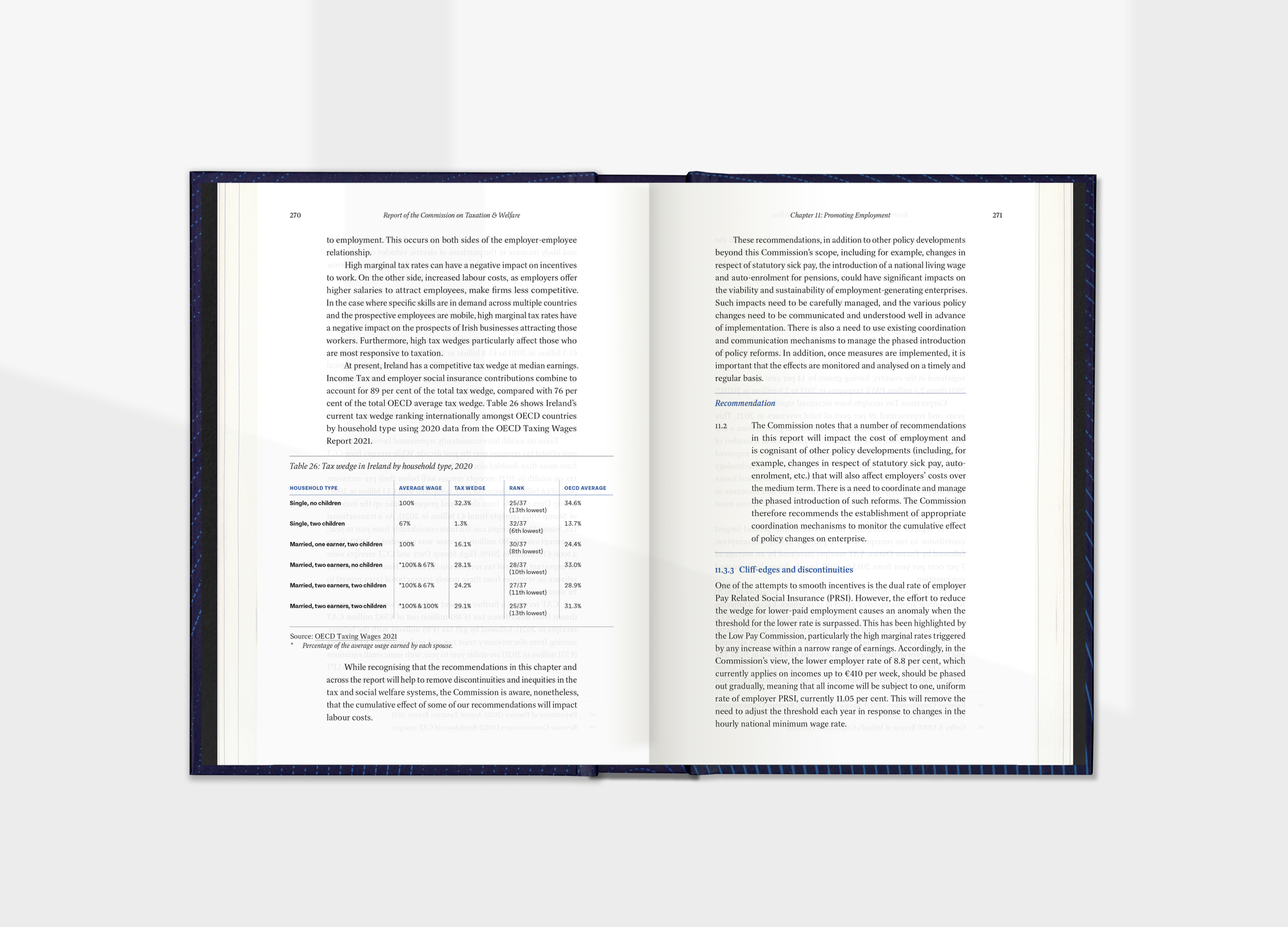
The report was issued as a limited-run hardcover book, and distributed online as a PDF. Its contents could affect the entire population of Ireland over an extended period. We were asked to create a book that could be in use for the next 20–25 years. This dictated that it should be robust, finished to a standard size and made to last.
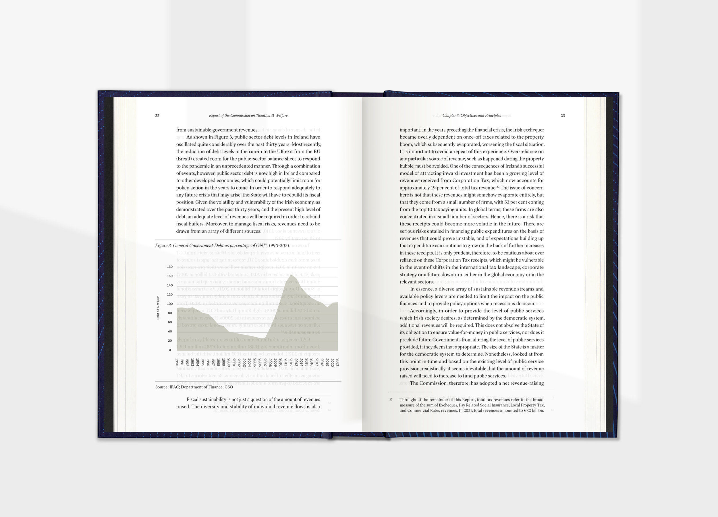
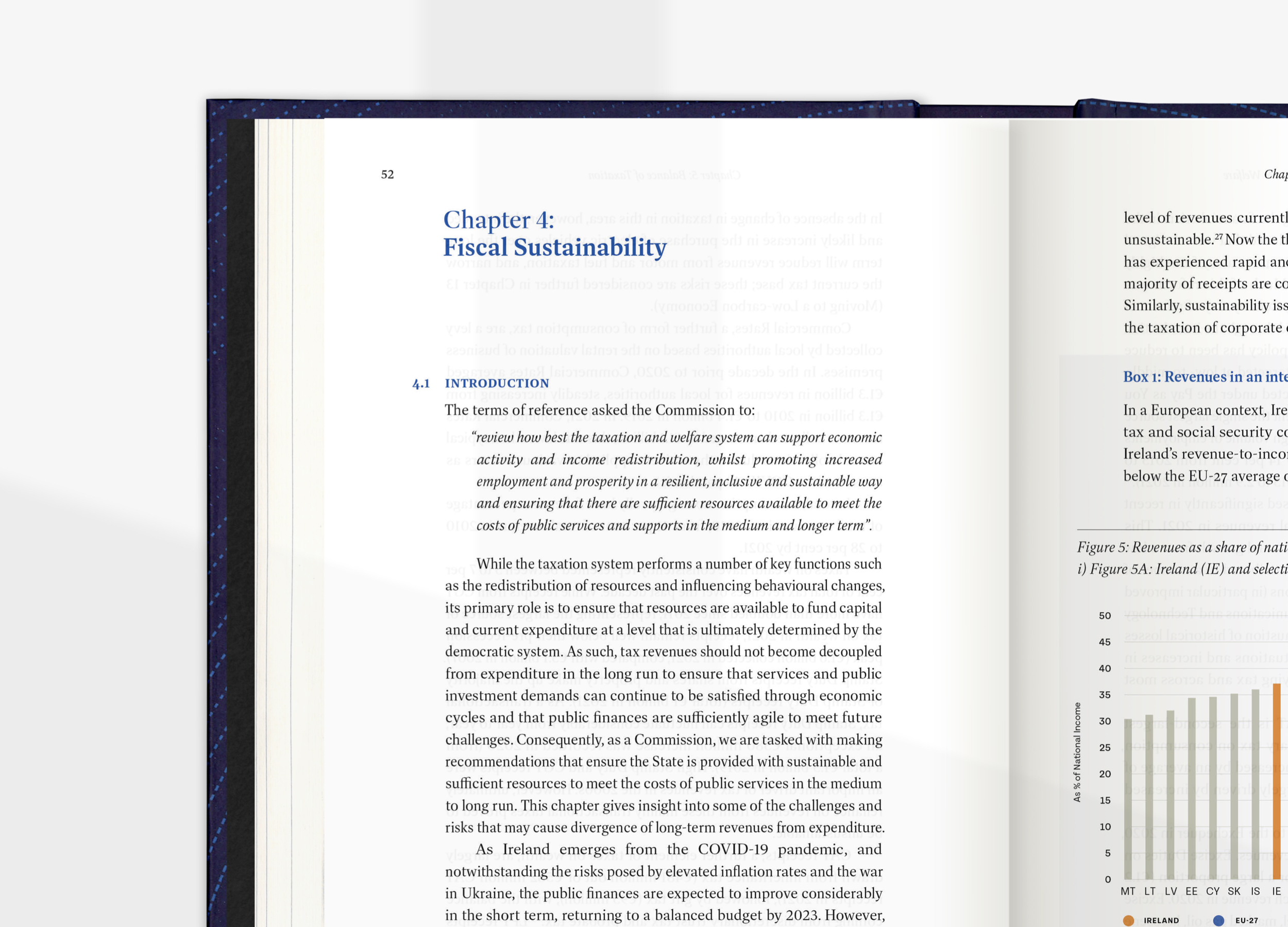
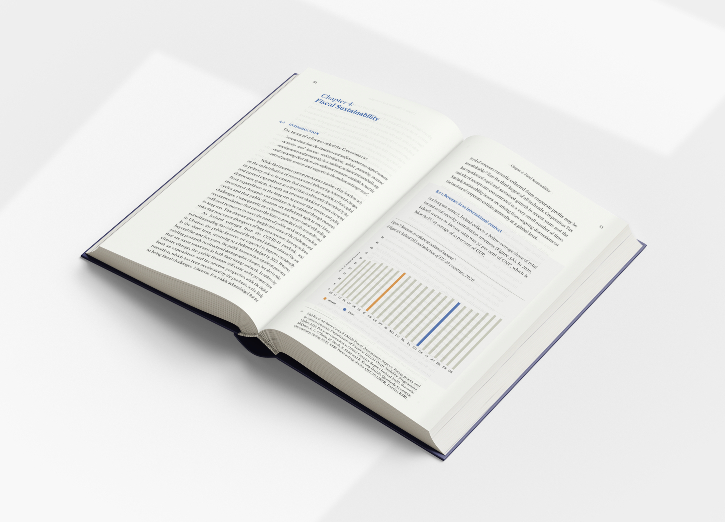
Aesthetic choices mark the significance of the report, with the design being inviting but not frivolous. As the approach uses an economy of styles, choices of how the book is made had elevated importance. The book is case bound and thread sewn with endpapers. The weight of the case delivers a sturdy object, and the paper in the interior is light, so that the report's 560-page extent still feels manageable in the hand.
The Commission‘s logo icon and existing colour scheme also gave us starting points. The icon is based on ogham lettering and its circular form recalls a coin. Responding to this, we created a pattern used on the book's cover and on interior dividing spreads, that was inspired by the detail etching found on banknotes. This abstracted treatment is positioned in layouts so that it appears as a ripple: showing the report’s impact extending over time from its publication. The subtle, low-contrast pattern also carries over to the digital version of the document, emulating the tangible without mimicking it.
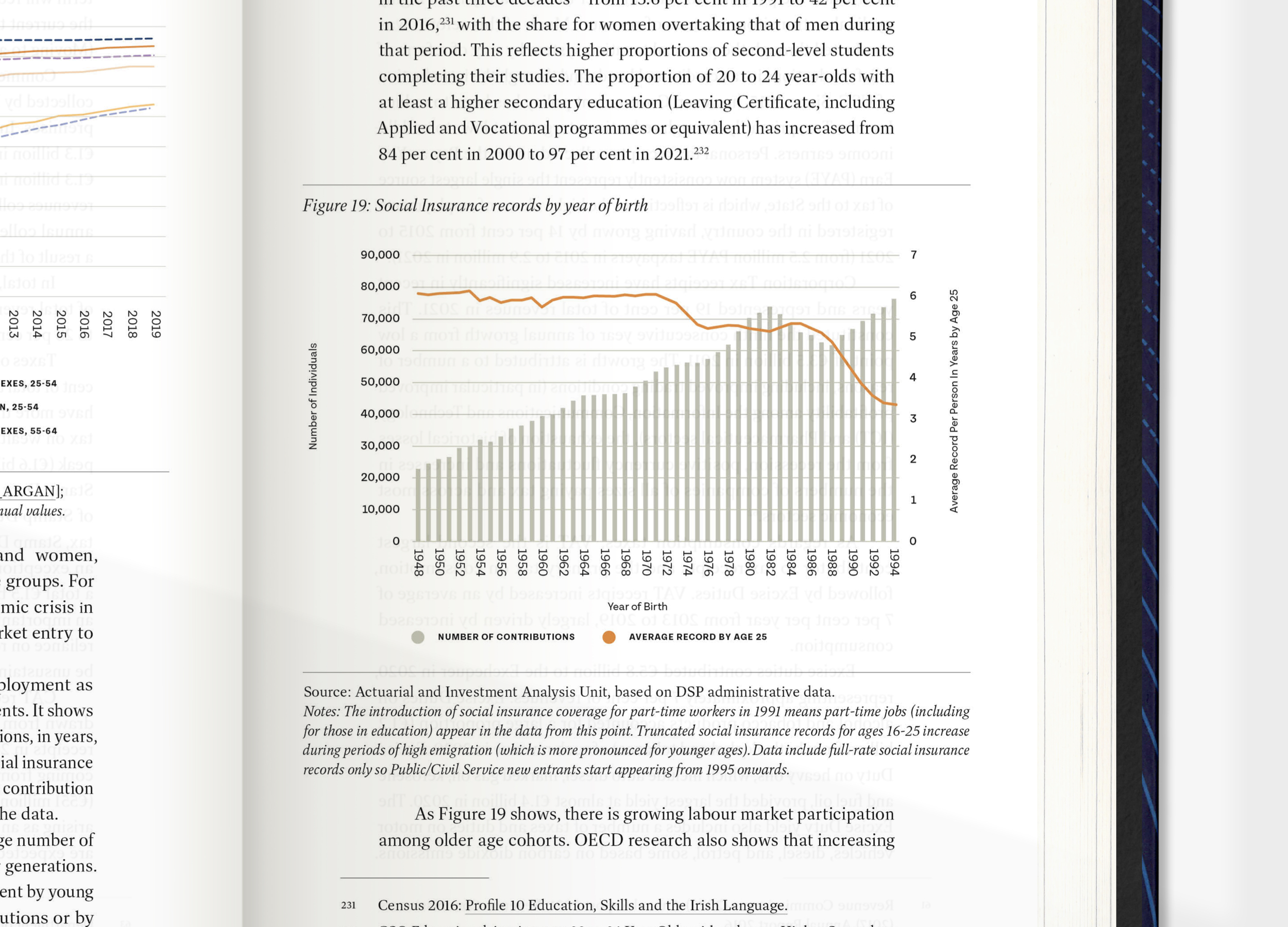
The publication uses two typefaces throughout: Dashiell and Tenon, both from Dublin-based Signal Type. They offer the readability, elegance and clarity needed to accommodate the various text hierarchies and data sets being shown. Dashiell includes three families: Dashiell Text, Dashiell Bright, and Dashiell Fine, all of which are used in the document, to show details and notes, for the body copy and for titling and headings.
