Fórsa
2013
Designed by Paula McEntee and David Stanley at Red Dog
Designer: Aiden Grennelle
Animator: Cian McKenna
Categories: Identity
Industry: Corporate
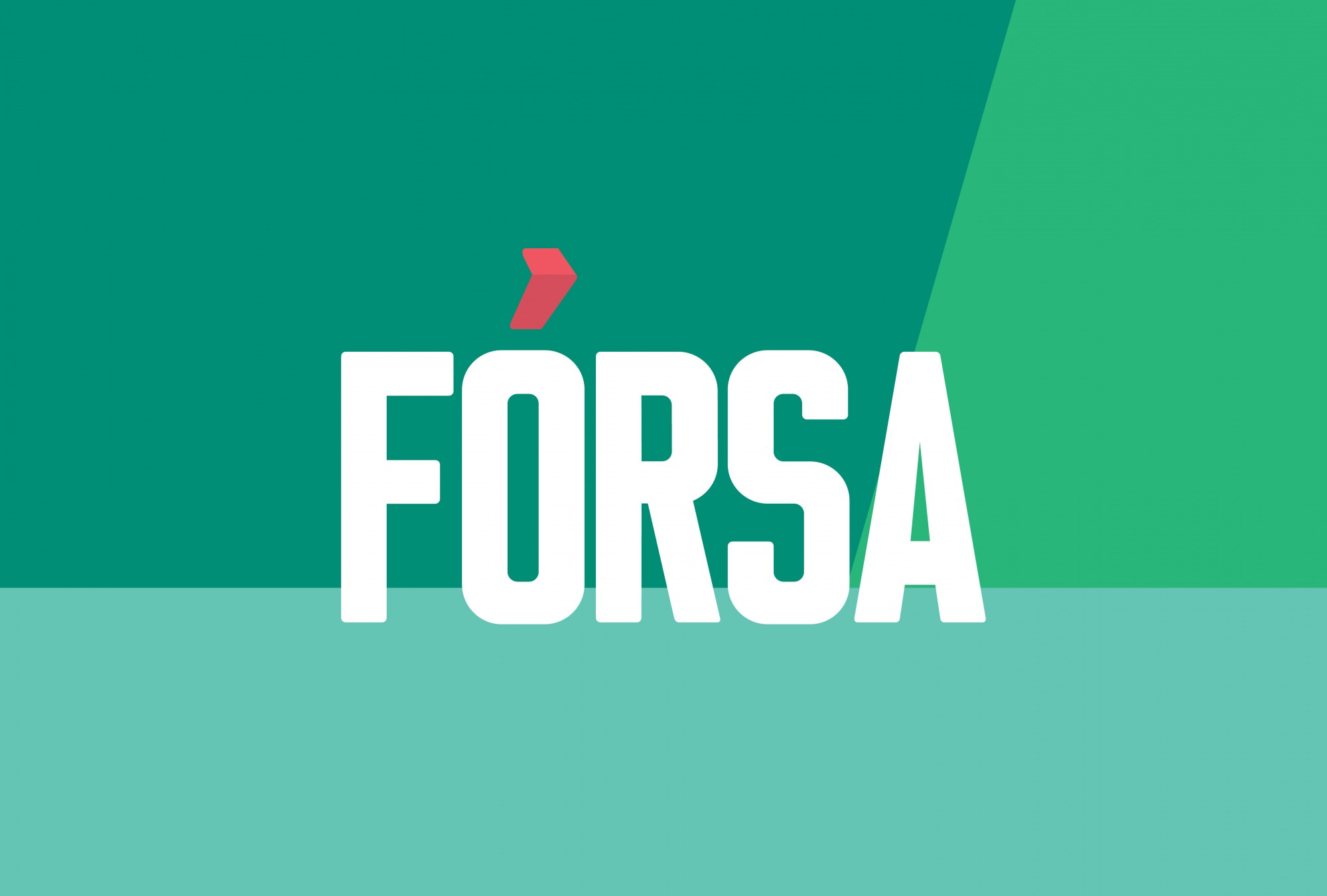
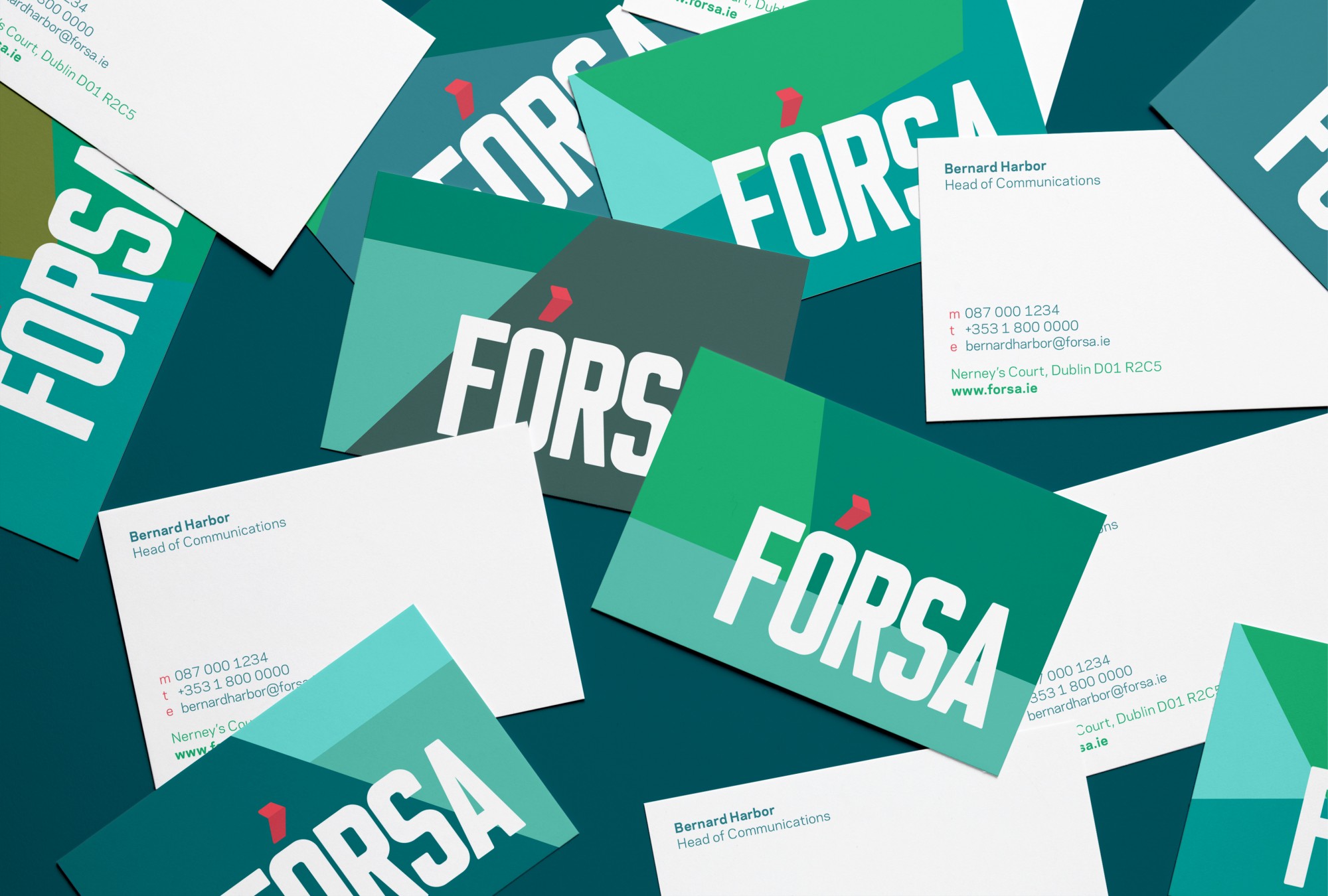
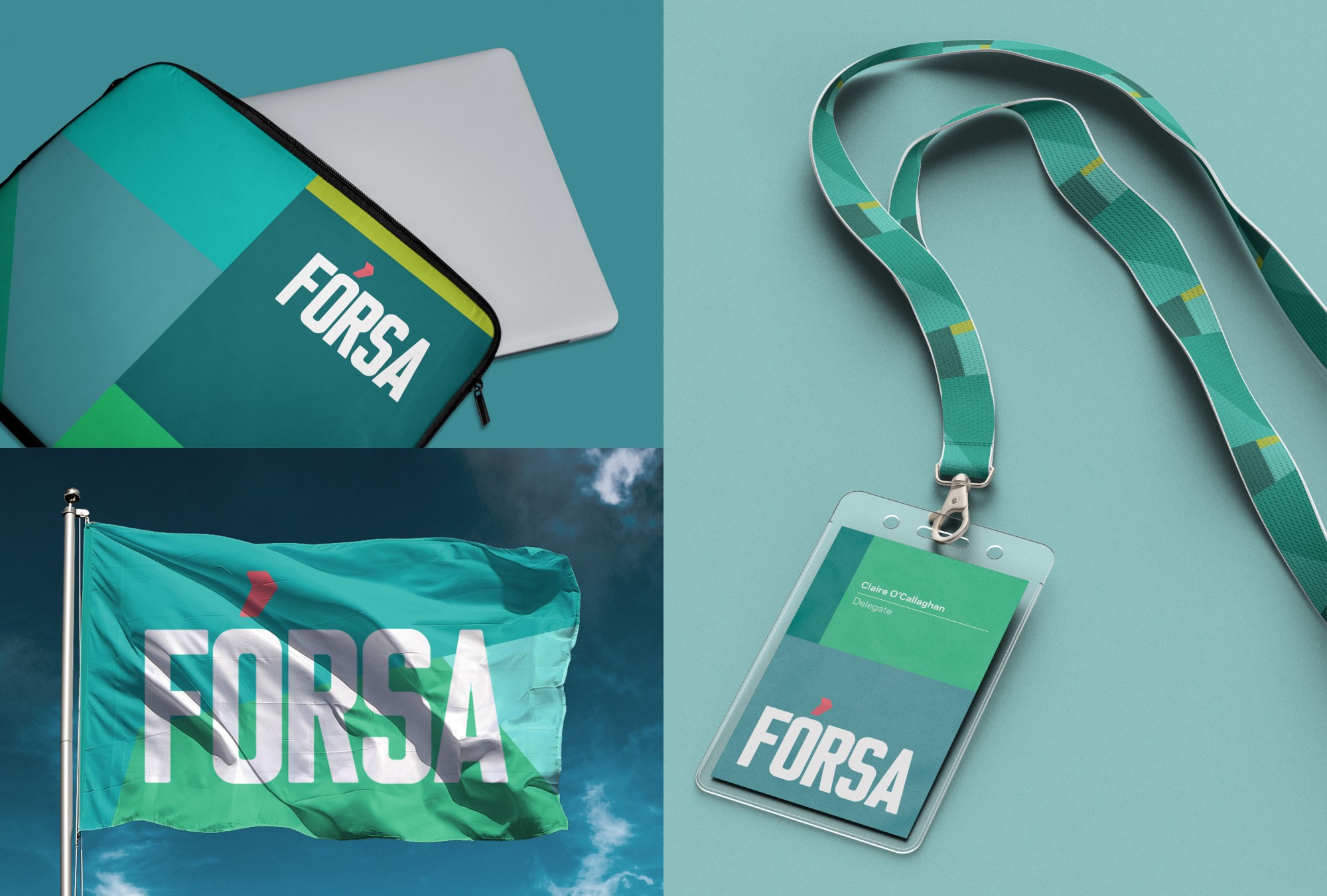
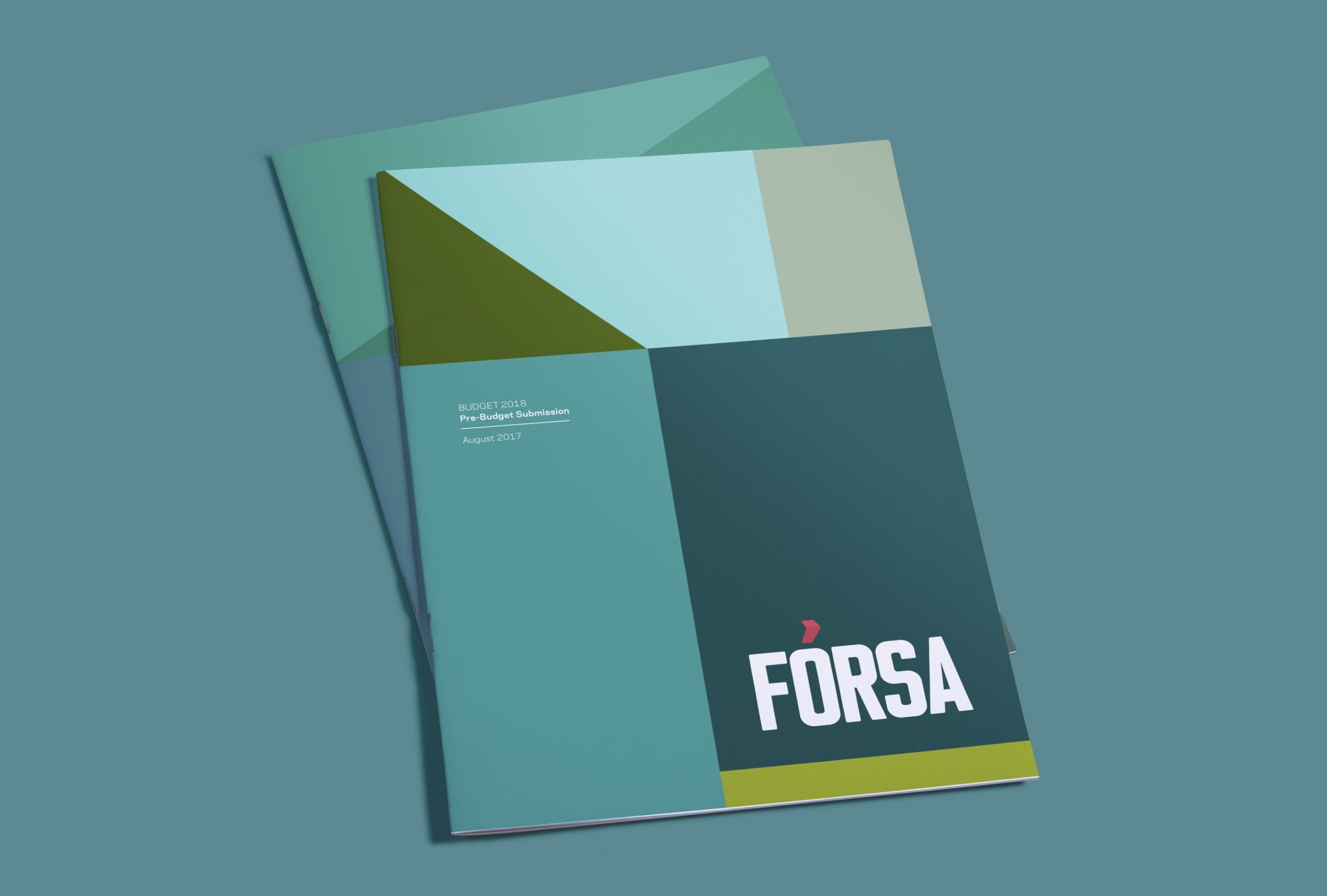
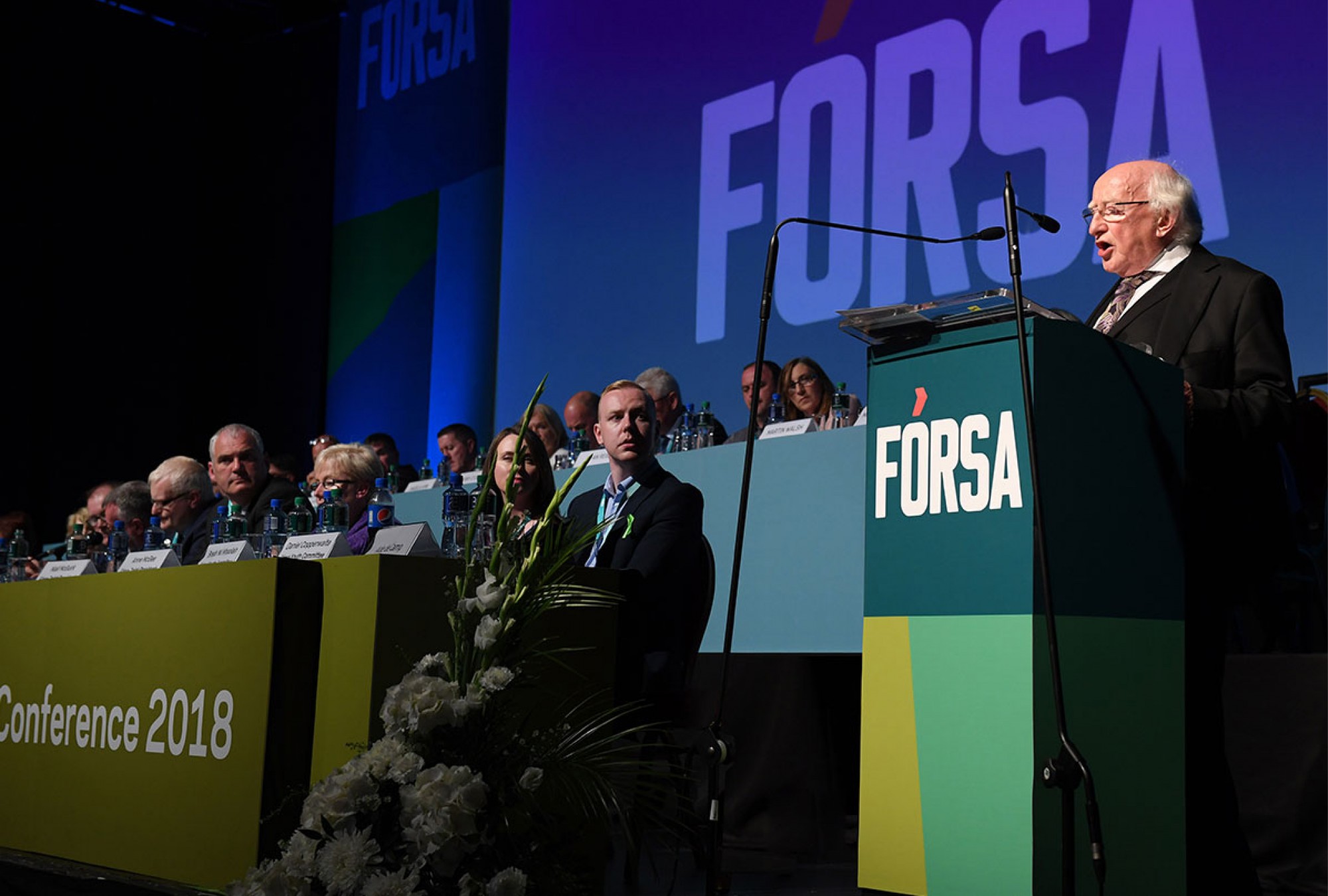
Fórsa was formed when three separate and unique organisations – CPSU, PSEU and Impact – joined forces to become the second largest union on the island of Ireland with 80,0000 members. The name and brand identity for this new trade union projects confidence and strength through the use of bold type on vivid coloured backgrounds to reflect their positioning. The fada above the letter Ó has been modified to resemble the “forward” symbol found on all audiovisual apps and devices.
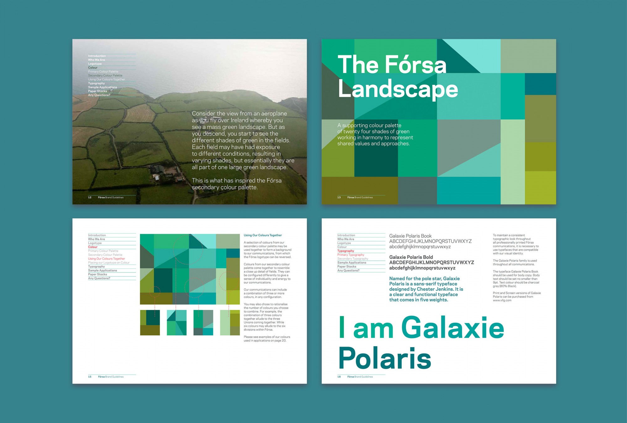
The visual language was inspired by imagining Ireland from the sky where different shades of green are evident in the fields. Each field may have had exposure to diverse conditions, resulting in varying shades – but, essentially, they remain part of the same landscape. So, in essence, the use of different shades of green represent individuality within a group setting. A subtle hint of bright red has been introduced to speak to the idea of fearlessness and standing firm when necessary.
