Focus Ireland Rebrand
2011
Focus Ireland plays a central role in putting homelessness on the public and political agenda – but it operates in a crowded space where the conversation is cluttered and dominated by outrage, crisis management and emergency services. In order to lead the conversation and differentiate themselves from other organisations, Focus Ireland felt it was time to refresh public perception of their brand. Crucial to this was finding a way to articulate a clear vision and purpose through a strong brand identity. Before we began, the following core challenges were identified: • Move the brand to an emotional, rather than functional space • Promote the core belief that homelessness is wrong • Talk about homelessness as a social injustice with a human cost Meeting those challenges, with visual and verbal language and a clear tone of voice, would allow Focus Ireland to strengthen their position in supporting people impacted by homelessness.
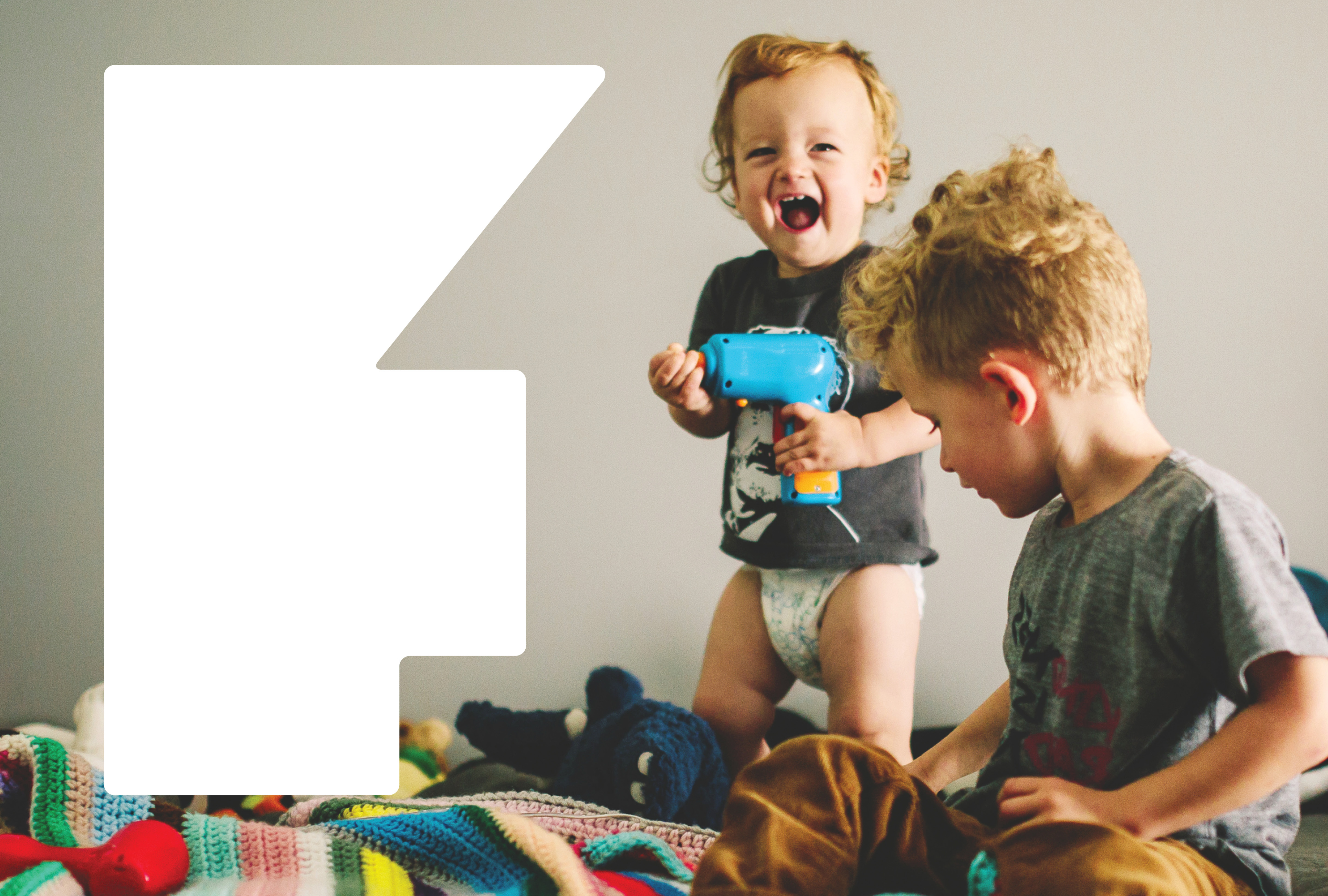
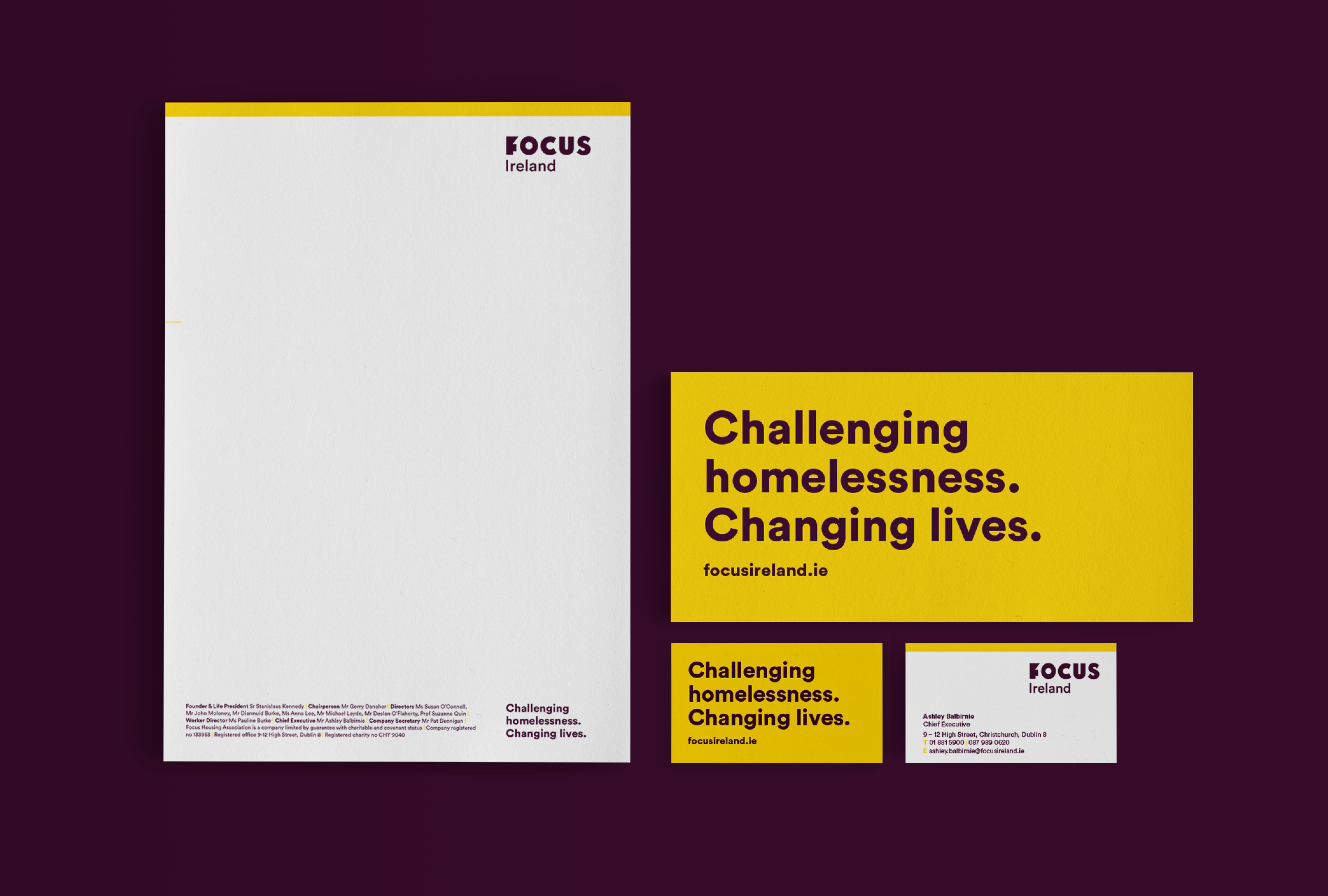
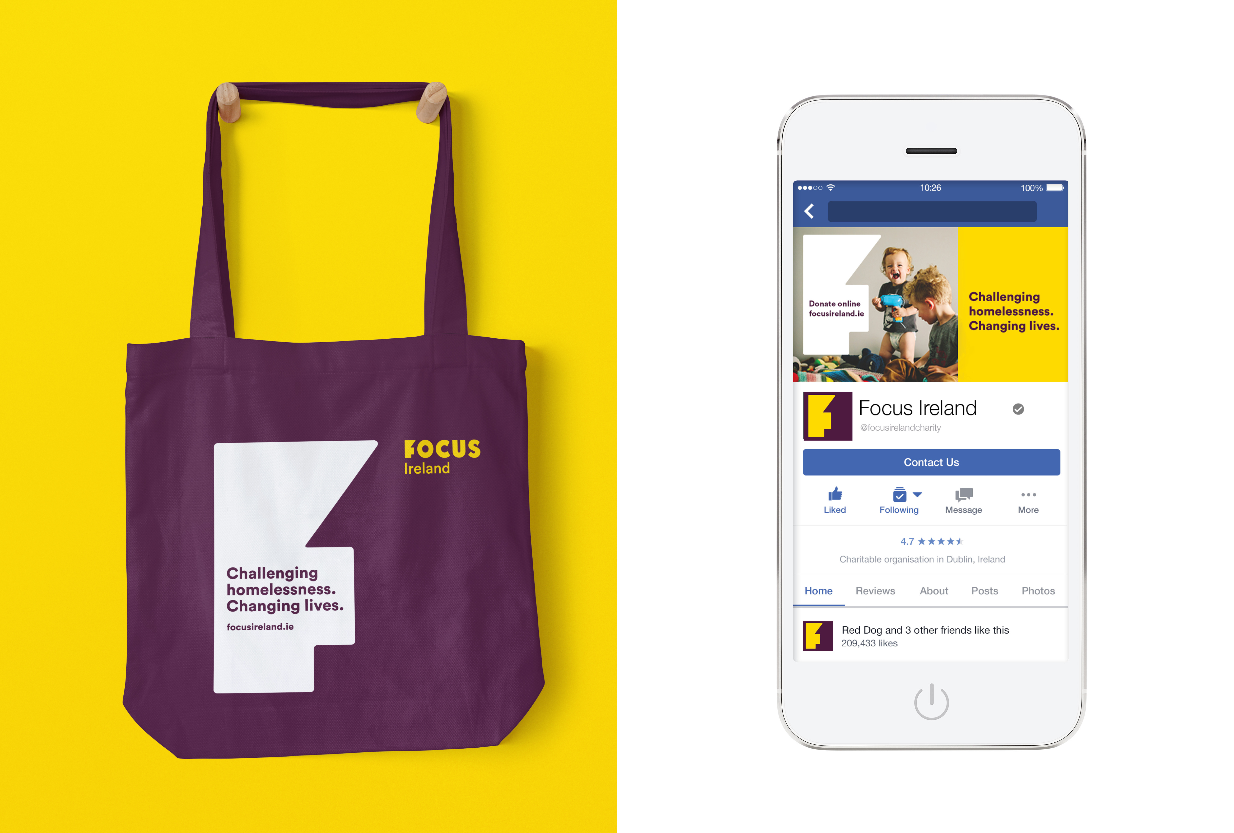
A unique part of the new identity is our brand-marque ‘F’ device. This device comprises a stylised version of the ‘F’ letterform, where the negative space represents a ‘missing’ home. When placed over an image, it supports the subjects of the photograph, ‘housing’ them. The ‘F’ device is also a unique ‘stamp’ and identifier for Focus Ireland, helping them to visually stand out from the crowd. We developed a new tagline, ‘Challenging homelessness. Changing lives.’ This reflects Focus Ireland’s commitment to challenge the status quo, while also acting as a rallying call within the organisation. To complement their core colours, we created a suite of colours that denote the level of urgency and illustrate the situation being represented. Code Blue colours, which convey a sense of urgency, are suited to appeals and emergency campaigns. Alternatively, Code Yellow colours convey hope and warmth – perfect for highlighting positive-impact stories. We created a straightforward design toolkit, which could be used effectively across the organisation. It allows for flexibility, yet strives to ensure that Focus Ireland is represented in a unified way. We created a comprehensive set of brand guidelines that set out clear rules to allow emergency appeals and activities to continue, yet within clearer restraints. We set out clear guidance on the usage of photography in Focus Ireland communications – the personification of homelessness – proposing that photography is approached two ways: (1) reportage and (2) intimate, as we wanted to change perceptions of homelessness and people who are homeless. Colour treatment and crop come into play in Focus Ireland imagery: a blue colour cast – ‘code blue’ – helps to convey a sense of coldness and negativity, while a yellow colour cast – ‘code yellow’ – helps convey a positive, hopeful situation. Teamed with Focus Ireland’s colour palette, this photographic treatment helps differentiate between appeals and positive-impact material, whilst maintaining a consistent photographic style across all communications. In-depth tone of voice supports the brand identity and tagline to ensure that Focus Ireland communicate with one voice, clearly and consistently.
